This post is the third part of a blog series on the AI features of Power BI. Part 1 described three generally available AI features in Power BI: forecasting, anomaly detection and natural language processing with the Q&A visual. Part 2 focused on three more generally available AI visuals, including the Key Influencers visual, the Decomposition Tree, and Smart Narratives. This post outlines the AI features of Power BI that come with premium licensing, including Cognitive Services and Machine Learning. These features are only available with Premium Per Capacity and Premium Per User (PPU) license plans. For more information about Power BI Premium, please refer to the Microsoft documentation here.
The aim of this blog series is to speed up the transition from BI to AI. Leveraging artificial intelligence capabilities can unlock more advanced ways of interpreting and understanding data leading to better decisions across the organisation.
In this post, the datasets used in the examples originate from the data science community Kaggle. These datasets include Amazon Book Reviews and Employee Attrition for Healthcare.
The Amazon Book Reviews consists of two files, a books_data.csv file containing details about books, such as the title, author, published date, and so on, and a Book_rating.csv file containing customer reviews, such as ratings and the review text. In preparation for using the data in Power BI, I applied a few transformation steps, including filtering out books without any ratings and titles and merging the two datasets on the book title using an inner join.
For the Employee Attrition for Healthcare dataset, I split the data into two files for machine learning – a training file and an inference file.
Cognitive Services
The first Premium AI feature to mention is the set of functions provided by Azure Cognitive Services. Azure Cognitive Services are a set of REST APIs containing AI models that can be called and used in applications, such as Power BI. The models available are primarily designed for recognising concepts such as language, speech, and vision. As it currently stands, Power BI offers the ability to enrich your data with text analytics and vision services, which are available in both the Power Query Editor of Power BI Desktop and when creating Dataflows in the Power BI Service.
Text Analytics
Text Analytics, also known as Language AI, uses Natural Language Processing (NLP) to understand and analyse written text. There are three language services available in Power BI, including sentiment analysis, key phrase extraction and language detection.
Language Detection
As it says on the tin, the Language Detection service detects the language of the given text, returning the name of the language and the ISO code.
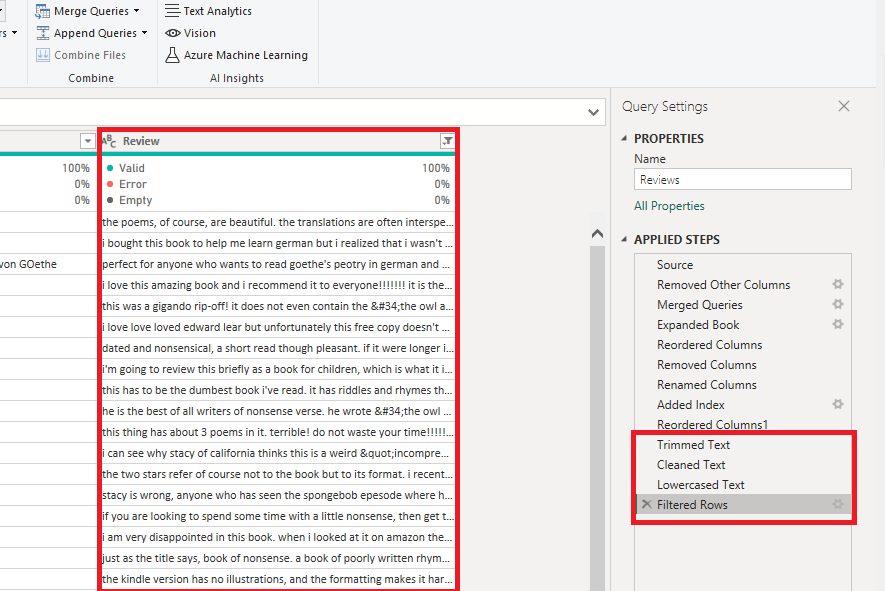
In the example below, I will apply language detection to the book reviews. First, I will prepare the data by cleaning the text, trimming any trailing spaces and unusual characters, and setting the text to either lowercase or uppercase.
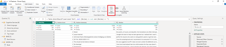
Once the text column is clean and ready, we can apply language detection by clicking the ‘Text Analytics’ button in the ‘AI Insights’ section of either the ‘Home’ tab or the ‘Add Column’ tab of the ribbon at the top.
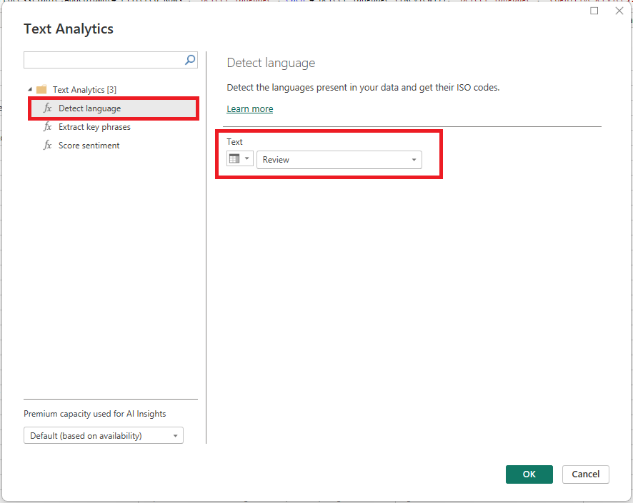
When the ‘Text Analytics’ popup window appears, ensure the correct premium capacity is used, select ‘Detect language’, change the ‘Text’ dropdown to ‘Column Name’, and supply the column name you want to analyse.
After hitting ‘OK’, the Cognitive Services language detection API is invoked, and the new columns are added to the query indicating the detected language.
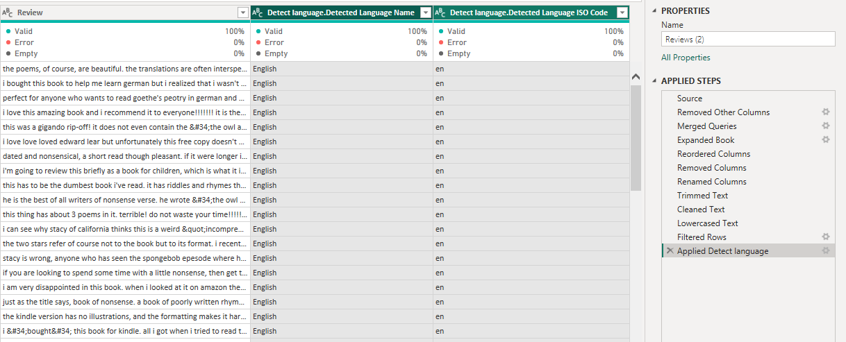
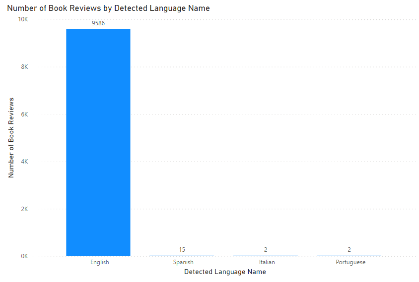
Following this, we can then report on the languages used in the book reviews.
Sentiment Analysis
Sentiment Analysis, also known as opinion mining, is a method of text analytics used to identify whether attitudes expressed in text are positive, negative, or neutral. This can be a particularly useful technique for categorising and understanding customer reviews, public feedback, and opinions expressed at scale.
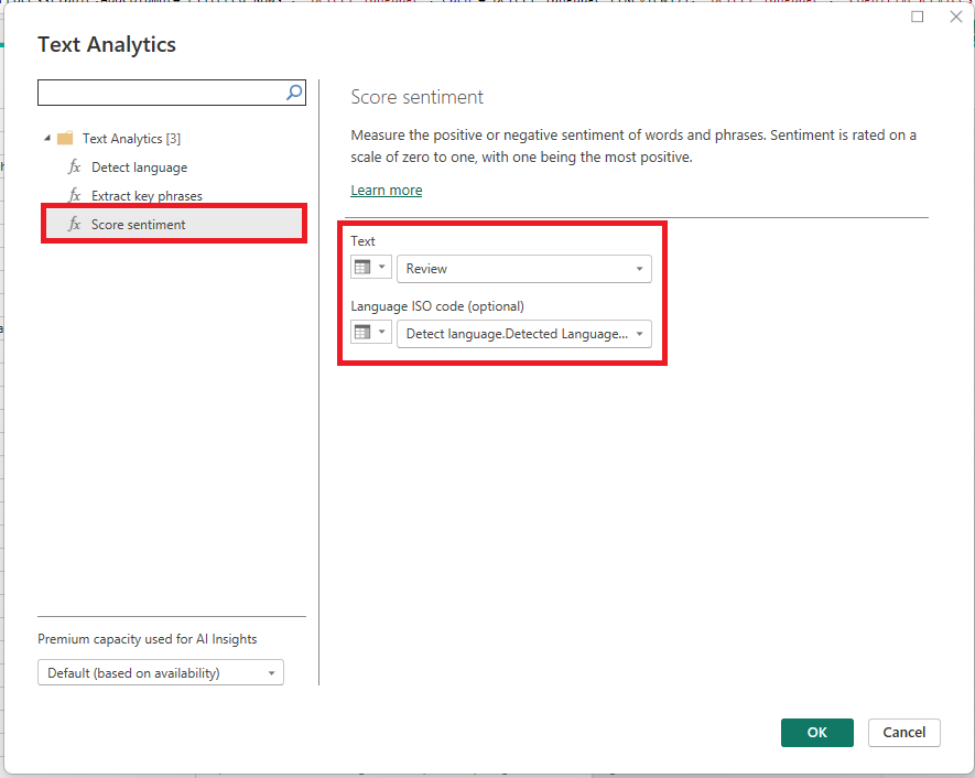
This time, when the ‘Text Analytics’ popup window appears, select ‘Score sentiment’, change the ‘Text’ dropdown to ‘Column Name’, and supply the column name you want to analyse. You can also support the feature by supplying the language ISO code of the text, however, this is optional.
After hitting ‘OK’, the API is invoked, and a new column is added to the query indicating the score sentiment. This process can take a few minutes.
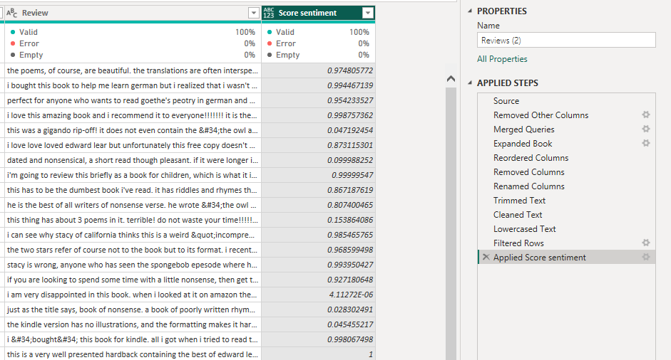
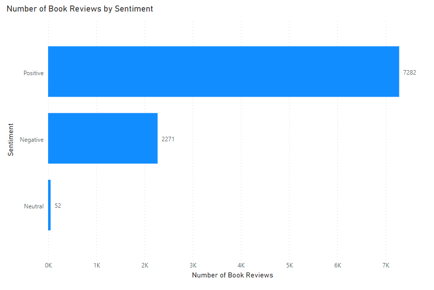
The score sentiment is a decimal value between 0 and 1, with 1 being extremely positive, 0 being extremely negative, and a value of 0.5 being neutral. You may want to add a conditional column to categorise the score sentiment into ‘Positive’, ‘Negative’, and ‘Neutral’ classes to support analysis and reporting.
Key Phrase Extraction
The final Text Analytics feature available is Key Phrase Extraction. This feature is designed to analyse text and pick out the key words and phrases within the text. This can be useful in identifying the main topics from a block of text, across a large amount of data, which can then be used to understand the common topics being discussed.
I will continue to apply the ‘Text Analytics’ to the book review column, this time in order to understand what the common words and phrases are used in the customer reviews. Click ‘Text Analytics’ in AI Insights and then select ‘Extract key phrases’ when the popup displays.
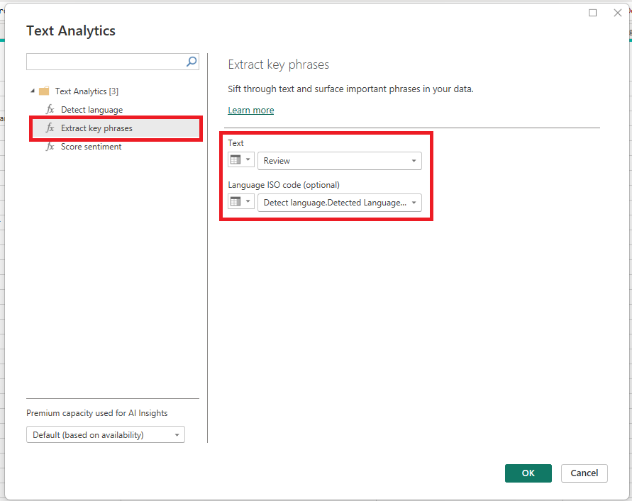
After choosing your columns and pressing ‘OK’, two new columns are added to the query, one being an ‘Extract key phrases’, which lists the key phrases in a single row per review, separating each key phrase with a comma. The second column is a row per key phrase for each review.
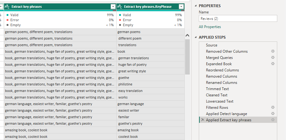
With the data being presented in this way, you may need to split the key phrases into a separate query/table and establish a one-to-many relationship between the reviews and the review key phrases. However, this depends on your data model.
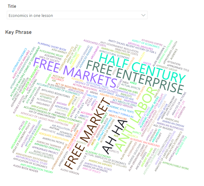
Once the key phrases are listed, again we can tidy them up by trimming the text and altering the casing. From there, we can then report on the common phrases, for example, by using the word cloud custom visual.
Vision
In addition to Text Analytics, the other Cognitive Service available is Vision, also known as Computer Vision. The aim of Computer Vision is to identify and understand what objects exist in videos and images. There is one Vision service available in Power BI, which is Image Tagging.
Image Tagging
Image Tagging is a feature used for recognising objects that appear in images and tagging them with a word or phrase that describes what it is. This can be useful for analysing large amounts of images, such as products, at scale, which can then be used for further analysis.
In the Amazon Book Reviews, there is a column containing a URL of the book’s front cover, which we will use for image tagging. The Vision capability can be found next to the ‘Text Analytics’ in the AI insights section of the ribbon.
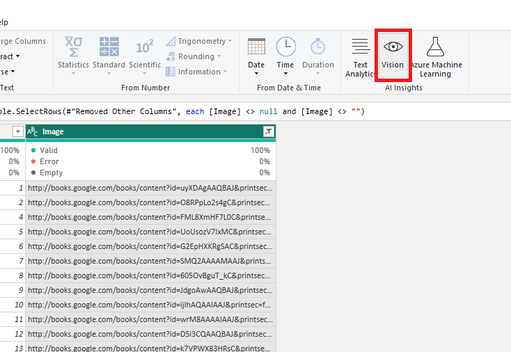
Once the menu pops up, ensure ‘Tag images’ is selected and choose your column containing the images.
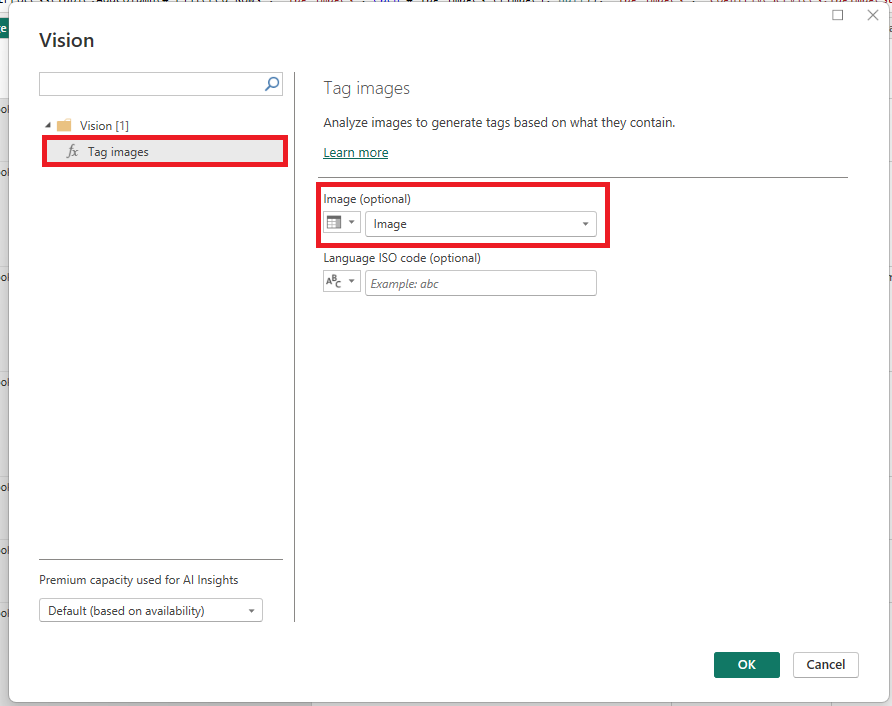
Five new columns get added to the query, including:
- Tag images.Tags column which lists the tagged objects in a single row per image, separating each tag with a comma.
- Tag images.Json column which provides a json format of the output of each object tagged.
- Tag images.Tag column which provides a row per object tagged for each image.
- Tag images.Confidence which provides a decimal number between 0 and 1 detailing the confidence the model has in the displayed tag.
- Tag images.ErrorMessage which displays an error message if one is present.
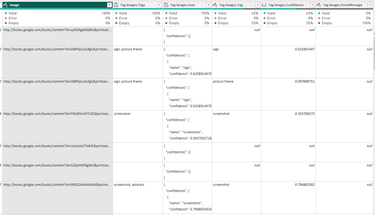
Again, depending on your data model, you may want to split the tags into a separate table/query and establish a one-to-many relationship between the image and the tags.
From there, one can create a table visual that displays the image and visualise the image tabs by the assigned confidence.
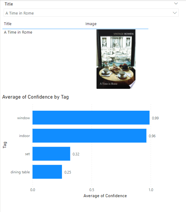
In the example above, we can see that it has tagged the book’s front cover as window, indoor, set and dining table, which seems mostly accurate.
Machine Learning
The next Premium AI feature to mention is the ability to create and consume machine learning models in the Power BI Service with dataflows. Powered by the automated ML (AutoML) feature of Azure Machine Learning, Power BI Premium users can train classification and regression models, evaluate their performance and apply the model to datasets to generate predictions.
In this example, we will use the Employee Attrition for Healthcare dataset to predict whether the employee is likely to leave their job or not.
In order to do this, we must first have a Premium per-user or Premium capacity workspace created in the Power BI Service, and a dataflow created containing the dataset. For information on how to create a dataflow, please visit here.
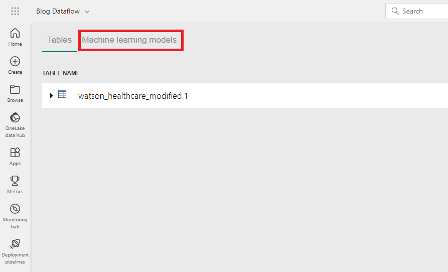
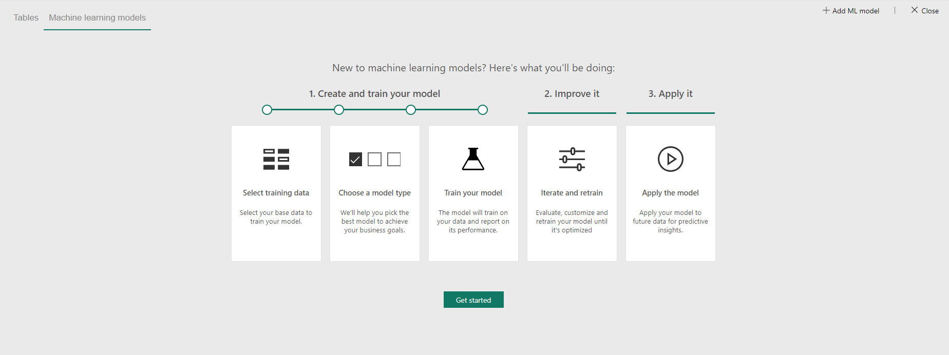
Once the dataflow has been created, select ‘Machine learning models’ and ‘Get started’.
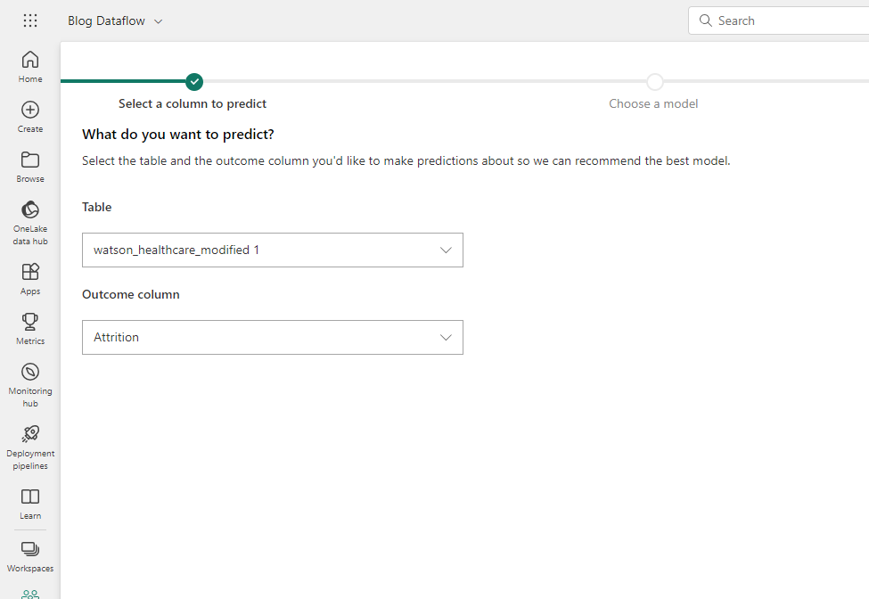
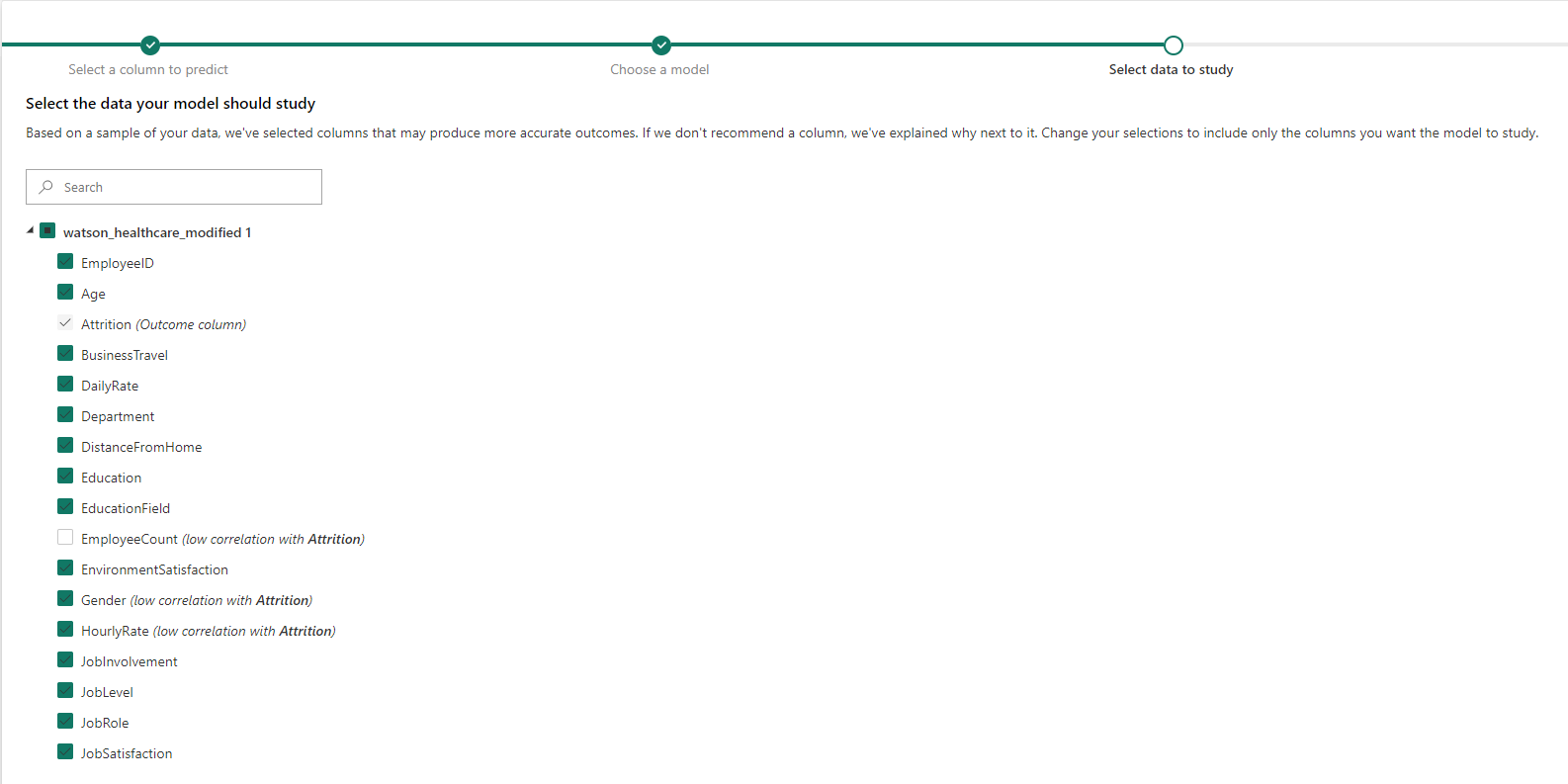
We then need to configure the settings of the model, firstly by selecting the table and outcome column, i.e., what we are predicting.
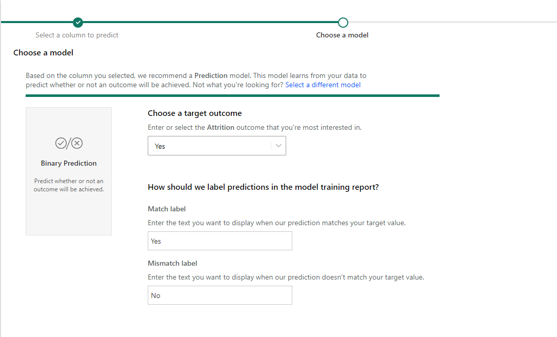
Next, we must choose the type of model. This will typically be automatically determined based on the outcome column selected, which in our case is a binary prediction model. In the rare case it is wrong, you can change this by clicking ‘Select a different model’. Then, we must select the outcome we are most interested in and the labels of the predictions.
The next step is to choose the columns you wish to use as features in the model – the independent variables. Make sure the outcome column is unselected here. In addition, some columns are unselected by default, including those that have low correlations with the outcome column, and those with only one value, however, we can still include them if we want.
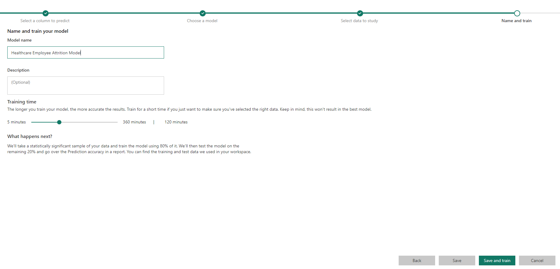
Finally, give the model a name and description (optional) and configure how long you are willing to wait for the training process to complete. Then hit ‘Save and train’ and grab a cup of tea while you wait for the model to train.
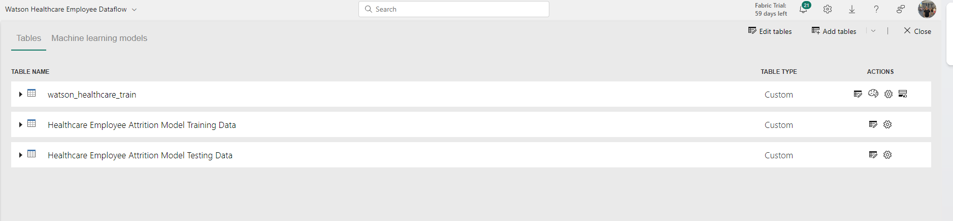
You will notice in the ‘Tables’ tab that two new tables have appeared in the dataflow – Training Data and Testing Data. The training data contains 80% of the dataset and is used as an input into the model so that it learns the patterns and trends within the data. The testing data contains the remaining 20% of the dataset and is used for evaluating the performance of the model.
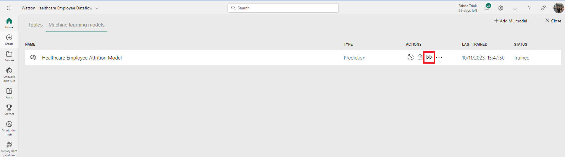
Once the model is trained, in the ‘Machine learning models’ tab, you will see your model listed with the ‘Trained’ status, the time it was last trained, and several actions to take, including ‘Retrain model’, ‘View training report’, and ‘Apply ML Model’.
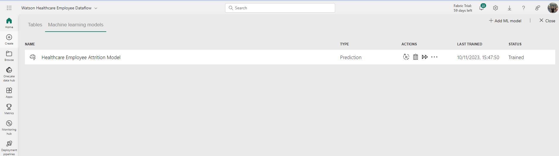
As we have only just trained the model, there is no need to retrain it just yet. However, in a live scenario, you may want to consider retraining the model on a regular basis, such as each month, quarter, or year.
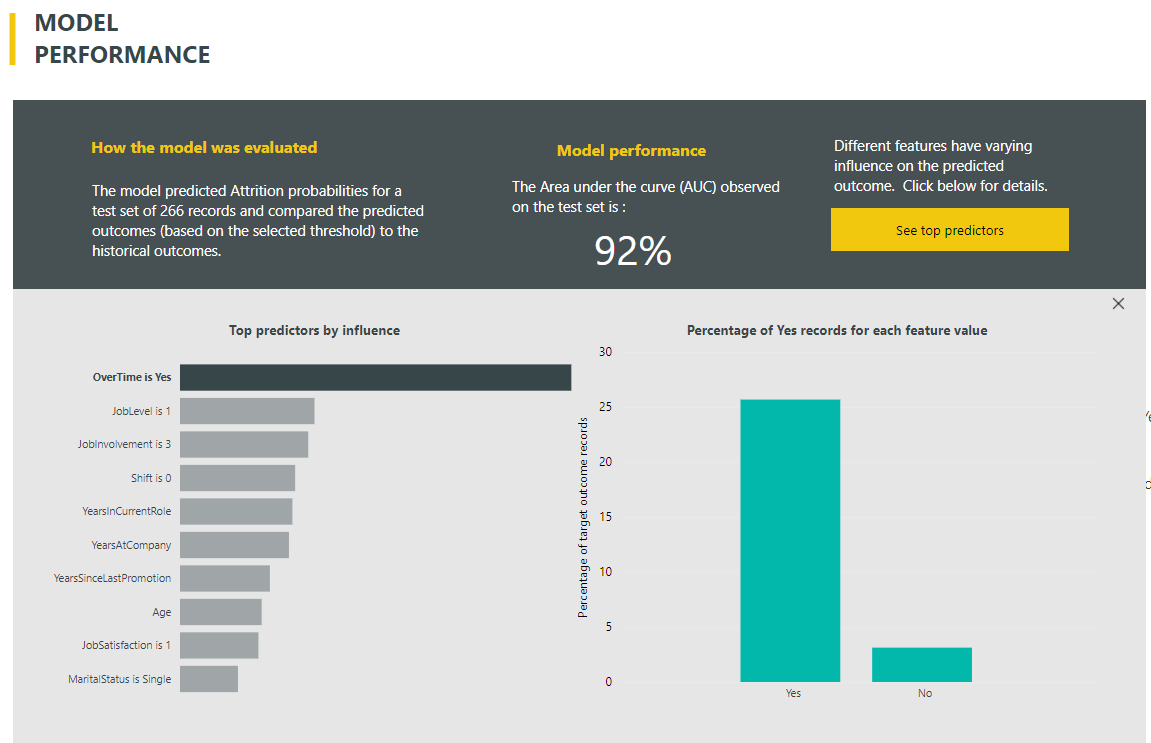
If we view the training report, we will be taken to a Power BI report that is useful for evaluating the model performance and understanding what the important features are. For classification models, this includes the Area under the curve (AUC), the confusion matrix, precision, recall, cost-benefit analysis, cumulative gains chart and ROC curve. For regression models, the report includes the R-squared value, the predicted vs. actual plot, and residual error. For more information on how to interpret these, see here for classification models and here for regression models.
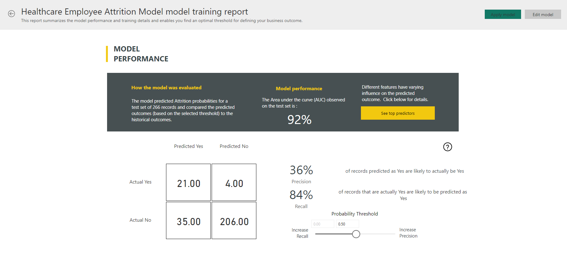
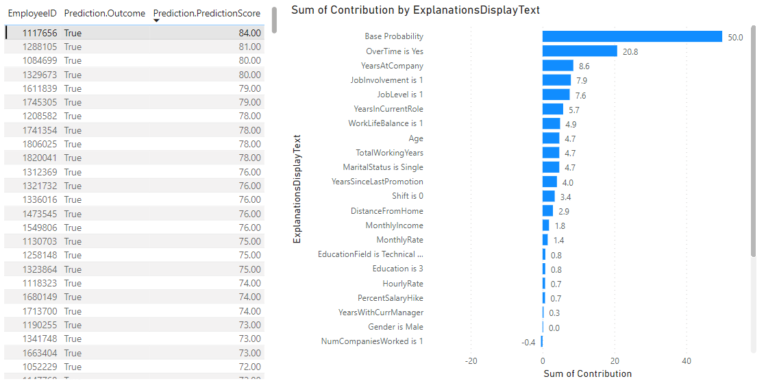
In my model, we can see when the threshold is set to 0.5 the precision is 36% and recall is 84%. If we click the ‘See top predictors’ button, we will see which features are the most important.

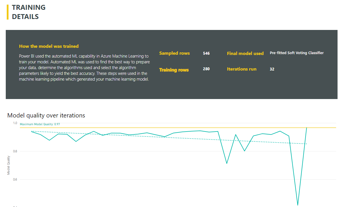
In my case, I can see that the most influential factor that is causing attrition is when the employee is working overtime. In addition to the performance and evaluation pages, there is also a training details page which describes the details of the model, including which algorithms were used, how many rows and iterations were used and what the imputation method was.
When we are happy with the model, we can then use it to make predictions on unseen data by clicking the ‘Apply ML model’.
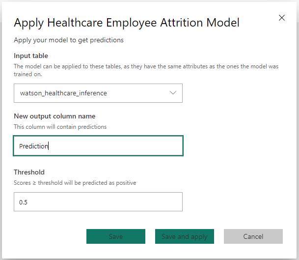
After pressing this, a menu appears where you define which table you want to apply the model on, what the new column will be called and what the threshold is for defining the two classes. This is typically 0.5, however you can use the probability threshold on the training report to determine what this should be.
After hitting ‘Save and apply’, two new tables will appear: an enriched table containing the scored dataset, and an explanations table containing the contribution scores for the influential features that made up the prediction.
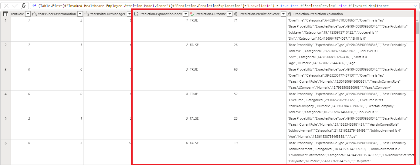
Finally, we can connect Power BI Desktop to our dataflow and visualise the predictions with the associated explanations.
Summary
This blog has been the third part in the Power BI to Power AI blog series. It has described the Premium AI features available, including how to create machine learning models and utilise Cognitive Services such as language detection, key phrase extraction, sentiment analysis and image tagging. For more information, refer to the Microsoft documentation here.
Introduction to Data Wrangler in Microsoft Fabric
What is Data Wrangler? A key selling point of Microsoft Fabric is the Data Science
Jul
Autogen Power BI Model in Tabular Editor
In the realm of business intelligence, Power BI has emerged as a powerful tool for
Jul
Microsoft Healthcare Accelerator for Fabric
Microsoft released the Healthcare Data Solutions in Microsoft Fabric in Q1 2024. It was introduced
Jul
Unlock the Power of Colour: Make Your Power BI Reports Pop
Colour is a powerful visual tool that can enhance the appeal and readability of your
Jul
Python vs. PySpark: Navigating Data Analytics in Databricks – Part 2
Part 2: Exploring Advanced Functionalities in Databricks Welcome back to our Databricks journey! In this
May
GPT-4 with Vision vs Custom Vision in Anomaly Detection
Businesses today are generating data at an unprecedented rate. Automated processing of data is essential
May
Exploring DALL·E Capabilities
What is DALL·E? DALL·E is text-to-image generation system developed by OpenAI using deep learning methodologies.
May
Using Copilot Studio to Develop a HR Policy Bot
The next addition to Microsoft’s generative AI and large language model tools is Microsoft Copilot
Apr