Off-the-shelf solutions for interactive data app development such as Microsoft Power BI are great – they allow users to easily develop data apps using a GUI. However, Power BI’s ease of use comes at the expense of reduced functionality. This is where programming languages such as Python, JavaScript or C# shine – you can practically code anything you like!
This blog will focus on Streamlit as a means of building interactive data apps. Streamlit is an open-source Python library that enables rapid creation of web apps (including, but not limited to, data apps) with minimal code. It acts as an intermediary between the easy-to-use, but functionally-limited characteristics of Power BI and the functionally-enhanced, but difficult-to-use characteristics of other programming tools such as JavaScript or C#.
Below, we present a step-by-step run-through detailing the fundamental steps required to build a data app using Streamlit. Please note the following:
- This blog assumes basic Python knowledge.
- The data and Python code used to create the app (~200 lines) can be accessed here.
- The Streamlit documentation can be accessed here.
- To view the images in this article properly, you may have to zoom in.
Example
Scenario
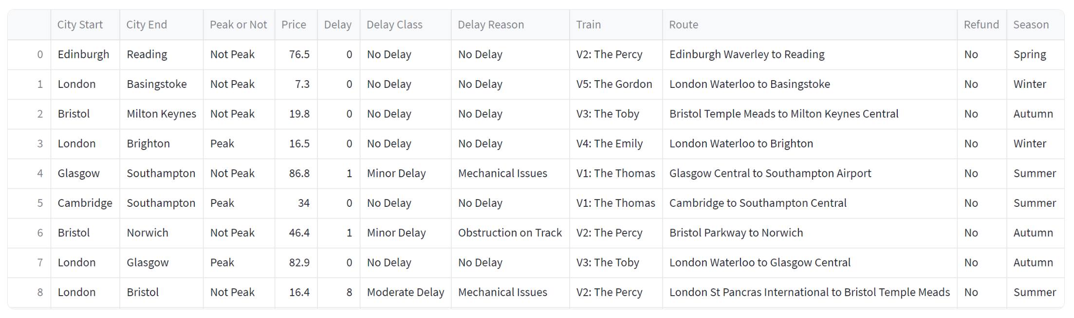
You work for Thomas Rail, a train company offering routes across the UK. Your manager has asked you to develop an app which allows you to see which cities commonly face delays and the reason for these delays. An excerpt of the data (df) is shown below:
Building the App
The app you plan to develop will be one page, split into three sections: filter pane, high-level metrics, and visuals. Before you start building your app, you must:
- Import the required packages (e.g., Streamlit, Plotly, etc.)
- Use the set_page_config() command to configure the page.
- Load the data.
To run your app, you must do so via the terminal using the following command: streamlit run [YourPythonScript.py].
Filter Pane
Users want to be able to filter the data by both City of Arrival and City of Departure. In this section, we will focus on building the filter pane as well as setting up the filter for City of Arrival.
Streamlit provides many pre-set functions to set-up the page layout. One of these functions is st.sidebar() – we will use this to configure the filter pane on the side of the page. For example, we can set up the filter pane header as shown below:

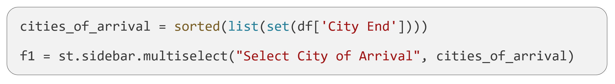
Streamlit offers many pre-set functions enabling interactivity. One of these functions is st.multiselect(). This allows the user to filter the data by selecting multiple options. We can use this function to create the filter for City of Arrival as shown below. Before creating the filter, we must also extract a unique list of cities to populate the filter.
And there you have it – those are the main functions required to build a filter pane in Streamlit! The example below shows what the filter pane could potentially look like with a few additional configurations.
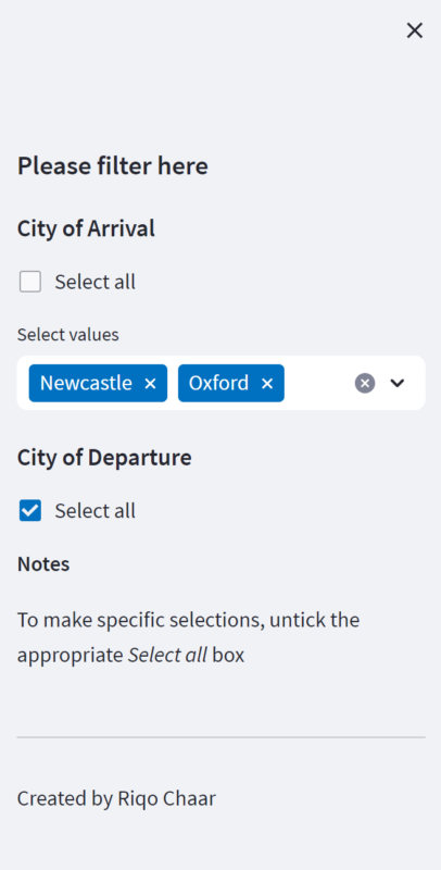
These additional configurations involve the use of:
- checkbox() to allow the user to select all filter options with one click.
- markdown() to generate markdown text.
- Conditional statements to define whether or not the multiselect() filter is visible depending on whether or not the st.checkbox() option is selected.
Currently, although the filters are present, they are not functional. To add functionality, we must create a new dataframe, called df_selection. This will be created using a query which incorporates the filter.
 Please note the following:
- When using multiple filters, the string is just extended with more equations, with each equation separated by an &.
- Backticks (“) are used for columns with spaces in them.
High-level metrics
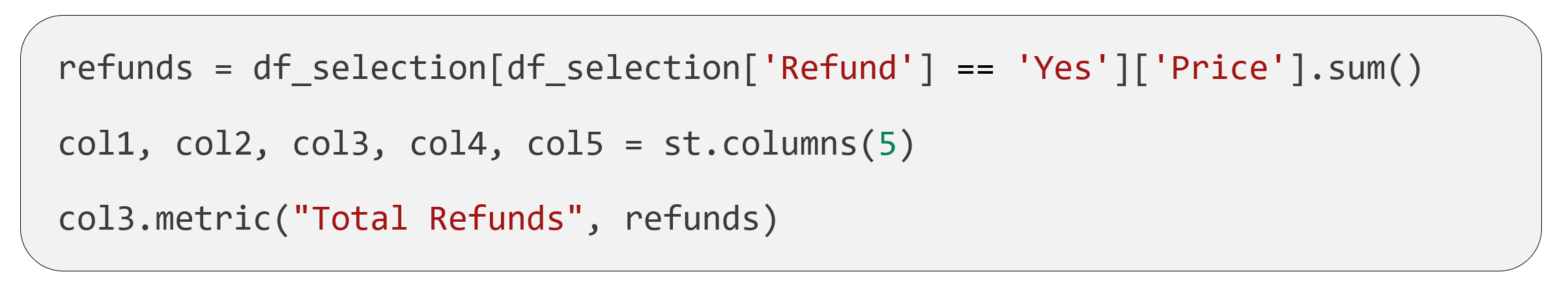
Now that we have set-up the filter pane, let’s populate the page with some data elements! To incorporate some high-level metrics into our app, we first have to define where they will be located on the page. To do this, we can use st.columns() to create a set number of columns for the metrics to go into. By calling these columns, we can then add metrics using st.metric(). Below is an example, showing the creation of a metric informing the user on the total financial value of refunds.
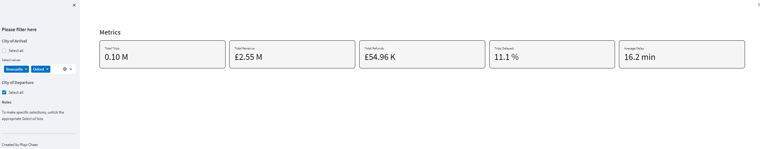
Shown below is an example of what the metrics panel could potentially look like:
Please note the following:
- The title was added using the markdown() function.
- Streamlit does not currently provide the functionality to format the metric value. Therefore, this had to be done using Python functions built for the task.
- Streamlit does not currently provide the functionality to format the metric box. Therefore, this had to be done via a CSS script. More information on this can be found here.
Visuals
There are many visualisation libraries that can be used with Streamlit to create interactive visuals. In this example, we will use Plotly. The Plotly documentation can be accessed here.
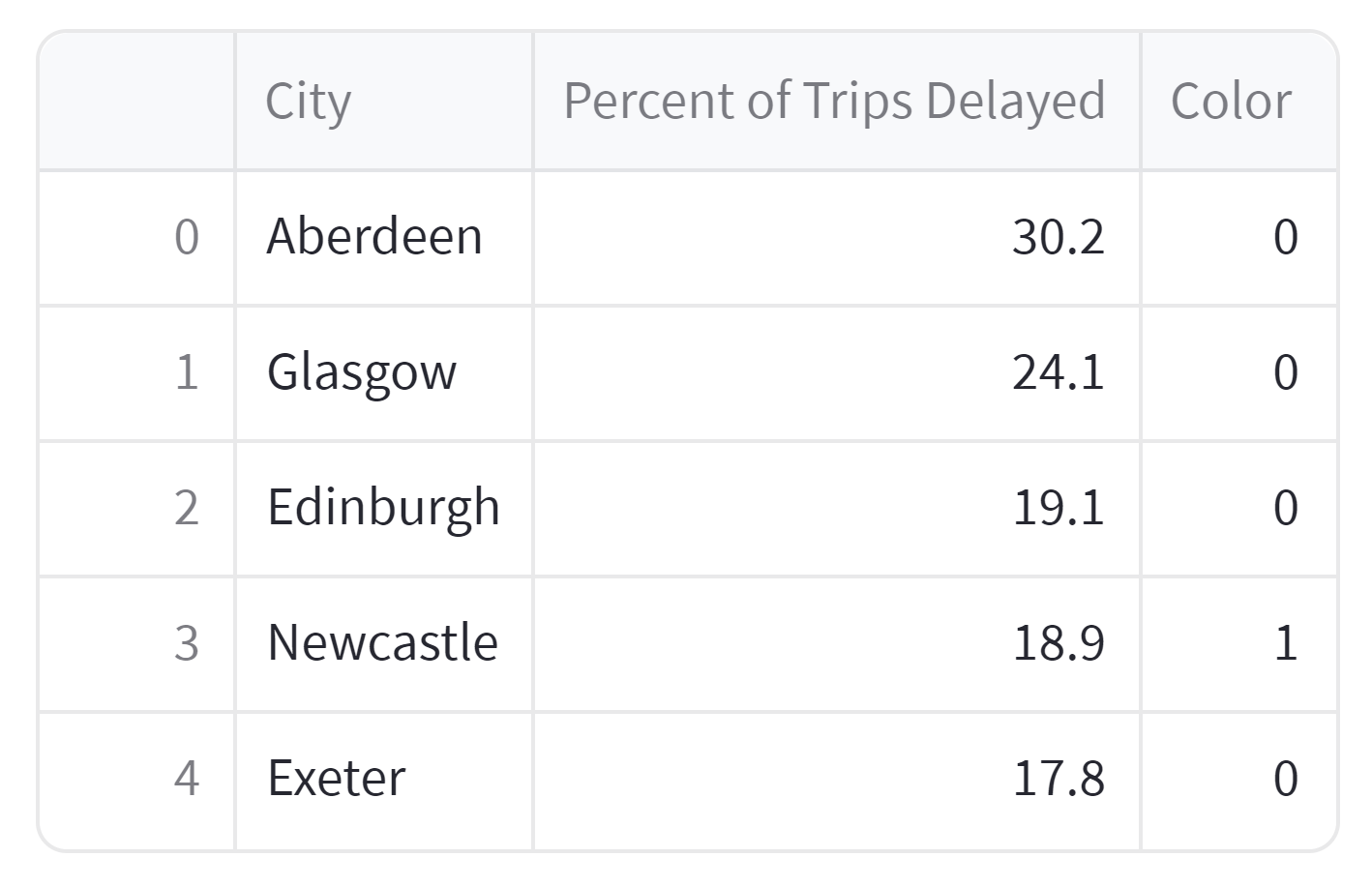
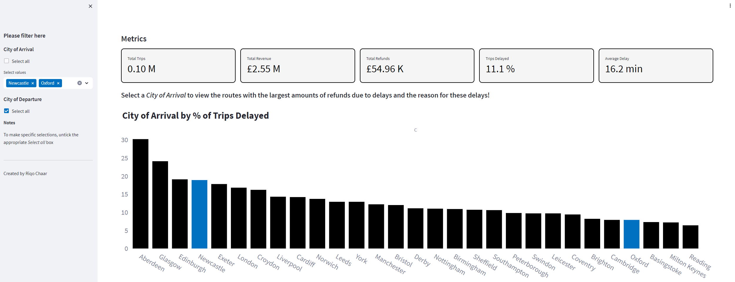
Let’s create a bar graph showing the percentage of trips delayed for each City of Arrival. To do this, we must firstly transform df_selection to generate a new dataframe with the relevant data. We will name this new dataframe percentage_of_trips_delayed_by_city – an excerpt of which is shown below:
Having created the dataframe, we can now:
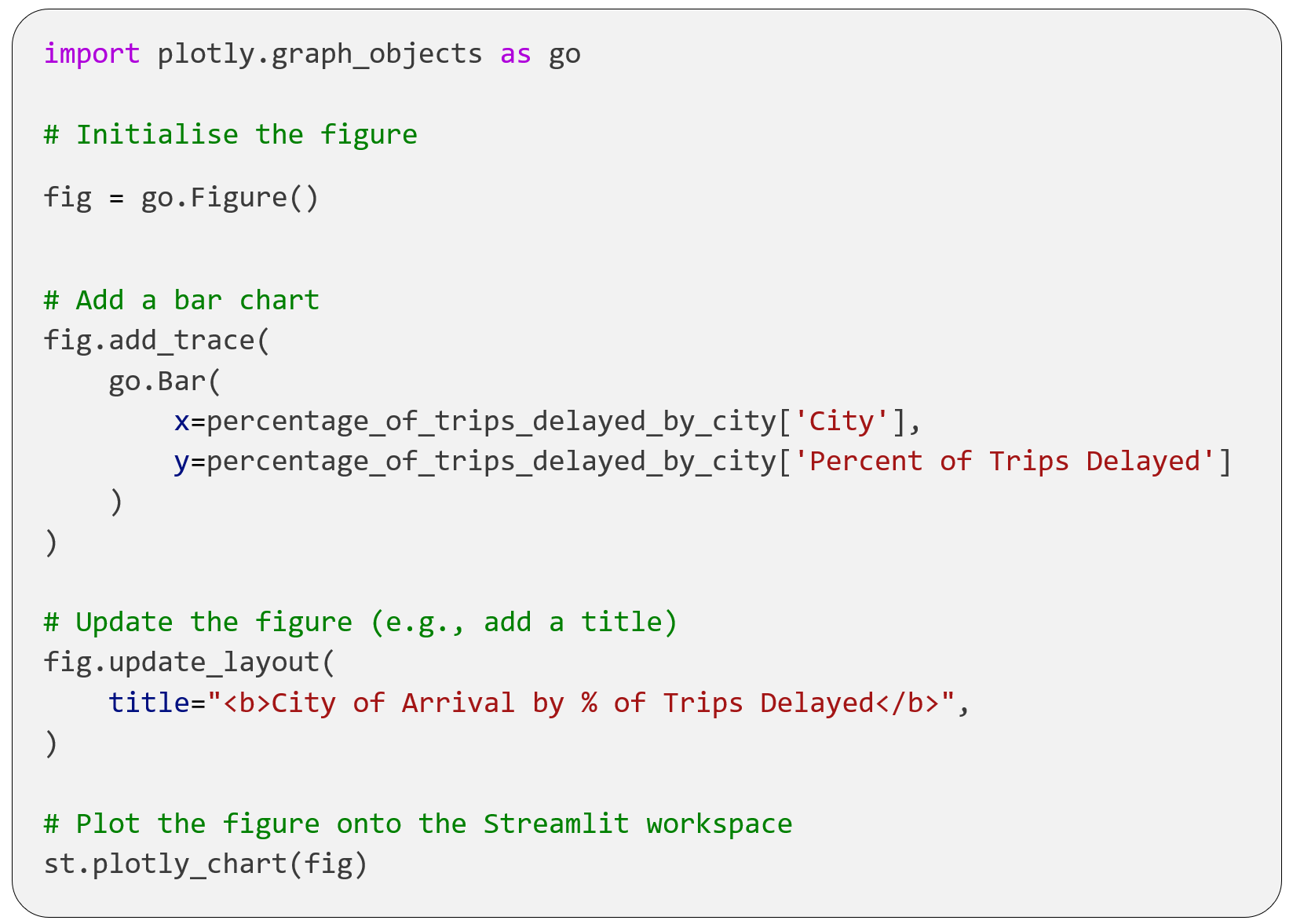
- Use the graph_objects module to create the Plotly figure.
- Use the plotly_chart() function to load the Plotly figure onto the Streamlit workspace.
Shown below is an example of what this code could produce with a few additional configurations:
Please note the following:
- The code which generates the figure above is written in such a way that instead of filtering, the City of Arrival filter highlights the relevant cities instead. This is configured using the Colour column and a map function.
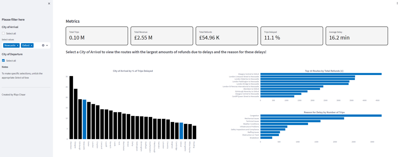
We can generate more plots on the page by adding more instances of the fig.add_trace() function. The image below shows what the final app could potentially look like!

Miscellaneous
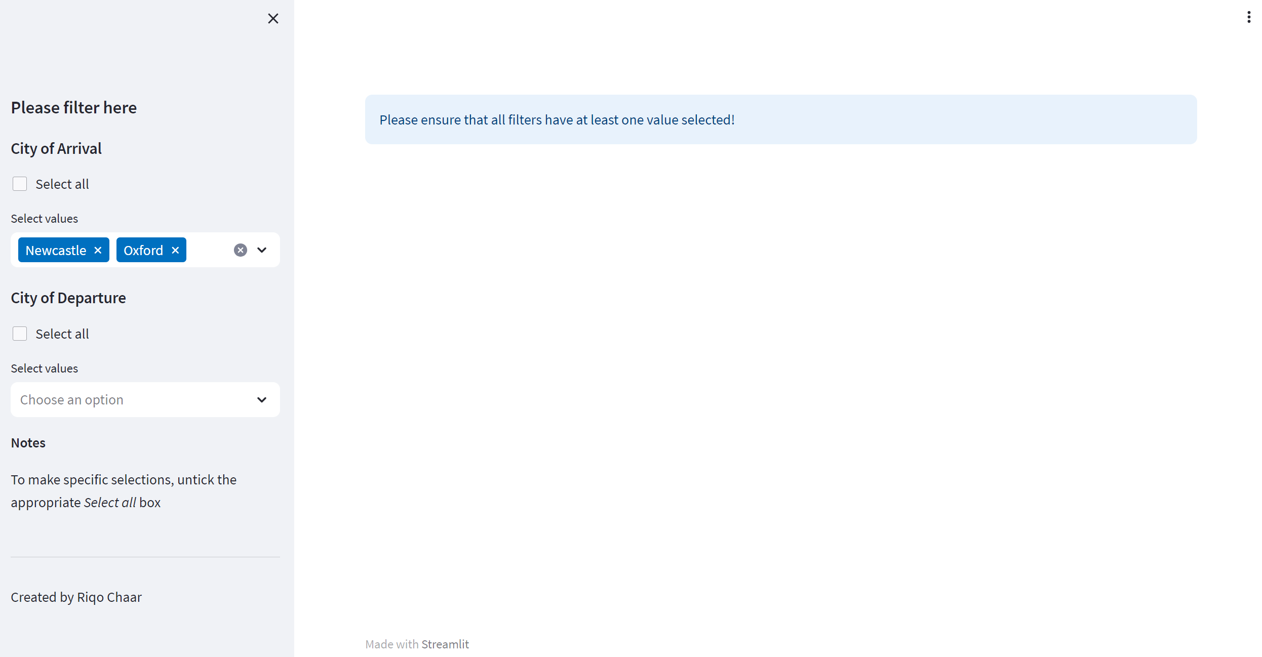
Streamlit has many other functions which haven’t been discussed in this blog but can be found in the documentation. One useful function that I would like to point out is st.info(). This function allows you to guide the user by providing additional information. For example, for the as-is dashboard to function, all filters must have at least one value selected. Instead of displaying an ugly error message, we can direct the user to ensure that all filters have a value selected using st.info() as shown below.
Final Thoughts
Streamlit is just one of a wide variety of tools that can be used to develop data apps, all coming with their own advantages and disadvantages. In order to become a well-rounded data specialist, it is important to be exposed to a wide variety of tools. For example, although Streamlit is more difficult to use than Power BI, it provides comparitevely improved functionality due to it’s programmatic nature. However, as Power BI is an already established product which is integrated into the Microsoft ecosystem, we don’t recommend the use of Streamlit as a replacement except for in cases where Power BI’s functionality isn’t sufficent.
In this blog, we have presented a step-by-step run-through detailing the fundamental steps required to build a data app using Streamlit. Hopefully with this new knowledge, you can now go and build your own data apps!
Introduction to Data Wrangler in Microsoft Fabric
What is Data Wrangler? A key selling point of Microsoft Fabric is the Data Science
Jul
Autogen Power BI Model in Tabular Editor
In the realm of business intelligence, Power BI has emerged as a powerful tool for
Jul
Microsoft Healthcare Accelerator for Fabric
Microsoft released the Healthcare Data Solutions in Microsoft Fabric in Q1 2024. It was introduced
Jul
Unlock the Power of Colour: Make Your Power BI Reports Pop
Colour is a powerful visual tool that can enhance the appeal and readability of your
Jul
Python vs. PySpark: Navigating Data Analytics in Databricks – Part 2
Part 2: Exploring Advanced Functionalities in Databricks Welcome back to our Databricks journey! In this
May
GPT-4 with Vision vs Custom Vision in Anomaly Detection
Businesses today are generating data at an unprecedented rate. Automated processing of data is essential
May
Exploring DALL·E Capabilities
What is DALL·E? DALL·E is text-to-image generation system developed by OpenAI using deep learning methodologies.
May
Using Copilot Studio to Develop a HR Policy Bot
The next addition to Microsoft’s generative AI and large language model tools is Microsoft Copilot
Apr