This post is the second part of a blog series on the AI features of Power BI. Part 1 described three generally available AI features in Power BI: forecasting, anomaly detection, and natural language processing with the Q&A visual. This article will focus on three more generally available AI visuals, including the Key Influencers visual, the Decomposition Tree, and Smart Narratives.
The aim of this blog series is to speed up the transition from BI to AI. Leveraging artificial intelligence capabilities can unlock more advanced ways of interpreting and understanding data leading to better decisions across the organisation.
As in Part 1, the examples below use the Wide World Importers (WWI) sample data warehouse from Microsoft, a wholesale novelty goods importer and distributor operating from the San Francisco bay area.
Key Influencers
The first AI visual to focus on is the Key Influencers visual. The aim of this visual is to help users understand what factors influence a particular continuous or categorical variable of interest, known as the dependent variable. For example, HR may want to gain an understanding of what factors cause an employee to leave; Sales and Marketing may want to understand the main factors that lead to a sale, and Finance may want to understand what causes higher income and expenses.
In the example below, I am analysing profit by various factors, including the year, quarter, month, and day; the product item, colour, brand, and size; the sales price, tax amount, and quantity; the state province, city, and location; and the employee that made the sale. When the factors are added to the ‘Explain by’ section they are then analysed by Power BI, and the results are displayed in the visual.
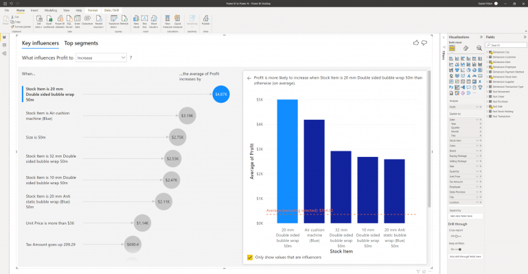
The visual consists of various parts, in the ‘Key Influencers’ part, you can choose if you want to see what influences your continuous variable to either increase or decrease. Then, underneath, you can see in a ranked order the factors that influence either the increase or decrease, with the most influential at the top. In the example above, I can see that the most influential factor on profit is when the stock item is ’20mm double sided bubble wrap 50m’. On average, this causes a $4.87K increase in profit compared to other items. With the bubble selected, a chart appears on the right-hand side, showing the influential stock item in comparison to the average and other stock items.
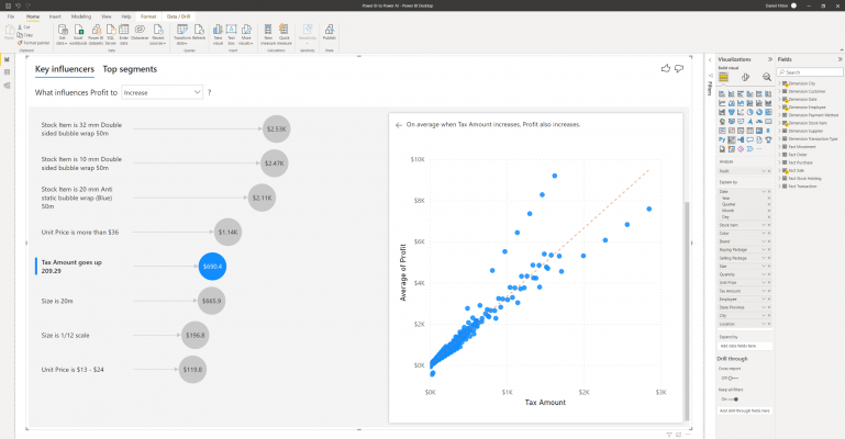
Clicking on other influencers will change the visual displayed on the right, using the most appropriate visual for the data type, usually either a column chart or scatter plot. Interestingly, in the example below, there is a positive correlation between tax amount and profit. When tax amount increases, profit also increases.
Power BI calculates the influential factors using a statistical machine learning approach. As described in this article, the key influencers are identified using ML.NET, a machine learning library for C# and F# languages. During the calculation process, data is first prepared for machine learning by replacing missing values, normalising the mean variance, and one-hot encoding the categorical variables.
Then, the machine learning algorithm is run, which entails either a linear regression model when you are analysing a continuous variable; or a logistic regression model when analysing a categorical variable. The linear regression algorithm that is used is Stochastic Dual Coordinate Ascent (SDCA) regression. The logistic regression algorithm that is used is the limited memory Broyden-Fletcher-Goldfarb-Shanno method (L-BFGS).
A further feature available with this visual is ‘Top segments’. This feature creates categories, or segments, within the data so that we can understand how combinations of factors influence the dependent variable.
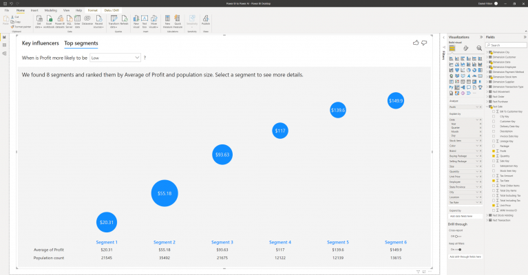
In the example above, I am looking to understand what combinations of factors cause less profit. I can see that Power BI has automatically split the data up into six segments, ranking them by average profit and population size. To understand more about these segments, I can click on the segment bubbles, which brings up a new screen in the visual.
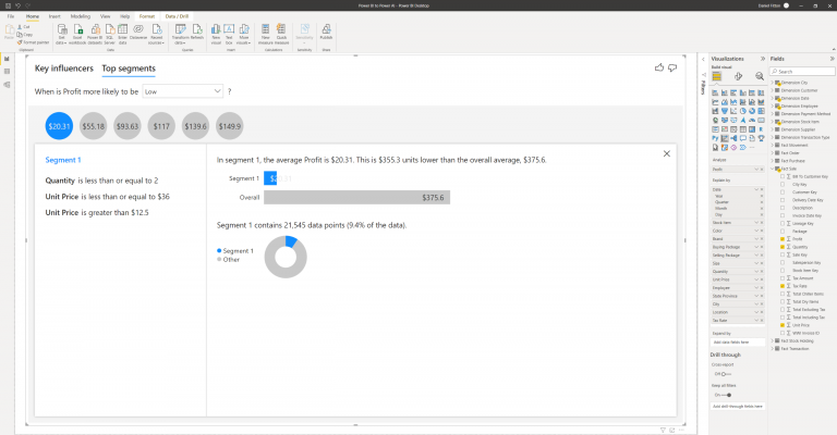
The visual explains how the segment is made up and how it compares against the overall data. In the example above, I can see that segment 1, which is the segment identified to cause the lowest profit, is made up of rules within the data, including when the quantity is less than or equal to 2, and when the unit price is less than or equal to $36 and greater than $12.5. When data points fall into these rules, they are part of this segment. Segment 1 overall makes up 9.4% of the population.
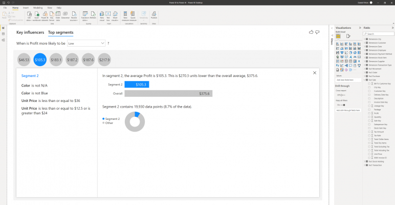
The second segment makes up 8.7% of data and is made up of records where the stock item colour is neither N/A or blue and where the unit price is either less than or equal to $36, less than or equal to $12.5 or is greater than $24.
One important consideration, however, is the potential for overfitting here. Overfitting is when the machine learning algorithm fits itself too closely to the underlying data, leading to a poorly performing model. It can happen when there isn’t enough statistical significance in the data to explain the dependent variable, causing the algorithm to create overly specific segments where they may not exist.
The segmentation feature of the Key Influencers visual is calculated based on a tree-based algorithm in the ML.NET library, named FastTree.
Decomposition Tree
Another AI visual Power BI offers is the Decomposition tree. The aim of this visual is to provide the user with the ability to perform ad hoc exploratory data analysis, and root cause analysis within a single visual. Root cause analysis is a method for identifying and understanding the main cause of problems or events. The decomposition tree supports this by automatically aggregating data by various dimensions and offering the ability for the user to drill into further details to understand what is driving each of the values.
In the example below, I want to understand what causes profit to be higher or lower by considering the sales territory, the state province, the employee that made the sales, and the stock item.

Dragging Profit into the ‘Analyze’ section initially presents us with a single aggregated value for profit. Next to the blue bar is a plus symbol. Clicking the plus symbol opens a menu where you can see each of the dimensions which I have added to the ‘Explain by’ field, also a ‘High value’ and ‘Low value’ option with a lightbulb symbol. The lightbulb indicates that Power BI will use AI to automatically identify where you should look next to understand the measure you are analysing.
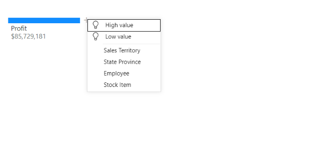
I want to understand what the main cause of higher profits is; therefore, I select the ‘High value’ option, which then splits the Profit value into the next significant level of detail.
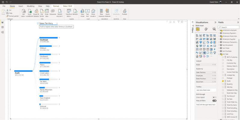
In this case, it happens to be the sales territory, and Power BI informs me that “Profit is highest when the Sales Territory is Southeast”. Also presented are the profit values for each of the territories, with bars indicating the proportion. I can then drill into further details, by clicking a plus symbol next to one of the territories, and again selecting high value.
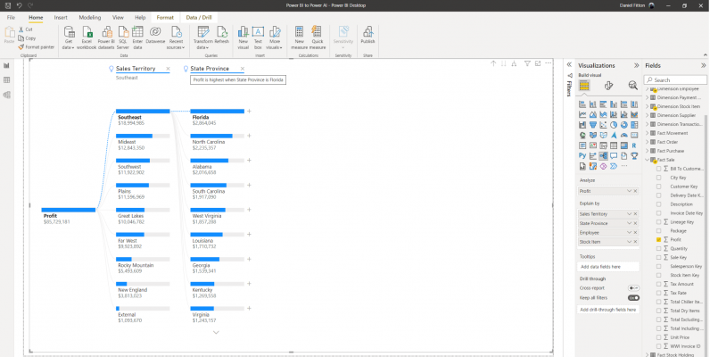
Here I can see that the state province within the Southeast territory where profit is highest is Florida. Drilling further into Florida, I can then see the breakdown by employee, and that profit is highest when the employee is Hudson Hollinworth.
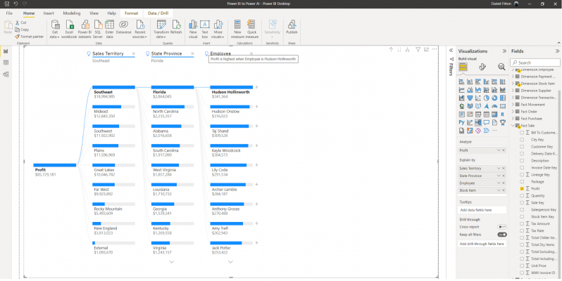
This can continue until I have gained a thorough understanding of what drives profit to be higher and lower, all within a single chart type. Although the decomposition tree isn’t using any sophisticated AI algorithm in the background, it is still a powerful visual, allowing the user to seamlessly aggregate up and drill down over multiple dimensions.
Smart Narratives
The final AI visual to discuss in this post is Smart narratives. The aim of the smart narratives visual is to automatically summarise a report or visual within a report. The smart narratives visual identifies the key insights within the data, such as trends and patterns, then auto-generates text that describes what the data shows, providing a narration of your data.
In order to use the smart narratives visual, you must have at least one visual already created on your page. Once you have created some visuals and added the smart narratives visual, it will take a few seconds to generate the text, then the text will be displayed narrating the key insights that Power BI has found from each of your visuals on the page.
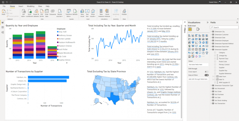
As we can see above, the smart narrative visual has identified, amongst other things, that the “Total Including Tax trended up, resulting in a 31.56% increase between January 2013 and May 2016”.
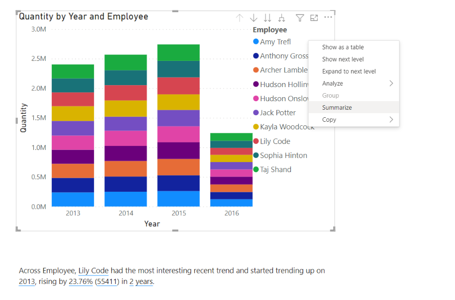
You can also create the smart narratives visual from individual visuals by right-clicking the visual you want to narrate, then selecting ‘Summarize’.

This will generate a smart narrative text for that individual visual, describing the key takeaways found in the data for this visual. You can also add further text to the visual to add your own narration and context, including headings and subheadings. A key benefit of the smart narrative visual is that it updates based on user interaction such as selecting elements of visuals, including slicer and filter context.
Summary
This blog has been the second part in the Power BI to Power AI blog series. It has described key influencers, decomposition tree and smart narrative AI features of Power BI.
Introduction to Data Wrangler in Microsoft Fabric
What is Data Wrangler? A key selling point of Microsoft Fabric is the Data Science
Jul
Autogen Power BI Model in Tabular Editor
In the realm of business intelligence, Power BI has emerged as a powerful tool for
Jul
Microsoft Healthcare Accelerator for Fabric
Microsoft released the Healthcare Data Solutions in Microsoft Fabric in Q1 2024. It was introduced
Jul
Unlock the Power of Colour: Make Your Power BI Reports Pop
Colour is a powerful visual tool that can enhance the appeal and readability of your
Jul
Python vs. PySpark: Navigating Data Analytics in Databricks – Part 2
Part 2: Exploring Advanced Functionalities in Databricks Welcome back to our Databricks journey! In this
May
GPT-4 with Vision vs Custom Vision in Anomaly Detection
Businesses today are generating data at an unprecedented rate. Automated processing of data is essential
May
Exploring DALL·E Capabilities
What is DALL·E? DALL·E is text-to-image generation system developed by OpenAI using deep learning methodologies.
May
Using Copilot Studio to Develop a HR Policy Bot
The next addition to Microsoft’s generative AI and large language model tools is Microsoft Copilot
Apr