A lot of Business Intelligence (BI) professionals have experience reporting on data and performing basic analysis. However, to take their skills to the next level, they could consider learning some data science and artificial intelligence (AI) techniques. The main advantage of these techniques is that it enables a deeper understanding of data. Furthermore, you can begin utilising predictive analytics techniques, such as time-series forecasting, anomaly detection, classification, and regression.
The go-to tool for business intelligence these days is Microsoft Power BI. Power BI primarily is a data visualisation and reporting tool; however, it also offers some AI capabilities. This blog series will go through some of these capabilities, with the aim of accelerating the reader’s transition from BI to AI.
Some Power BI AI features require premium licensing, and the setup of additional tools and services. However, there are also many out-of-box capabilities related to AI that the Power BI developer with a free or pro account can take advantage of. This blog will focus on some generally available AI features, including forecasting, anomaly detection, and natural language processing. There will be further blogs in the series to look at the additional AI capabilities.
The examples below use the Wide World Importers (WWI) sample data warehouse from Microsoft, a wholesale novelty goods importer and distributor operating from the San Francisco bay area.
Forecasting
The first AI feature to focus on is forecasting. Time-series analysis or forecasting is a widely used technique used for predicting quantitative values over time. For example, it could be the number of interactions per hour, number of sales per day, number of deliveries per month, number of new hires per year, and so on.
The time-series forecast in Power BI works by using the exponential smoothing method. The algorithm involves decomposing the historic data into three components: trend, seasonality, and error.
- Trend is simply the increase or decrease in data over a period of time.
- Seasonality indicates if a recurring time pattern is present in the data, for example, if the data typically fluctuates by the hour of the day, day of the week, month of the year, etc.
- Error, also known as the remainder, indicates fluctuations that occur outside of the typical trend and seasonal patterns.
To utilise forecasting in Power BI, simply select the line chart visual, drag the date or time column into the ‘Axis’, and the dependent variable into the ‘Values’, for example, quantity, sales total, or some other measure.
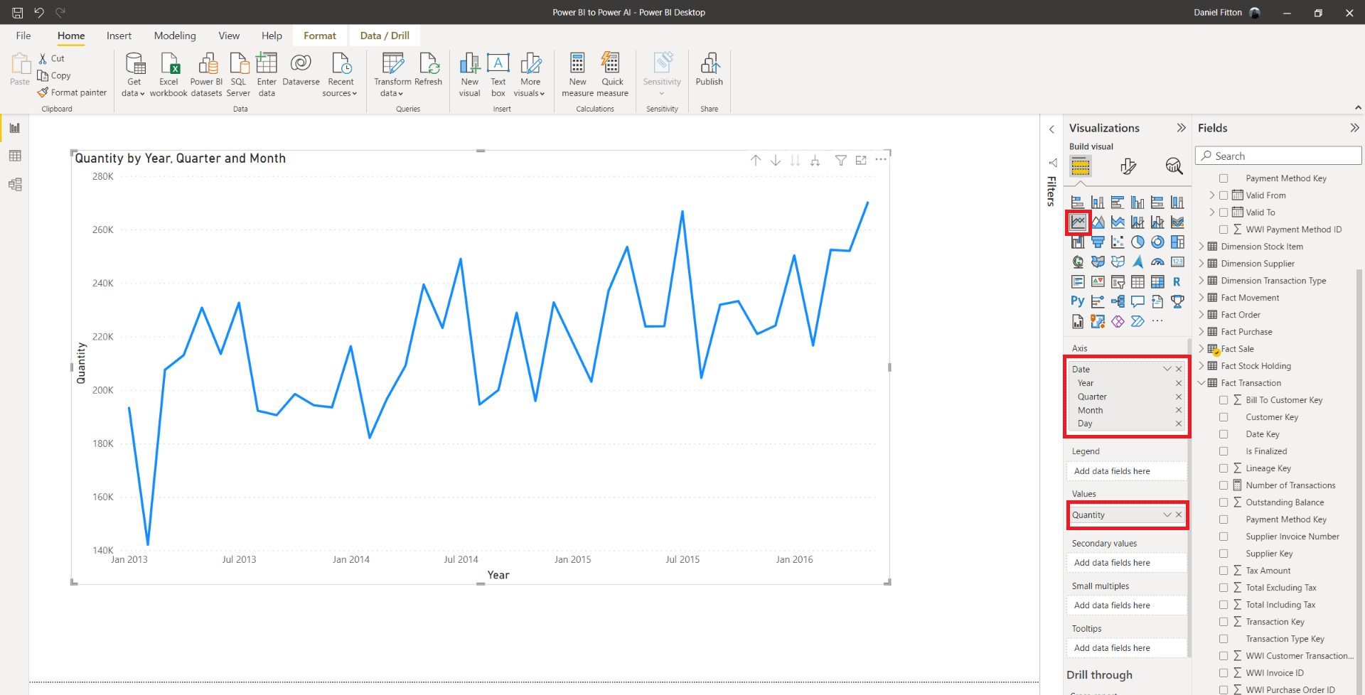
Next, open the ‘Analytics’ tab in the ‘Visualizations’ pane of the line chart visual and expand the ‘Forecast’ section. From here, we can add our required forecast, specifying the length, whether to ignore the last points, the confidence interval percentage, and the seasonality points. You can also change the display formatting, such as the colour, the line style, the confidence band style, and the transparency.
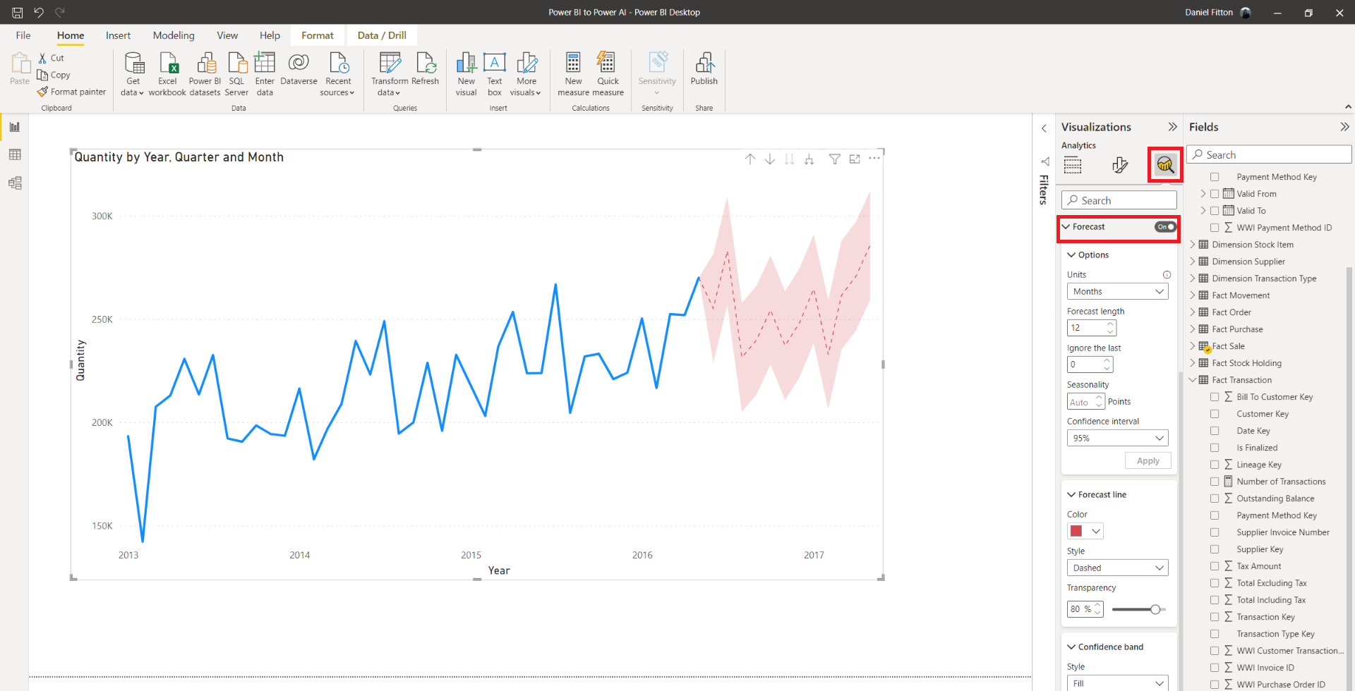
Here, I have configured a 12-month forecast, using 95% confidence intervals, and auto seasonality. The result is that the line chart now displays the forecasted sales quantity for the next 12 months, based on the trend, seasonality, and error, as described above. Generally, the more historic data you have, the better the forecast will be. The benefit of the forecast is that business users will have an idea of future behaviour and can prepare accordingly.
Anomaly Detection
Below the ‘Forecast’ section of the ‘Analytics’ tab of the line chart is another AI feature – Find anomalies. Anomaly detection, also known as outlier detection, is a machine learning technique that is used to pinpoint unusual or unexpected points in data, usually over time. These unusual data points typically warrant further investigation into what is causing them – it could be fraud, a data quality issue, or a genuine deviation from the norm.
There are various methods and techniques for anomaly detection, including tree-based methods, neural networks, clustering, and distance-based methods, however, they mostly work in a similar way. First, understand what normal looks like or the expected behaviour, then, introduce a boundary or threshold and classify any point that falls outside of it as an anomaly. Information about the algorithm used by Power BI is detailed here.
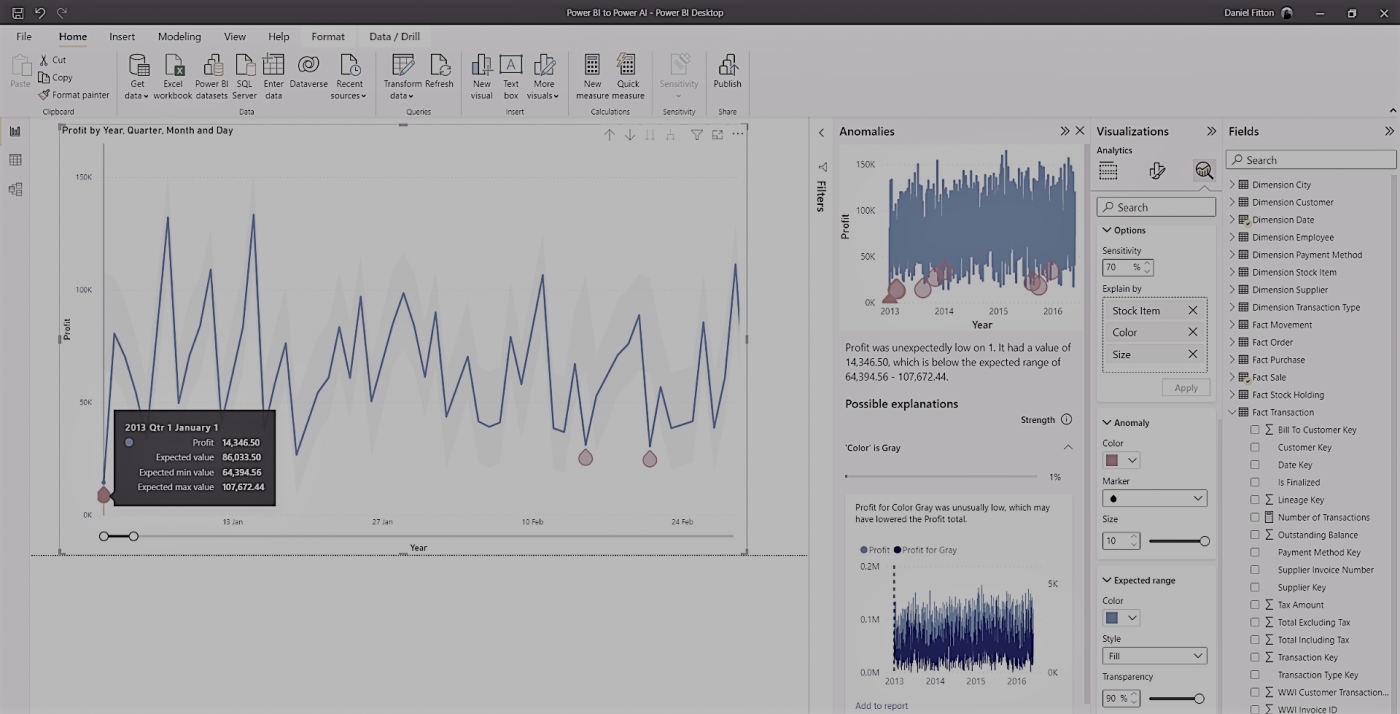
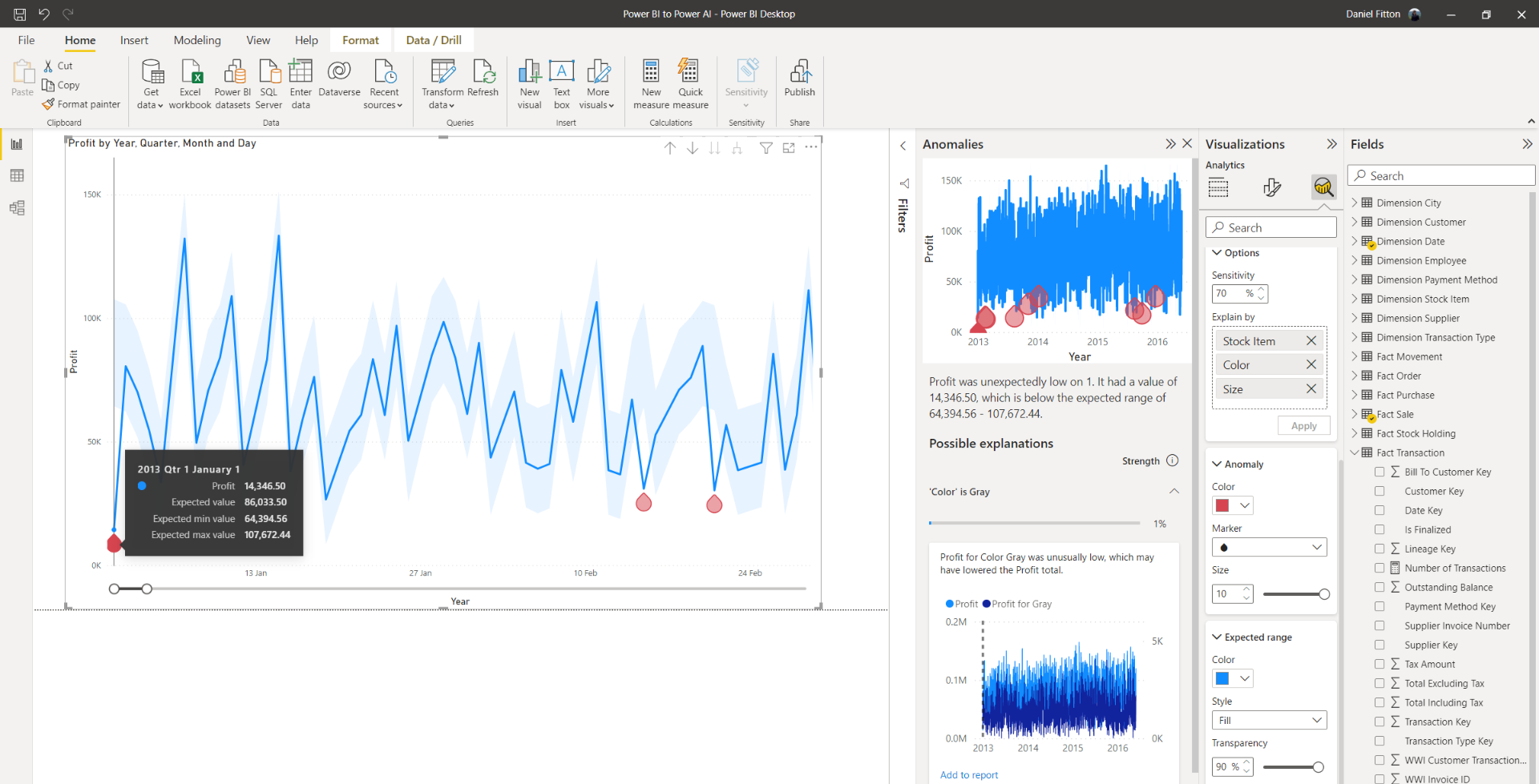
As mentioned above, anomaly detection is available in the ‘Analytics’ tab when creating a line chart. In the example below, I am visualising profit over time at a daily level.
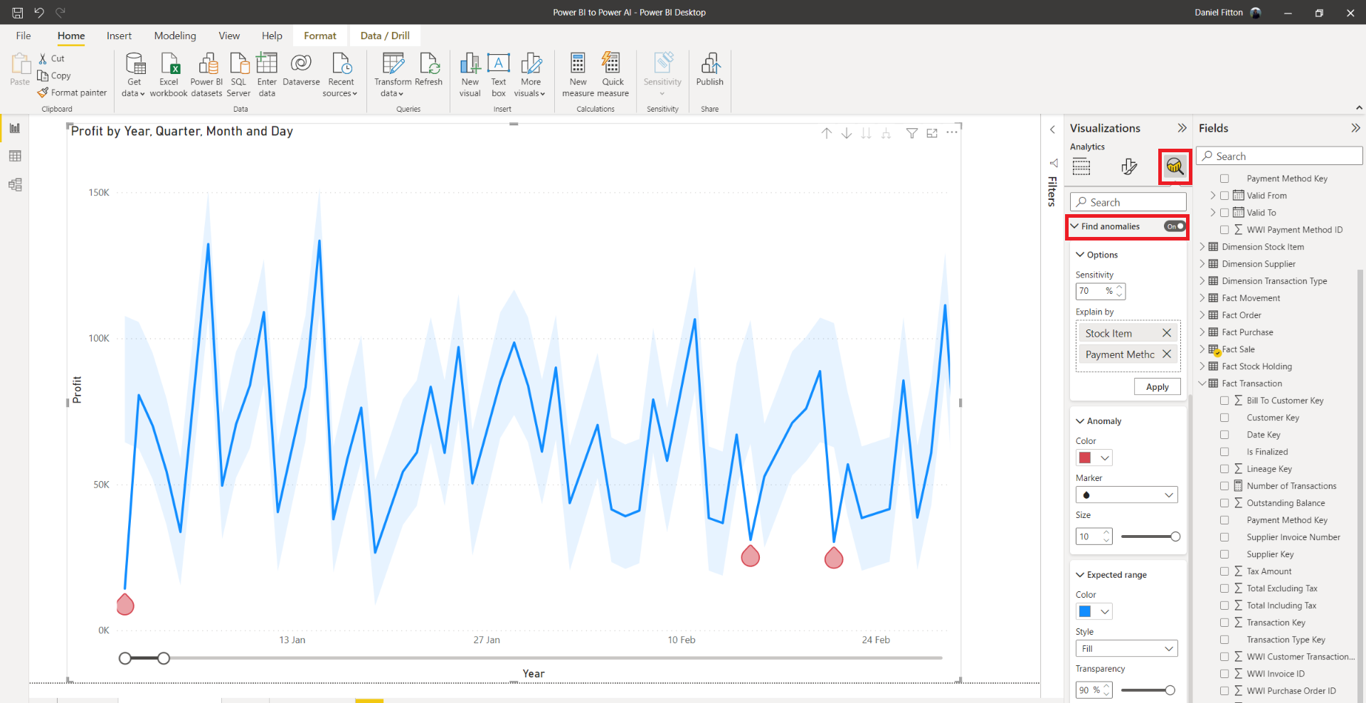
I have configured the ‘Find anomalies’ feature with the sensitivity at 70% – the higher the sensitivity, the smaller the boundary, thus the more anomalies. You can adjust the formatting of the anomaly by changing the shape, the size, and the colour. You can also adjust the formatting of the boundary, known as the expected range, by changing the style, transparency, and colour. Hovering over the data points in the chart provides a tooltip with the actual value, the expected value, and the lower and upper threshold values.
Now that the anomalies have been flagged, I can investigate these values further and find their root cause. I can do this independently, or I can use the automated explanation feature, by dragging the possible fields that I think could account for the anomaly into the ‘Explain by’ box. Now, when clicking on an anomaly, a new pane will appear, attempting to describe possible explanations for why the anomaly occurred.
Q&A
The next AI visual to focus on is the Q&A visual. The Q&A visual allows the user to ask ad-hoc questions related to the data, which Power BI answers in the form of a visual or chart. For example, in the image below, I have created the Q&A visual, and asked “what is the amount of profit by stock item?” The question is interpreted by Power BI, and a chart is displayed providing the answer.

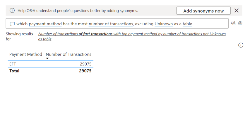
In another example below, I ask a more complex question, which includes filtering: “which payment method has the most number of transactions, excluding Unknown?”
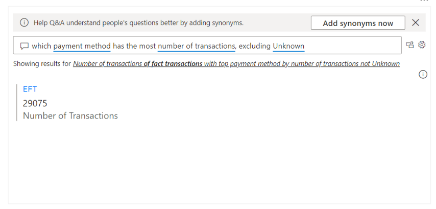
When typing your question, Power BI attempts to help by suggesting questions and autocompleting as you are typing. Recognisable terms will also be underlined in blue, and unrecognisable terms underlined in red.
Power BI will display the answer in the suggested visual type, but you can override it by adding your preferred chart type to the question, such as the below:
The Q&A visual is powered by an AI method known as natural language processing. Natural language processing (NLP) combines linguistics with computer science and AI, to enable computers to interpret and understand human language.
The unstructured nature of natural language data, along with the complexities and intricacies of grammar, dialect, and figures of speech, means that NLP is an incredibly challenging task. However, technological advance and a heavy amount of research has led to advancements in the field in recent years.
The NLP algorithm that underpins Power BI is on the cutting edge of technology, though, is still not perfect. By optimising your data and following best practices, you can make Q&A functionality work efficiently. According to the Microsoft documentation, the Q&A feature works best when:
- Relationships exist between tables
- The underlying data model is normalised
- Columns and tables are appropriately named
- Data types are configured properly
- Appropriate default summarisation types set up
Additionally, you can also support the Q&A functionality by adding your own suggested questions and configuring synonyms for measures and attributes.
Summary
This blog has been the first part of the Power BI to Power AI blog series. It has described forecasting, anomaly detection, and Q&A artificial intelligence features of Power BI. Part 2 will focus on three more AI visuals, including the Key Influencers visual, the Decomposition Tree, and Smart Narratives.
Introduction to Data Wrangler in Microsoft Fabric
What is Data Wrangler? A key selling point of Microsoft Fabric is the Data Science
Jul
Autogen Power BI Model in Tabular Editor
In the realm of business intelligence, Power BI has emerged as a powerful tool for
Jul
Microsoft Healthcare Accelerator for Fabric
Microsoft released the Healthcare Data Solutions in Microsoft Fabric in Q1 2024. It was introduced
Jul
Unlock the Power of Colour: Make Your Power BI Reports Pop
Colour is a powerful visual tool that can enhance the appeal and readability of your
Jul
Python vs. PySpark: Navigating Data Analytics in Databricks – Part 2
Part 2: Exploring Advanced Functionalities in Databricks Welcome back to our Databricks journey! In this
May
GPT-4 with Vision vs Custom Vision in Anomaly Detection
Businesses today are generating data at an unprecedented rate. Automated processing of data is essential
May
Exploring DALL·E Capabilities
What is DALL·E? DALL·E is text-to-image generation system developed by OpenAI using deep learning methodologies.
May
Using Copilot Studio to Develop a HR Policy Bot
The next addition to Microsoft’s generative AI and large language model tools is Microsoft Copilot
Apr