
Introduction
A common task in data science and analytics involves using data to make predictions. Predictions can add a tremendous amount of value to businesses, allowing them to plan ahead, focus resources and increase efficiency.
Making predictions involves using labelled example data to build a statistical model, which represents the real world. The model essentially learns from underlying patterns that exist within data, and then outputs a prediction along with its associated probability. In the technical context, this is called supervised machine learning.
At a high level, there are two types of supervised machine learning, including:
- Predicting which category a data point belongs – known as classification;
- Predicting a numerical/continuous value – known as regression.
In both instances, evaluating whether the model is good or not is an essential part of the model building process and for determining which model to deploy. But what exactly constitutes a good model?
As a baseline, the model should at least be better than random chance. A binary classification model should perform better than a simple flip of a coin; similarly, a regression model should be better than licking your finger and sticking in the air to see which way the wind is blowing. If your model seems too good, like scary-level good, you are probably overfitting.
Luckily, there are evaluation techniques that exist which indicate how good or bad the model is. This involves splitting your data into a training set for building or “training” the model, and a test set for testing and evaluating the performance of the model. In addition, certain metrics and plots can be generated which provide insight into how good the model is, which the data scientist can evaluate to understand the model, compare it with others and decide which is best to deploy.
The generated metrics and plots differ for the two types of supervised machine learning methods mentioned. This post outlines the key things to look for when evaluating classification models. We will look at regression in part 2 of this blog series. We will specifically be looking at model evaluation application in Azure Machine Learning, including the Designer and Automated ML features.
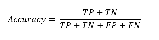
Accuracy
The first port of call when evaluating a classification model, is to look at the accuracy score. Accuracy is a quick and easy to interpret metric that is generally a good indicator of model performance.
Accuracy is defined as the proportion of correctly classified instances from the total number of cases. The formula looks like the following:
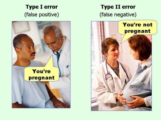
True Positives (TP) are the instances in which the model correctly predicted a positive class.
True Negatives (TN) are the instances in which the model correctly predicted a negative class.
False Positives (FP) are the instances in which the model incorrectly predicted a positive class (also known as a type 1 error).
False Negatives (FN) are the instances in which the model incorrectly predicted a negative class (also known as a type 2 error).
Although accuracy is a quick and insightful indicator of model performance, you cannot solely rely upon it. This is because it hides the existence of bias in the model, which is common if the dataset is imbalanced, i.e. there are significantly more negatives than positives, or vice versa.
Confusion Matrix
The confusion matrix is perhaps the most important thing to look at when evaluating a classification model. It contains a large amount of insight for such a small sized table. Despite its name, the confusion matrix is actually quite simple. It is a matrix that visualises the count of actual class instances against predicted class instances. This allows you to quickly see the amount of correct and incorrect predictions for each category, and whether any bias exists, and if so, where it is.
In Azure Machine Learning Designer, the confusion matrix is visualised like the following:
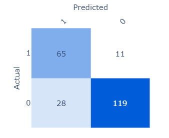
The darker the blue, the higher the count is.
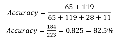
If we were to calculate the evaluation metrics manually, we would use the confusion matrix. In the case above, accuracy would look like the following:
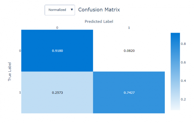
In Automated ML, the confusion matrix appears at the bottom of the Visualizations page. The matrix is also structured slightly differently. The true positives appear in the bottom right box and the true negatives in the top left.
Tip: It is important to first observe how the confusion matrix is structured, prior to conducting analysis.
The Automated ML confusion matrix also offers the ability to see a normalised view of the output. The normalised view allows you to see how the results are distributed as a percentage, which the user may find more interpretable, particularly for larger datasets.
Precision-Recall
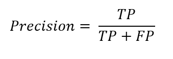
Following the confusion matrix, the next place to look ought to be precision and recall. Precision is the proportion of correctly predicted positive classifications from the the cases that are predicted to be positive. In other words, precision answers the question: when the model predicts a positive, how often is it correct? The formula looks like the following:
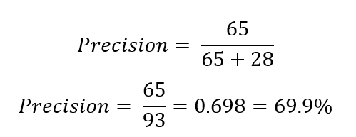
In our example above, it would be:
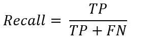
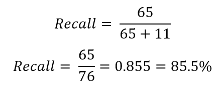
Recall, on the other hand, is the proportion of correctly predicted positive classifications from the cases that are actual positives, also known as Sensitivity or the True Positive Rate. It answers the question: when it is actually positive, how often does it predict a positive?
And in our example:
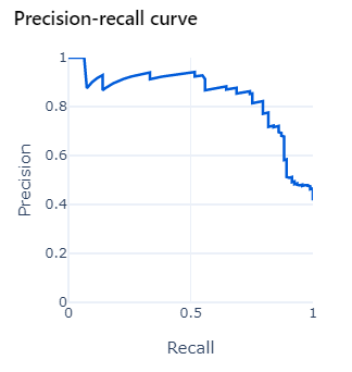
Precision and recall can be visualised in a plot with precision on the y-axis and recall on the x-axis.
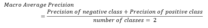
In Automated ML, the plot also computes the macro, micro and weighted averages. The macro average takes the metric (precision or recall) of each individual class first, then divides it by the number of classes. For example, in binary classification:
The micro average, on the other hand, takes the sum of all the true positives, false positives, true negatives and false negatives per class first, then calculates the average overall. For example:
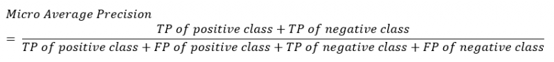
You should look at the micro average if class imbalance exists.
The weighted average is similar to the macro average in that it first calculates the metric for each individual class, but it then uses a weight depending on the number of true instances of each class.
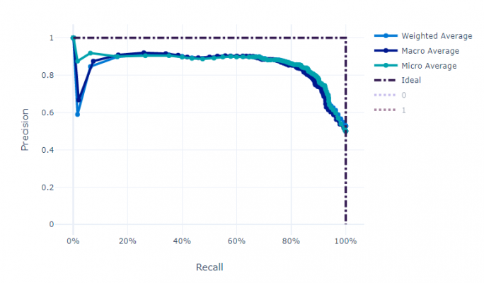
There is often a trade-off to make between precision and recall, i.e. when we increase the recall, we decrease the precision. The precision-recall curve visualises the trade-off, helping to establish the correct balance.
Precision should be emphasised when you want to ensure the predictions you do make are correct, at the cost of missing some positive instances. Hypothetically, you would have a smaller number of correct positive predictions, but those instances that you have predicted to be positive are likely to be correct. In other words, you are prioritising correctness of predictions over volume.
Conversely, recall should be emphasised when you want to capture the maximum about of positives possible, at the cost of capturing incorrect predictions. In other words, you would have a large number of incorrectly predicted positives, but also a large number of correctly predicted positives. You are prioritising volume of predictions over correctness.
The decision of which to emphasise is highly dependent on the business context. Generally, higher precision should be prioritised when the cost of a false positive is worse than a false negative. For example, in spam detection, a false positive risks the receiver missing an important email due to it being incorrectly labelled as spam. Higher recall, on the other hand, should be prioritised when the cost of a false negative is worse than a false positive. For example, in cancer detection and terrorist detection the cost of a false negative prediction is likely to be deadly.
F1 Score
After calculating the precision and recall, it is possible to calculate another important metric for model evaluation and comparison: the F1 score.
The F1 score, or F-score, is the harmonic mean of the Precision and Recall. It is a score between 0 and 1 that indicates how precise and robust the model is, with 1 being perfect. It is calculated as follows:
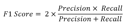
If the aim is to achieve a model that optimally balances recall and precision, the F1 score should be paid close attention to. The limitation of the F1 score, however, is that it does not take into consideration the true negatives.
ROC
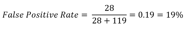
After looking at precision and recall, you should then observe the Receiver Operator Characteristic (ROC) curve. The ROC curve is a plot of the True Positive Rate (also known as the Sensitivity) on the y-axis, against the False Positive Rate on the x-axis. The False Positive Rate is sometimes expressed as 1- Specificity, with Specificity being the True Negative Rate.
It is helpful to think of the True Positive Rate as the ‘hit rate’ and the False Positive Rate as the ‘false alarm rate’. The True Positive Rate is exactly the same as recall. The False Positive Rate answers the question: When it’s actually a negative, how often does the model predict a positive? The equation is as follows:
In our example:
Just as there was a trade-off between Precision and Recall, there is also a trade-off between True Positive Rate and False Positive Rate. The ROC plot helps to make the decision of where to set the classification threshold, either to maximise the True Positive Rate or minimise the False Positive Rate, which is ultimately a business decision.
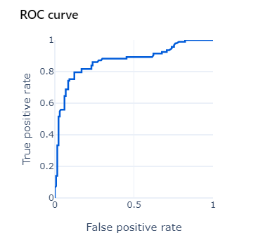
This plot is most useful when the dataset is balanced, i.e. a similar number of positives and negatives. The ideal plot should arc close to the top-left corner of the chart.
AUC
From the ROC curve, another important evaluation metric can be calculated: Area Under the Curve (AUC). The AUC literally measures the area underneath the ROC curve. In our case, the AUC value is 0.87, therefore, 87% of the area of the plot is below the curve. The larger the area under the ROC curve, the closer the AUC value is to 1 and the better the model is at separating classes. A model that performs no better than random chance would have an AUC of 0.5. AUC is a good general summary of the predictive power of a classifier, especially when the dataset is imbalanced.
Summary
For now, we must conclude this part of the blog series. In this post we have learnt what to look for when evaluating a classification model, including accuracy, confusion matrix, precision, recall, ROC and AUC.
In the next part, we will look at how to evaluate a regression model.
Until then, please look at the following links for more information:
- Data Science: what it is and why it matters
- Introduction to Azure Machine Learning
- 4 Ways to Prevent Overfitting in Machine Learning
- An Ode to the Humble Decision Tree
- Understand automated machine learning results
Introduction to Data Wrangler in Microsoft Fabric
What is Data Wrangler? A key selling point of Microsoft Fabric is the Data Science
Jul
Autogen Power BI Model in Tabular Editor
In the realm of business intelligence, Power BI has emerged as a powerful tool for
Jul
Microsoft Healthcare Accelerator for Fabric
Microsoft released the Healthcare Data Solutions in Microsoft Fabric in Q1 2024. It was introduced
Jul
Unlock the Power of Colour: Make Your Power BI Reports Pop
Colour is a powerful visual tool that can enhance the appeal and readability of your
Jul
Python vs. PySpark: Navigating Data Analytics in Databricks – Part 2
Part 2: Exploring Advanced Functionalities in Databricks Welcome back to our Databricks journey! In this
May
GPT-4 with Vision vs Custom Vision in Anomaly Detection
Businesses today are generating data at an unprecedented rate. Automated processing of data is essential
May
Exploring DALL·E Capabilities
What is DALL·E? DALL·E is text-to-image generation system developed by OpenAI using deep learning methodologies.
May
Using Copilot Studio to Develop a HR Policy Bot
The next addition to Microsoft’s generative AI and large language model tools is Microsoft Copilot
Apr