
Introduction
This is part 2 of a two-part blog series about evaluating models in Azure Machine Learning. Part 1 focused on explaining classification models to predict the category in which a data point belongs. It involved looking at the accuracy score, the confusion matrix, precision and recall, the Receiver Operator Characteristic (ROC) and the Area Under the Curve (AUC).
This post focuses on evaluating regression models, which is the name of the supervised machine learning technique used to predict numerical or continuous values, such as the amount of income or profit a company makes; the price of product or service; and the number of sales or customers.
As mentioned in part 1, model evaluation is a key step before deployment to understand whether you have a good model or not. It involves splitting your data into a training and test set, then analysing the output and comparing it with other models. The metrics and plots that are generated differ between classification and regression, therefore this post will outline the main things to look for in a regression problem.
In Azure Machine Learning, the Automated ML feature has the primary evaluation metric for regression set by default to Spearman’s correlation. Spearman’s correlation is a nonparametric1 measure that provides a score between 1 and -1 indicating the strength and direction of the relationship between the target column (the dependent variable) and the feature columns (the independent variables). It is useful for understanding if the target increases or decreases with the features and the magnitude to which it does so. However, its purpose fundamentally is for analysing the relationship between variables, not for evaluating model performance. A high (or low) correlation does not necessarily mean that the model is good (or bad), therefore I would advise switching to a more useful metric.
R squared
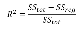
The initial go-to metric for understanding a regression model is the R squared (or R2) value, also known as the coefficient of determination. R squared measures how well the model is fitted to the data – the goodness of fit. It indicates how much of the variation of y (the target) is explained by the variation in x (the features).
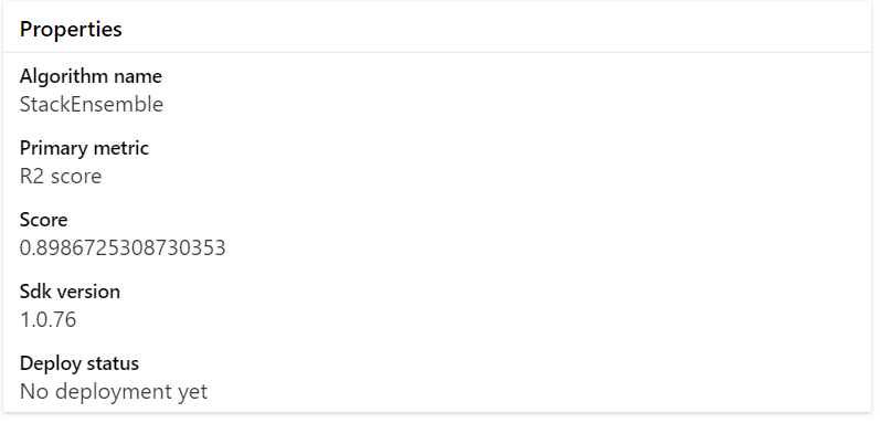
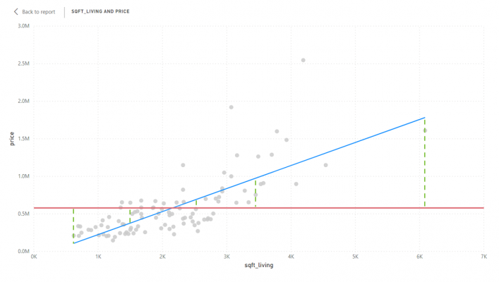
In the example model above, the R2 value is 0.89867, meaning that 89.8% of the variation in house price, is explained by features in the model including number bedrooms, bathrooms, size (sqft), condition, grade, year built and more.2
Aside from being easy to interpret, another advantage of R squared is that the equation is fairly straightforward.
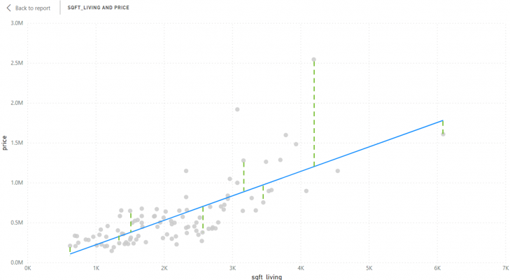
The numerator, SSres, is the sum of squares of residuals. A residual is the prediction error or the difference between the actual value and the model’s expected value. After working out the residuals for every data point, a sum is then taken and squared to get the SSres. This essentially tells us the variation in the target that is not explained by the model. The chart below demonstrates how it is calculated:
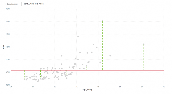
The denominator, SStot, is the total sum of squares, which is the same as what statisticians call variance. It is calculated by taking the average of the target variable (in this case the average price), then measuring the difference between each data point and the average. The total is then worked out by taking a sum and squaring it. See the chart below:
In addition to SSres and SStot, the regression sum of squares (SSreg) can be calculated, also known as the explained sum of squares. SSreg describes how much variance has been captured by the model and is calculated by subtracting the predicted values from the average of the target, then squaring the result – i.e. the blue line minus the red line squared. See the chart below:
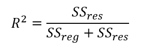
The sum of squares of residuals (the numerator) is usually always equal to the total sum of squares minus the regression sum of squares (SSreg). Consequently, the equation for R squared can also be expressed like the following:
Or:
Residual Histogram
As mentioned above, residuals are the difference between the prediction and the actuals, calculated as the actual value subtracted by the predicted value. This means that the residual can either be a positive or negative value. A positive value means that the prediction is too low; a negative value means that the prediction is too high.3 When it comes to regression, it is unrealistic to expect the predicted to equal the actual, therefore you should instead aim for the prediction to be as close as possible to the actual.
Azure Machine Learning outputs a histogram to display the distribution of the residuals.
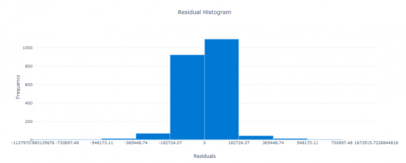
Ideally, the residuals should be as close to 0 as possible, therefore the residuals should be normally distributed as a bell curve, centred around 0. If the histogram is negatively skewed, this indicates there is a bias towards predicting values that are too high; likewise, if the histogram is positively skewed, there is a bias towards predicting values that are too low.
Although it is not available in Automated ML, data scientists and statisticians also tend to standardise the residuals and plot them on a scatter chart. This allows them to see within how many standard deviations the residuals fall. Standardising is useful when communicating results and comparing it with other models. See this post for more information.
Root Mean Square Error
Now that we have an understanding of residuals, we can understand the calculation behind one of the most important and widely used evaluation metrics for regression – Root Mean Square Error (RMSE). RMSE is simply the standard deviation of the residuals. In other words, how spread out the residuals are.
The formula is as follows:
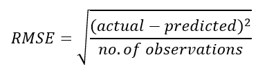
The RMSE is always a value greater than or equal to 0. The smaller the RMSE is the better the model because the residuals are less spread out.
Mean Absolute Error
An alternative to RMSE is Mean Absolute Error (MAE). MAE is a similar metric to RMSE in that they both are looking at expressing the amount of prediction error as a value greater than or equal to 0, where a smaller value is preferable to a larger value. However, the calculation of MAE is slightly different, leading to different results.
MAE is simpler and more interpretable than RMSE because it simply sums the absolute values of the residuals, then divides by the number of observations.
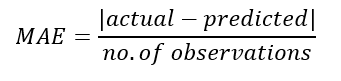
Although MAE is more interpretable, it does not penalise large prediction errors as well as RMSE does, therefore, RMSE is generally a preferable metric.
Both MAE and RMSE are often normalised by dividing the metric either by the mean of the measured data or by subtracting the minimum from the maximum of the measured data. The benefit of normalising is that it allows for better comparison with other models and datasets because the scale is the same.
Predicted vs. True Chart
In terms of visualisations, the best chart to view that is outputted by Automated ML is the Predicted vs. True chart. This chart does what it says on the tin – it plots the actual values on the x-axis and the predicted values on the y-axis.
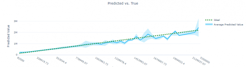
A green dotted line is plotted to show the ideal, which is when x = y. The closer the blue line is to the green dotted line, the higher the R squared value, and the better the model is.
The advantage of this visualisation is that it allows the user to quickly see the accuracy and inaccuracy of predictions and where they are located. For instance, in the example above, the predictions become less accurate when actual values are higher. The light blue shade around the blue line indicates the margin of error – the wider the range between the upper and lower bounds, the less confident the prediction is.
Conclusion
This short blog series has outlined what to look for when evaluating supervised machine learning models in Azure Machine Learning. Part 1 focused on evaluating classification models, and Part 2 focused on evaluating regression models. Regardless of the technique, model evaluation is a crucial step to take before deploying a model to a production environment, because it indicates whether you have a good model or not.
Footnotes
- Nonparametric essentially means that the underlying data does not need to be normally distributed. For more information about Spearman’s correlation see this paper by statstutor.ac.uk.
- The dataset used to build this model is the kc_house_data downloaded from Kaggle, see here.
- Note, residuals can also be calculated the other way round – i.e. prediction – actuals. In this case, a positive value means the prediction was too high and a negative value means the prediction was too low. There is a debate about which is the “correct” way, but generally, the standard is actuals – predicted.
Introduction to Data Wrangler in Microsoft Fabric
What is Data Wrangler? A key selling point of Microsoft Fabric is the Data Science
Jul
Autogen Power BI Model in Tabular Editor
In the realm of business intelligence, Power BI has emerged as a powerful tool for
Jul
Microsoft Healthcare Accelerator for Fabric
Microsoft released the Healthcare Data Solutions in Microsoft Fabric in Q1 2024. It was introduced
Jul
Unlock the Power of Colour: Make Your Power BI Reports Pop
Colour is a powerful visual tool that can enhance the appeal and readability of your
Jul
Python vs. PySpark: Navigating Data Analytics in Databricks – Part 2
Part 2: Exploring Advanced Functionalities in Databricks Welcome back to our Databricks journey! In this
May
GPT-4 with Vision vs Custom Vision in Anomaly Detection
Businesses today are generating data at an unprecedented rate. Automated processing of data is essential
May
Exploring DALL·E Capabilities
What is DALL·E? DALL·E is text-to-image generation system developed by OpenAI using deep learning methodologies.
May
Using Copilot Studio to Develop a HR Policy Bot
The next addition to Microsoft’s generative AI and large language model tools is Microsoft Copilot
Apr