I recently came across the need to build a screening pattern based on the Kimball “Screening” concept. One of the desired outputs was a Power BI report that allowed a data steward to easily identify the failed screen, drill down to the detail and show the row(s) rejected by the data quality rule. To achieve this goal, I had to mimic in Power BI an SSRS functionality called dynamic dataset, which allowed me to, using a single matrix, show different source columns based on a selected screen. Feeling curious already? Then, let’s dive into the details.
A screen is designed to operate on a single input file or database table and contains the data quality condition to check. For example, there could be a Missing Customer Postcode screen which would test for any customers who are missing a postcode.
Let’s assume I have two SQL tables, Customer and ShippingAddress. Following the above logic, I would have two screens with the following conditions: SELECT * FROM Stage.Customer WHERE Postcode IS NULL and SELECT * FROM Stage.ShippingAddress WHERE Postcode IS NULL. The output of these screens would be two different structures, as shown below:

To allow the data steward to drill down to the detail, the output of the screen had to be stored in a single table. To achieve this, the output of the screens were converted to XML and stored in a column with the XML data type. One important point to note is that XML does not support NULL fields, which means that, if the Postcode is not converted to a NULL string, the column will not be captured in the XML structure.

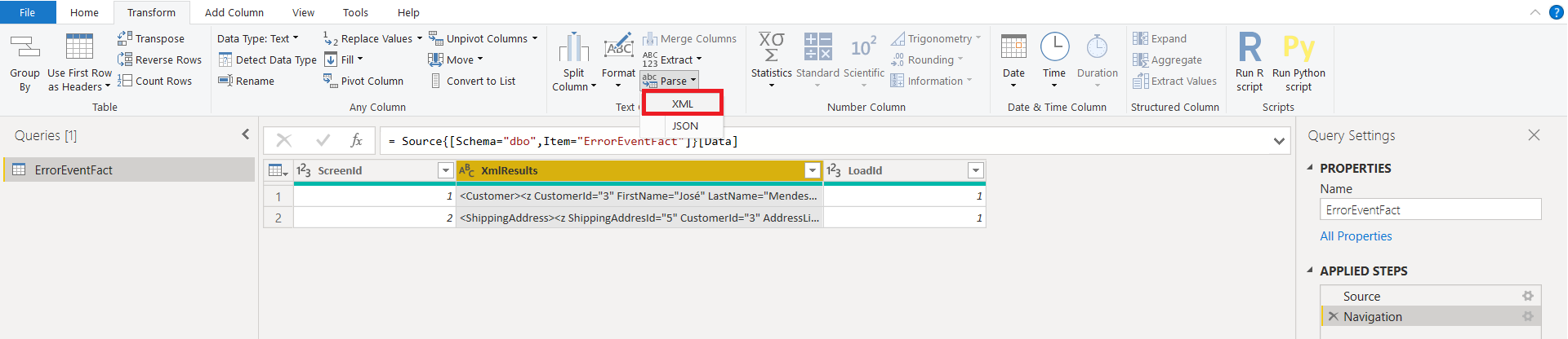
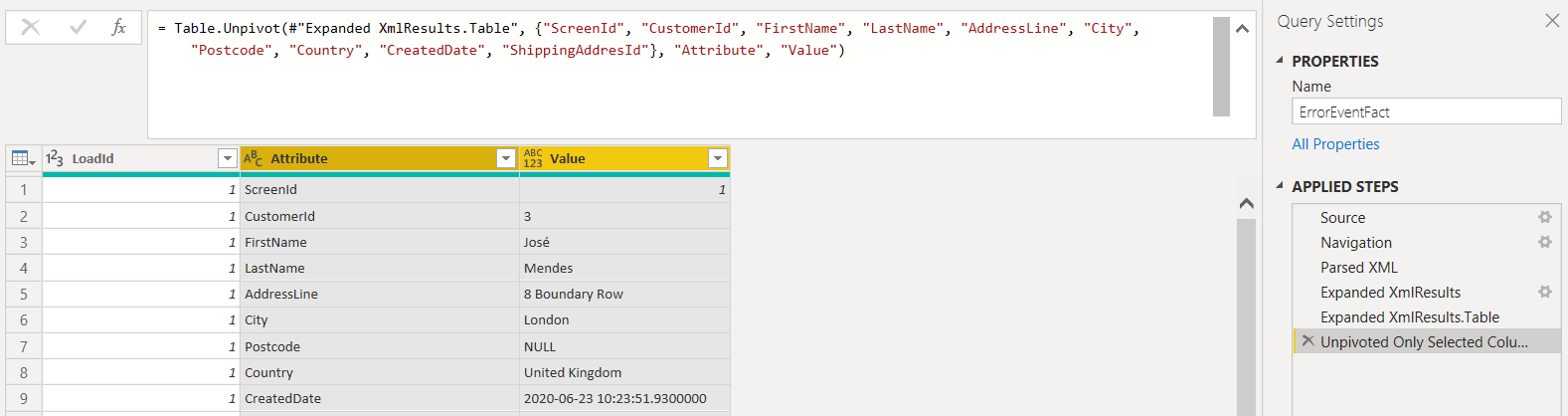
The next step can either be completed in the database or in Power BI. The idea is to extract the XML structure and then unpivot the column names to a column named Attributes and the values to a column named Values. To do that in Power BI, start by importing the table holding the XML results and then Transform the Data as followed:
Parse the column XmlResults to XML
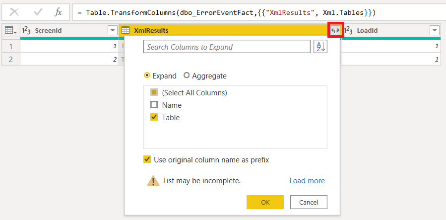
Expand the Table columns
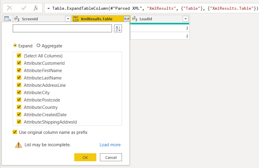
Expand the Table columns one more time
Rename the column names to remove the prefix “XmlResults.Table.Attribute”. Once completed, select all the columns and Unpivot them.
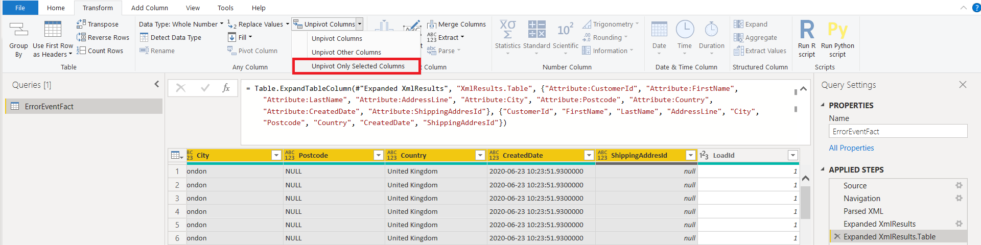
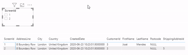
You can see that for Customer, only the relevant columns were selected
Close and apply the transformations. Add a matrix to the canvas and add “Attribute” to “Columns” and “Value” to “Rows”. When selecting a screen, only the relevant columns are shown. This happens because the Columns in the matrix are set to “hide items with no data”.
As always, if you have any questions, feel free to leave a comment.
Introduction to Data Wrangler in Microsoft Fabric
What is Data Wrangler? A key selling point of Microsoft Fabric is the Data Science
Jul
Autogen Power BI Model in Tabular Editor
In the realm of business intelligence, Power BI has emerged as a powerful tool for
Jul
Microsoft Healthcare Accelerator for Fabric
Microsoft released the Healthcare Data Solutions in Microsoft Fabric in Q1 2024. It was introduced
Jul
Unlock the Power of Colour: Make Your Power BI Reports Pop
Colour is a powerful visual tool that can enhance the appeal and readability of your
Jul
Python vs. PySpark: Navigating Data Analytics in Databricks – Part 2
Part 2: Exploring Advanced Functionalities in Databricks Welcome back to our Databricks journey! In this
May
GPT-4 with Vision vs Custom Vision in Anomaly Detection
Businesses today are generating data at an unprecedented rate. Automated processing of data is essential
May
Exploring DALL·E Capabilities
What is DALL·E? DALL·E is text-to-image generation system developed by OpenAI using deep learning methodologies.
May
Using Copilot Studio to Develop a HR Policy Bot
The next addition to Microsoft’s generative AI and large language model tools is Microsoft Copilot
Apr