Recently I’ve been looking at applying dynamic bandings for a client. What was required was to split the data into different bandings upon the values in the source data. For example – if it was product price, the bottom third would have a low value, the middle third would show as being in the middle and the top third would show it was a high value.
The client was using the latest version of Power BI Desktop which supports several new functions. In order to achieve this I used one of the new percentile functions (PERCENTILE.EXC) which made the process really simple, so I thought I would share the technique.
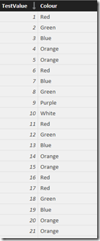
Firstly I imported the dataset – in this example I have a used a basic dataset. Test Value is a number which increments from 1 – 300 over 300 rows.
Secondly I added a calculated column ‘Banding’ for which I used the following DAX formula:
1 Banding =
2 IF (
3 VALUE ( PERCENTILE.EXC ( SampleData[TestValue], 1 / 3 ) )
4 > Table1[TestValue],
5 "Low",
6 IF (
7 VALUE ( PERCENTILE.EXC (SampleData[TestValue], 2 / 3 ) )
8 > Table1[TestValue],
9 "Medium",
10 "High"
11 )
12 )
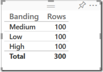
Uploading the workbook to Power BI you can now see that we have 100 rows belonging to each of the different categories based upon the dynamic banding we have applied using the percentile based calculation.
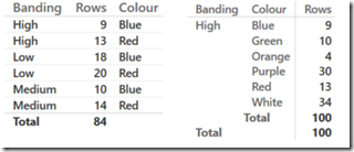
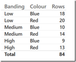
We can now use this to determine how products of different colours perform – for example we can see that compared to blue products that there are more red ones in the High category. We can also break down sales of product colour by banding.
The only issue is that we can’t sort in the order Low > Medium > High as Power BI is arranging the values alphabetically. In order to do this we need to add a column to use for sorting. This can be achieved using the following DAX formula:
1 BandingSortOrder =
2 IF (
3 VALUE ( PERCENTILE.EXC ( SampleData[TestValue], 1 / 3 ) )
4 > Table1[TestValue],
5 "1",
6 IF (
7 VALUE ( PERCENTILE.EXC ( SampleData[TestValue], 2 / 3 ) )
8 > Table1[TestValue],
9 "2",
10 "3"
11 )
12 )
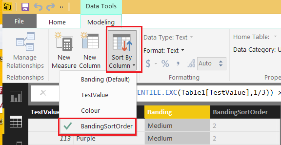
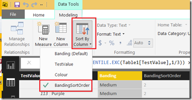
In the model designer select the Banding calculated column and on the ‘Modeling’ option tab click ‘Sort By Column’ and select BandingSortOrder.
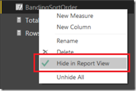
Hide the BandingSortOrder column from the Report View so it’s not visible in the reporting layer (right click in fields to do this).
Now when we publish to Power BI we can see it’s now ordered from Low to high:

Introduction to Data Wrangler in Microsoft Fabric
What is Data Wrangler? A key selling point of Microsoft Fabric is the Data Science
Jul
Autogen Power BI Model in Tabular Editor
In the realm of business intelligence, Power BI has emerged as a powerful tool for
Jul
Microsoft Healthcare Accelerator for Fabric
Microsoft released the Healthcare Data Solutions in Microsoft Fabric in Q1 2024. It was introduced
Jul
Unlock the Power of Colour: Make Your Power BI Reports Pop
Colour is a powerful visual tool that can enhance the appeal and readability of your
Jul
Python vs. PySpark: Navigating Data Analytics in Databricks – Part 2
Part 2: Exploring Advanced Functionalities in Databricks Welcome back to our Databricks journey! In this
May
GPT-4 with Vision vs Custom Vision in Anomaly Detection
Businesses today are generating data at an unprecedented rate. Automated processing of data is essential
May
Exploring DALL·E Capabilities
What is DALL·E? DALL·E is text-to-image generation system developed by OpenAI using deep learning methodologies.
May
Using Copilot Studio to Develop a HR Policy Bot
The next addition to Microsoft’s generative AI and large language model tools is Microsoft Copilot
Apr