Until recently, the overall functionality of the Matrix Visual in Power BI has been limited.
However, this all changed when Microsoft announced the Power BI March update, which gives users access to the
Matrix Preview. This can currently be used alongside the old matrix.
In this blog, I will be comparing the old Matrix and the new Matrix Preview. The updates featured in the latter are as follows:
- Performance improvements
- Drilling into hierarchies
- Stepped layout
- Cross highlighting and filtering from matrix headers and cell contents
This article will only focus on the drilling into hierarchies’ functionality. Click here to find more information around the
Matrix updates, along with the extra features not covered in the blog.
Hierarchy Drill Through
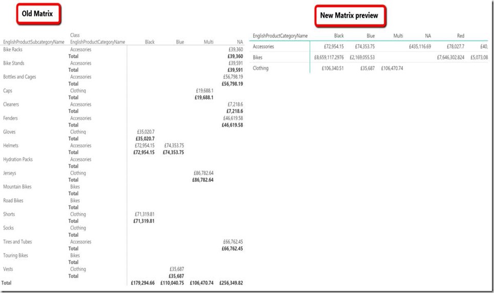
One of the visible changes in the new matrix preview it is the ability to show all the headers collapsed by default making
the user experience easier when dealing with large datasets. The image below shows this new feature compared to the old and new Matrix.

There is also the capability to show both levels of the hierarchy simultaneously , which is again done using the hierarchy navigation buttons
as illustrated in the image below.

You can also drill up and down on individual columns using the right click function as shown in the image below. The benefit of this is that it
gives the user a more detailed drill down of a desired column.


Further drill down options are available, for example, the ability to drill down on row category headers.
In normal mode (without drill mode turned on), other datasets in other row category headers will be faintly visible. By turning on the drill down mode
it allows users to works on a specific category row header in isolation. The following images show the differences in the two views.


Conclusion
The Matrix Preview has brought about interesting and useful tools making it more interactive. The ability to be able to drill up and down within a report particularly stands out for me.
It is also worth mentioning that other features, not covered in this blog give users increased customisation when working on reports – showing how impressive the Matrix Preview is. April`s Power BI update
includes more features for the Matrix Preview.
My next blog will be looking at the following two features added for Matrix Preview:
- Rename axis titles
- New matrix visual enhancements: column sorting, column resizing, and word wrap
Further Reading (Power BI Blogs)
https://powerbi.microsoft.com/en-us/blog/power-bi-desktop-march-feature-summary/#matrix
https://powerpivotpro.com/2017/03/two-great-new-power-bi-features/
Introduction to Data Wrangler in Microsoft Fabric
What is Data Wrangler? A key selling point of Microsoft Fabric is the Data Science
Jul
Autogen Power BI Model in Tabular Editor
In the realm of business intelligence, Power BI has emerged as a powerful tool for
Jul
Microsoft Healthcare Accelerator for Fabric
Microsoft released the Healthcare Data Solutions in Microsoft Fabric in Q1 2024. It was introduced
Jul
Unlock the Power of Colour: Make Your Power BI Reports Pop
Colour is a powerful visual tool that can enhance the appeal and readability of your
Jul
Python vs. PySpark: Navigating Data Analytics in Databricks – Part 2
Part 2: Exploring Advanced Functionalities in Databricks Welcome back to our Databricks journey! In this
May
GPT-4 with Vision vs Custom Vision in Anomaly Detection
Businesses today are generating data at an unprecedented rate. Automated processing of data is essential
May
Exploring DALL·E Capabilities
What is DALL·E? DALL·E is text-to-image generation system developed by OpenAI using deep learning methodologies.
May
Using Copilot Studio to Develop a HR Policy Bot
The next addition to Microsoft’s generative AI and large language model tools is Microsoft Copilot
Apr