Power View has been given a couple of small changes from RC0 to the RTM release:
Firstly, you can now choose the colour of the various visualisations via the Themes section, which you’ll find on the new Styles ribbon tab:
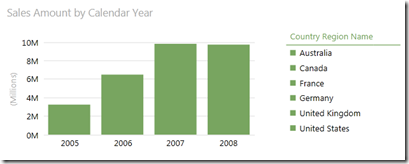
This will allow you to change the colour for a slicer, table or card, whereas for a chart it will set the palette that gets used for the chart series. Surprisingly it seems to set the theme globally, rather than allowing you to set the colour/palette for a single object:
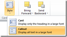
The other change that I’ve noticed is that the Card visualisation now has a Style option on the ribbon:
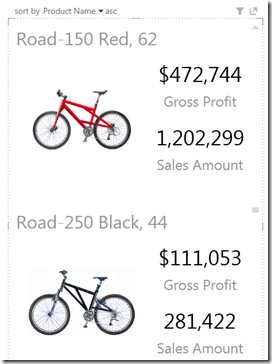
This allows the cards to be displayed without normal coloured background, with a much larger font. So potentially useful for highlighting key numeric facts:
I do really like Power View, in particular the clean look & feel, fast performance, export to PowerPoint and animations to name a few. However, even though RC0 added a lot of new features, I think it’s still missing some of the functionality offered by other reporting tools. I know that it’s marketed as a data visualisation tool rather than a reporting tool, but those lines will become a bit blurred for users. This is where Connect comes in…
One connect suggestion that I’ve created is to allow drill down in Power View charts. If you’ve used Power View to perhaps spot a trend or spike in the data, then it makes sense for you to manipulate the view to find the root cause, which I think drill down would help with. Other suggestions that I think would be useful are heat maps and allowing Power View to access multidimensional models. Please vote on Connect if you agree!


Introduction to Data Wrangler in Microsoft Fabric
What is Data Wrangler? A key selling point of Microsoft Fabric is the Data Science
Jul
Autogen Power BI Model in Tabular Editor
In the realm of business intelligence, Power BI has emerged as a powerful tool for
Jul
Microsoft Healthcare Accelerator for Fabric
Microsoft released the Healthcare Data Solutions in Microsoft Fabric in Q1 2024. It was introduced
Jul
Unlock the Power of Colour: Make Your Power BI Reports Pop
Colour is a powerful visual tool that can enhance the appeal and readability of your
Jul
Python vs. PySpark: Navigating Data Analytics in Databricks – Part 2
Part 2: Exploring Advanced Functionalities in Databricks Welcome back to our Databricks journey! In this
May
GPT-4 with Vision vs Custom Vision in Anomaly Detection
Businesses today are generating data at an unprecedented rate. Automated processing of data is essential
May
Exploring DALL·E Capabilities
What is DALL·E? DALL·E is text-to-image generation system developed by OpenAI using deep learning methodologies.
May
Using Copilot Studio to Develop a HR Policy Bot
The next addition to Microsoft’s generative AI and large language model tools is Microsoft Copilot
Apr