I’ve been using both PowerPivot and Power View quite a bit recently and, in addition to the post I did a while back, have made a few further observations on getting the two to play nicely together.
Building an Example PowerPivot Model
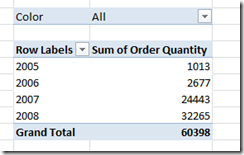
For this post I’ve created a very very simple PowerPivot model, based on the Adventure Works Internet Sales Fact table and its related tables. What this means is that after the model is built, I can build a variety of Excel reports that summarise the measures in the FactInternetSales Adventure Works fact table, such as Sales Amount, Tax Amount or Order Quantity. In the example below I’ve built a very basic report showing Order Quantity by year:
On to Power View
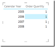
Having already published the workbook to SharePoint, my task now is to create a Power View report, which can be done via the PowerPivot Gallery. If wanted to try and create a visual version of the above report in Power View (E.g. a graph), my steps would be to do first of all drag Calendar Year into the report, then Order Quantity. However, when doing this recently, the result wasn’t quite what I expected:
Order Quantity has not been summed at all, which is the opposite behaviour to that of PowerPivot. Consequently I can’t create a graph visualisation, because Power View thinks I don’t have any measures in my report:
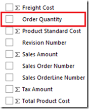
Yet if we contrast this to measures such as Internet Sales Amount or Tax Amount, they all work fine. Upon looking at the field list for Internet Sales, we will see that Order Quantity is missing the sum symbol, as Power View has not interpreted it as a measure:
We can get around this in Power View with a bit of dragging and dropping, but we may as well look why it’s happened in the first place. The reason for this is the way in which the PowerPivot import wizard interprets SQL data types. The OrderQuantity column in the FactInternetSales SQL table has a data type of Smallint, which will not be summarised by default in Power View. Decimal and Money types are fine, hence why Tax Amount and Sales Amount above look ok.
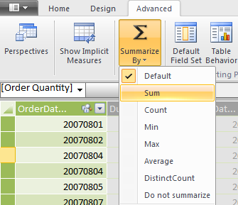
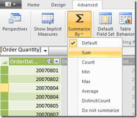
Rather than changing the data types, we can force Power View to interpret the column as a measure by going to the PowerPivot advanced tab and clicking on Summarize By. If the Summarize By value is changed from Default to Sum, then Power View will interpret the column as a measure:
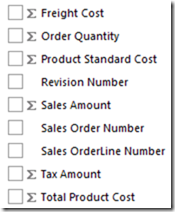
If we republish the model and then go back to Power View, we will see quite a difference with the same actions as before. First of all the field list is looking correct:
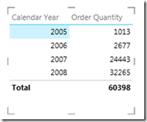
Secondly, only dragging Calendar Year and Order Quantity will now give the following correct results:
Now that we have a measure, it means that we can now change the table into a visualisation of our choice:
Power View is the kind of product that power users are hopefully going to find intuitive, but we can make things even easier for users by making small changes like this.



Introduction to Data Wrangler in Microsoft Fabric
What is Data Wrangler? A key selling point of Microsoft Fabric is the Data Science
Jul
Autogen Power BI Model in Tabular Editor
In the realm of business intelligence, Power BI has emerged as a powerful tool for
Jul
Microsoft Healthcare Accelerator for Fabric
Microsoft released the Healthcare Data Solutions in Microsoft Fabric in Q1 2024. It was introduced
Jul
Unlock the Power of Colour: Make Your Power BI Reports Pop
Colour is a powerful visual tool that can enhance the appeal and readability of your
Jul
Python vs. PySpark: Navigating Data Analytics in Databricks – Part 2
Part 2: Exploring Advanced Functionalities in Databricks Welcome back to our Databricks journey! In this
May
GPT-4 with Vision vs Custom Vision in Anomaly Detection
Businesses today are generating data at an unprecedented rate. Automated processing of data is essential
May
Exploring DALL·E Capabilities
What is DALL·E? DALL·E is text-to-image generation system developed by OpenAI using deep learning methodologies.
May
Using Copilot Studio to Develop a HR Policy Bot
The next addition to Microsoft’s generative AI and large language model tools is Microsoft Copilot
Apr