Power View includes several ways to create visualisations with images, ranging from a simple table, to the scrollable tile visualisation. In this post I’m going to explain a bit about the tile visualisation, showing how it can be used in Power View, before showing a couple of tips for working with images in both PowerPivot and Analysis Services Tabular models.
Power View Tiles
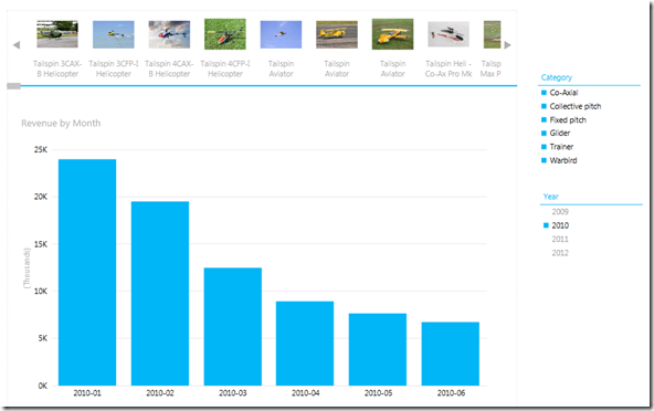
The Power View Tiles visualisation allows you to display a scrollable series of images, which, when clicked on, will display data of your choosing. The report below is an example of this:

What’s nice about the View above is that the names of the products are automatically displayed underneath the images. This is a sensible place to display the product names, as it means the area below can focus on whatever product level data you want, in this case Revenue by Month for the selected product.
This works fine in the sample models (in my case the Tailspin Toys model that I think came with CTP3) but it wont work in vanilla PowerPivot / Tabular models unless you configure a few model settings. Trying to reproduce the report above without these settings will give the following tile visualisation, minus the product names:

PowerPivot Advanced Settings
To address this in PowerPivot, you first of all need to switch to Advanced Mode, which you can do by selecting this option from the File menu in PowerPivot:

This gives you the following advanced tab:

Clicking on the highlighted Table Behaviour button in the ribbon gives you the following Table Behaviour window:

Here you can “change the default behaviour for different visualisation types and default grouping behaviour in client tools for this table”. The following properties should be set in order to get the tiles working correctly:
- Row Identifier – Specifies a column that only contains unique values, which allows the column to be used as an internal grouping key in client tools.
- Default Label – Specifies which column gives a row level display name, e.g. the product name in a Product table. This is key, as when a row level image is used, this property specifies which value to display alongside the image in tiles and other image-based visualisation.
- Default Image – Specifies which column contains images representing the row level data, e.g. pictures of products.
The full details for all these properties can be found here.
Tabular Models
Tabular Models contain the same properties, which can be edited when you open a tabular project in the new SQL Server Data Tools. The image below shows how the properties have been configured for the column in my model called Image:

Back to Power View
If we now build a tile visualisation using the image column, we will see that we get the names of the products returned along with the image. It’s also worth noting that the Image and Product Name columns have now have an icon next to them, indicating that the field exhibits “row level” behaviour:

Finally, for some examples of what’s new in Power View SQL 2012 RC0 take a look at this post on the Reporting Services Team Blog.
Introduction to Data Wrangler in Microsoft Fabric
What is Data Wrangler? A key selling point of Microsoft Fabric is the Data Science
Jul
Autogen Power BI Model in Tabular Editor
In the realm of business intelligence, Power BI has emerged as a powerful tool for
Jul
Microsoft Healthcare Accelerator for Fabric
Microsoft released the Healthcare Data Solutions in Microsoft Fabric in Q1 2024. It was introduced
Jul
Unlock the Power of Colour: Make Your Power BI Reports Pop
Colour is a powerful visual tool that can enhance the appeal and readability of your
Jul
Python vs. PySpark: Navigating Data Analytics in Databricks – Part 2
Part 2: Exploring Advanced Functionalities in Databricks Welcome back to our Databricks journey! In this
May
GPT-4 with Vision vs Custom Vision in Anomaly Detection
Businesses today are generating data at an unprecedented rate. Automated processing of data is essential
May
Exploring DALL·E Capabilities
What is DALL·E? DALL·E is text-to-image generation system developed by OpenAI using deep learning methodologies.
May
Using Copilot Studio to Develop a HR Policy Bot
The next addition to Microsoft’s generative AI and large language model tools is Microsoft Copilot
Apr