We’ve been lucky enough (or we rather hassled enough people in MSFT for long enough!) to have been participating in the Office 2010 technical preview for the last couple of months but as it’s all been under NDA haven’t been able to blog about it. This also means that we’ve had a chance to look round SharePoint 2010 and, in particular for me, PerformancePoint Services. Nick Barclay has just done a series of posts about what’s new/improved/different in the new version so go there for the full list. Here’s a quick round up of our first impressions:
What looks good so far:
- SharePoint integration – Whilst Dashboard designer is still pretty much the same product for doing your, errr, dashboard design it’s no longer the admin and security tool as well. This is all carried in SharePoint and in fact you have to set up a specific PPS site to do this. A great deal of effort has obviously gone into this and which looks to have paid off.

- Security is all through SharePoint – no need to set up permissions twice!
- AS Conditional formatting now works.
- Decomp tree is back!!

- Measures can now be formatted independently.
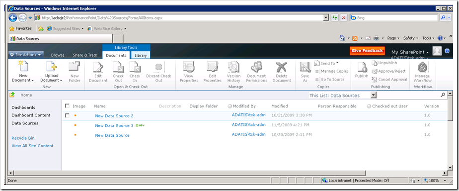
- Workspace browser is now much more intelligently organised.
- Filter by value – you can now restrict rowscolumns by value

- Dynamic dimension measures on scorecards- this was a bit of a workaround in 2007 as I’ve posted about previously. This now works properly
- Re-usable filters – Filters can now be shared and re-used across dashboards
Disappointments:
- Lack of improvements for data visualisation – Very disappointing – other than the decomp tree, the visualisation side of PPS has changed little. Still no real control over how your graphs look. The only other new item to be introduced is the Pie Chart!!!! oh dear. Still no bar charts (and I mean Bars not Columns), no chart formatting options or (controllable) second y axis options that I can see 🙁

- Decomp tree is not a chart type but a right click option from a deployed report. i Like the option to do this from any point in a report but would be nice to have both options.
- It’s still called PerformancePoint! – I have to admit I when I read another blog of Nick’s following the demise of Planning I didn’t entirely agree with him that it should be renamed. Having spent the last ten months trying to explain to various IT departments that PerformancePoint is not the devil and that the Monitoring side has not been affected (usually to no avail) has changed my opinion completely.
- As per Chris’s blog – ProClarity just seems to have disappeared – I know that was never what Monitoring was supposed to be but the lack of an ad-hoc cube browser is a huge oversight.
- Did I mention the lack of data visualisation improvements????
There’s lots more to discuss and there will be more to come over the next few weeks time allowing. SharePoint 2010 looks pretty impressive…
Introduction to Data Wrangler in Microsoft Fabric
What is Data Wrangler? A key selling point of Microsoft Fabric is the Data Science
Jul
Autogen Power BI Model in Tabular Editor
In the realm of business intelligence, Power BI has emerged as a powerful tool for
Jul
Microsoft Healthcare Accelerator for Fabric
Microsoft released the Healthcare Data Solutions in Microsoft Fabric in Q1 2024. It was introduced
Jul
Unlock the Power of Colour: Make Your Power BI Reports Pop
Colour is a powerful visual tool that can enhance the appeal and readability of your
Jul
Python vs. PySpark: Navigating Data Analytics in Databricks – Part 2
Part 2: Exploring Advanced Functionalities in Databricks Welcome back to our Databricks journey! In this
May
GPT-4 with Vision vs Custom Vision in Anomaly Detection
Businesses today are generating data at an unprecedented rate. Automated processing of data is essential
May
Exploring DALL·E Capabilities
What is DALL·E? DALL·E is text-to-image generation system developed by OpenAI using deep learning methodologies.
May
Using Copilot Studio to Develop a HR Policy Bot
The next addition to Microsoft’s generative AI and large language model tools is Microsoft Copilot
Apr