Although you’ve always been able to deliver KPIs in Reporting Services by using images and expressions, Reporting Services in SQL Server 2008 R2 now includes a feature called Indicators, which assists with producing KPIs out of the box.
This got me thinking how producing KPIs and/or scorecards in Reporting Services compares to doing the same in PerformancePoint Services. This blog post gives a short overview of creating KPIs in each technology, before comparing the pros and cons of each.
Reporting Services 2008 R2 Indicators
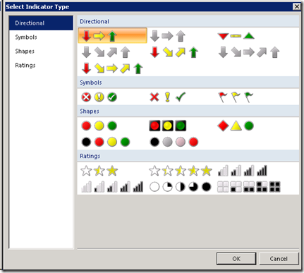
The indicators in Reporting Services come as an extra item on your toolbox, and can be dragged onto a Tablix for example. Once you do add the indicator to your report, you’ll be prompted to select the shape that you want for your indicator:
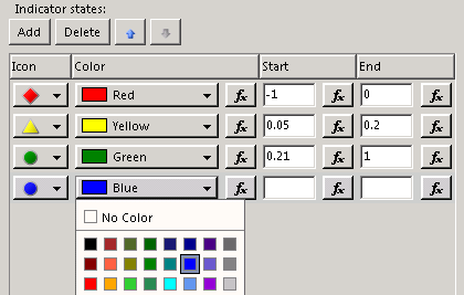
So no more messing about with images! Once you click OK your indicator will be added to your report. If you then right click on the properties of the indicator, you can choose what to base the indicator’s value on on, and also set its state, both of which essentially control the points at which your indicator changes its colour and shape. What I quite like here is that it’s easy to change the colour for each state, and it’s also easy to add new states, if you need four colours rather than three for example:
You seem to be able to add a huge number of indicator states here, certainly more than enough to deal with KPIs. Taking some data from AdventureWorks, based around employee sales targets, I’ve created the following very basic report using the Indicators:

PerformancePoint Services KPIs
The KPI and Scorecard have had a few decent changes in SharePoint 2010 (e.g. drill up/down), but Dashboard Designer is still the tool that’s used to create KPIs in PerformancePoint Services, and its a different experience to developing in Visual Studio.
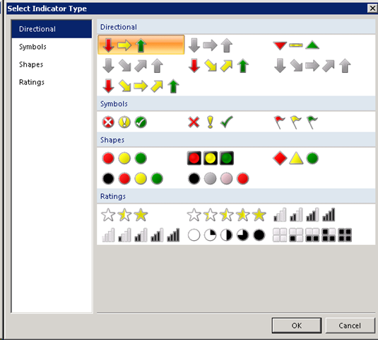
Assuming that you get to the point where you have a data source set up, the first thing to do in order to create a KPI is to pick an indicator. The choice here is very similar to the choice in SSRS:
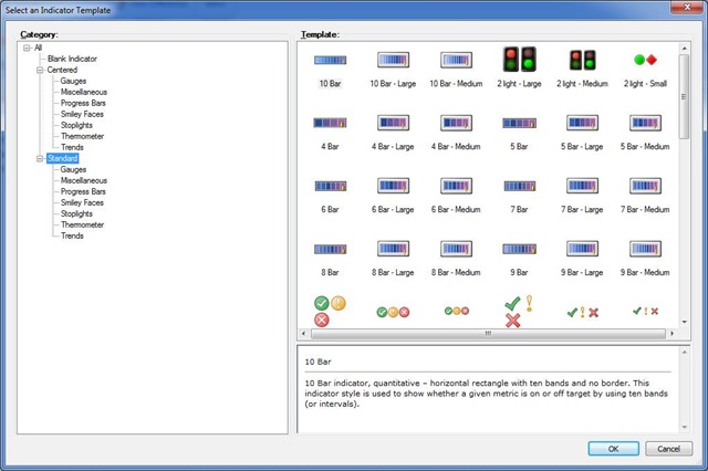
The alternative here is to pick a blank indicator, where you’ll have to decide yourself how many levels you want for your indicator, and what the colours and shapes should be. You can pick an image for an indicator state (as you can with SSRS), although you are limited to a maximum of 10 states. Again, that should be more than enough for KPIs.
The objects within PerformancePoint Services are very modularised, meaning that you create indicators, KPIs and scorecards separately. If you need to re-use an indicator in a new KPI, then you can just point to an existing indicator, or alternatively you can create a new one.
Again, taking some sample data from AdventureWorks, I’ve produced the following basic scorecard, based on similar data:

Comparison
The following table lists some KPI/Scorecard features and compares how SSRS and PPS are able to deal with them:
|
Feature |
PerformancePoint Services |
Reporting Services 2008 R2 |
|
Parent KPIs |
Out of the box Parent KPIs |
No built in parent KPIs |
|
Scoring |
|
No built in scoring capability |
|
Data Sources |
|
|
|
Positioning |
|
|
|
Formatting |
|
If the Indicator is embedded in a Tablix, then each cell can be altered in terms of Colours and number formats. |
|
Ease of Use |
As long as your data is in good shape, its possible for power users to build KPIs and Scorecards with Dashboard Designer relatively easily. |
The indicator windows are very intuitive in SSRS, but I’d say that building an SSRS report is harder for a power user than building a PPS dashboard. |
|
Other functionality |
Scorecards allow users enter comments against KPI values, which is a great feature. |
The standard SSRS expressions allow you to fine tune indicators, states, values and formatting of your KPIs. |
In summary, PerformancePoint Services in SharePoint 2010 will allow you to get some great looking KPIs and Scorecards up and running much quicker, as that’s what it’s designed to do. It is, however, more restrictive than Reporting Services, so SSRS is the better choice if your KPI requirements are complex in terms of layout or formatting.
Introduction to Data Wrangler in Microsoft Fabric
What is Data Wrangler? A key selling point of Microsoft Fabric is the Data Science
Jul
Autogen Power BI Model in Tabular Editor
In the realm of business intelligence, Power BI has emerged as a powerful tool for
Jul
Microsoft Healthcare Accelerator for Fabric
Microsoft released the Healthcare Data Solutions in Microsoft Fabric in Q1 2024. It was introduced
Jul
Unlock the Power of Colour: Make Your Power BI Reports Pop
Colour is a powerful visual tool that can enhance the appeal and readability of your
Jul
Python vs. PySpark: Navigating Data Analytics in Databricks – Part 2
Part 2: Exploring Advanced Functionalities in Databricks Welcome back to our Databricks journey! In this
May
GPT-4 with Vision vs Custom Vision in Anomaly Detection
Businesses today are generating data at an unprecedented rate. Automated processing of data is essential
May
Exploring DALL·E Capabilities
What is DALL·E? DALL·E is text-to-image generation system developed by OpenAI using deep learning methodologies.
May
Using Copilot Studio to Develop a HR Policy Bot
The next addition to Microsoft’s generative AI and large language model tools is Microsoft Copilot
Apr