In a recent project, we had to produce a scorecard using a set of manual and calculated KPIs. To obtain the manual KPI figures, we used Master Data Services (MDS) where the users could insert the values, while for the calculated, we used the base measures created in the tabular cube.
So far, this requirement does not look very complicated, however, what if I tell you that the same KPI can either be manually or automatically calculated by the cube? And that we have to present the values for different levels of a hierarchy? And that some of the KPIs are not absolute values but ratios? Now that I got your attention, let’s have a look at the solution we implemented.
How to join manual and automated KPIs?
Because the client couldn’t always provide the data to calculate the base measures, we delivered an MDS model to, among other functionalities, manually insert the numeric values. You can check this blog if you want to know more about the Survey model (https://adatis.co.uk/Modelling-Survey-Style-Data).
Since we were working with different markets, the same KPI could either be manually or automatically calculated, which means, the cube had to to select the appropriate scenario, depending on the selected market. In order to achieve such requirement, we created 3 measures.
AutKPI – Using base measures from multiple tables, we defined the DAX code to calculate the KPI
ManKPI – Knowing all the MDS values were in one table, we defined a simple DAX query to sum the values
Actual – This measure was implemented with an IF statement. Eg.
Actual:=IF(ISBLANK([AutKPI]), [ManKPI], [AutKPI])
How to aggregate ratio KPIs?
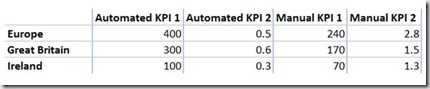
Let’s have a look at the example below, where we are calculating the KPI for two levels of a geography hierarchy.

Automated KPI 1 – Europe is naturally aggregating the values from Great Britain and Ireland
Automated KPI 2 – Considering we are using base measures, the cube can properly calculate the KPI at Europe level.
Manual KPI 1 – All manual entries were aggregated with a SUM. Because those are absolute values, the figure for Europe is correct
Manual KPI 2 - Following the same logic as Manual KPI 1, we can see the Europe value is incorrect. Because this is a ratio we can’t aggregate the value from the lower levels. The simplest approach to resolve this problem was to create a new calculation using an AVERAGE function, however, considering the requirements, we had to introduce a weighted average.
Implementing weighted averages
The first step to this approach is to define a weight for each market. Since the values can change according to the user’s needs, we added a new entity to the MDS model.

Now let’s consider the example below showing the weighted approach.

Following is the formula to calculate the KPI at Europe level. For a better understanding, I split it in different steps.
C1 GB: Manual KPI x Weight
C1 Ireland: Manual KPI x Weight
C2: C1 GB + C1 Ireland
C3: GB Weight + Ireland Weight
Europe KPI: C2 / C3
The scope of the project stated we had to implement the following logic:
· When presenting the KPIs at market level, don’t apply the weighting
· When presenting the KPIs at region level, apply the weighting but only for the ratio KPIs
The biggest challenge of this requirement was to overwrite the aggregating logic of the geography hierarchy. To achieve that, we implemented a dynamic segmentation pattern on the ratio KPIs (more details on this link http://www.daxpatterns.com/dynamic-segmentation/). This approach can be split in four steps.
First step is the calculation of our numerator.
Num Weighted AutKPI – Because the base measures from our automated KPIs are from different tables, we had to firstly group our data by market and region level and only then apply the calculation. Eg.
Num Weighted AutKPI:=
CALCULATE(
SUMX(
SUMMARIZE(
‘KPI Value’,
Market[Region],
Market[Market]
),
[AutKPI] * [KPI Weight]
)
)
Num Weighted ManKPI – On this instance, the grouping was not necessary because we only had one measure to consider. Eg.
Num Weighted ManKPI:=
CALCULATE(
SUMX(
‘KPI Value’,
CALCULATE(
SUM ( ‘KPI Value'[KPIActual] ) * [KPI Weight]),
‘KPI'[KPI] = “Manual KPI”
)
)
)
The second step is the calculation of our denominator.
Den Weighted AutKPI – Once again, because the weights were stored in a single table no grouping was necessary.
Den Weighted AutKPI:=
CALCULATE(
SUMX(
‘KPI Value’,
CALCULATE([KPI Weight])
)
,’KPI'[KPI] = “Automated KPI”
)
Den Weighted ManKPI – The same logic applies on this instance.
Den Weighted ManKPI:=
CALCULATE(
SUMX(
‘KPI Value’,
CALCULATE([KPI Weight])
)
,’KPI'[KPI] = “Manual KPI”
)
The third step is the division of our measures.
Weighted AutKPI:= DIVIDE([Num Weighted AutKPI], [Den Weighted AutKPI])
Weighted ManKPI:= DIVIDE([Num Weighted ManKPI], [Num Weighted ManKPI])
The fourth step is the calculation of our Weighted Actual measure, by once again, using an IF function.
Weighted Actual:= IF(ISBLANK([Weighted AutKPI]), [Weighted ManKPI], [Weighted AutKPI])
Finally, considering we only wanted to use the weighted measures for a subset of our KPIs, we created a new measure using a SWITCH function. Eg.
Actuals:=
SWITCH(
VALUES(‘KPI'[KPI]),
“Percentage KPI”, [Weighted Actual],
“Percentage KPI2”, [Weighted Actual],
“Absolute KPI”, [Actual],
“Absolute KPI2”,[Actual]
)
Hopefully, I was able to clearly demonstrate our problem and how we managed to implement a solution to solve it. As always, if you have any questions or comments, do let me know.
Introduction to Data Wrangler in Microsoft Fabric
What is Data Wrangler? A key selling point of Microsoft Fabric is the Data Science
Jul
Autogen Power BI Model in Tabular Editor
In the realm of business intelligence, Power BI has emerged as a powerful tool for
Jul
Microsoft Healthcare Accelerator for Fabric
Microsoft released the Healthcare Data Solutions in Microsoft Fabric in Q1 2024. It was introduced
Jul
Unlock the Power of Colour: Make Your Power BI Reports Pop
Colour is a powerful visual tool that can enhance the appeal and readability of your
Jul
Python vs. PySpark: Navigating Data Analytics in Databricks – Part 2
Part 2: Exploring Advanced Functionalities in Databricks Welcome back to our Databricks journey! In this
May
GPT-4 with Vision vs Custom Vision in Anomaly Detection
Businesses today are generating data at an unprecedented rate. Automated processing of data is essential
May
Exploring DALL·E Capabilities
What is DALL·E? DALL·E is text-to-image generation system developed by OpenAI using deep learning methodologies.
May
Using Copilot Studio to Develop a HR Policy Bot
The next addition to Microsoft’s generative AI and large language model tools is Microsoft Copilot
Apr