Here at Adatis we’re big fans of Reporting Services. Yep, it has it’s quirks and frustrations (don’t talk to me about excel export!) but doesn’t deserve all the criticism it gets in our opinion. You can create some great looking reports with not a lot of extra effort over the defaults (though how many times have you seen a “slate” style report called “Report1” go into production!)
We’re also fans of what some might call the more “trendy” visualisation techniques such as sparklines and bullet charts and with Microsoft acquiring Dundas technology for use in SQL 2008, SSRS has some much improved functionality in this area. I’ll be taking a look at some of these new features in a future post.
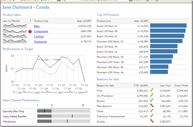
Whilst SSRS 2005 does have it’s limitations, with a little effort you can still create some very effective information visualisations. The dashboard below is built using completely standard functionality
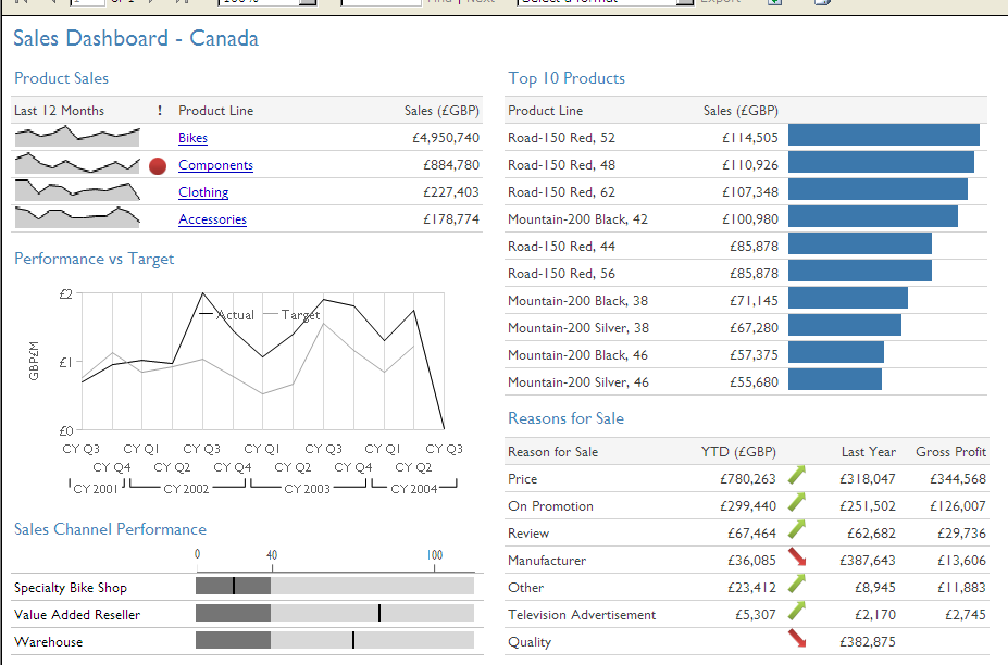
Adding sparklines and in-table bar charts is very simple (and pretty clever IMO). This MSDN Article covers how to do it in detail but in essence you simply add a line or bar chart into a cell in your data table.
Whilst the bullet chart (in the Sales Channel Performance region of the dashboard) may be simplistic compared to those available in SSRS 2008 or MicroCharts from XLCubed (from whom I nicked the styling for our dashboard) it still provides a very clear visualisation of the data. This required a little more trickery in the underlying query but is also just a chart in a table cell – this time a 100% stacked bar. I’ve explained how this works here
Introduction to Data Wrangler in Microsoft Fabric
What is Data Wrangler? A key selling point of Microsoft Fabric is the Data Science
Jul
Autogen Power BI Model in Tabular Editor
In the realm of business intelligence, Power BI has emerged as a powerful tool for
Jul
Microsoft Healthcare Accelerator for Fabric
Microsoft released the Healthcare Data Solutions in Microsoft Fabric in Q1 2024. It was introduced
Jul
Unlock the Power of Colour: Make Your Power BI Reports Pop
Colour is a powerful visual tool that can enhance the appeal and readability of your
Jul
Python vs. PySpark: Navigating Data Analytics in Databricks – Part 2
Part 2: Exploring Advanced Functionalities in Databricks Welcome back to our Databricks journey! In this
May
GPT-4 with Vision vs Custom Vision in Anomaly Detection
Businesses today are generating data at an unprecedented rate. Automated processing of data is essential
May
Exploring DALL·E Capabilities
What is DALL·E? DALL·E is text-to-image generation system developed by OpenAI using deep learning methodologies.
May
Using Copilot Studio to Develop a HR Policy Bot
The next addition to Microsoft’s generative AI and large language model tools is Microsoft Copilot
Apr