The current instalment in my SSRS 2016 blog series focuses on one of the two new chart types – Tree Maps. They were made available to Reporting Services 2016 CTP 2.3.
What are Tree Maps?
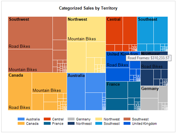
Tree Maps are designed to analyse quantitative measures that fit into a hierarchy. To put it simply, this enables a user to visualise how an attribute is performing against its parent category and in turn, how this category performs against other categories. The size of rectangle (in the example below) is proportionate to the numeric quantity.

Source: MSDN (Microsoft)
Creating a Tree Map
I will now show you how to create a simple Tree Map chart in SSRS 2016. The functionality is available through both Report Builder and Visual Studio. For this demo, I will use Report Builder.
1. Navigate to Report Builder through your configured SSRS web service and choose Blank Report.
2. Set up your own relevant Data Source, dimension Datasets and report Parameters. I suggest using a simple fact table and dimension from AdventureWorksDW2016. A copy of this database can be found here.
3. Select Insert > Chart > Insert Chart from the Menu Pane.

4. Create the Tree Map Dataset, which is derived from the fact table. The SQL for my chart is as follows:
SELECT DT.Country,
DL.LeagueName,
DT.TeamName,
SUM(LT.TotalPoints) AS Points
FROM [Warehouse].[VwFactLeagueTable] AS LT
INNER JOIN
[Warehouse].[DimTeam] AS DT
ON DT.TeamKey = LT.TeamKey
INNER JOIN
[Warehouse].[DimLeague] AS DL
ON DL.LeagueKey = LT.LeagueKey
GROUP BY
DT.Country,
DL.LeagueName,
DT.TeamName
The query is bringing back the total number of points each English football team has accumulated since the 2010/11 season.

5. Create Values, Category Groups and Series Groups (as shown below). These work in exactly the same way as other versions of SSRS.

6. Right Click on ‘Sum(Points)’ and select Series Properties.

7. In the Series Data tab, select the Tooltip Expression.

8. In the screenshot below, I have concatenated the team name field and the value together, as the Tree Map will truncate descriptions that do not fit in a section. The logic could be different for your own Tree Map. Click OK to confirm changes.

9. Add any additional chart headers, logos, etc to your report and Save the report. Click Run to view it.

10. That is it – the report is now ready. As you can see, ‘Man United’ are not visible until you hover over the applicable section.
Conclusion
Designing and implementing a Tree Map is very easy in SSRS 2016. Although this is a new chart type, you can set up a simple example in minutes. A BI analyst, report user or a company CEO can use Tree Maps to quickly spot well or badly performing products/features/departments. As this chart is hierarchical, you are able to analyse different levels of data in one visualisation.
Once we have grasped the concept, we can begin to create far more sophisticated Tree Maps. Although I will not be touching on them in this blog, there is plenty of material out there already that goes into greater detail.
References/Future Reading
For more information on Tree Maps, I recommend the below resources/blogs:
· Adventure Works DW 2016 CTP 3.0 database download – https://www.microsoft.com/en-us/download/details.aspx?id=49502
· MDSN Blog – https://msdn.microsoft.com/en-us/library/mt416753.aspx
· Sorna Kumars Muthuraj (MVP) Web Blog – https://www.youtube.com/watch?v=mj2eqelJt7E
· Using Tree Maps in Excel (Microsoft) – https://blogs.office.com/2015/08/11/breaking-down-hierarchical-data-with-treemap-and-sunburst-charts/
My next blog will focus on another new chart type – Sunbursts.
Introduction to Data Wrangler in Microsoft Fabric
What is Data Wrangler? A key selling point of Microsoft Fabric is the Data Science
Jul
Autogen Power BI Model in Tabular Editor
In the realm of business intelligence, Power BI has emerged as a powerful tool for
Jul
Microsoft Healthcare Accelerator for Fabric
Microsoft released the Healthcare Data Solutions in Microsoft Fabric in Q1 2024. It was introduced
Jul
Unlock the Power of Colour: Make Your Power BI Reports Pop
Colour is a powerful visual tool that can enhance the appeal and readability of your
Jul
Python vs. PySpark: Navigating Data Analytics in Databricks – Part 2
Part 2: Exploring Advanced Functionalities in Databricks Welcome back to our Databricks journey! In this
May
GPT-4 with Vision vs Custom Vision in Anomaly Detection
Businesses today are generating data at an unprecedented rate. Automated processing of data is essential
May
Exploring DALL·E Capabilities
What is DALL·E? DALL·E is text-to-image generation system developed by OpenAI using deep learning methodologies.
May
Using Copilot Studio to Develop a HR Policy Bot
The next addition to Microsoft’s generative AI and large language model tools is Microsoft Copilot
Apr