The Sunburst is the second of the new chart types in Reporting Services 2016. It was made available by Microsoft in CTP 2.3. The aim of this blog is to describe what a Sunburst chart does and provide a guide on how to create one.
What are Sunburst Charts?
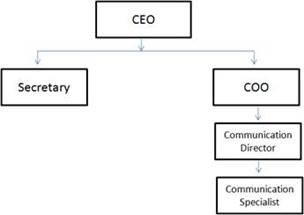
Like Tree Maps, Sunburst charts are an ideal candidate to display hierarchical data. They work particularly well with ragged hierarchies and clearly indicates where relationships exist. A ragged hierarchy is when some levels do not automatically roll up to its parent, e.g. an organizational hierarchy. The CEO may have two managers – one who has a subordinate under them (COO)and the other who is not responsible for anyone (Secretary).
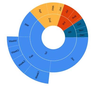
This is how a ragged hierarchy looks in a Sunburst Chart:
Source: Koen Verbaeck (www.mssqltips.com)
The Sunburst is just like a Donut chart but with multiple layers. You can see there is an extra ‘ray’ coming out from Feb, as this is the only month that contains weekly data. The hierarchy may in fact contain a weekly leaf member throughout but because Feb is the only month with values at the week level, none of the other members are visible.
The whole purpose of this chart type is to help a user visualise how an outer ring (child member) contributes to an inner ring (parent member). If you have a hierarchy that does not aggregate naturally, I would advise using other SSRS visualisations.
Creating a Sunburst Chart
I will now show you how to create a simple Sunburst chart in SSRS 2016. The functionality is available through both Report Builder and Visual Studio. For this demo, I will use Report Builder.
1. Navigate to Report Builder through your configured SSRS web service and choose Blank Report.
2. Set up your own relevant Data Source, dimension Datasets and report Parameters. I suggest using a simple fact table and dimension from AdventureWorksDW2016.
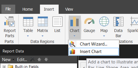
3. Select Insert > Chart > Insert Chart from the Menu Pane.
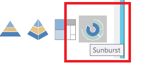
4. Select the Sunburst chart and click OK.
5. Create the Sunburst Dataset, which is derived from the fact table. The SQL for my chart is as follows:
SELECT
DC.DateKey,
CalendarDate,
‘Week ‘ + CAST(CalendarWeekNumber AS VARCHAR(2)),
CalendarMonthName,
CalendarQuarterName,
CalendarYearName,
COUNT(*) AS No_Of_Games
FROM [Warehouse].[DimDateCalendar] DC
INNER JOIN
[Warehouse].[FactResults] FR
ON FR.DateKey = DC.DateKey
INNER JOIN
Warehouse.DimLeague DL
ON DL.LeagueKey = FR.LeagueKey
WHERE DL.LeagueName = ‘Premier League’
GROUP BY
DC.DateKey,
CalendarDate,
‘Week ‘ + CAST(CalendarWeekNumber AS VARCHAR(2)),
CalendarMonthName,
CalendarQuarterName,
CalendarYearName
The query is bringing back the number of Premier League football matches played on a given day. It only contains data from 2010 to 2015.
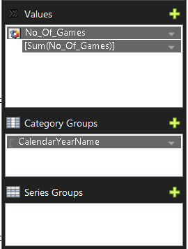
6. Now let’s bring in just one level of the hierarchy and a Sum of the No_Of_Games.
7. If we preview the chart, it still looks very incomplete.
8. If we add more Category Groups, it will add additional rings to the outside of the chart. Eventually building up a number of layers.
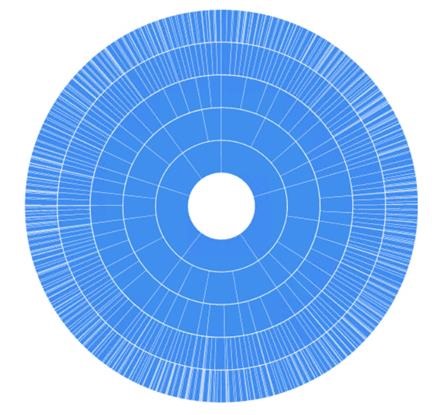
9. The chart now looks like a Sunburst but it is very difficult to make sense of what is going on. Therefore, we will add some colours, labels and groupings to the data.
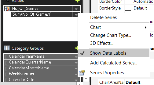
10. Right Click on the ‘No_Of_Games’ Value property and ensure Show Data Labels is ticked.
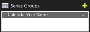
11. The Sunburst can be partitioned (by colour) depending on the desired attributes. For simplicity, we will use ‘CalendarYearName’.
12. Add any additional chart headers, logos, etc to your report and Save the report. Click Run to view it.
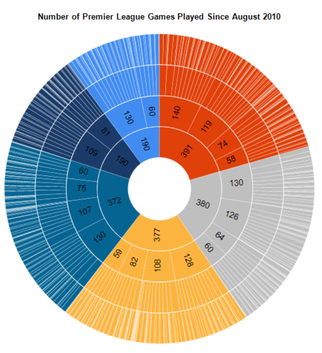
13. That is it – the report is now ready. You can clearly see a pattern in the data and each year represents a colour. In addition, it is easy to see what proportion of quarters, months and weeks make up a given year.
Conclusion
The Sunburst chart type is a very visual chart type and not to be used to interrogate numbers at a granular level. It is far better to spot anomalies within a hierarchy or highlight any bias towards a certain segment.
One major drawback I found was that it is very difficult to view or report on accurate information, especially when the data becomes more granular. This is the age old issues with Pie Charts, which is why the BI community frown upon this chart type. In the example above, the most outer ring is very busy and virtually impossible to analyse. I would definitely advise using Tree Maps for more detailed analysis.
There are also a couple of known limitations in CTP 2.3 for Sunburst charts. Tooltips only show in the outer ring when an expression is defined and you cannot control the different slices. On the other hand, Pie Charts enable a user to set a PieStartAngle, as well as a variety of other property options. I am sure a lot of the missing functionality will be brought in – either in newer CTP releases or when the SQL Server 2016 is fully available.
For more interactive and aesthetically pleasing Sunburst charts, I would advise using either Power BI or D3 components (for web developers). Not only is it more configurable but you can offer some really cool features like removing ‘ray’s, drill through and chart zoom. A pre-configured D3 example can be found here. I had a quick look through the SunburstChart Properties in SSRS 2016 and cannot see such options.
References/Future Reading
For more information on Tree Maps, I recommend the below resources/blogs:
· Adventure Works DW 2016 CTP 3.0 database download
· Sorna Kumars Muthuraj (MVP) Web Blog


![clip_image002[6] clip_image002[6]](https://adatis.co.uk/wp-content/uploads/historic/callumgreen_clip_image0026_thumb_76B34CAC.jpg)

Introduction to Data Wrangler in Microsoft Fabric
What is Data Wrangler? A key selling point of Microsoft Fabric is the Data Science
Jul
Autogen Power BI Model in Tabular Editor
In the realm of business intelligence, Power BI has emerged as a powerful tool for
Jul
Microsoft Healthcare Accelerator for Fabric
Microsoft released the Healthcare Data Solutions in Microsoft Fabric in Q1 2024. It was introduced
Jul
Unlock the Power of Colour: Make Your Power BI Reports Pop
Colour is a powerful visual tool that can enhance the appeal and readability of your
Jul
Python vs. PySpark: Navigating Data Analytics in Databricks – Part 2
Part 2: Exploring Advanced Functionalities in Databricks Welcome back to our Databricks journey! In this
May
GPT-4 with Vision vs Custom Vision in Anomaly Detection
Businesses today are generating data at an unprecedented rate. Automated processing of data is essential
May
Exploring DALL·E Capabilities
What is DALL·E? DALL·E is text-to-image generation system developed by OpenAI using deep learning methodologies.
May
Using Copilot Studio to Develop a HR Policy Bot
The next addition to Microsoft’s generative AI and large language model tools is Microsoft Copilot
Apr