
Taking the Power BI customers experience to the next level
In this final part of the blog series, we will be exploring the Drill-down and Drill-though capabilities of Power BI. So far, you should have a good understanding of the some essential data storytelling functionalities in Power BI – Bookmarks, Selections and Report Page tooltips. If you need details around how to use them, read the previous parts of this blog series to get helpful information for making a good looking reports and improve the analytical insights for end users to the next level.
Series Index
- Power BI Bookmarks & Selections & Buttons
- Report Page Tooltips
- Benefits of Drill-through and Drill-down
Drill-through vs. Drill-down – When to use what?
Drill-down and Drill-through are two extremely powerful features in Business intelligence. They are an essential part of the larger set of interactive features which exist in Power BI Self-Service. They both give the user the ability to visually analyse data in context and they do so in different manners. I will showcase how to use these features of Power BI to improve the interactivity and the overall user experience of reports.
Introduction to Drill-down
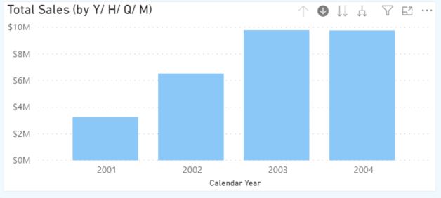
Drill-down is a capability that allows us to explore multidimensional data by navigating from a more general view of the data to a more specific one. For example, a report that shows Total sales revenue by year can allow the user to select a year, quarter, month, date, etc. Further levels of drill-down can be set up within the report – depending on the data granularity. This feature is called “drill-down” because it allows the user to go deeper into more specific layers of the data or information being analysed. Another great benefit of applying drill-down is that displaying one data layer at a time lightens the load on the server at query time, thus improves performance.
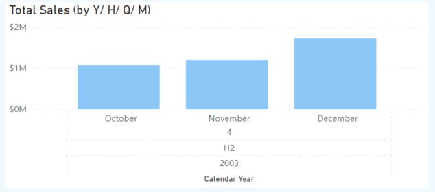
In my example, the drill-down goes from year to half-year, to quarter and month of total sales. By drill-down the look and feel of each level of the report are similar. What changes is the granularity of the data.
How to create a Drill-down in Power BI?
- Choose a measure you would like to analyse with drill-down.
- Create a hierarchy for the data you will use for drill-down. In my example – Calendar Hierarchy with year, half-year, quarter, month.
- Sort your visual by the hierarchy.
- In Format Painter, go to X axis and change its type from Continuous to Categorical.
- You can enhance the drill-down experience further if you add a label for each level of the hierarchy (see the X axis of the screenshot above). To achieve this, turn-off “Concatenate labels” under the X axis settings in format painter.
Drill-through
When presenting a report, developers are often asked: “What makes up that number?”. They could explain and show how total numbers are derived. However, what is better from a user perspective, is to let users research the numbers on their own. You can achieve this by using the drill-through feature in Power BI. In this way, users can see the detail within the report from different angles.
Instead of taking the user to a more granular level of the data, drill-through leads to a report that is relevant to the data being analysed. For example, a tabular report that shows sales revenue by the state can allow the user to click on it and reveal an analysis grid of the same data, or a heat map representing the data in visual form. It is called “drill through” because it is a feature that allows the user to pass from one report to another while still analysing the same set of data
How to create a Drill-through in Power BI?
- Drill-through reports have two components: master report – the main report that contains links to other child reports and child reports – the reports that are linked to the master report. First, plan your main and your detailed report page. As you decide on these report tabs, you can have multiple drill-through reports for one master report. When linking detailed reports to your main report, you define a relationship between the reports based on fields in the master report that correspond to filters in the child reports.
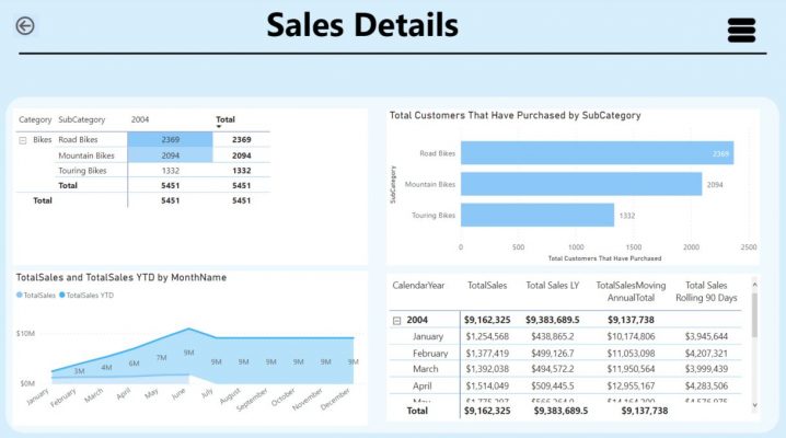
- Start by creating your detailed reports. In my example, it is “Sales Details”.
3. Once you have finished creating your child reports, create your master report – “Sales Overview”.
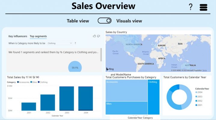
4. Add our drill-through filters. The master report is where you set up the drill-through functionality – the relationships to the “Sales Details” report page. In my example, I included the Category and Subcategory in the drill-though section of my “Sales Overview” report page.
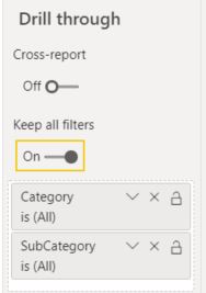
5. Above the the drill-through filters area, there is an option “Keep All Filters”. Setting up this option “On” allows filters used on the “Sales Overview” page to be passed to the “Sales Details” page. This allows sync of the “Sales Overview” page filters with values shown on the “Sales Details” page. Turning this functionality “Off” means only columns placed in the drill-through field list will be used as filters for the detail page.
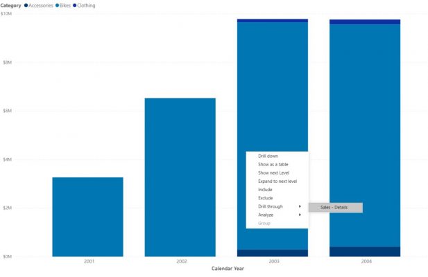
6. The Drill-through functionality is now enabled, thus the user has the option to see the “Sales Details” page after a right-click on a visual from the overview page.
Summary
So far we have discussed bookmarks, selections, and buttons in the first part of my “Data Storytelling with Power BI” blog series and how to use a report page as a tooltip in part 2. In part 3, we discussed how drill-through and drill-down features can improve the usability of your report. By applying them, the end-user can gain instant knowledge of different depths of the data. Drill-through enables users to analyse the same data through different reports, and even display it through different data analytics and visualisations. On the other hand, drill-down gives the user a deeper insight into what makes up the figures he’s analysing.
Sources:
- https://docs.microsoft.com/en-us/power-bi/desktop-drillthrough
- https://docs.microsoft.com/en-us/power-bi/consumer/end-user-drill
Hope you enjoyed my post. If this blog was useful, and you feel you would benefit from further communication with me and Adatis, please reach out to us.
Introduction to Data Wrangler in Microsoft Fabric
What is Data Wrangler? A key selling point of Microsoft Fabric is the Data Science
Jul
Autogen Power BI Model in Tabular Editor
In the realm of business intelligence, Power BI has emerged as a powerful tool for
Jul
Microsoft Healthcare Accelerator for Fabric
Microsoft released the Healthcare Data Solutions in Microsoft Fabric in Q1 2024. It was introduced
Jul
Unlock the Power of Colour: Make Your Power BI Reports Pop
Colour is a powerful visual tool that can enhance the appeal and readability of your
Jul
Python vs. PySpark: Navigating Data Analytics in Databricks – Part 2
Part 2: Exploring Advanced Functionalities in Databricks Welcome back to our Databricks journey! In this
May
GPT-4 with Vision vs Custom Vision in Anomaly Detection
Businesses today are generating data at an unprecedented rate. Automated processing of data is essential
May
Exploring DALL·E Capabilities
What is DALL·E? DALL·E is text-to-image generation system developed by OpenAI using deep learning methodologies.
May
Using Copilot Studio to Develop a HR Policy Bot
The next addition to Microsoft’s generative AI and large language model tools is Microsoft Copilot
Apr