This is part 2 of a blog series about R. See part 1 here: Meandering Through R (Part 1: Working with Data)
As mentioned at the end of the last post, one of the main advantages of using R is its graphical capabilities. With a few lines of code, you can produce high-quality visualisations that allow you to communicate data effectively.
Base R plots
In R, visualisations are not just available when importing packages/libraries. Base R also has graphical capabilities. Although the base R visualisations are limited, they are quite useful when you want to quickly plot some data. Furthermore, in terms of their appearance, they look quite scientific; you can easily imagine them in a scientific paper or publication. For example, continuing to use the Iris dataset, simply type plot(iris) and you get a pair plot that looks like this:
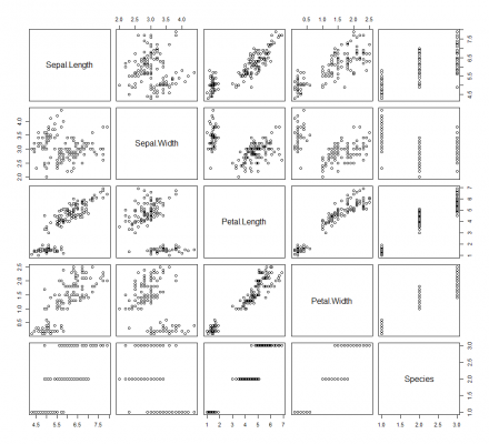
This pair plot provides a collection of small scatter plots that compare the distribution of each variable in the dataset. If you want to specify the variables to plot, simply use the x and y parameters, like so:
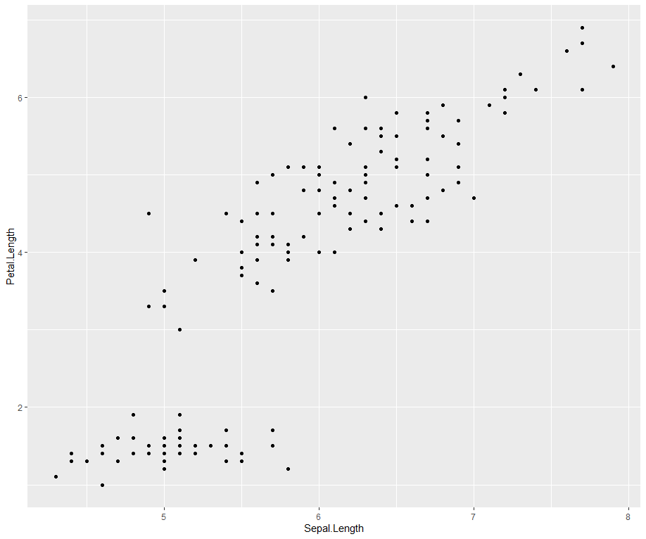
![]()
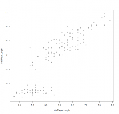
Here we are comparing the sepal length against the petal length.
As you would expect, you do have control over the appearance of the visual, such as colours, axes, labels, and so on. However, it is very limited compared to other visualisation packages.
In terms of chart types available, Base R offers bar charts, line charts, histograms, box plots, dot plots, scatter plots, pie charts, density plots, and more.
The Base R plot function is also useful when you want to evaluate a linear model. Wrapping your linear model object in the plot function will automatically produce a series of plots helping you to understand the performance of your model. These plots include Residuals vs. Fitted, Normal Q-Q plot, Scale-Location, and Residuals vs. Leverage.
ggplot2
The widely recognised graphical capability of R is due for the most part to the ggplot2 library, which is a powerful tool for data analytics and visualisation. Hadley Wickham based ggplot2 on the ‘grammar of graphics’, a coherent system for describing and building graphs. The package offers a system of fully customisable aesthetics and layers, allowing for great design flexibility.
A basic ggplot2 visualisation typically consists of 3 components: a dataset, a coordinate system, and geometrics. A more advanced visualisation may also have a statistics layer. Each of these components are added in layers.
To demonstrate, let’s build a new plot iteratively, adding more layers at each turn. This reflects the reality of building a ggplot2 visualisation.
We begin by loading the library and drawing the initial layer. In the ggplot() function we specify the dataset to use and we map the coordinate system, i.e. the x and y axis.

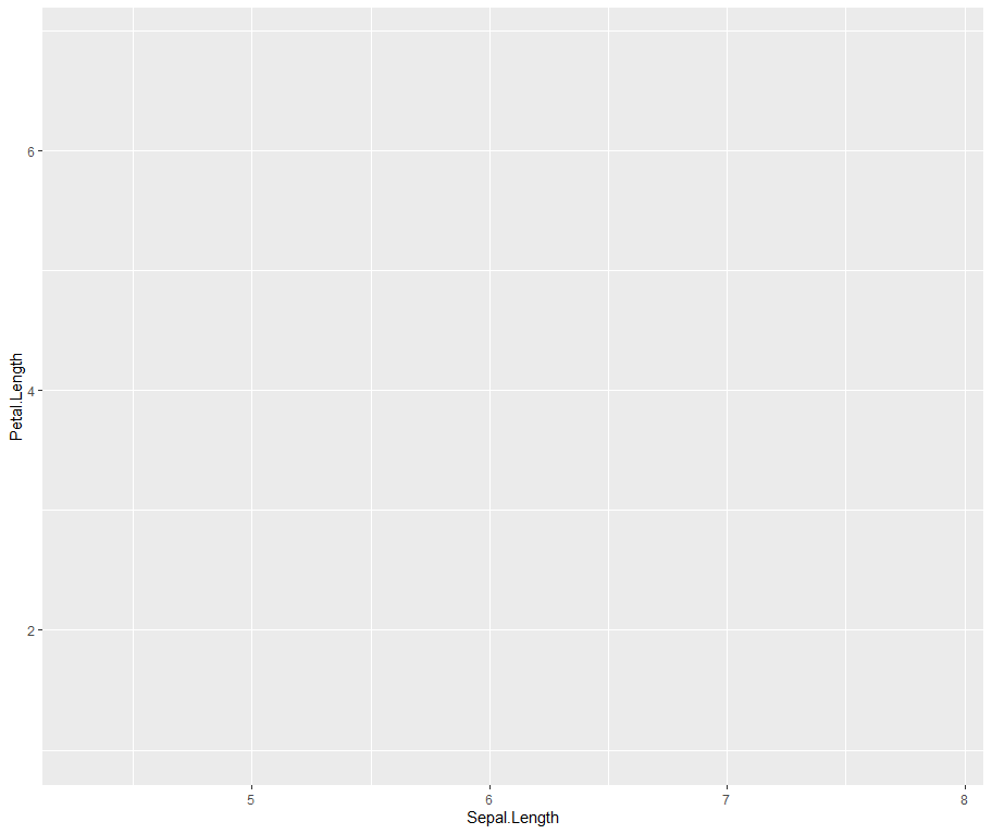
Now we have a canvas to build on top of.
Next, we add the geometric layer. This is where we specify the type of visualisation to represent the data. This can be as points, bars, lines, text, and so on. For example, to build a scatter plot, the data is represented as points.

Simple! As mentioned earlier, ggplot2 offers great design flexibility over most of what you see, including the size, colour and position of data points, axes, labels, titles, legend, grid, background, and so on.
Let’s continue building our plot and improve the aesthetics.

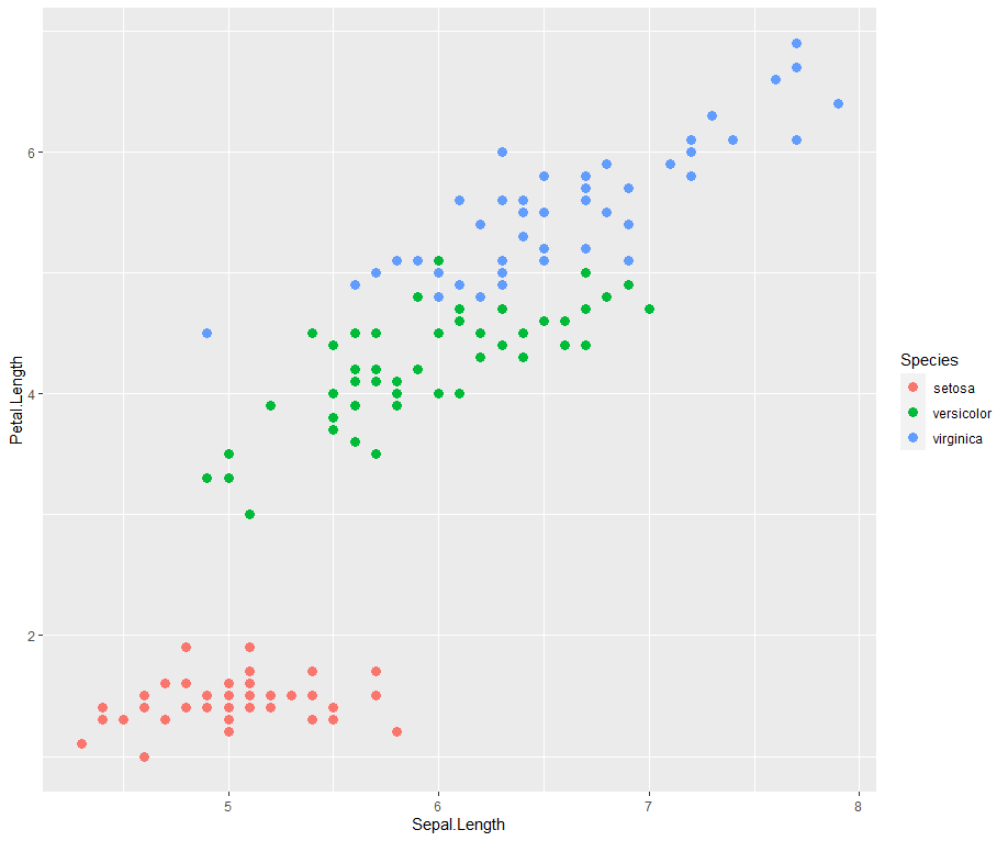
As you can see, I have added an aes() argument inside the geometric, and coloured the points based on the type of species. I have also increased the size of the points.
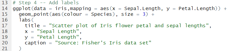
Generally, the default axis labels are not up to scratch, so I’d always recommend defining your own labels. Let’s do that in the next layer.
Now let’s take things further and add a smoothing line as a statistical layer.
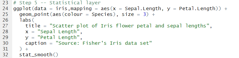
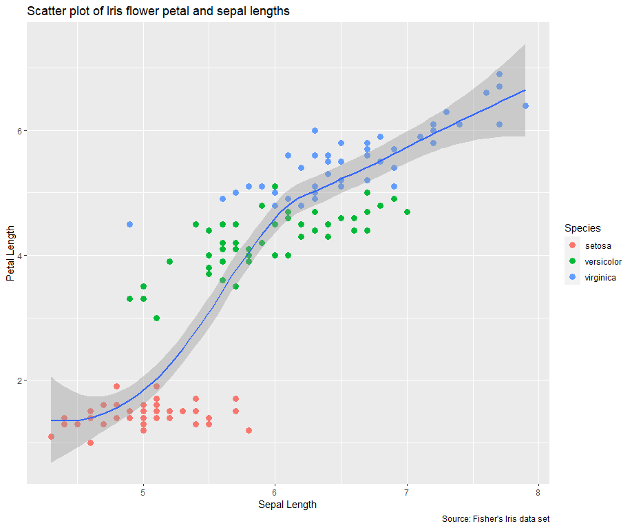
Our ggplot2 visualisation is almost complete. However, I’m generally not a fan of the default grey background. Fortunately, you can change that very easily by adding a theme layer.
Here I am using a built-in ggplot2 theme theme_light(), however, there are a whole host of additional themes that can be used by importing packages, such as ggthemes, hrbrthemes, ggtech, and more.
Although ggplot2 is a fantastic library, the biggest limitation is that it produces static visualisations. There are no tooltips, drill-downs, zooming into data points, or other forms of animations. This becomes a problem when you are building a dashboard, for example, where interaction and user experience is crucial. A quick way around this is to wrap your ggplot code inside a ggplotly function, after loading the plotly library. Alternatively, you can use other visualisation packages, such as plotly, googleVis, dygraphs, r2d3, etc.
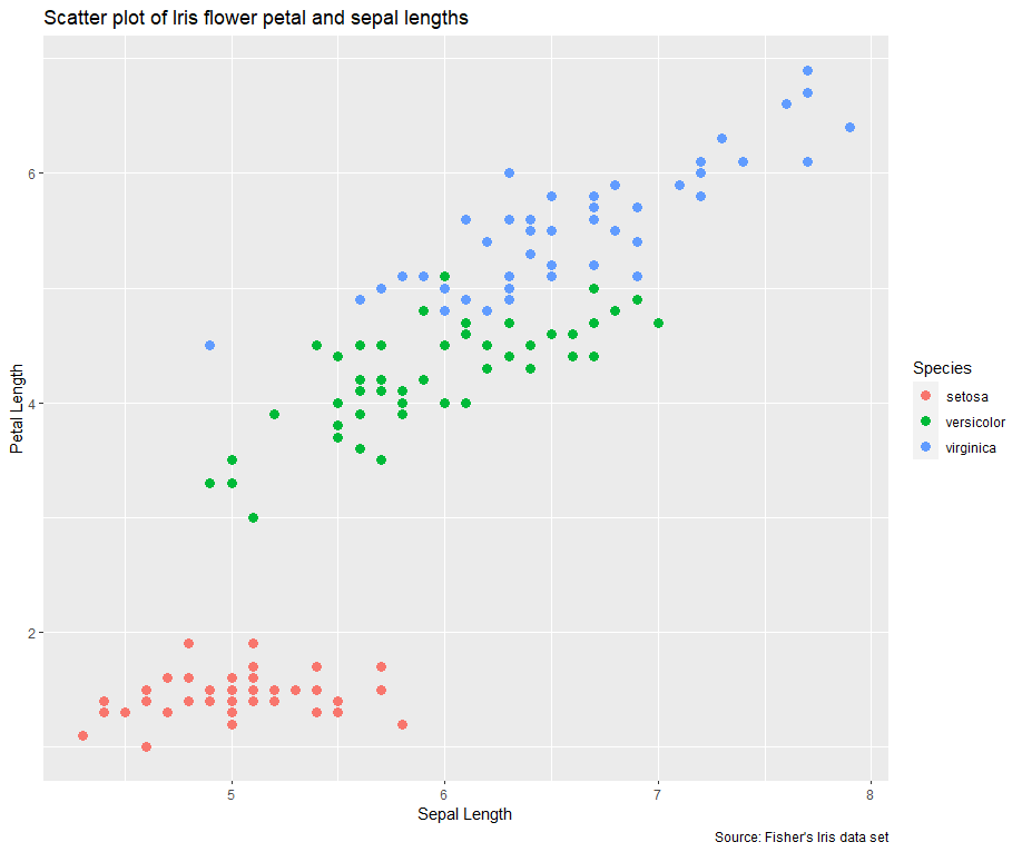
Now the plot is complete. Although it is by no means the greatest visualisation created, hopefully, I have demonstrated the concept and process of creating a ggplot2 chart.
R Markdown
Analysing data and producing visualisations is all well and good, however, it’s not much use if they aren’t being communicated frequently to decision-makers. R predominantly offers two ways of doing this. One is through using R Markdown to produce dynamic reports and documents. These reports are created using R code and can be in the format of HTML, PDF, Word, PowerPoint, and more. I have personally found R Markdown most useful for explanatory data analysis; when you have found something interesting in your analysis and you need to communicate your findings effectively. It can also be useful for generating automated operational reports that can be printed out and shared with end-users.
To create an R Markdown file (a .Rmd file) in RStudio, simply click File > New File > R Markdown. A menu will then appear allowing you to choose the output format, the document title and author. After clicking OK, a template markdown code is then provided, allowing you to quickly get going in creating your document.
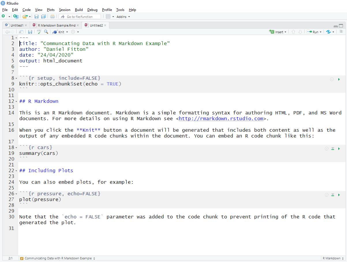
This is how the template looks. At the top, surrounded by three dashes, you can see some metadata (the YAML header), with information that was specified in the menu when creating the file. If you want, you can remove them or change any of them directly in the code, so no need to create a new file. However, if I am changing the format from HTML to PowerPoint, for example, it might be wiser to create a new file as the template is slightly different.
You can also see that the template has some chunks of code with a grey background, surrounded by four grave accents (`). This is where you write the R code to embed in the document. The document will display the output of the code chunk. You also have the option to display the R code used to produce the output in the document, specified with the echo parameter. The {r name} that immediately follows the grave accents allows you to specify a name for the code chunk. Although this name is not displayed in the document, it is useful when writing your code, allowing you to quickly navigate to different sections.
The section between the code chunks is where you write up your commentary and blocks of text. Headings are created with #. Most of the usual formatting options are available, including italics, bold, code, superscript, subscript, as well as bullet points, numbered lists, links, images, and tables.
When your document is complete and you are ready to see the output, click on the “Knit” button and the document will be rendered. You can also create parameter-driven reports that are useful if you want to render the same report but with different inputs, for example, if you just want to see data for a particular region or area of the business. This is done by using the params field in the YAML header at the top of your code, and rendered using “Knit with Parameters”.
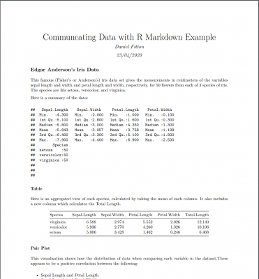
Below is a quick example of a Markdown report that I have created (click the image to view the PDF):
R Markdown is versatile and can be used for a wide range of purposes. Here is a gallery on the RStudio website of some Markdown documents.
R Shiny
The other way to communicate data with R is to produce an interactive dashboard or web application within R using Shiny. Whereas Markdown reports are most useful for explanatory analysis; Shiny, in my opinion, is useful for exploratory data analysis. This is when you want to display information for investigative purposes, allowing the user to gain greater familiarity by having the ability to interact with data, filter it, and dig deeper into the underlying details.
Shiny is incredibly flexible, providing the user the capability of turning their R code and objects, including tables, plots, and analysis, into a comprehensive and interactive web page or app, without requiring a fully-fledged web development skillset. Although there is a steep learning curve, the freedom and precision Shiny brings means that for the most part you are limited only by your skillset rather than the tool itself.
To create an R Shiny file in RStudio, first, make sure you have the “shiny” package installed, then simply click File > New File > Shiny Web App. A menu will then appear allowing you to specify the application name, the directory, and the application type. Here, you can either create a single file called app.R, or split the app into multiple files, including a ui.R file and server.R file. I’d recommend a single file for small applications, and multiple files for larger, more complicated applications. After clicking OK, a template Shiny code is then provided, allowing you to quickly get started with creating your app.

You will notice that there is a ‘Run App’ button at the top of the pane. Click that and you will see a local instance of the user interface output generated by the template code.
A Shiny app is composed of three parts:
- A User Interface (UI) component
- A Server component
- A component to run the application
The UI side is for defining the front-end of the app — i.e. the layout and appearance, including what is displayed and where. Behind the scenes, it actually works by generating HTML code, therefore, HTML elements such as headers, paragraphs, links, buttons, div sections, line breaks, and so on, are all available by using a Shiny tags object. Furthermore, Shiny uses the Bootstrap framework from Twitter, ensuring that your apps’ panels and elements are responsive, using a fluid grid system. Shiny offers some template layouts that you can take advantage of; you can also load packages such as shinydashboard or shinythemes that help with your design; otherwise, you can build your own layout if you prefer. You can also significantly improve the design of your app by adding CSS styling, either inline or using an external style script; similarly, you can do the same with JavaScript/JQuery to improve the user experience.
The Server side is for defining the back-end of the app — i.e. the instructions, logic, and calculations, including inputs, outputs, and what happens when the user interacts with the different elements on the screen. The server side essentially listens for inputs from the user, such as clicks, hovers, selections, etc. and outputs what the reaction should be, i.e. rendering a plot, text, or visual. In the template example above, there is a slider input in the UI with the ID “bins”. On the server side, you can see this being referred to using input$bins. This allows the output histogram to be rendered based on the slider value controlled by the app user.
The app is ran using the shinyApp function, which combines UI and server into a functioning application. If you develop using multiple files, you can run the app using the runApp function.
When you have developed your app, you can either deploy it to shinyapps.io (hosted in the cloud by RStudio), your own Shiny server, or Shiny Server Pro.
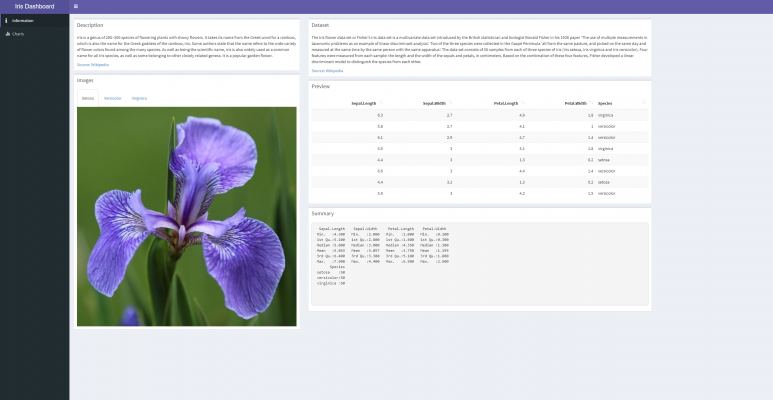
Below is an example of a quick Shiny app I have created (click the image to view the dashboard):
Here is a gallery on the RStudio website of some Shiny apps.
Code
References
The Base Plotting System in R – Roger D. Peng
AVML 2012: ggplot2 – Josef Fruehwald
How sports scientists can use ggplot2 in R to make better visualisations – Mitch Henderson
Themes to Improve Your ggplot Figures
R for Data Science – Garrett Grolemund and Hadley Wickham
Building Shiny apps – an interactive tutorial – Dean Attali
R powered web applications with Shiny (a tutorial and cheat sheet with 40 example apps) – Zev Ross


Very Interesting nice information.