
Taking the Power BI customers experience to the next level
Learn how to build user-friendly and informative reports with intuitive navigation in Power BI! In part one of my “Data Storytelling with Power BI” posts I talk about Power BI Bookmarks and Selections. If you haven’t read it yet, make sure to check it out. In this blog-post series I will explain how enhance the user-experience further by utilising the Report Page Tooltips feature.
Series Index
- Power BI Bookmarks & Selections & Buttons
- Report Page Tooltips
- Benefits of Drill-through and Drill-down
Intro to Power BI Tooltips
I will showcase how to use the tooltip feature of Power BI to improve the interactivity and the overall user experience of reports.
Default Tooltips
Tooltips are an elegant way of providing more contextual information and detail to data points on a visual. If the Tooltip tab of a visual in Format Painter is turned on and its Type is set to “Default”, we take advantage of the default tooltip look. The following screenshot shows such kind of a tooltip applied to a chart in Power BI Desktop.
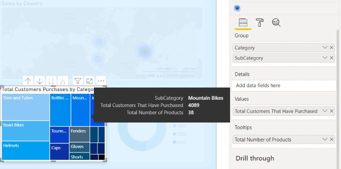
Report Tooltips on a visual
The exiting part of tooltips comes after we select “Report Page” instead of “Default” for tooltip Type. The Report Page Tooltip feature allows us to create a mini-report page that is linked back to the tooltip pop-up whenever we hover over a filtered element of a chart, table, or even card. If you go to a different row you will notice that the numbers change. That is because the tooltip is being filtered on the row that you are hovering over.
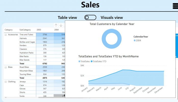
On the screenshot below I have demonstrated what the user experience looks like. You will notice that when a report users hover over a visual they are getting the value showing in this section on a card that is displayed of a certain size. One of the nice things with these report tooltips is that you can easily customise the tooltip report page size.
How to create a report page tooltip?
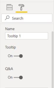
1. Create a new report page in Power BI Desktop and rename it as “Tooltip 1”.
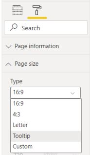
2. Go to the page Format painter button and then to “Page Size”. Change “Page Size” from 16: 9 to “Tooltip”.
3. On “Page Information” make sure that the tooltip tab is turned on.
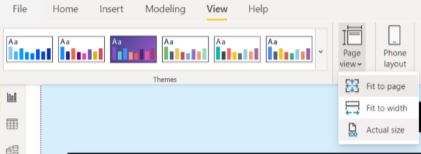
4. Go to the View section in Power BI Desktop, then on “Page View” and change the page width from “Fit to Page” to “Actual Size”. This changes the default size of your report page to 320 by 240. This is a canvas just like any report page and you can have any objects of any size in anything within there.
5. Next, we create a visual on the “Tooltip 1” report page.
6. Finally, after the tooltip is created we need to add the “Tooltip 1” report page to a visualisation. Go to the format painter of a visual where you want to include the report tooltip. Under the tooltip tab change Tooltip type from “Default” to “Report page”. Under the pages tab, select “Tooltip 1”. Any of the visuals, meaning built-in charts that are not custom visuals (The ones that are included with Power BI), tables, and single cards can all have a report page as a tooltip.
What tooltip sizes work well?
Besides the default tooltip page size page to 320 by 240, you have the freedom to do custom sizes. To achieve this, go on your “Tooltip 1” report page, then change its type to “Custom”. After that, you can put whatever pixels you want under width and height.
Here are some page sizes which look well from my experience.
- 450 x 300
- 625 x 438
- 750 x 525
- 875 x 625
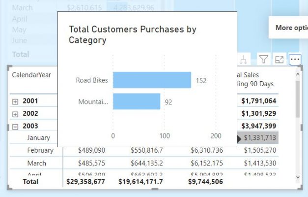
A tooltip with customised size comes handy when you want to include multiple visuals in your report tooltip with a reasonable size. As an example, here I applied 625 x 438. This makes it possible to accommodate two visuals in one tooltip in a readable format.
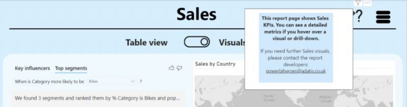
Using card visuals as navigation instructions on mouse hover
Using Report page tooltips for adding guidelines for a report is another great option to help report users. This is useful for helping users when they navigate for the first time in a new report. You can show them how to read a report, how to use an advanced visual, maybe even to explain how a key performance indicator (KPI) is defined and calculated.
Follow the steps below to create a sample navigation card visual:
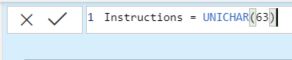
1. First, create a new measure. It can be a simple text measure or you can utilise the built-in UNICHAR() DAX function.
2. Add your measure to a card visual

3. Next, create a new report page and set up its type as “Tooltip”.
4. Then to page formatting panel and specific to page size. Select type “Tooltip”.
5. Finally, navigate to your main report and select the card visual with the question mark. Go to card formatting options and under the tab “Tooltip” select “Report page” for Type. On the “Page” tab, choose the report page created in step 3.
6. As an extra touch, you can hide the visual header so users don’t see the ellipsis […] above the card after the report is published in the Power BI service.
Summary
So far we have discussed bookmarks, selections, and buttons in the first part of my “Data Storytelling with Power BI” blog series. In this post, I explained how to use a report page as a tooltip. The tooltip feature can quickly and easily improve the usability and aesthetics of your report. You can enhance further the user experience by applying it and elevate the analytical insights of your report to the next level.
Hope you enjoyed my post. If this blog was useful, and you feel you would benefit from further communication with me and Adatis, please reach out to us.
Sources: https://docs.microsoft.com/en-us/power-bi/desktop-tooltips
Next Time
Coming up next: Benefits of Drill-through and Drill-down
Introduction to Data Wrangler in Microsoft Fabric
What is Data Wrangler? A key selling point of Microsoft Fabric is the Data Science
Jul
Autogen Power BI Model in Tabular Editor
In the realm of business intelligence, Power BI has emerged as a powerful tool for
Jul
Microsoft Healthcare Accelerator for Fabric
Microsoft released the Healthcare Data Solutions in Microsoft Fabric in Q1 2024. It was introduced
Jul
Unlock the Power of Colour: Make Your Power BI Reports Pop
Colour is a powerful visual tool that can enhance the appeal and readability of your
Jul
Python vs. PySpark: Navigating Data Analytics in Databricks – Part 2
Part 2: Exploring Advanced Functionalities in Databricks Welcome back to our Databricks journey! In this
May
GPT-4 with Vision vs Custom Vision in Anomaly Detection
Businesses today are generating data at an unprecedented rate. Automated processing of data is essential
May
Exploring DALL·E Capabilities
What is DALL·E? DALL·E is text-to-image generation system developed by OpenAI using deep learning methodologies.
May
Using Copilot Studio to Develop a HR Policy Bot
The next addition to Microsoft’s generative AI and large language model tools is Microsoft Copilot
Apr