
Power BI is one of the leading platforms for incorporating Artificial Intelligence and advanced analytics into applications. With regular updates, it’s easy to miss out on features that can enhance data analysis and insight generation. Our goal here is to explore these advanced features, focusing on time series analysis and how a moving average can be your secret weapon for more insightful decision-making.
1. First, we start with establishing the Foundation
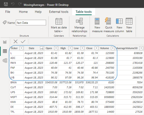
We begin by populating a custom dataset containing real historical time series data for the top 1000 stocks in the US stock market for the last 2 years. We need the closing prices as well as the percentage changes for each of the stocks.
2. The next step is linking Time with Data
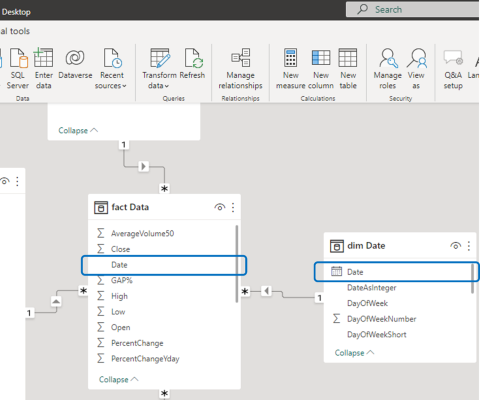
Think of data as a puzzle. We need a piece that connects time to our stock data. We’ll create a link between a date dimension table and our main data table. Establish a connection between a static date dimension table and the date field in the fact table. This connection forms the basis for our time series analysis.
3. Bringing Data to Life
Now, we’re in the fun part. Imagine you want to know how many stocks went down 2% or more on a specific day. We’ll use a simple DAX formula to find that out. Transition to Report View and introduce a table visual. Craft your first measure using the DAX formula:
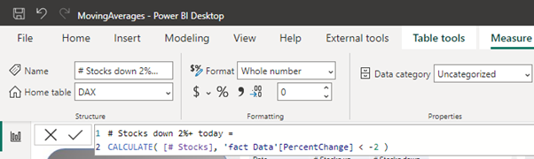
# Stocks down 2%+ today =
CALCULATE( [# Stocks], 'fact Data'[PercentChange] < -2 )
4. Flipping the Coin for Gainers
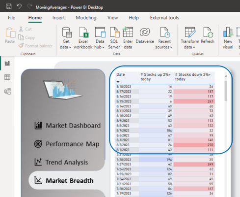
Let’s flip the script. What about stocks that went up by 2% or more? We’re going to use another code to reveal this information.
# Stocks up 2%+ today =
CALCULATE( [# Stocks], 'fact Data'[PercentChange] > 2 )
Now, we’ll bring together the date column and our two DAX measures into the table visual. We’ll also enhance the visual appeal by applying some colour changes using conditional formatting. This will help us visualise the trends more effectively.
Moving forward, let’s utilise a Line chart to see how these values change over time. This approach is known as time series analysis. Embedding a Line chart into your report allows you to effectively visualize the patterns in the data as they unfold chronologically.
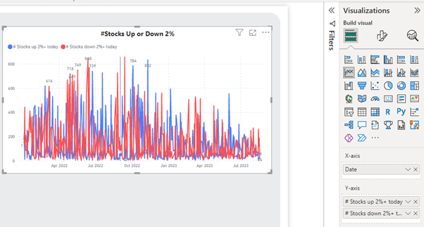
You would say, “This visual isn’t telling us much”. And you’re spot on! Sometimes, peering at daily data sometimes clouds the bigger picture. The constant ups and downs make it hard to see the forest for the trees. But hey, no worries! Here’s where moving averages come to the rescue. They’re like your secret weapon for understanding trends in the data. And guess what? This guide is all about showing you how to bring this magic into your Power BI dashboards so you can make smarter decisions.
5. Smoothing the Ride
It’s time to calculate the average over 30 days to make the waves smoother. Here’s how we go about that. We create two additional columns and employ the following DAX code to estimate the 30-period moving averages.
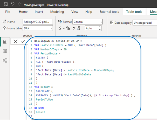
RollingAVG 30 period of 2% UP =
VAR LastVisibleDate = MAX ( 'fact Data'[Date] )
VAR NumberOfDays = 30
VAR PeriodToUse =
FILTER (
ALL ( 'fact Data'[Date] ),
AND (
'fact Data'[Date] > LastVisibleDate - NumberOfDays,
'fact Data'[Date] <= LastVisibleDate
)
)
VAR Result =
CALCULATE (
AVERAGEX ( VALUES('fact Data'[Date]), [# Stocks up 2%+ today] ) ,
PeriodToUse
)
RETURN
Result
6. Seeing the Magic
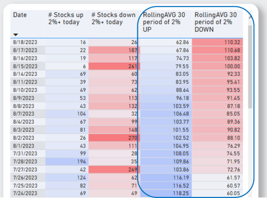
With our moving averages calculated, we now add two new columns to our table visual. We can already see the trends clearer. The data waves start to look more like gentle ripples.
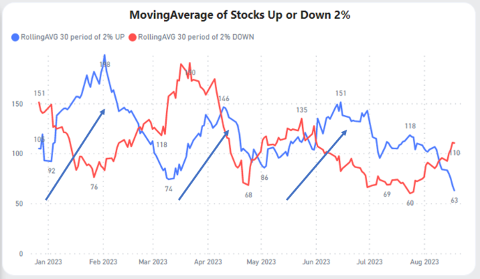
We’ll use another line chart to show off our newly smoothed data. We can now see the real trends in the data. When the blue line is going up, we know that there are many stocks that are going up in price. On Wall Street, they would say that’s a ‘bullish market’. Someone can even argue that based on this visual the best time to invest in stocks in 2023 would be the periods when the blue line is trending up.
- From Jan to Feb
- From mid-March to mid-April
- From mid-May to mid-June
Conclusion
Congratulations! You’ve just unlocked a new skill in the chest of analytical powers. These skills can transform you into a data wizard, capable of crafting powerful reports. If you’re ready to dive even deeper into the world of Power BI, check out our other Power BI performance tips or dig deeper into Microsoft’s learning resources on Power BI.
Introduction to Data Wrangler in Microsoft Fabric
What is Data Wrangler? A key selling point of Microsoft Fabric is the Data Science
Jul
Autogen Power BI Model in Tabular Editor
In the realm of business intelligence, Power BI has emerged as a powerful tool for
Jul
Microsoft Healthcare Accelerator for Fabric
Microsoft released the Healthcare Data Solutions in Microsoft Fabric in Q1 2024. It was introduced
Jul
Unlock the Power of Colour: Make Your Power BI Reports Pop
Colour is a powerful visual tool that can enhance the appeal and readability of your
Jul
Python vs. PySpark: Navigating Data Analytics in Databricks – Part 2
Part 2: Exploring Advanced Functionalities in Databricks Welcome back to our Databricks journey! In this
May
GPT-4 with Vision vs Custom Vision in Anomaly Detection
Businesses today are generating data at an unprecedented rate. Automated processing of data is essential
May
Exploring DALL·E Capabilities
What is DALL·E? DALL·E is text-to-image generation system developed by OpenAI using deep learning methodologies.
May
Using Copilot Studio to Develop a HR Policy Bot
The next addition to Microsoft’s generative AI and large language model tools is Microsoft Copilot
Apr