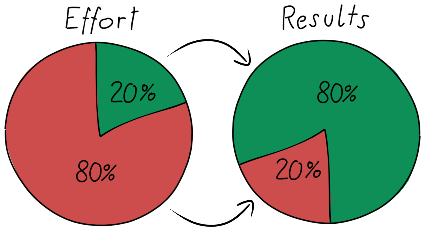
The Pareto principle, commonly referred to as the 80/20 rule, is a concept of prioritisation.
It states that for many outcomes, 80% of the outputs are derived from 20% of the inputs. Although this isn’t a universal truth, this pattern has been observed in many different cases. For example, a large proportion (80%) of the revenue a particular business generates may primarily be associated with only a small proportion (20%) of big-selling products. This concept is related to the law of diminishing returns and poses the following question: If, after reaching a certain level of output (80%), significantly more effort is required to achieve further increases in this output, is this additional effort worth it?
In this article, we demonstrate the process (using DAX expressions) of creating a Pareto chart in Power BI.
The Example
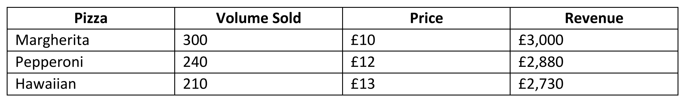
Pizza My Heart is a pizza restaurant, and they would like to perform some Pareto analysis around their menu-item data to understand if they can reduce the size of their menu, helping them save on costs and streamline operations. An excerpt of the data is shown below:
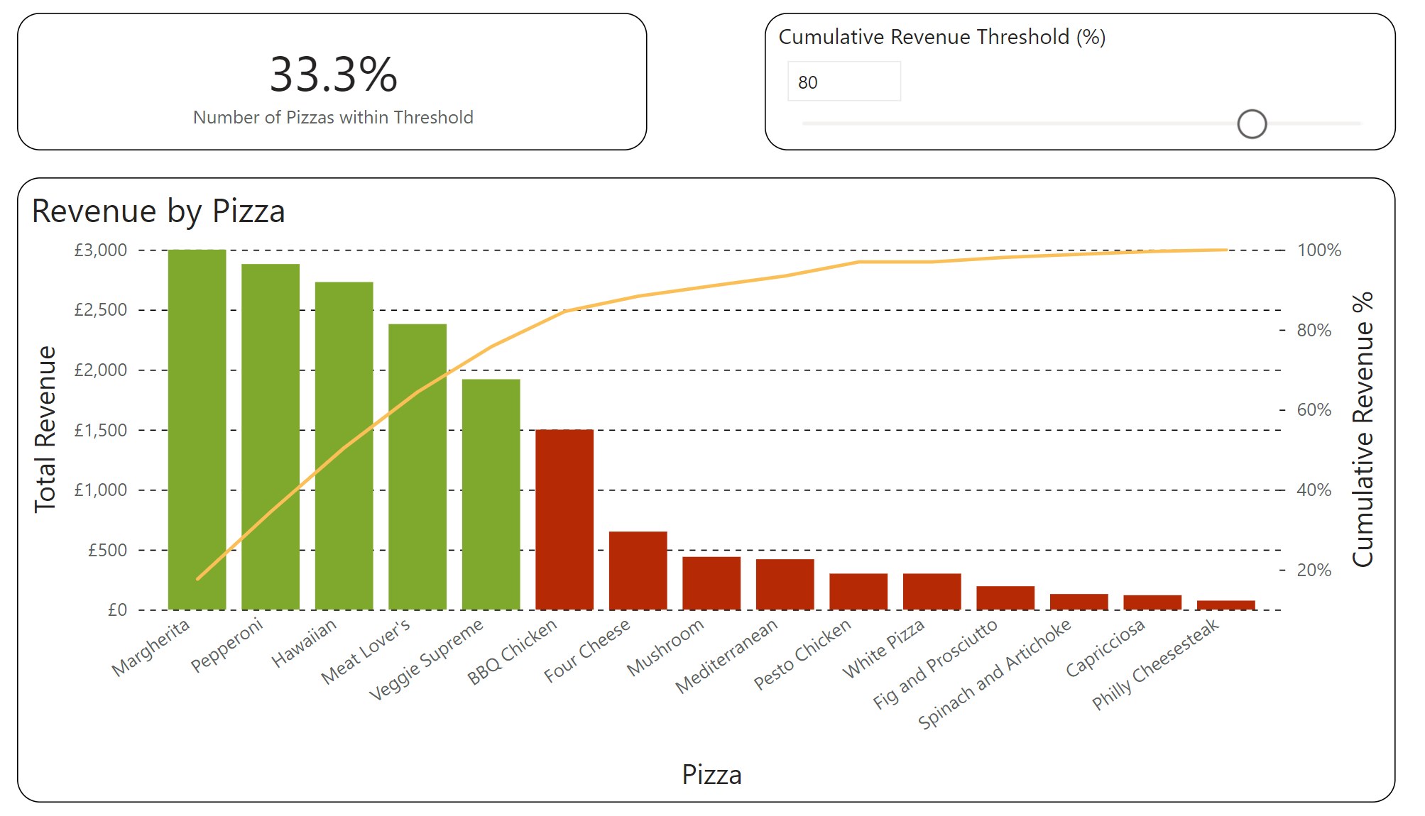
In this blog, we will be creating the chart shown below:
The DAX Expressions
To perform the analysis, we must follow the procedure below:
- Calculate the percentage of total revenue associated with each pizza
- Rank the pizzas in order of percentage of total revenue
- Calculate the cumulative sum of percentage of total revenue in order of rank
For visualisation purposes, we can also add the following two steps:
- Tag whether or not the pizza is within a user-specified threshold
- Calculate the percentage of pizzas within this user-specified threshold
1. Calculate the percentage of total revenue associated with each pizza
As DAX expressions only work with aggregated values, one cannot pass a column without an aggregation assigned to it. Therefore, the first step is to aggregate the Revenue column:
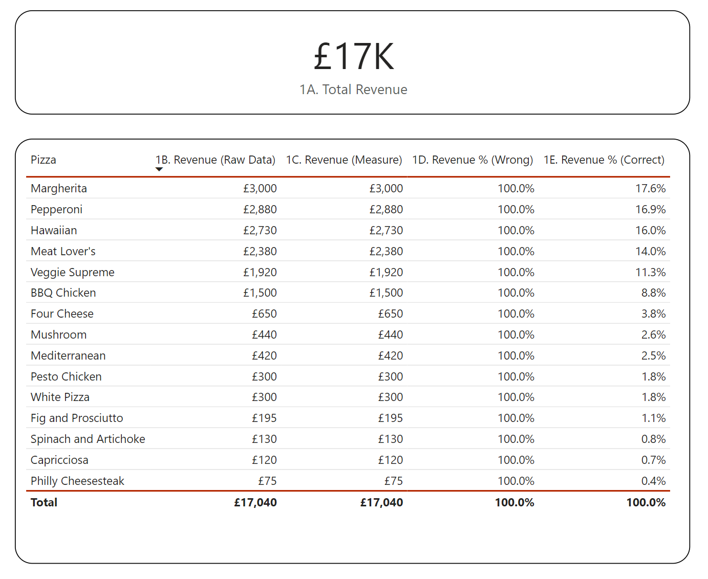
In the table below, it is shown that the Total Revenue measure returns the same values as the raw data: 1B. Revenue (Raw Data) = 1C. Revenue (Measure). However, this is due to the filter context – the presence of the Pizza column in the table visualisation. If the Total Revenue measure was applied to a visualisation with no filters (e.g., the 1A. Total Revenue Card visual) the aggregation effect of this measure can be seen more clearly – £17k is the total revenue generated by all pizzas.
Now, we can calculate the percentage of total revenue associated with each pizza as follows:

Here, we need to use two DAX functions, CALCULATE and ALL to correctly perform the calculation. This is to remove the filter context effect that the Pizza column brings. We can see the effect of these two functions by viewing the difference between 1D. Revenue % (Wrong) and 1E. Revenue % (Correct). In essence, the CALCULATE function calculates the Total Revenue by removing any filters applied to the Pizza table (using the ALL function) – the value it returns is the same as the 1A. Total Revenue Card visual: £17k.
Now, we can calculate the percentage of total revenue associated with each pizza as follows:
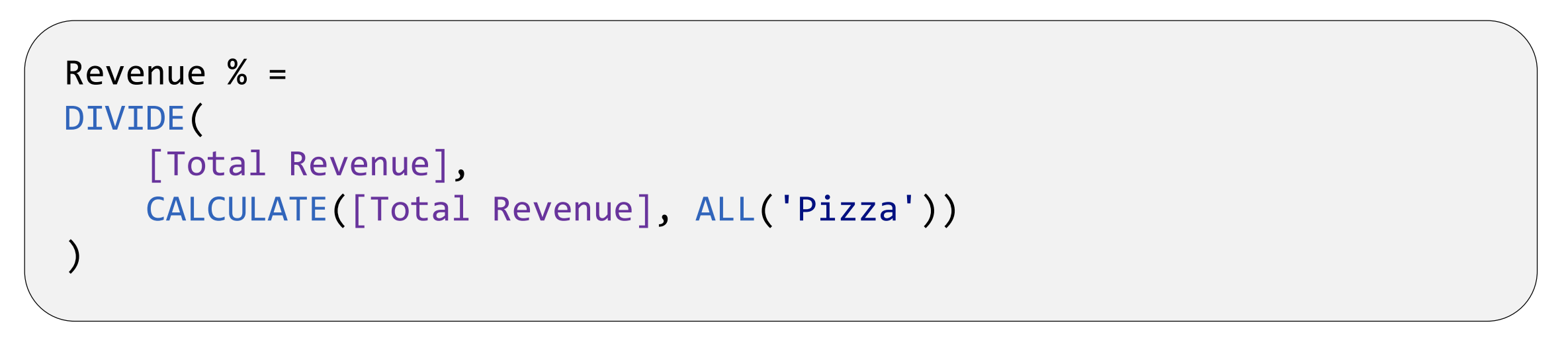
Here, we need to use two DAX functions, CALCULATE and ALL to correctly perform the calculation. This is to remove the filter context effect that the Pizza column brings. One can see the effect of these two functions by viewing the difference between 1D. Revenue % (Wrong) and 1E. Revenue % (Correct). In essence, the CALCULATE function calculates the Total Revenue removing any filters applied to the Pizza table (using the ALL function) – the value it returns is the same as the 1A. Total Revenue Card visual: £17k.
2. Rank the pizzas in order of percentage of total revenue
Although the pizzas are automatically ranked by the table visual, creating a numeric ranking column is useful as it can be used in subsequent DAX calculations. This can be done like so:
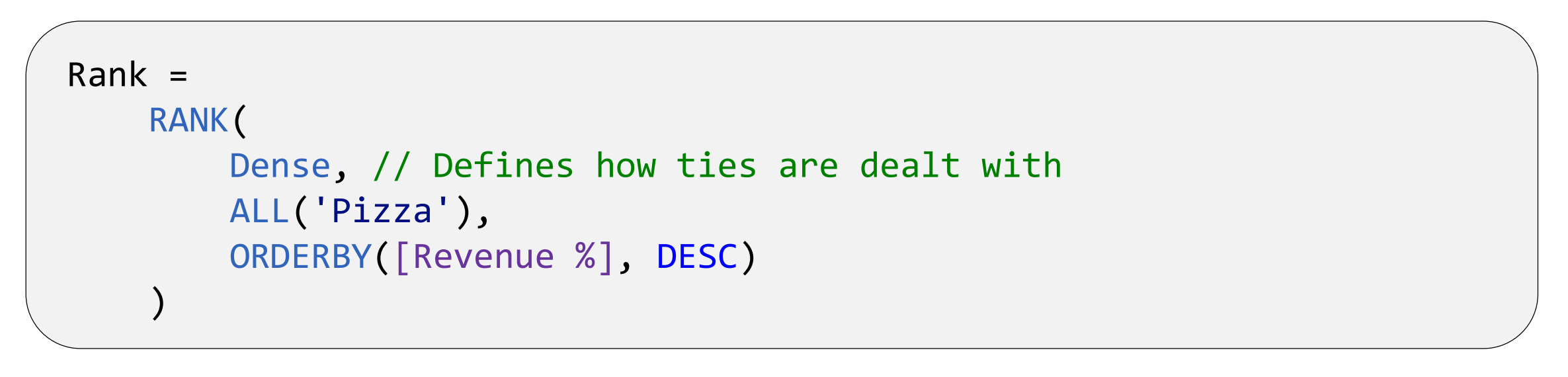
Here, we use the RANK function to rank each pizza’s Revenue % in descending order. The RANK function is relatively new to Power BI – before this, RANKX was used – however RANK is generally favoured as it is easier to fine-tune. For example, it is much easier to do the following with RANK vs. RANKX: Rank relative to Category A; if ties exist, rank ties based on Category B by modifying the ORDERBY statement – see below:

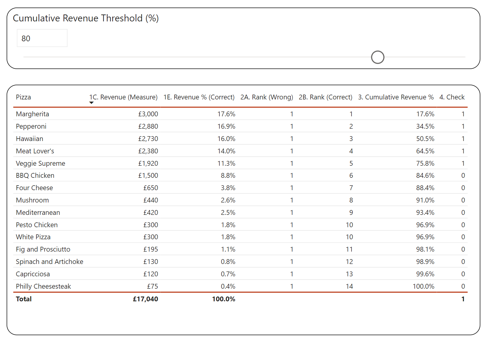
Also, we again use the ALL function to remove the filter context – we can see the effect of this by viewing the difference between 2A. Rank (Wrong) and 2A. Rank (Correct) in the table below.
3. Calculate the cumulative sum of percentage of total revenue in order of rank
To calculate the cumulative sum of Revenue %, we can do the following:
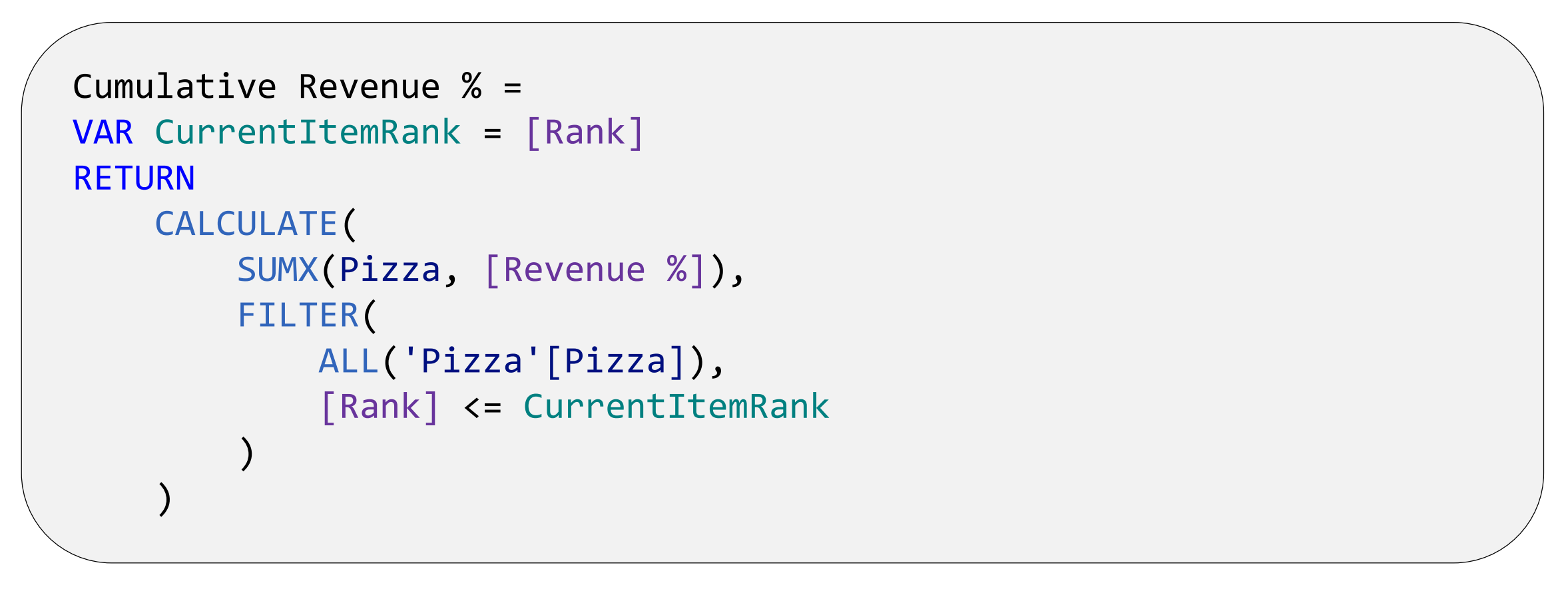
Here, we use the CALCULATE function to sum (using the iterator function, SUMX) the Revenue % within a given filter context (as defined within the FILTER function). The filter context is to sum all values of Revenue % from where the Rank value is less than, or equal to, the Rank value of a specific row (refer back to the table at the end of Step 2).
4. Tag whether the pizza is within a user-specified threshold
One of the key benefits of Power BI is its ability to facilitate user interactivity. We can add a parameter which allows the user to answer the following question: Which pizzas make up X% of the generated revenue? This can be done by adding a Numeric Range parameter within the Modelling tab. After this, a simple conditional statement can be applied: 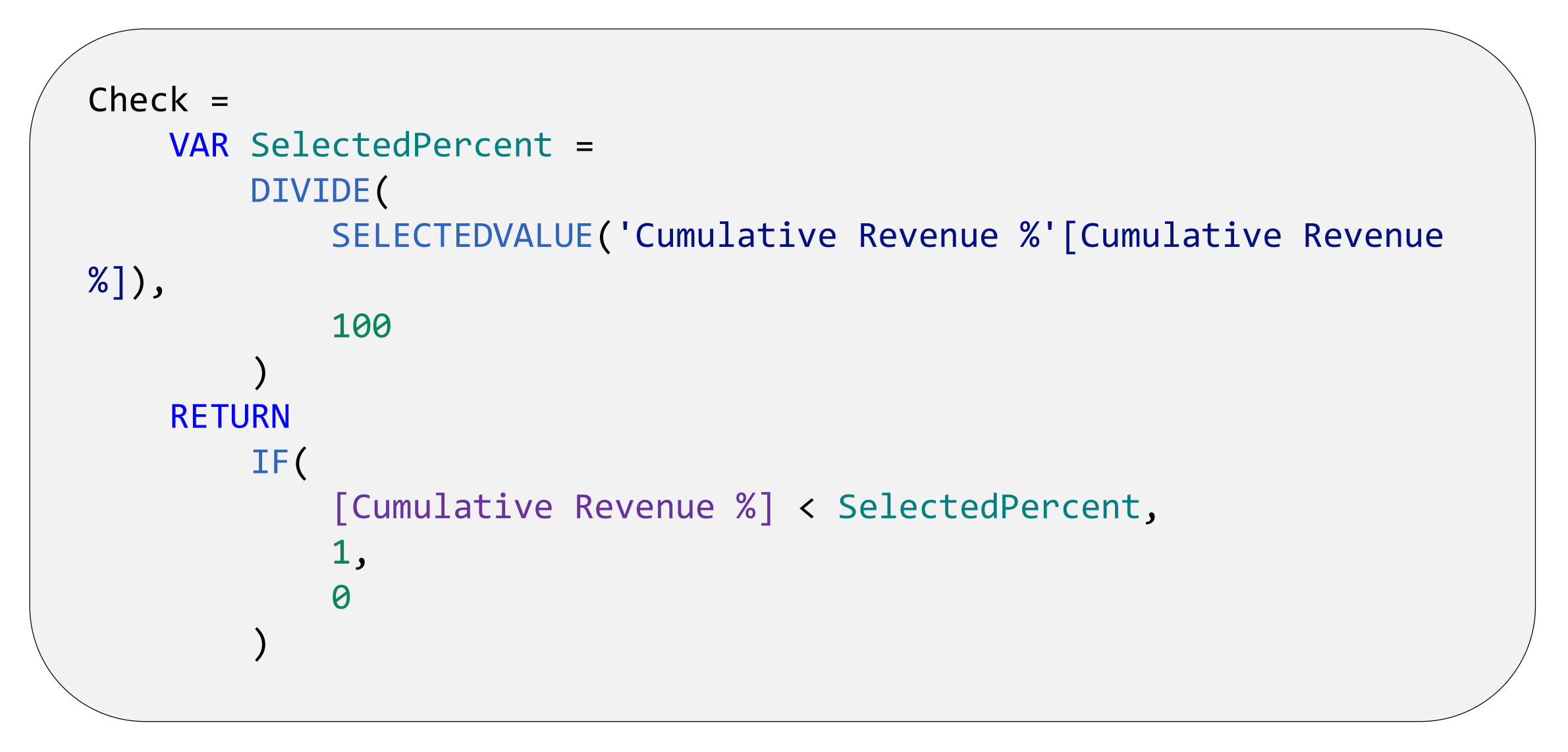
Here, we use the SELECTEDVALUE function to return the user input and check whether it is greater than the Cumulative Revenue % value calculated in Step 3. This can be used to conditionally format visuals, highlighting the pizzas which contribute to X% of the generated revenue (refer back to the table at the end of Step 2).
Although tables are very practical for explanatory purposes, there are better ways to visualise the output. Let’s use a Pareto Chart (Line and Clustered Column chart) to see which pizzas are contributing to the revenue the most:

As we can see, it’s much easier to derive key insights using this chart as opposed to a table. We can see that for Pizza My Heart, only 33.3% of pizzas contribute to 80% of the revenue. If we had data referring to profitability, this analysis could help us understand which Pizzas we should and shouldn’t retain.
The DAX used to calculate the percentage of pizzas within the user-specified threshold is shown below:
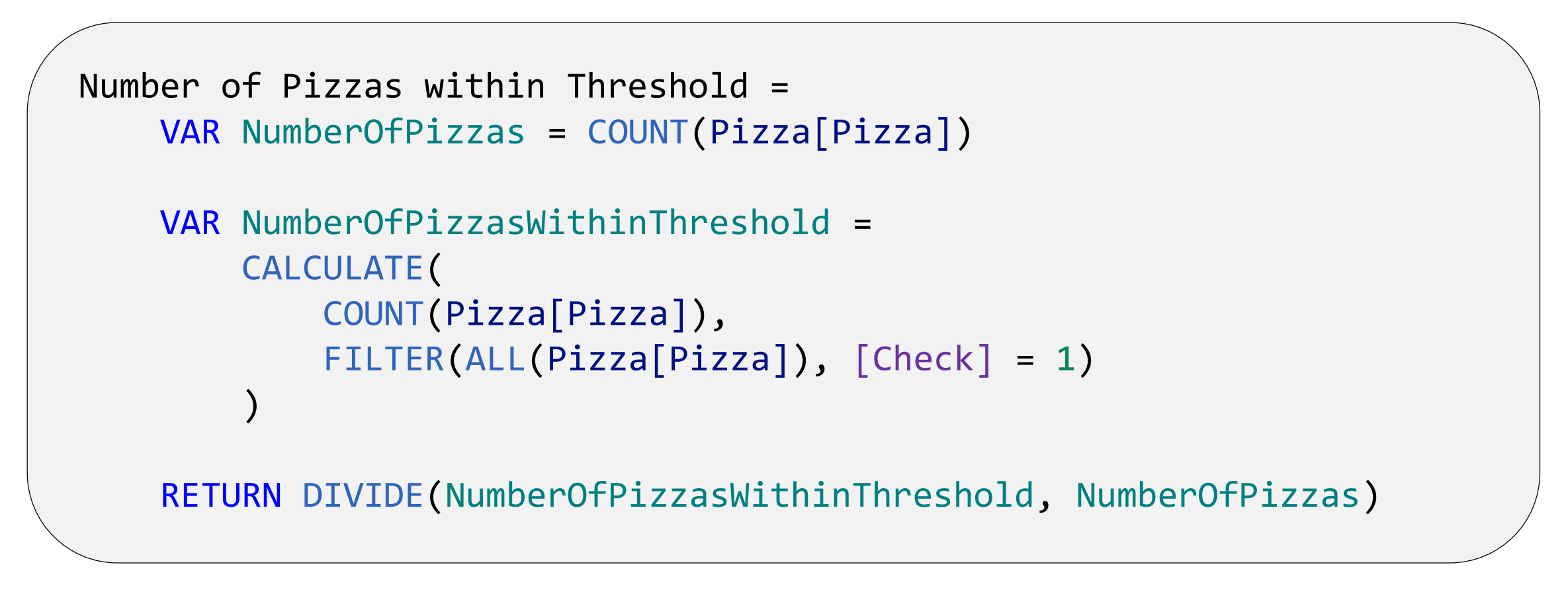
Here, we calculate the total number of Pizzas with the filter context, [Check] = 1 and divide it by the total number of pizzas. Please note, within the equation for NumberOfPizzasWithinThreshold, if NumberOfPizzas is used instead of COUNT(Pizza[Pizza]), the code will return an incorrect answer as the variable NumberOfPizzas refers to a constant value (15), unaffected by any CALCULATE function.
Wrap-up
In this blog, we have discussed the creation of Pareto charts in Power BI and the DAX enabling us to do so. You can now incorporate this new-found knowledge in your own Power BI reports!
Note
The data and Power BI model discussed in this blog can be found here.
Introduction to Data Wrangler in Microsoft Fabric
What is Data Wrangler? A key selling point of Microsoft Fabric is the Data Science
Jul
Autogen Power BI Model in Tabular Editor
In the realm of business intelligence, Power BI has emerged as a powerful tool for
Jul
Microsoft Healthcare Accelerator for Fabric
Microsoft released the Healthcare Data Solutions in Microsoft Fabric in Q1 2024. It was introduced
Jul
Unlock the Power of Colour: Make Your Power BI Reports Pop
Colour is a powerful visual tool that can enhance the appeal and readability of your
Jul
Python vs. PySpark: Navigating Data Analytics in Databricks – Part 2
Part 2: Exploring Advanced Functionalities in Databricks Welcome back to our Databricks journey! In this
May
GPT-4 with Vision vs Custom Vision in Anomaly Detection
Businesses today are generating data at an unprecedented rate. Automated processing of data is essential
May
Exploring DALL·E Capabilities
What is DALL·E? DALL·E is text-to-image generation system developed by OpenAI using deep learning methodologies.
May
Using Copilot Studio to Develop a HR Policy Bot
The next addition to Microsoft’s generative AI and large language model tools is Microsoft Copilot
Apr