There are several reasons why you should design great looking dashboards. Here are a few;
- They make information more accessible – end users benefit from an intuitive design that makes insight easy to obtain so they can make informed decisions.
- They help convey your message – you’re in a better position to tell a coherent story. Applying design principles can also help accentuate your message. My colleague Kalina Ivanova has written an excellent series of blogs on Data Storytelling with Power BI.
- They encourage user adoption – if a report is useful to users and has a great look and feel then you’re winning.
In this blog, I’ll briefly cover the building blocks that make up a good Power BI dashboard. I then explore the stepping stones that will level up your dashboard and take it from good to great.
The examples covered in this blog are taken from the dashboard I helped design as part of the Microsoft Nonprofit Data Warehouse Quickstart solution. To learn more about the Quickstart solution, please visit GitHub or take a look at the Modern Data Warehouse Webinar Series for Nonprofits or take a look at Microsoft’s Blog.
Building Blocks
- Visualizations
- Information
- Filters & Navigation
Visualizations
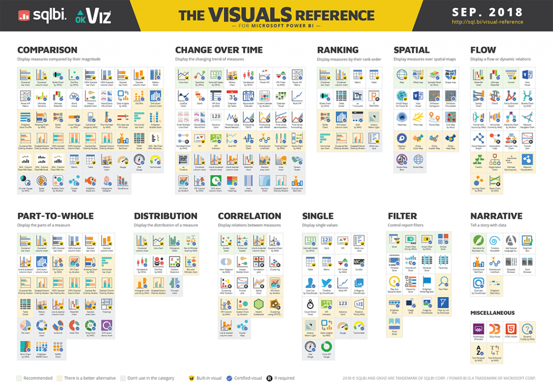
Visualizations are the cornerstone of any dashboard as they allow us to show Patterns, Trends and Outliers within our data. There are different types of visualization you can use depending on the required analysis. See below cheat sheet courtesy of sqlbi.com
Information
Provides additional information about the data/dashboard, it adds a bit of context. The following is a checklist of items that, when added, give the dashboard enough context:
- Titles
- Description of report
- Labelled Axes
- Legend
- Row/Column Table Headers
- Data Labels
- Last refresh data (so users know if they are working with the latest cut of data)
Filter & Navigation
Provides a way for users to slice and dice the data as well as drill into it. Filtering allows users to very easily interact with the data.
Three ways to filter data
Natively
Power BI allows you to Filter data natively, doing so enables you to;
- Apply Filters on the current report page – And all the visual contain therein.
- Apply Filter on all pages in the report – And all the visual contain therein.
Slicer Component
You can add a slicer component from the visualizations pane. This gives you greater control over which visuals the filter is applied on, compared to native filtering. That said, it is marginally less performant.
Cross Filtering
A selection on one chart affects other charts.
Stepping Stones
- Information Processing
- Progressive Disclosure
- C.A.R.P
Information Processing
This is about understanding where to place components on a dashboard, we do so by identifying patterns for reading content.
There are 2 Patterns to consider:
- F-Shaped Pattern
- Z-Shaped Pattern
The F-Shaped Pattern came about through tracking the eye movement of users while reading web content.
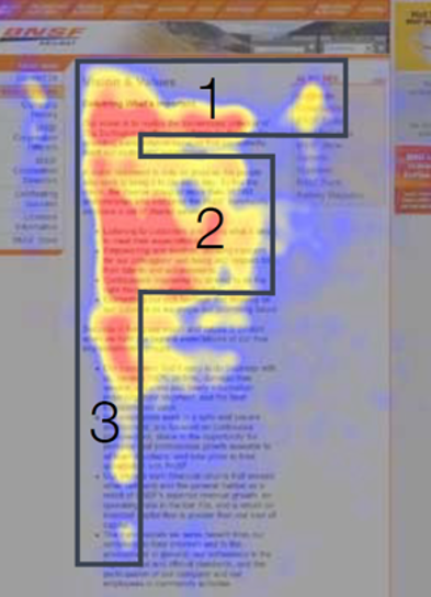
The most important implications of the F-Shaped Pattern are;
- State the most important information in the header section.
- Don’t put important information on the right-hand side of the report.
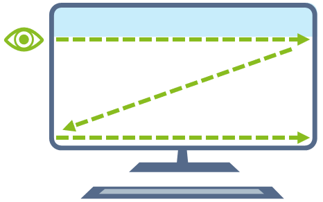
The Z-Shaped Pattern purely comes out of the fact that information is read from left to right (in western cultures)
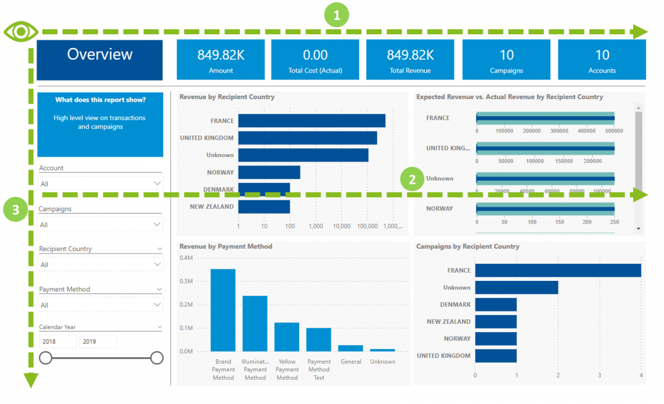
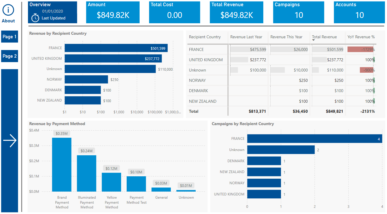
Using the F-Shaped Pattern we can see that the below Dashboard is “F-Shaped”, namely:
- The headline figures (KPIs) are in the “header sections”
- The visualization have been ordered according to how much value they bring, the top two visualizations being the most valuable.
- The Filters have been purposefully placed on the left hand side.
Progressive Disclosure
Progressive Disclosure handles the Designer’s Dilemma. The dilemma is stated as follows; Users want all the features but they want simplicity. In other words, a user wants a dashboard with all the features (charts/visualizations) to handle all their needs. At the same time, they want simplicity, they find it hard to choose between lots of features.
Hick’s Law: The time taken to make a decision increases as the number of choices is expanded.
We handle this dilemma through progressive disclosure.
Definition: Progressive disclosure is an Interaction design technique that helps maintain the focus of a user’s attention by reducing clutter, confusion, and cognitive workload. This improves usability by presenting only the minimum information required for the task at hand.
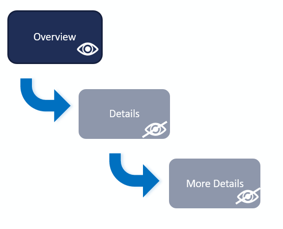
- Initially, show users only a few of the most important visualisations (via overview page/home page)
- Offer a larger set of secondary charts/visualisations if a user requests for them , e.g. by navigating to the appropriate page.
Two rules of progressive disclosure
- Get the right split between initial and secondary features (think about your intended audience)
- Make it obvious how to progress from the primary to the secondary disclosure levels.
C.A.R.P
The following Design Principles that can be applied to create great User Interfaces (UI).
Design Principles
- Contrast
- Alignment
- Repetition
- Proximity
Contrast
The purpose of contrast is to organise the page and make it more interesting. In order to do so, determine what you want the focus to be and use contrast to create the focus.
Expected outcomes;
- Creates a focal point
- Brings out dominant elements
- Creates a hierarchy
Alignment
The purpose of alignment is to unify and organise the screen. Nothing should be placed on the page arbitrarily.
Use the “Grid-lines” & “Snap to grid” features of Power BI when designing your report.
Expected outcomes:
- Organises the screens
- Creates a consistent look.
Repetition
The purpose of repetition is to create consistency and to add visual interest.
Repeat visual elements throughout the report; fonts, font sizes, colours, shapes, textures, spacing, line thickness.
Expected outcomes:
- Organises the screens
- Creates a consistent look.
Proximity
The purpose of proximity is to organise and group the various parts of the UI. All related items should be grouped together so that related items appear as cohesive groups.
Expected Outcomes;
- Improves organisation
- Gives the page a clear structure
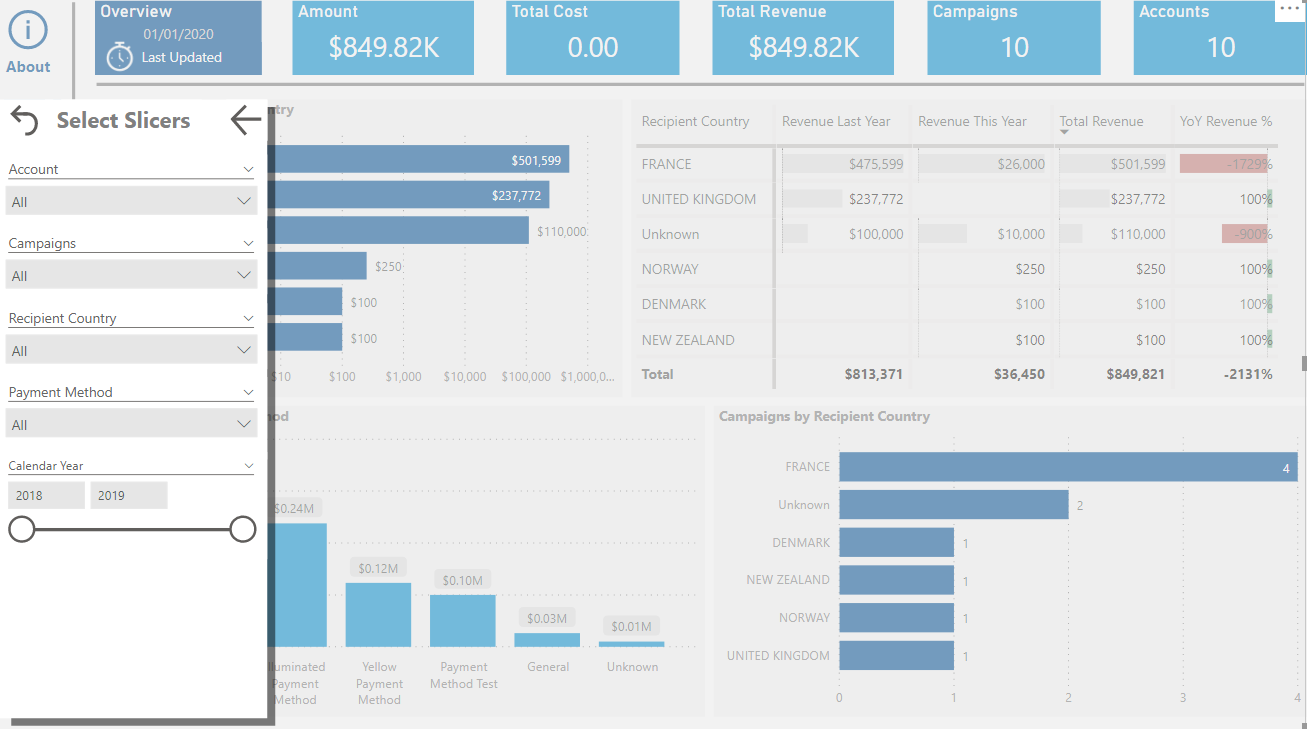
Bonus Tip
This bonus tip is a cherry on top of the cake. By combining some of the tips I previously covered, you’ll add the wow factor to your dashboard. We can combine the ‘Filter & Navigation’ building block together with the ‘Information Processing’ & ‘Progressive Disclosure’ stepping stones and create a pop out navigation bar as shown below. Reid Haven is the architect of this pattern, here is a quick video where he explains the technique.
Introduction to Data Wrangler in Microsoft Fabric
What is Data Wrangler? A key selling point of Microsoft Fabric is the Data Science
Jul
Autogen Power BI Model in Tabular Editor
In the realm of business intelligence, Power BI has emerged as a powerful tool for
Jul
Microsoft Healthcare Accelerator for Fabric
Microsoft released the Healthcare Data Solutions in Microsoft Fabric in Q1 2024. It was introduced
Jul
Unlock the Power of Colour: Make Your Power BI Reports Pop
Colour is a powerful visual tool that can enhance the appeal and readability of your
Jul
Python vs. PySpark: Navigating Data Analytics in Databricks – Part 2
Part 2: Exploring Advanced Functionalities in Databricks Welcome back to our Databricks journey! In this
May
GPT-4 with Vision vs Custom Vision in Anomaly Detection
Businesses today are generating data at an unprecedented rate. Automated processing of data is essential
May
Exploring DALL·E Capabilities
What is DALL·E? DALL·E is text-to-image generation system developed by OpenAI using deep learning methodologies.
May
Using Copilot Studio to Develop a HR Policy Bot
The next addition to Microsoft’s generative AI and large language model tools is Microsoft Copilot
Apr