What are we trying to do?
I recently had a request from a client to have a traffic light indicator in a table visualisation in Power BI. Fine I thought, conditional formatting was released with the November Power BI Desktop update which will be able to handle that nicely. However, a further requirement emerged which was that this conditional formatting must be based on the difference between the values of 2 separate measures. For example, if we have a measure for ‘Sales Amount’ and a second measure for ‘Sales Amount Last Month’ we would need a traffic light indicator showing green, yellow and red if the Sales Amount was more, equal to or less than Sales Amount Last Month respectively. My initial thought for this problem was actually fairly positive, I had worked with conditional formatting in Power BI and KPIs in SSAS before so I had a plan of attack, however when I had a quick search online I couldn’t find any posts about this being done before. Luckily my initial feeling proved correct and this is very easy to achieve!
How we did it
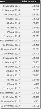
I first imported a very simple data set with ‘Date’ and ‘Sales Amount’ columns:
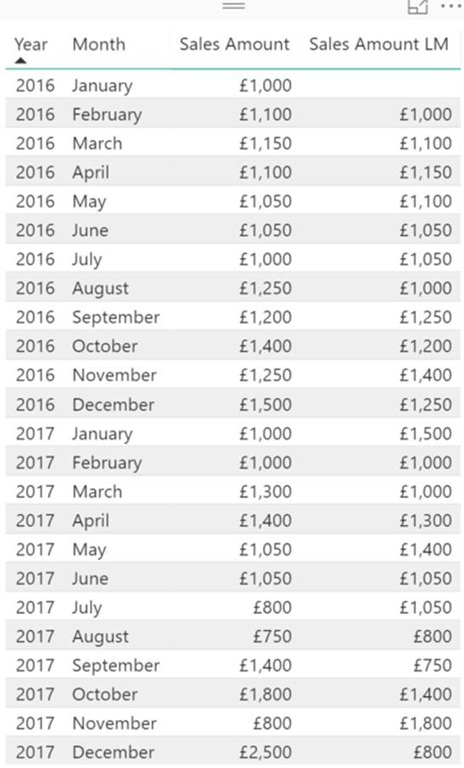
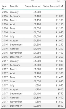
Next, I created a measure to calculate the Sales Amount for the previous month:
Sales Amount LM = CALCULATE(SUM(Sales[Sales Amount]),PREVIOUSMONTH(Sales[Date].[Date]))
Now I needed to create a third measure which would act as my traffic light indicator. All this measure needs to do is show a value which can be used to calculate the difference between ‘Sales Amount’ and ‘Sales Amount LM’ which can in-turn be used to indicate the difference for a conditional formatting range. This of course can simply be ‘Sales Amount’ minus ‘Sales Amount LM’:
Indicator = SUM(Sales[Sales Amount]) – ‘Sales'[Sales Amount LM]
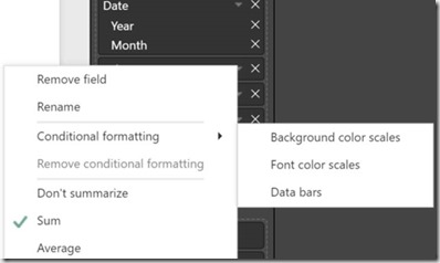
From here it is simply a case of applying the conditional formatting to the ‘Indicator’ measure. In case you haven’t done this before you first click on the drop-down arrow for your measure you wish to conditionally format and then select ‘Conditional formatting’:
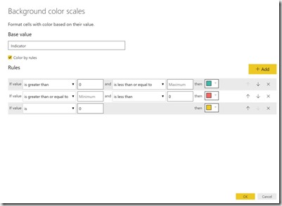
Here are the settings I chose for ‘Background color scales’:
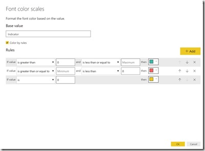
Here are the settings I chose for ‘Font color scales’:
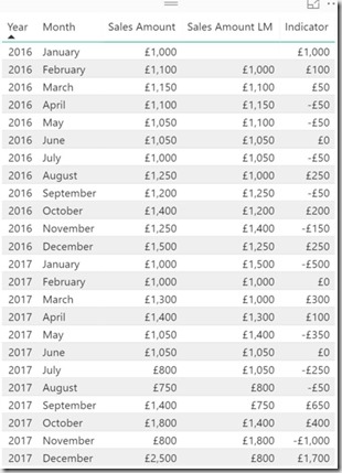
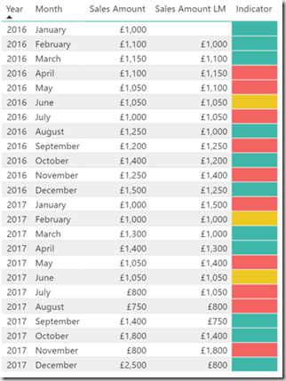
After applying those settings to our ‘Indicator’ measure we arrive at the following for our table visualisation:
And that’s it! Of course, this can be used in a number of different ways if you needed a different type of value comparison or a different range for your conditional formatting but this should help get you started.
As always, any comments or thoughts are very welcome.

Introduction to Data Wrangler in Microsoft Fabric
What is Data Wrangler? A key selling point of Microsoft Fabric is the Data Science
Jul
Autogen Power BI Model in Tabular Editor
In the realm of business intelligence, Power BI has emerged as a powerful tool for
Jul
Microsoft Healthcare Accelerator for Fabric
Microsoft released the Healthcare Data Solutions in Microsoft Fabric in Q1 2024. It was introduced
Jul
Unlock the Power of Colour: Make Your Power BI Reports Pop
Colour is a powerful visual tool that can enhance the appeal and readability of your
Jul
Python vs. PySpark: Navigating Data Analytics in Databricks – Part 2
Part 2: Exploring Advanced Functionalities in Databricks Welcome back to our Databricks journey! In this
May
GPT-4 with Vision vs Custom Vision in Anomaly Detection
Businesses today are generating data at an unprecedented rate. Automated processing of data is essential
May
Exploring DALL·E Capabilities
What is DALL·E? DALL·E is text-to-image generation system developed by OpenAI using deep learning methodologies.
May
Using Copilot Studio to Develop a HR Policy Bot
The next addition to Microsoft’s generative AI and large language model tools is Microsoft Copilot
Apr