In September’s Power BI Desktop release, one of Microsoft’s announcements was a new offering of Themes. My previous blog back in March 2017 explained what a Theme could (or couldn’t!) do, but I am pleased to say Microsoft listened to the community and have improved it greatly.
Originally, we were limited to setting a few page or chart colours – mainly tables and matrices. Appreciated this was a first release from Microsoft, but it’s safe to say I was left uninspired. The good news is Themes can now do a lot more, including:
– Set the font size for specific charts e.g. 14
– Set visuals to use a specific font type style e.g. Calibri
– Turn off/on chart data labels
– Set default property values for a chart
– “*” functionality that will apply a specific property across all charts
This blog will focus on how to not only use the new features, but how they can be brought together to form a larger, organizational configuration file.
If you would like to follow my examples, please ensure you have downloaded the latest version of Power BI Desktop – found here.
New JSON
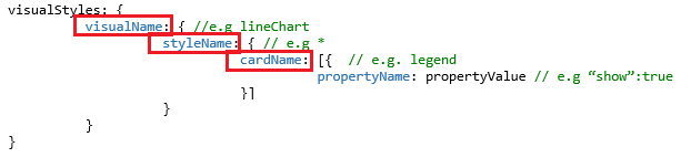
In order to extend the Adatis Theme, a new section called visualStyles must be added to the JSON. The format is as follows:

The highlighted JSON sections give you the ability to use ‘*’ syntax, which means the Theme format will apply to everything underneath it. This is useful for things if you want to apply a global font size across the entire report, rather than needing to configure every chart/visual.
Now, let’s pick a simple use case. Client A requires the following to always be applied to a Pie Chart in Power BI Desktop:
– Switch on the Pie Chart Legend
– Set Text Size to 14
– Set Font Family to Calibri Light.
Default Pie Chart:

– By design, Legends are turned off.
The configuration file is tweaked to contain the new JSON – highlighted in yellow.
{
“name”: “Adatis”,
“dataColors”: [ “#002C5C”, “#006FBA”, “#81C341”, “#F4AA00”, “#003876”, “#00448F”, “#0051A9”, “#007ED4”, “#008DED”, “#74B238”, “#8EC954”, “#DB9800”, “#FFB60F” ],
“background”: “#FFFFFF”,
“foreground”: “#002C5C”,
“tableAccent”: “#81C341”,
“visualStyles”: {
“pieChart”: {
“*”: {
“legend”: [
{
“show”: true,
“fontSize”: 14,
“fontFamily”: “Calibri Light”
}
]
}
}
}
}
The final step is to import the modified JSON file, resulting in a completely different looking Pie Chart.
Applied Theme:

1. The traditional Adatis chart colours have been applied.
2. A Legend is visible – in both the properties pane and the visual itself.
3. Font family and Text Size are updated.
Adatis Theme Extended
I will now add some additional configurations to the Adatis Themes file.
– Turn On all Chart Legends.
– Pie Chart Label Style set to Percent of Total.
– Set Card Label and Category Label Font Size to 12, but all other visuals use 10.
This changes the JSON code significantly, but by following the visualStyles format, this was more straightforward than it seems.
{
“name”: “Adatis”,
“dataColors”: [ “#002C5C”, “#006FBA”, “#81C341”, “#F4AA00”, “#003876”, “#00448F”, “#0051A9”, “#007ED4”, “#008DED”, “#74B238”, “#8EC954”, “#DB9800”, “#FFB60F” ],
“background”: “#FFFFFF”,
“foreground”: “#002C5C”,
“tableAccent”: “#81C341”,
“visualStyles”: {
“*”: {
“*”: {
“*”: [
{
“fontSize”: 10,
“fontFamily”: “Calibri”
}
],
“legend”:[{
“show”:true
}]
}
},
“card”: {
“*”: {
“labels”: [
{
“fontSize”: 12
}
],
“categoryLabels”: [
{
“fontSize”: 12
}
]
}
},
“pieChart”: {
“*”: {
“labels”: [
{
“labelStyle”: “Percent of total”
}
]
}
}
}
}
The report is significantly different. I will pinpoint a specific area of the report to illustrate where the configurations occurred.
Before:

After:

1. Global font size is set to 10.
2. Percent of Total setting applied to Pie Charts.
3. Category Labels and Labels set to font size 12 for all Cards.
What else can Themes do?
This article is only scratching the surface at what Power BI Themes can now do. Click here to find the extensive list of properties that can be configured. It is worth mentioning that if you have limited JSON experience, some of the configurables can be a little tricky to set up. However, there are quite a few blogs out there that can get anyone up to speed, which I will further provide below.
Limitations
There are a couple of limitations, as well some things I have experienced:
– Debugging JSON (natively within Power BI) is not supported and a syntax error occurs. Power BI will give you a generic error message like below:

– Data configurations are not supported
· This is understandable, though. Every report tab contains different slices or filtering of data, but colours, fonts and chart properties tend to remain the same.
– Setting Card font and background colours does not appear to be possible yet. Or at least I have been unable to get it to work or find any supporting documentation from Microsoft to suggest it is.
– Overriding a Theme
· Individually changing a chart property will override the Theme JSON file. I was caught out by this and couldn’t understand why the configuration wouldn’t change on a Pie Chart.
· To get around this, use Revert to default within a chart property and it will re-apply the Theme. This option exists in each top-level chart property – see example below.

Further Reading
o Jason Lengstorf’s JSON Blog – http://bit.ly/2aU1OHS
o Power BI Desktop September Update – http://bit.ly/2y1QLWe
o Power BI Report Themes BI Blog – http://bit.ly/2mPq69l
o Themes Gallery (containing example JSON files) – http://bit.ly/2pyUKpl
Contact Me
If you would like a copy of the PBIX workbook/JSON Theme file or have any general questions, feel free to leave a comment below. I am particularly interested to see what Theme files other people have created and if there any other known limitations.
Twitter: @DataVizWhizz


Hi there! Would you mind if I share your blog with my facebook group?
There’s a lot of folks that I think would really appreciate
your content. Please let me know. Cheers
Thanks very nice blog!