In my last post, I showed a dashboard in SSRS 2005 that included sparklines, inline bar charts and bullet charts. As I mentioned there is good MSDN article on how to do inline charts but the Bullet chart took a little more thought.
As one of my colleagues has pointed out, these aren’t bullet charts in the truest sense that Stephen Few designed them as they don’t show the “bullet’s path” running through them, however I think they serve the same purpose albeit in a simplistic way
The charts are made using 100% stacked bars with three data values for each “zone” of your chart:
- The section below your marker;
- The marker itself (which of course only shows if it falls in that zone); and
- The section above your marker.
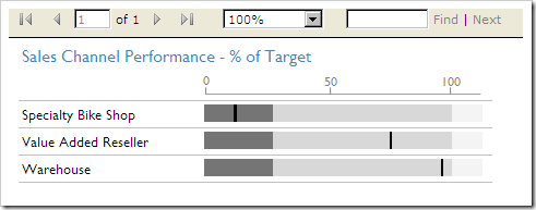
So in the Speciality Bike Shop row in the example above, the three values that add up to the first zone of 25 are 11, 1 and 13 with the colour set as Dark Grey, Black and Dark Grey respectively. Whereas as Value Added Reseller is made up of three zones with values 0, 0 and 25
Likewise, the 2nd zone for Speciality Bike Shop is made up of 0, 0 and 64 whereas VAR is 42, 1 and 22 this time with light grey, black, light grey
So how do we come with the numbers? It’s just a case of calculating the size of the zones as a percentage of the whole and deciding whether the marker should show. Lets follow the MDX query through to explain
First lets define our key measures: the zone limits, and the actual value for our marker. I’m using constants for the zone sizes but you could easily have this coming from your data:
WITH
//replace this constant with your Zone 1 measure
MEMBER [Measures].[Zone1] AS
     300000

//replace this constant with your Upper Zone 2 measure
MEMBER [Measures].[Zone2] AS
     1067000

//replace this constant with your Upper Zone 3 measure
MEMBER [Measures].[Zone3] AS
     1200000

//Actual measure
MEMBER [Measures].[Actual] AS
    [Measures].[Reseller Sales Amount]
Next we need to calculate which zone the marker will fall in – we set a boolean for each which is also used as the marker for the chart.
//Are we in the zone 1
MEMBER [Measures].[ShowZone1Marker] AS
    IIF(
        [Measures].[Actual] < [Measures].[Zone1],
        1,
        0
    )
//Are we in Zone 2
MEMBER [Measures].[ShowZone2Marker] AS
    IIF(
        ([Measures].[Actual] >= [Measures].[Zone1]
        AND
        [Measures].[Actual] < [Measures].[Zone2]),
        1,
        0
    )

//Are we in Zone 3
MEMBER [Measures].[ShowZone3Marker] AS
    IIF(
        [Measures].[Actual] >= [Measures].[Zone2],
        1,
        0
    )
Then we need to calculate the size of the lower and upper parts of each zone, lower first:
MEMBER [Measures].[Zone1a] AS
    (([Measures].[Actual]) * [Measures].[ShowZone1Marker]
    /
    [Measures].[Zone3]
    *
    100)
    -
    ([Measures].[ShowZone1Marker] * [Measures].[ShowZone1Marker])
the logic is:
The actual value subtract the previous zone limit (not required in zone 1), multiplied by the boolean value of whether or not the marker falls in this zone as a percentage of the whole chart. The bottom line removes one from the value to allow for the marker.
The upper part of zone 1:
MEMBER [Measures].[Zone1b] AS
    ([Measures].[Zone1] - ([Measures].[Actual] * [Measures].[ShowZone1Marker]))
    /
    [Measures].[Zone3]
    *
    100
this time the logic is:
the zone size subtract the actual value multiplied by the boolean value of whether or not the marker falls in this zone as a percentage of the whole chart.
Repeat the same for subsequent zones and then bring it all together in a select statement on your cube
Just in case I’ve explained all this as badly as I think I have, you can download the sample project and have a look yourselves: BulletCharts.zip (7.42 kb)
And the scale – errr OK in case you hadn’t already guessed, it’s an image on the column header – hey what more do you want?the moon on a stick? 😉 You can size the chart to fit the scale or create your own image. The image is also included in the sample project.
All criticism/suggestion for improvement welcome.
Introduction to Data Wrangler in Microsoft Fabric
What is Data Wrangler? A key selling point of Microsoft Fabric is the Data Science
Jul
Autogen Power BI Model in Tabular Editor
In the realm of business intelligence, Power BI has emerged as a powerful tool for
Jul
Microsoft Healthcare Accelerator for Fabric
Microsoft released the Healthcare Data Solutions in Microsoft Fabric in Q1 2024. It was introduced
Jul
Unlock the Power of Colour: Make Your Power BI Reports Pop
Colour is a powerful visual tool that can enhance the appeal and readability of your
Jul
Python vs. PySpark: Navigating Data Analytics in Databricks – Part 2
Part 2: Exploring Advanced Functionalities in Databricks Welcome back to our Databricks journey! In this
May
GPT-4 with Vision vs Custom Vision in Anomaly Detection
Businesses today are generating data at an unprecedented rate. Automated processing of data is essential
May
Exploring DALL·E Capabilities
What is DALL·E? DALL·E is text-to-image generation system developed by OpenAI using deep learning methodologies.
May
Using Copilot Studio to Develop a HR Policy Bot
The next addition to Microsoft’s generative AI and large language model tools is Microsoft Copilot
Apr