Don’t tell MSFT I said this but this is really quite cool:
http://code.google.com/apis/chart/
The Google charts API allows you to create charts as a web page by simply setting the querystring:
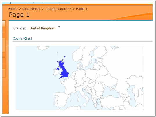
If you use it in conjunction with a simple web page that is picking up the parameters from a PPSM filter (like Nick B has created here) you’ve got some instant functionality – e.g. display the country/state you’ve filtered on. Here, I’ve taken Nick’s example and built the response.redirect statement to include the country code from a tabular data source based on the parameter selected:
Taking it a step further you could create a custom report type using the SDK for PPSM that connects to one of the built in data sources and prepares a querystring.
The main drawback is of course that you need an Internet connection to display the charts. Another drawback is that there is a limit to length of a querystring so thousands of data points is not possible (nor should it be allowed in charts!!) but other than that this a definitely a short-term solution to some of the <whispers!> shortcomings of the built-in PPSM V1 chart.
Introduction to Data Wrangler in Microsoft Fabric
What is Data Wrangler? A key selling point of Microsoft Fabric is the Data Science
Jul
Autogen Power BI Model in Tabular Editor
In the realm of business intelligence, Power BI has emerged as a powerful tool for
Jul
Microsoft Healthcare Accelerator for Fabric
Microsoft released the Healthcare Data Solutions in Microsoft Fabric in Q1 2024. It was introduced
Jul
Unlock the Power of Colour: Make Your Power BI Reports Pop
Colour is a powerful visual tool that can enhance the appeal and readability of your
Jul
Python vs. PySpark: Navigating Data Analytics in Databricks – Part 2
Part 2: Exploring Advanced Functionalities in Databricks Welcome back to our Databricks journey! In this
May
GPT-4 with Vision vs Custom Vision in Anomaly Detection
Businesses today are generating data at an unprecedented rate. Automated processing of data is essential
May
Exploring DALL·E Capabilities
What is DALL·E? DALL·E is text-to-image generation system developed by OpenAI using deep learning methodologies.
May
Using Copilot Studio to Develop a HR Policy Bot
The next addition to Microsoft’s generative AI and large language model tools is Microsoft Copilot
Apr