
Pre-Requisites
- Terraform
- VS-Code
- Terraform Extensions in VS-Code
Overview
An interesting and useful module that comes with Terraform is “Graph”, and in a nutshell, this feature allows you to visually represent the infrastructure defined in your Terraform code in a diagram. This module in my opinion is a really great feature to have because it allows another layer of understanding to really see how your infrastructure looks before any such deployments are committed.
In this blog, I’m using an example deployment of some common Azure services.
So how does it look ?
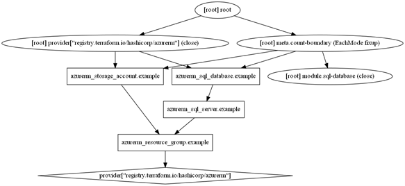
As can be seen from the image above we have every resource that is defined in the Terraform code that is to be deployed. At a first glance, it does appear that not all the information here is of such relevance, for example, the metadata referring to registry or root provider. However, if we look away from this we can begin to see how the Infrastructure model is going to look once it has been deployed.
We can see that we have one resource group called “example” which has an Azure SQL Server and also an Azure Storage account also both called “example” and that all of these resources directly link to the resource group. I would also point out that you can also see that Azure SQL database directly links to the SQL server giving a clear indication of which databases belong to which server.
When deploying only a few resources into one resource group we may not see the full benefit of this. However, when deploying multiple resources into multiple resource groups this will provide a great visualisation of knowing where objects are going to be deployed to. Furthermore, if you have already deployed your infrastructure you can use the same commands to get an up-to-date representation of how your infrastructure environment looks.
How do I get it?
This blog is assuming you have Terraform installed (if you haven’t please refer to the Terraform site on how to do this). In addition to this, you will need to install Visual Code from the following link https://code.visualstudio.com/.
Once these tools are installed you then must install the following package https://graphviz.org/download/ (find the appropriate operating system for you).
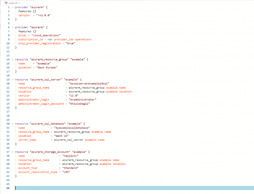
When you have all the appropriate tools installed and you have your Terraform project opened as below:
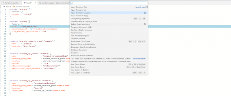
You can then create the graph visualisation my selecting Ctrl+Shift+P, which will list the Terraform commands shown below:
Once your command has run you will see on the left-hand pane that a PNG file has now been created in the directory that your Terraform files are stored in. Alternatively, another way in which you can output the graph is to run the following command line commands:
- terraform .graph > base.not
- terraform graph | dot -Tsvg > graph.svg
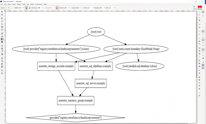
This will then output the file to svg format which can then be opened with tools such as “InkView” and be represented as shown below:
To summarise, if you are developing a complex (or even simple) infrastructure and want a visual representation of how the environment is going to look, prior to making any deployment commitments. Or if you want a visual representation of a deployment that has already been created, then Terraform graph provides a great way to visualise and understand the components being installed. The output of the tool isn’t very visually appealing so it isn’t suitable for presenting back to clients. So, I would be interested to know if there is a way to customise the appearance of the output and filter out unnecessary elements.
If you enjoyed this blog, please check out our other blogs here.
Introduction to Data Wrangler in Microsoft Fabric
What is Data Wrangler? A key selling point of Microsoft Fabric is the Data Science
Jul
Autogen Power BI Model in Tabular Editor
In the realm of business intelligence, Power BI has emerged as a powerful tool for
Jul
Microsoft Healthcare Accelerator for Fabric
Microsoft released the Healthcare Data Solutions in Microsoft Fabric in Q1 2024. It was introduced
Jul
Unlock the Power of Colour: Make Your Power BI Reports Pop
Colour is a powerful visual tool that can enhance the appeal and readability of your
Jul
Python vs. PySpark: Navigating Data Analytics in Databricks – Part 2
Part 2: Exploring Advanced Functionalities in Databricks Welcome back to our Databricks journey! In this
May
GPT-4 with Vision vs Custom Vision in Anomaly Detection
Businesses today are generating data at an unprecedented rate. Automated processing of data is essential
May
Exploring DALL·E Capabilities
What is DALL·E? DALL·E is text-to-image generation system developed by OpenAI using deep learning methodologies.
May
Using Copilot Studio to Develop a HR Policy Bot
The next addition to Microsoft’s generative AI and large language model tools is Microsoft Copilot
Apr