I thought I’d share my findings on this subject when I was unable to find an example. You can adjust the width of all columns in a chart to the same size by modifying the chart series attribute called PointWidth, which can be found here.
This post will show you how to adjust each column with a different width for a stacked column chart.
Requirement
This was a client request who wanted to use a column chart to identify potential customers, either new or existing for a particular product.
A typical report requirement will read:
- As a Marketing Analyst, I want to identify the potential for sales of new customers and existing customers following the launch of a new product. So that we can increase overall sales by X amount with a more effective campaign.
An example of the report is below.

Dataset
The dataset that allows the comparison of Customer Sales Size Percentage against the Customer Segment Size Percentage for a particular product is in the following data table.
| ID | AgeBand | CustomerSalesSizePerc | CustomerSizePerc | Gender | Product |
|
1 |
U16 |
60 |
10 |
M |
X |
|
2 |
16-24 |
40 |
25 |
M |
X |
|
3 |
25-34 |
35 |
35 |
M |
X |
|
4 |
35-44 |
15 |
15 |
M |
X |
|
5 |
45-60 |
10 |
10 |
M |
X |
|
6 |
60+ |
2 |
5 |
M |
X |
So for ID=1, 10% of all male customers are in the age band U16. 60% of these males have purchased product X for a given period. And so on.
Reporting Services (RS) – Varying Column Report
In RS create a dataset as above. Add a Stacked Column chart and link the dataset to the chart.

Click on the edge of the chart to show the Chart Data window. Add the Customer Sales Size Percentage to the value pane and add Age Band to the category group pane and series group pane.

A category for each age band will be created from U16 to 60+. We must also add age band to the series group to be able to modify the column properties.
Bring up the age band category group properties window. By default “General” will be highlighted in the left pane. Click the fx icon to the right of the label text box. Add the following to the expression window.
- =Fields!AgeBand.Value & ” ( ” & Fields!CustomerSizePerc.Value & ” % )”
In the left pane highlight “Sorting” and sort by ID. Now bring up the age band series group properties window and also sort by ID.
Lets preview the chart (text has been added to the title, y-axis and x-axis).

Although we have added the male percentage population to the age band category, it still isn’t evident which of the age bands has a higher or lower population percentage.
Adjust Columns Width
A particular column width can be adjusted using the PixelPointWidth attribute found in the chart series custom attributes.
We adjust the width of a column by specifying it’s width in pixels.

A switch function is used to specify the column pixel width for each column (age band).
The width of a column is measured in pixels. To ensure the columns are in proportion with one another, I have multiplied the customer size percentage by a factor of 2. The column sizes are relative to the size of your chart and therefore need to be calculated correctly. Otherwise you will notice either large gaps between columns or overlapping.
Add the following expression to the PixelPointWidth expression window:

=Switch(
Fields!Id.Value=1, Fields!CustomerSizePerc.Value*2
,Fields!Id.Value=2, Fields!CustomerSizePerc.Value*2
,Fields!Id.Value=3, Fields!CustomerSizePerc.Value*2
,Fields!Id.Value=4, Fields!CustomerSizePerc.Value*2
,Fields!Id.Value=5, Fields!CustomerSizePerc.Value*2
,Fields!Id.Value=6, Fields!CustomerSizePerc.Value*2)
Lets preview our chart now.

We can now see there is potential for new customers for the age band U16. There is also potential for existing customers for the age bands 16-24 and 25-34. Less potential for the remaining age bands.
Summary
Hopefully this has shown a very neat and simple solution to compare segmented customer sizes for there uptake of a particular product. More time was spent writing the query to generate the required dataset, then building the chart.
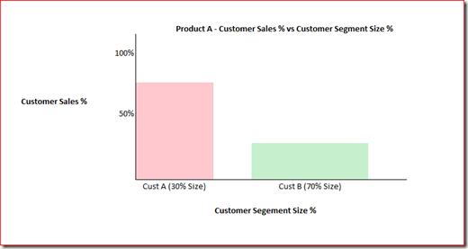
What about a Column Chart?
You might be wondering why I didn’t use a column chart? I did. Although the result was similar it was not aesthetically pleasing. The more I increased the PixelWidthPoint factor the more unpleasant it became.
As we must use age band in both groups of the category and series, the column chart will try and evenly distribute six columns per age band horizontally. You can set the space between bars to zero but this applies to the category level and not the series.
When you try to apply the expression above for the PixelWidthPoint the bars are either overlapping or out of proportion. The column chart example is below.

Introduction to Data Wrangler in Microsoft Fabric
What is Data Wrangler? A key selling point of Microsoft Fabric is the Data Science
Jul
Autogen Power BI Model in Tabular Editor
In the realm of business intelligence, Power BI has emerged as a powerful tool for
Jul
Microsoft Healthcare Accelerator for Fabric
Microsoft released the Healthcare Data Solutions in Microsoft Fabric in Q1 2024. It was introduced
Jul
Unlock the Power of Colour: Make Your Power BI Reports Pop
Colour is a powerful visual tool that can enhance the appeal and readability of your
Jul
Python vs. PySpark: Navigating Data Analytics in Databricks – Part 2
Part 2: Exploring Advanced Functionalities in Databricks Welcome back to our Databricks journey! In this
May
GPT-4 with Vision vs Custom Vision in Anomaly Detection
Businesses today are generating data at an unprecedented rate. Automated processing of data is essential
May
Exploring DALL·E Capabilities
What is DALL·E? DALL·E is text-to-image generation system developed by OpenAI using deep learning methodologies.
May
Using Copilot Studio to Develop a HR Policy Bot
The next addition to Microsoft’s generative AI and large language model tools is Microsoft Copilot
Apr