Update: Nick Barclay has made some nice tweaks to the sample here
Whenever I’m reading Visualisation books and in particular the best practice examples, I always find myself wondering whether:
a) it’s possible with Reporting Services? and
b) it can look as good with Reporting Services?
and this was the case whilst I finally got round to starting to read Few’s new book Now You See It. One of the key principles of data visualisation is “Compared to What?”. It’s all very well presenting the information in a clear fashion but without context it’s hard to argue it’s worth.
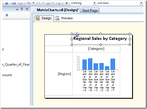
The use of a matrix of charts (lattice charts, trellis charts) allows the eye to very easily compare data both horizontally and vertically. This method of display is also known as “Small Multiples” – a term coined by Tufte in his book – Envisioning Information. These charts also allow you to easily add additional dimensions to a two-dimensional display.
I’m sure many of you will have used SSRS inline-charts before in a table (my bullet chart examples use this method) but it’s also possible to do this with the matrix object as well. I’m not going to explain in detail the method to produce in-line charts in SSRS as it’s well documented already in this msdn article but in summary you simply set up your matrix with the appropriate row and column groupings, design your chart outside of the matrix then when it’s ready simply drop it in the data cell.

One thing to make sure you do is to change the maximum setting for your value axis to be the maximum value from your entire dataset using a scoped field expression (=MAX(Fields!Sales_Amount.Value, “DataSet1”)). This ensures that all the axes have the same scale – without this you will be visually comparing apples with oranges!.
With a bit of work on the formatting, the result looks pretty reasonable (though the spread of AdventureWorks data isn’t that great). You can easily see which region is performing best and which category has the best sales.
Please see the sample below:

Introduction to Data Wrangler in Microsoft Fabric
What is Data Wrangler? A key selling point of Microsoft Fabric is the Data Science
Jul
Autogen Power BI Model in Tabular Editor
In the realm of business intelligence, Power BI has emerged as a powerful tool for
Jul
Microsoft Healthcare Accelerator for Fabric
Microsoft released the Healthcare Data Solutions in Microsoft Fabric in Q1 2024. It was introduced
Jul
Unlock the Power of Colour: Make Your Power BI Reports Pop
Colour is a powerful visual tool that can enhance the appeal and readability of your
Jul
Python vs. PySpark: Navigating Data Analytics in Databricks – Part 2
Part 2: Exploring Advanced Functionalities in Databricks Welcome back to our Databricks journey! In this
May
GPT-4 with Vision vs Custom Vision in Anomaly Detection
Businesses today are generating data at an unprecedented rate. Automated processing of data is essential
May
Exploring DALL·E Capabilities
What is DALL·E? DALL·E is text-to-image generation system developed by OpenAI using deep learning methodologies.
May
Using Copilot Studio to Develop a HR Policy Bot
The next addition to Microsoft’s generative AI and large language model tools is Microsoft Copilot
Apr