Unlike SSRS 2005 where creating bullet graph takes a bit of jiggery-pokery, Reporting Services 2008 almost has them built-in (thanks the the acquisition of Dundas technology). I say almost as it’s actually using a linear gauge object which in the wrong hands allows you to put the likes of a thermometer on your reports to show just how “hot” your business is! Luckily, there is a built-in bullet graph template for the gauge but it still requires a bit of customisation to make it look like a bullet graph as per Stephen Few’s specifications. However it’s almost all formatting/setup. Here follows a quick(-ish) how-to.
In most cases you’ll be using this type of chart inline in a table, however it’s easier to develop the graph object outside of the table then drop it in once you’ve got the formatting right. To start with create yourself a datasource and build a dataset that has the following fields and one row for each bullet graph you want to display:
- Category Name
- Actual Value
- Target Value
- Bad Zone Max
- Satisfactory Zone Max
- Good Zone max
- Optionally you may need a bad zone min if you have negative values
Next drop a gauge object onto your report and select the bullet graph template.

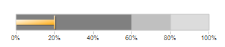
You’ll notice that the default is lots of jazzy shading and spangly borders. We particularly need to get rid of these if we are using the graph inline as they will make the graph very hard to read when scaled down (and of course add no value in terms of visualising the key information anyway). We’ll also want to remove the scale if we are using inline – we can add it back into our column header later.
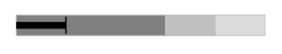
Right click on the graph and select gauge properties. Select the Back fill section and set Gradient to solid and the colour to no colour. Then select the Frame section and set the style to none. Close the properties pane. Looking better already:
Next lets remove the scale – right click on the graph again, this time selecting Gauge and then Scale Properties. Select the Labels section then check the Hide Scale Labels checkbox. Then select the Major Checkmarks section and check the Hide Major checkmarks checkbox. At this point also set the start and end margins to 1 in the Layout section and set the Maximum value of the scale to your good zone max field. Close the properties panel again.
Now lets deal with each component of the graph. You’ll notice that the orange bar is actually made up of two objects known as linear pointers. Lets tidy them up and assign our Actual and Target values to those pointers. First make sure you’ve set the relevant datasetname property for the graph. Then right click on your graph again, gauge sub-menu and Pointer(LinearPointer1) properties. Set the value to be your actual field from your dataset. The go to the Pointer Fill section, set the fill style to solid and pick a suitable colour for your “bullet”. Set the Pointer width to 30 and finally select the shadow section and set the shadow offset to 0. Do the same for your target pointer (LinearPointer2) but this time setting a width of 8 and an length of 80.
Now set the relevant properties for each of the zones. This time select Range(LinearRange1) properties from your Gauge sub-menu. Set the Start Range to 0 and the End range to your Bad Zone Max field. Whilst you have the properties pane open, get rid of the range borders by setting the border style to None and the start and end widths to 60. Repeat for range two but this time setting the Start Range to Bad Zone Max and the End Range to your Satisfactory Zone Max. The same for zone three but this time with Satisfactory Zone Max and Good Zone Max.
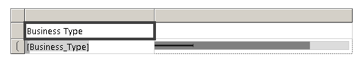
Now add a table to your report, set the datasetname to the same dataset as your graph. Delete the third column and drop your Category field into the second row, first column and then add a grouping on the Category Field (right click on second row, group properties, add). Then drop your chart into the second column, second cell. You should have something that looks like this in design view:
Almost there. One of the quirks of any inline chart is that it overrides the border of the cell it’s placed in so you need to set the border for the GaugePanel to the same as your cell borders. Finally lets add a scale to the header of column two. Copy your chart from the cell and then paste it the header. Remove all the components except the scale from the gauge panel by carefully highlighting and deleting. Right click the Gauge in your header and select scale properties from the sub-menu. Uncheck the Hide Scale Labels checkbox and the Hide Major checkmarks checkbox. For the max value of the scale you need to make sure you use the max grouping for you good zone max rather than the default sum (=Max(Fields!Zone3.Value)). In the layout section, set the position in gauge to 90, in the labels section set the placement to inside and distance from scale to 30. Set the major tick mark placement to inside. Phew!
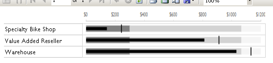
Tidy up your fonts and general layout and you’re good to go:
That’s about it – if all that seems like a lot of work download the sample report and use that instead 🙂
HowTo2008Bullets.rdl (41.22 kb)
Introduction to Data Wrangler in Microsoft Fabric
What is Data Wrangler? A key selling point of Microsoft Fabric is the Data Science
Jul
Autogen Power BI Model in Tabular Editor
In the realm of business intelligence, Power BI has emerged as a powerful tool for
Jul
Microsoft Healthcare Accelerator for Fabric
Microsoft released the Healthcare Data Solutions in Microsoft Fabric in Q1 2024. It was introduced
Jul
Unlock the Power of Colour: Make Your Power BI Reports Pop
Colour is a powerful visual tool that can enhance the appeal and readability of your
Jul
Python vs. PySpark: Navigating Data Analytics in Databricks – Part 2
Part 2: Exploring Advanced Functionalities in Databricks Welcome back to our Databricks journey! In this
May
GPT-4 with Vision vs Custom Vision in Anomaly Detection
Businesses today are generating data at an unprecedented rate. Automated processing of data is essential
May
Exploring DALL·E Capabilities
What is DALL·E? DALL·E is text-to-image generation system developed by OpenAI using deep learning methodologies.
May
Using Copilot Studio to Develop a HR Policy Bot
The next addition to Microsoft’s generative AI and large language model tools is Microsoft Copilot
Apr