
Good User Experience (UX) design is crucial in enabling stakeholders to maximise the insights that they are able to derive from Power BI reports. One common challenge of report design is being able to display data distributions and patterns effectively. This article will describe the process behind a method that can mitigate this issue; creating histograms from standard bar chart visuals. These histograms will provide the additional benefit of being dynamic; allowing the user to change the bin size to extract even more potentially hidden insights.
This article was inspired by a video from the YouTube channel, How to Power BI.
The Example
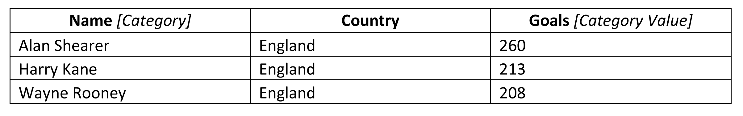
The dataset we will analyse pertains to football players and the number of goals they have scored in the Premier League across their careers. An excerpt of the data is shown below:
This data was scraped using the Python library, Selenium, from the official Premier League website – if you are interested in how this was done, I’ve written another blog on web scraping with Selenium – click here to read.
Every footballer who has scored a Premier League goal is included in the dataset – accurate as of the 12th of December 2023.
The Procedure
The process to creating histograms from a standard bar chart visual is as follows:
- Create a table containing data which specifies the starting points for the bins
- Create a numeric parameter for bin size
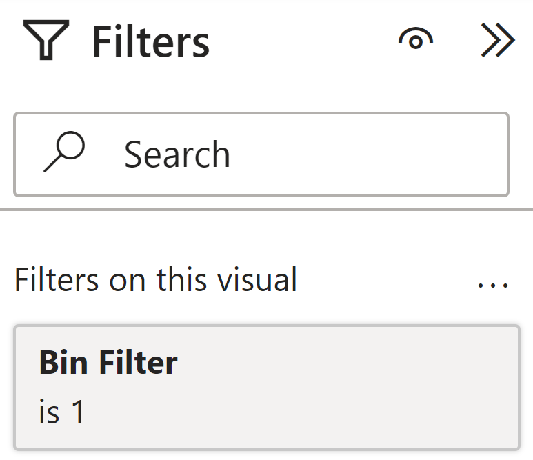
- Create a measure to filter for the selected bin size
- Count number of categories in each bin
- Create a basic bar graph and add data labels
- Filtering the X-axis range
1. Create a table containing data which specifies the starting points for the bins
A new table containing a list of starting points for the bins can be created using the following DAX expression:

The DAX expression above creates a column that ranges from 0 to 300, with an increment of 5. This increment represents the smallest bin size the user will be able to select.
2. Create a numeric parameter for bin size
To allow the user to choose a desired bin size, we need to create a numeric parameter. These can be added under the Modelling tab.
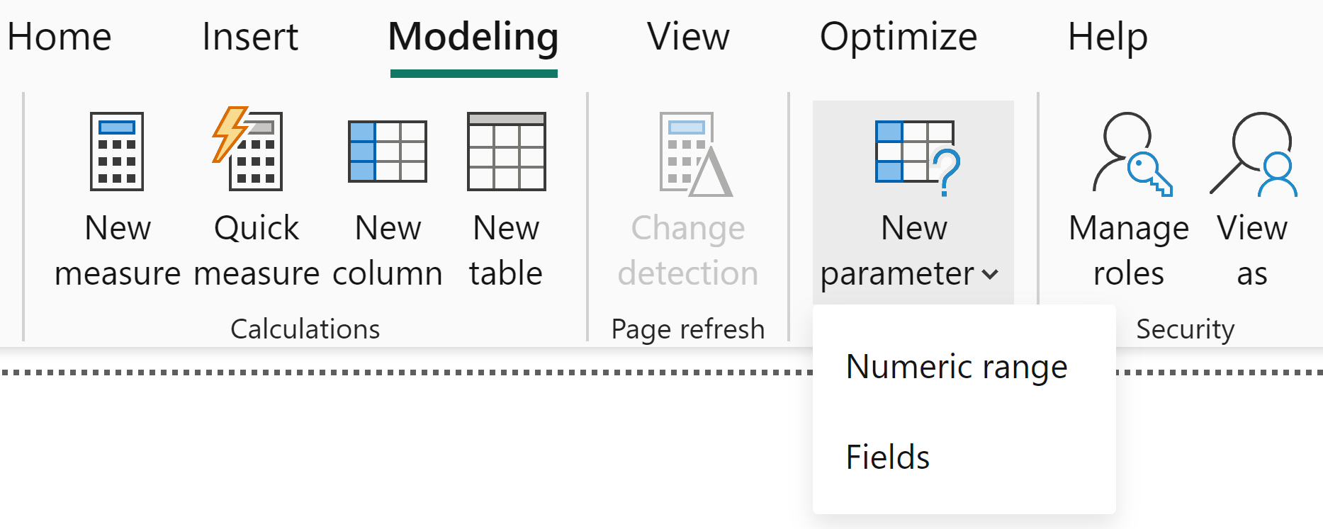
Upon creation of this numeric parameter, a measure is automatically created for us: Bin Size Value. This measure uses the SELECTEDVALUE function to return the value the user has specified.
3. Create a measure to filter for the selected bin size
Now that we have all the required data, we can start to build the functionality of the histogram. To do this, we must first create a measure which filters for the selected bin size – namely, filter the Bin Start column based on the Bin Size Value provided by the user. This is shown below:
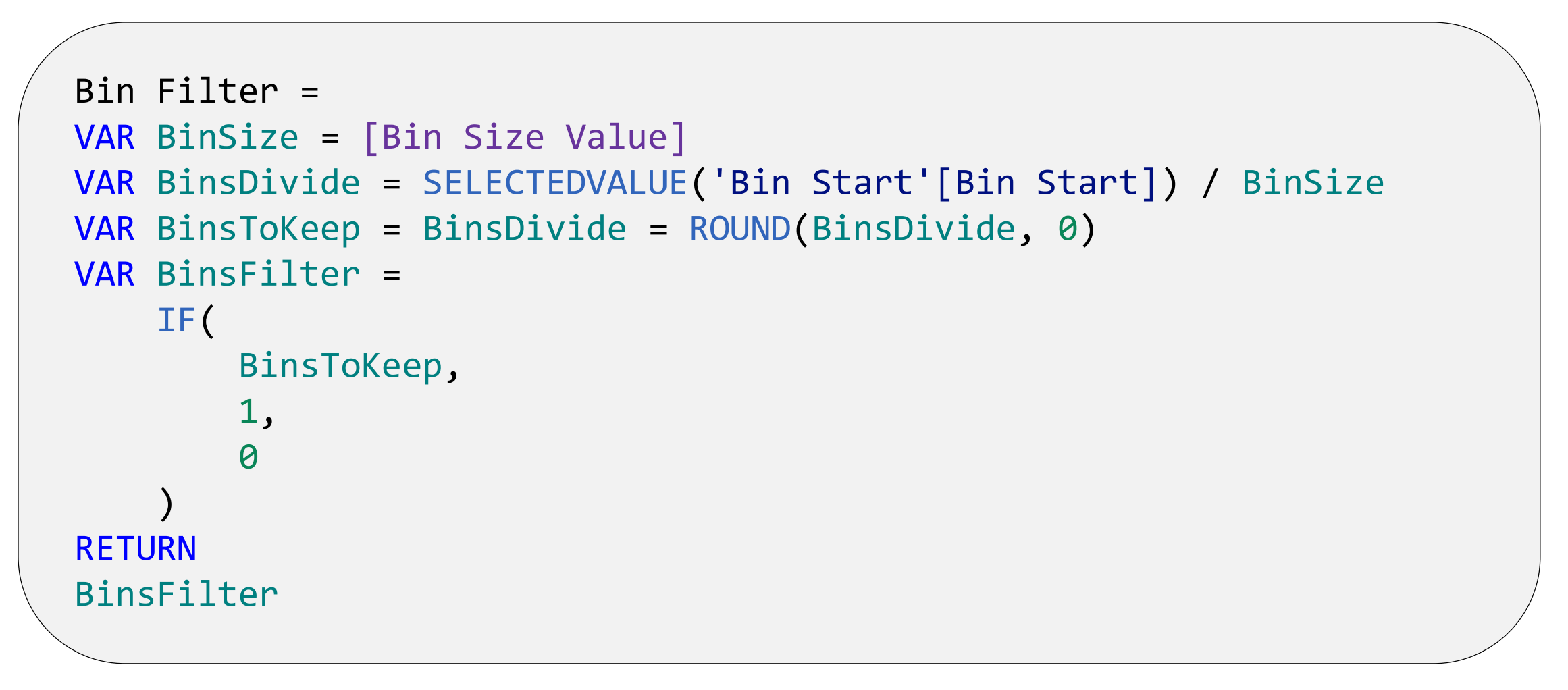
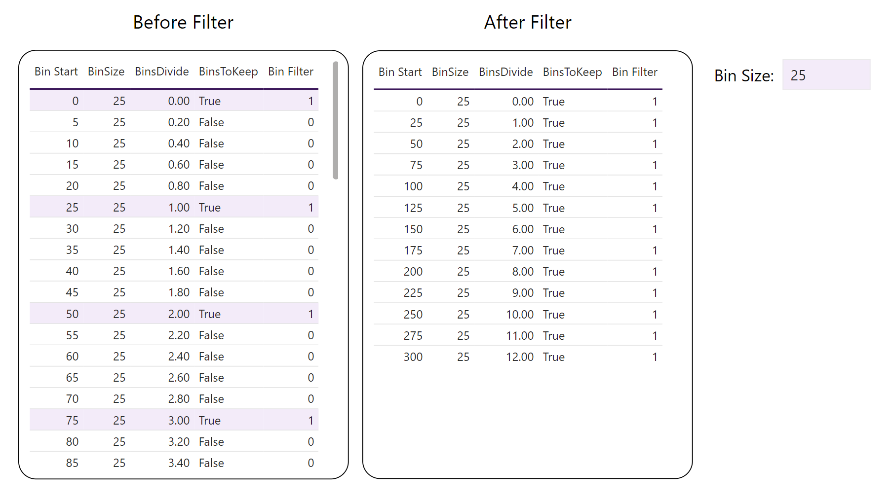
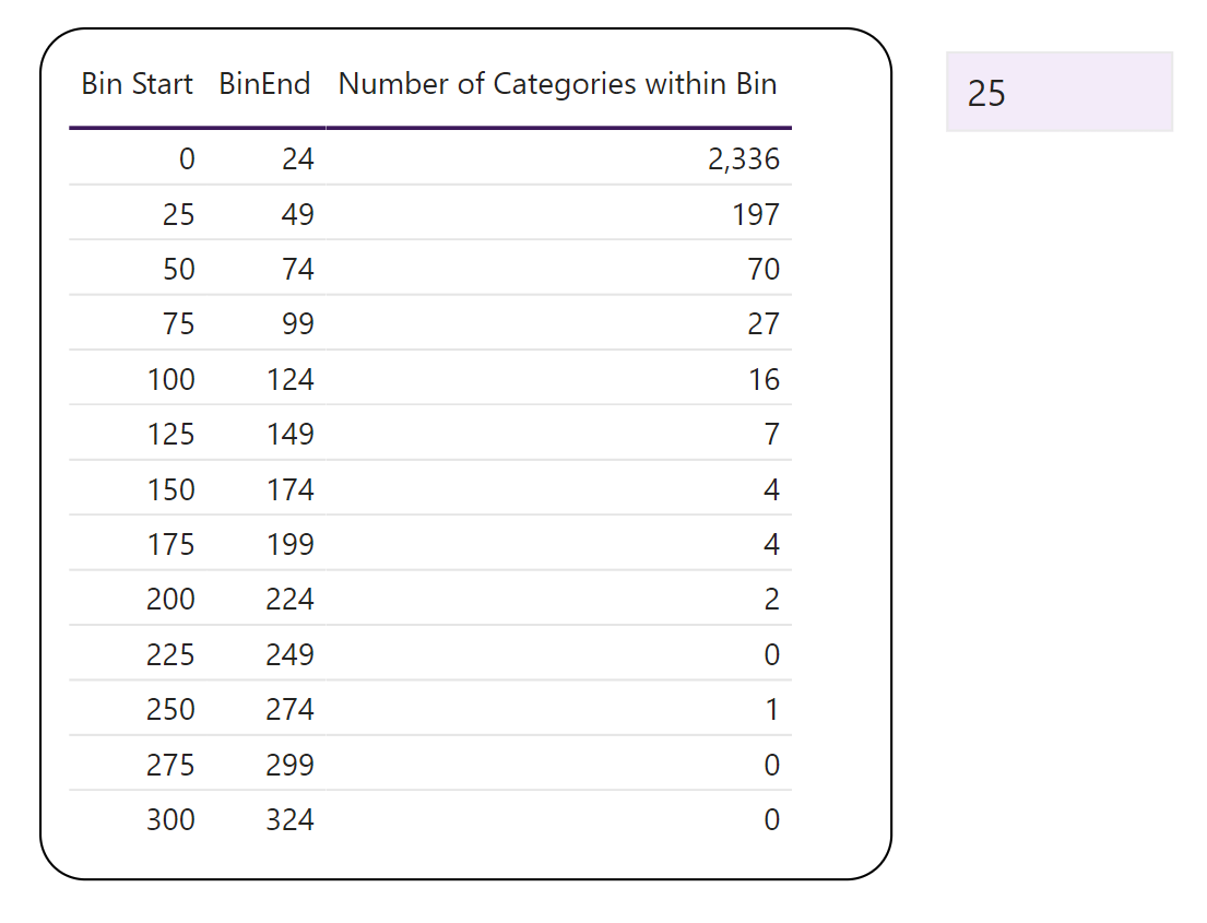
The DAX code above identifies the Bin Start values which the Bin Size Value is a factor of. The result of this code allows us to extract the relevant bins by filtering for where BinsFilter = 1. An example is shown below:
 4. Count number of categories in each bin
Now that we have a list of the relevant bins, we can calculate the number of categories within each bin.
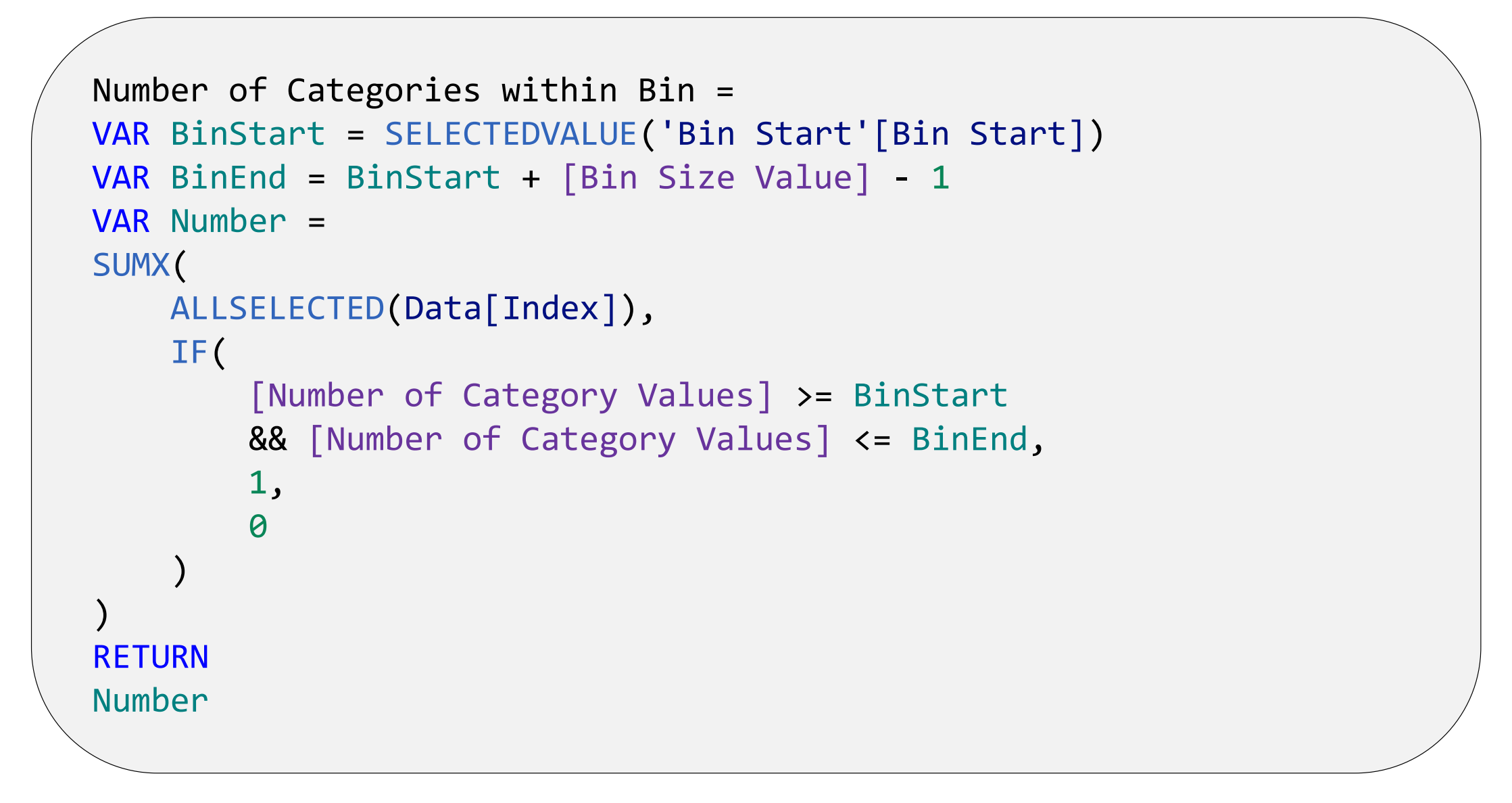
The DAX code above follows a three-step process:
- For each bin, returns the start (BinStart) and end (BinEnd) point.
- For each category, returns the bin their associated value is contained within. For example, Harry Kane has scored 213 goals and is therefore within the 200-219 bin.
- For each category within a bin, a 1 is returned. Therefore, calculating the sum of the output of Step 2 will return the total number of categories within each bin.
 5. Creating a basic bar graph and adding data labels
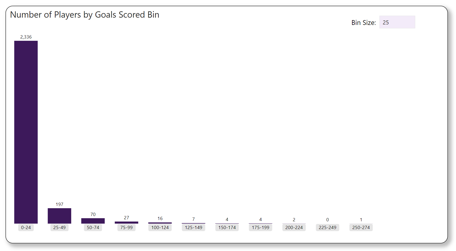
From the work we have done so far, we can create the following bar chart:
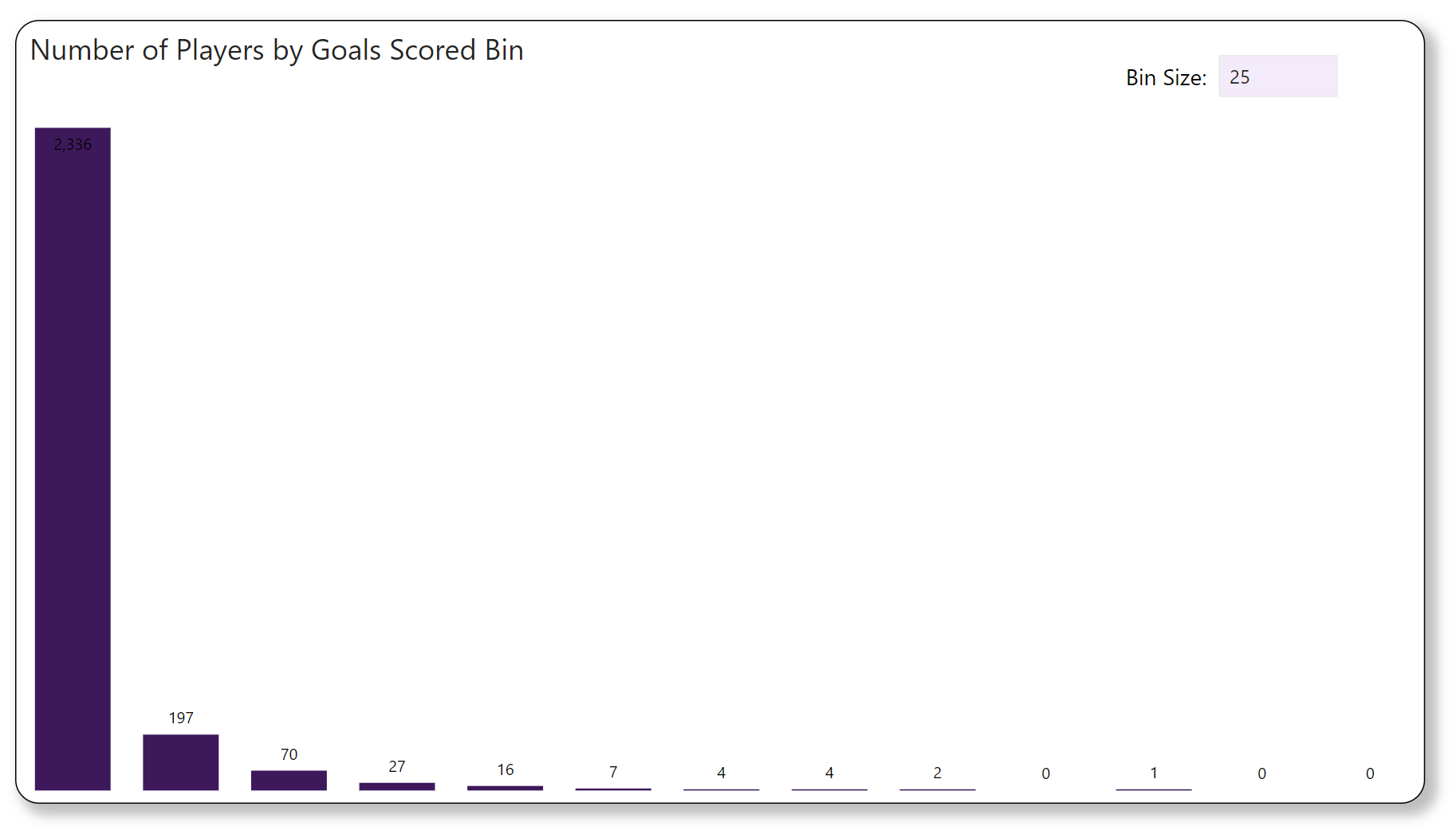
However, there are some problems with this histogram:
- Lack of space for data labels – minimal space below and within each bin to add data labels.
- There is no information on bin range for each bin.
- Bins where the number of categories is zero and which come after the final bin that has a non-zero number of categories should be removed (e.g., the final two bins in the figure above).
To create more space for data labels, we can add the following measures:
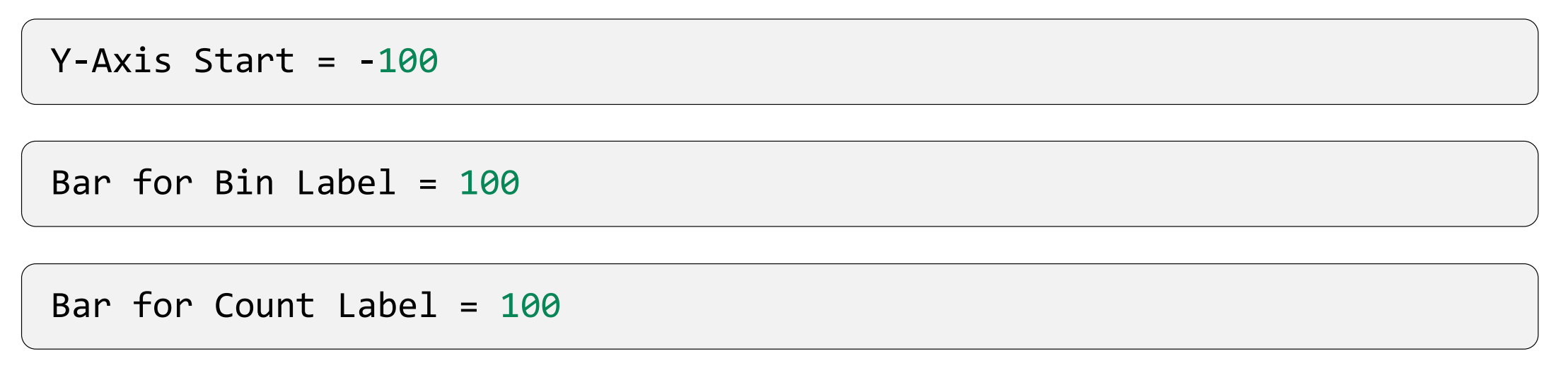
Using these measures, we can add data labels using the following process:
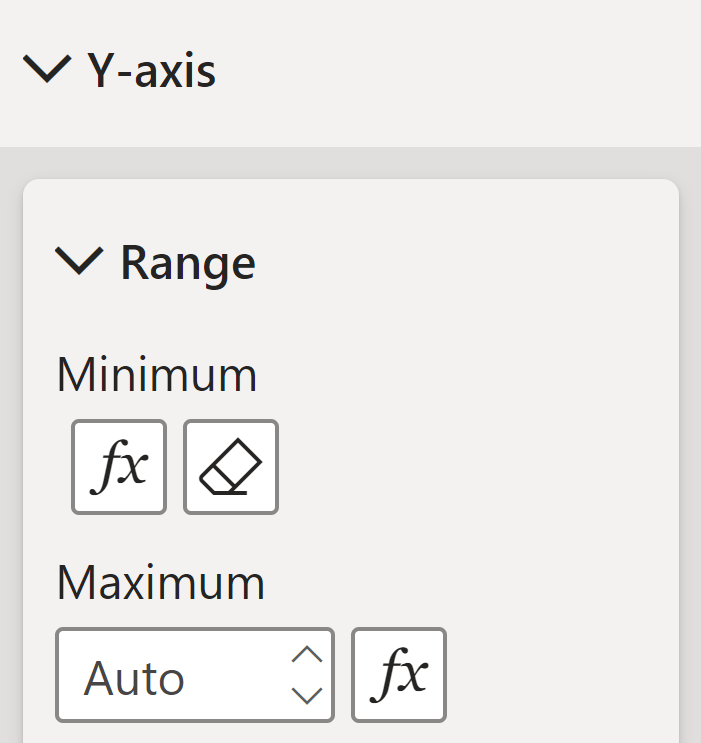
- Using the Y-Axis Start measure, we can shift the Y-axis within the Y-axis menu by specifying the minimum value:
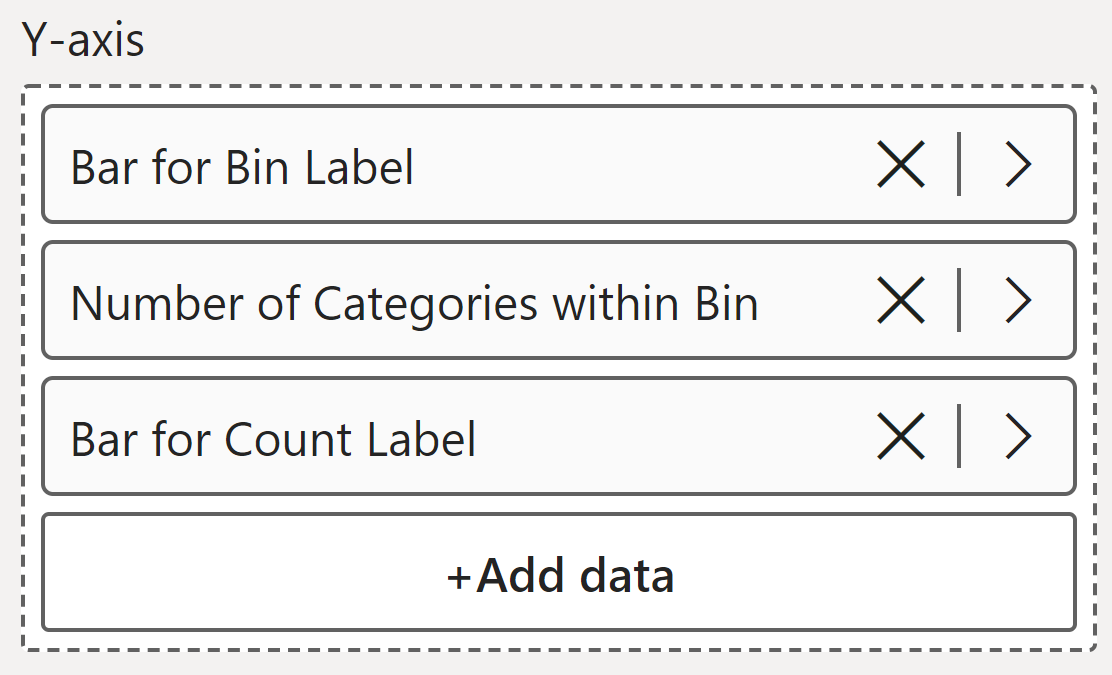
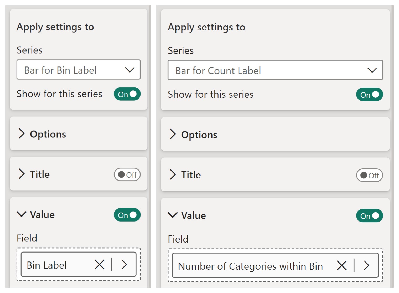
2. Add Bar for Bin Label and Bar for Count Label as new series onto the Y-axis:
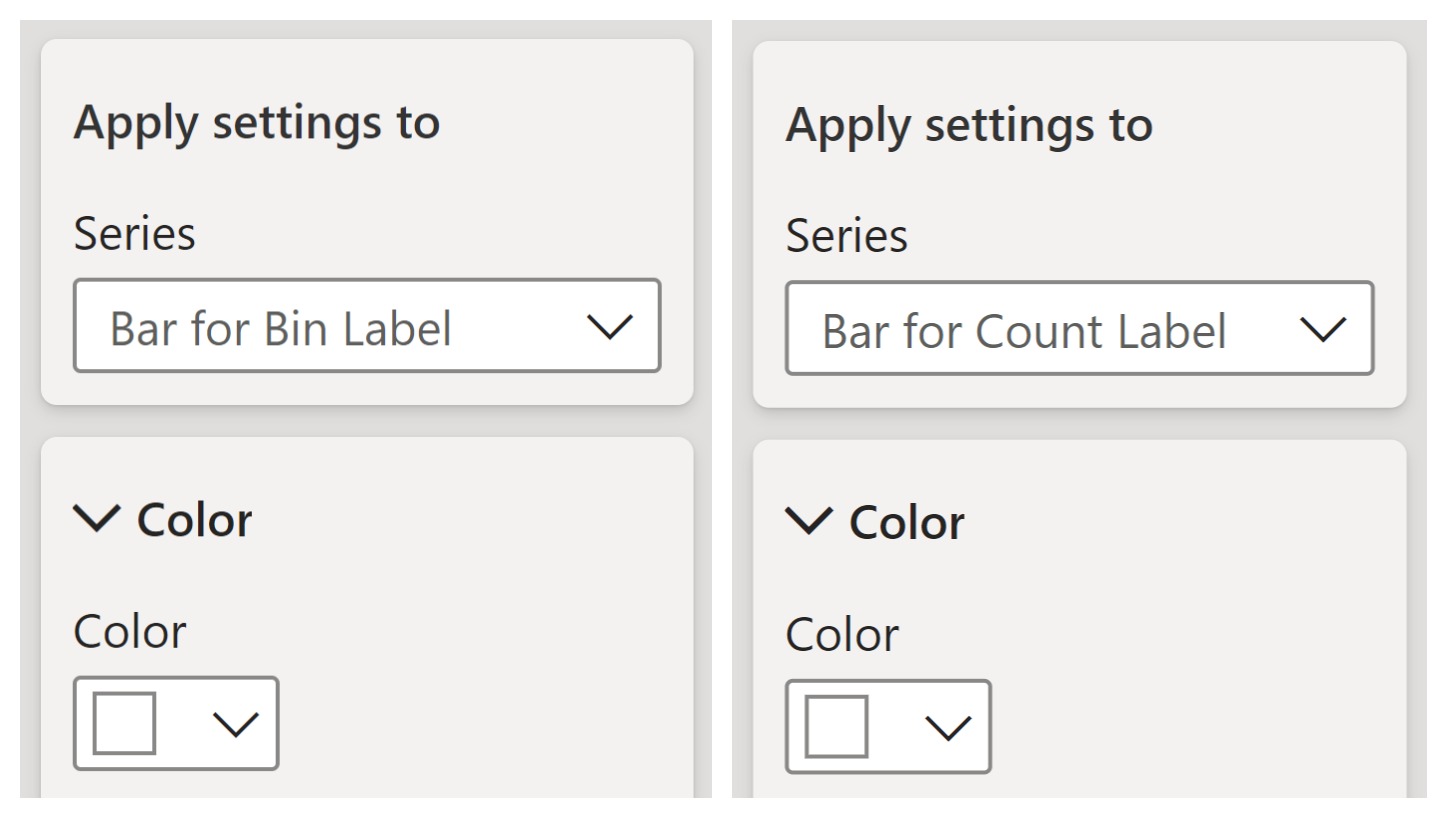
3. Make these new series invisible by setting the colour of both bars to be the same as the background (white):
4. Add and configure the data labels of both bars:
The Bin Label measure is defined below:

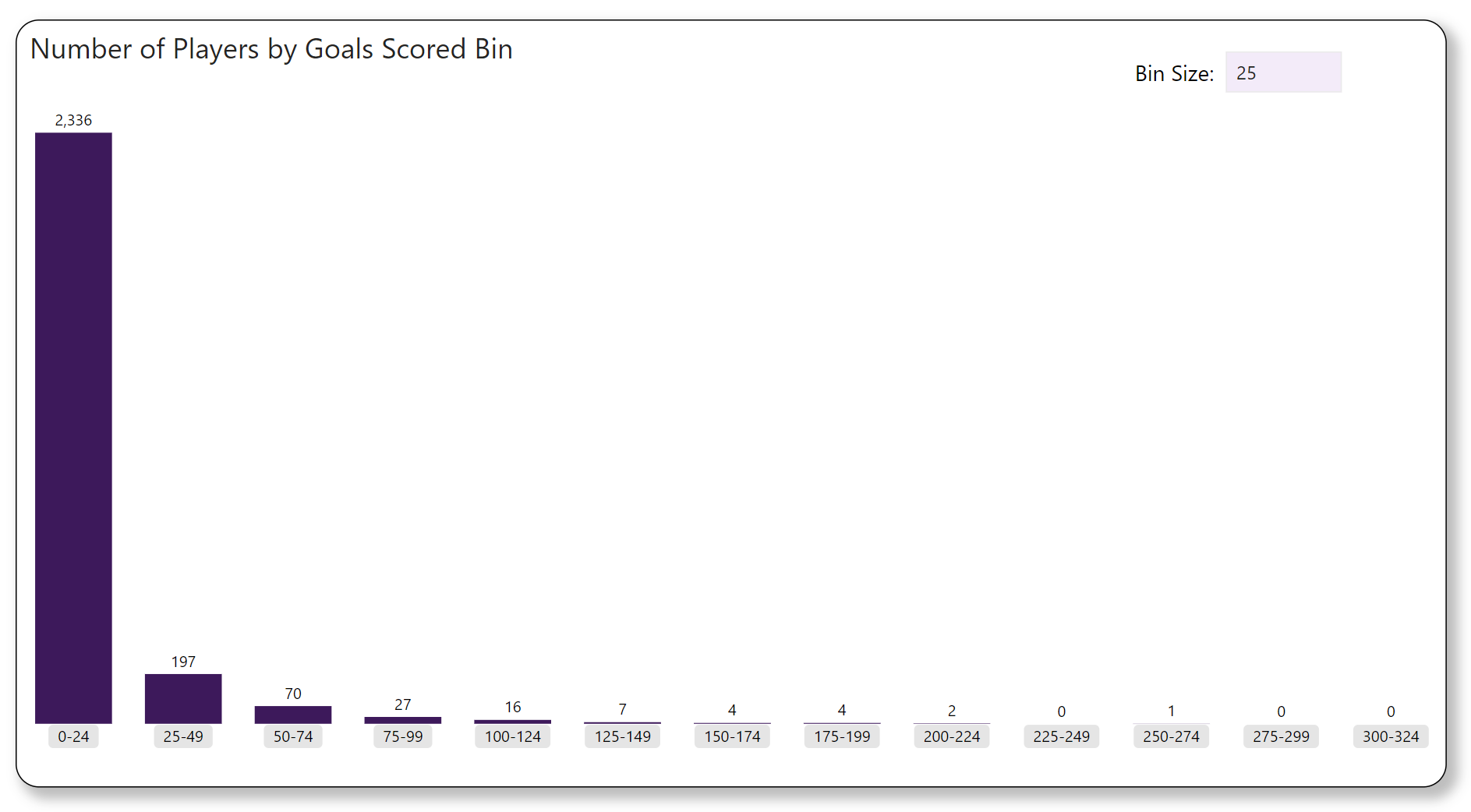
Shown below is the effect these changes have on the appearance of the chart visual:
 6. Filtering the X-axis range
To remove bins where the number of categories is zero and which come after the final bin that has a non-zero number of categories (e.g., the final two bins in the figure above), we need to create some measures. The first of these measures is shown below:
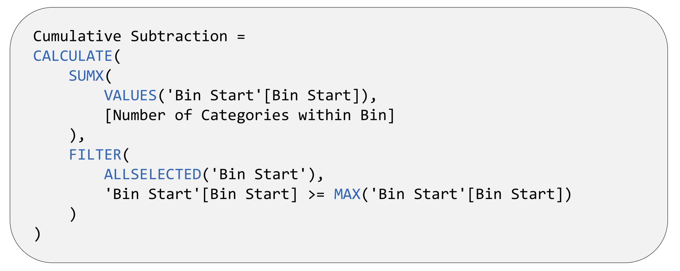
The DAX code above calculates a cumulative subtraction of the Number of Categories within Bin measure. This is the opposite of a running total – as you go down from one row to the next row of a column, you subtract one more value from the base value. See the example below:
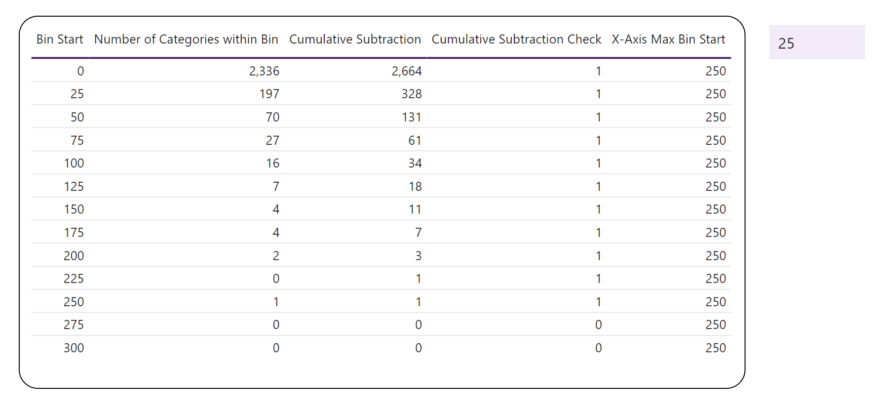
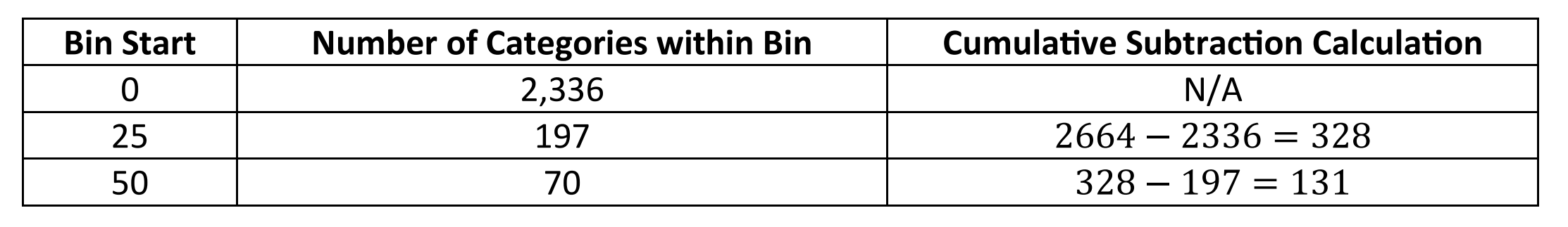
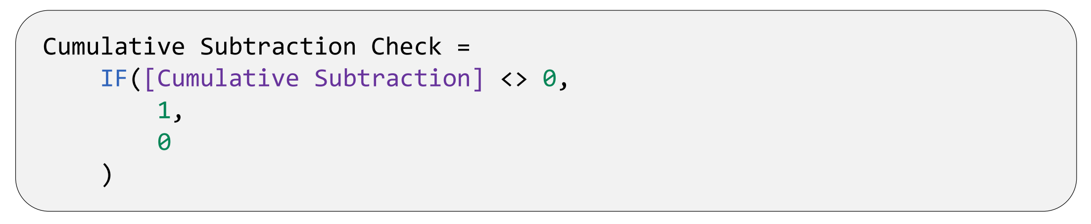
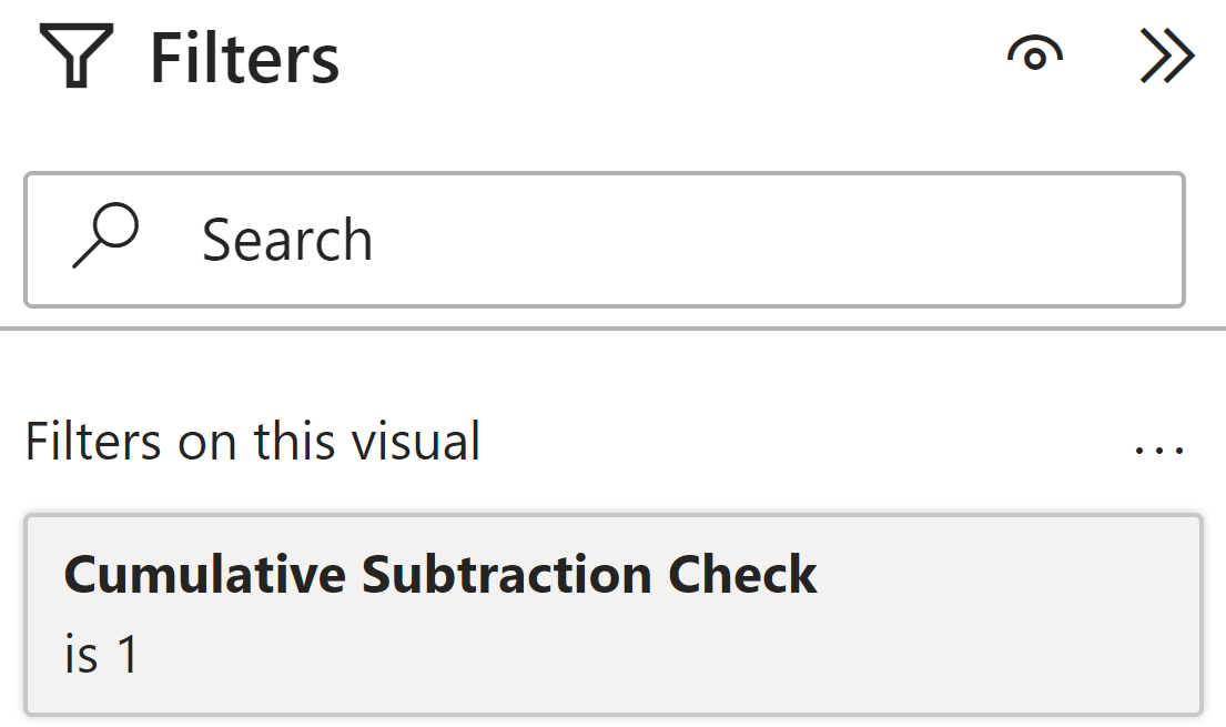
Bins where the number of categories is zero and which come after the final bin that has a non-zero number of categories are designated by Cumulative Subtraction values of 0. This allows us to identify the bins we want to keep using the following DAX expression and configuration:
Shown below is the effect these changes have on the appearance of the chart visual:
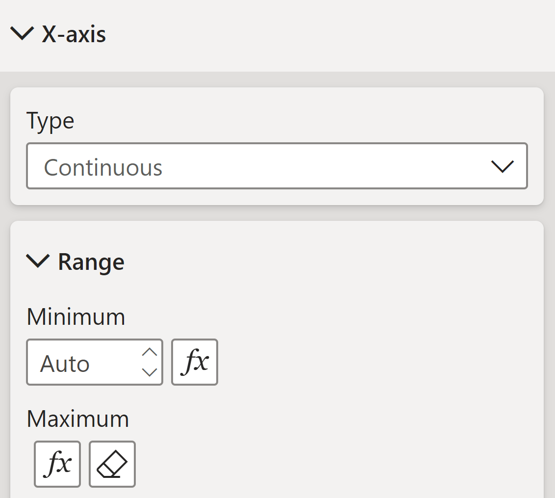
We now have one final problem, the X-axis range is not affected by this change – leaving a large white space at the end. To fix this, we can use the following measure.
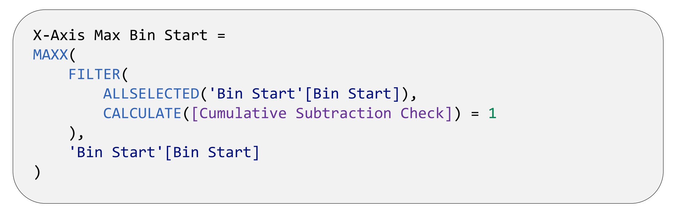
The DAX code above returns the maximum Bin Start (from those which the user has selected via specifying the Bin Size Value) where the Cumulative Subtraction Check = 1. After this, we can then shift the X-axis within the X-axis menu by specifying the maximum value using the X-Axis Max Bin Start measure:
With that, we are done! Shown below is the final appearance of the histogram:
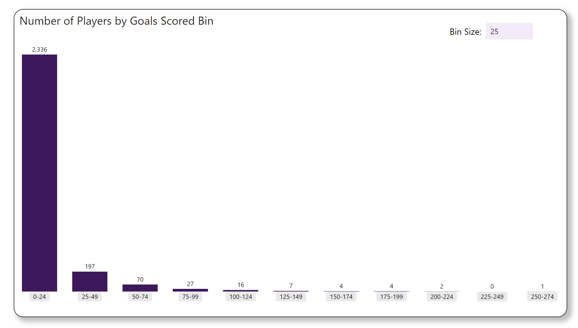
Looks great! However, there is one small bug that may be experienced – if the bin size is too small, some of the bins lose their labels. To mitigate this issue, we may want to reformat or remove those bin options in such cases.
Wrap-up
In this blog, we have discussed the creation of histograms in Power BI and the DAX that enables it. Hopefully, you can now incorporate this new found knowledge in your own Power BI reports!
Note
The data and Power BI model discussed in this blog can be found here.
Introduction to Data Wrangler in Microsoft Fabric
What is Data Wrangler? A key selling point of Microsoft Fabric is the Data Science
Jul
Autogen Power BI Model in Tabular Editor
In the realm of business intelligence, Power BI has emerged as a powerful tool for
Jul
Microsoft Healthcare Accelerator for Fabric
Microsoft released the Healthcare Data Solutions in Microsoft Fabric in Q1 2024. It was introduced
Jul
Unlock the Power of Colour: Make Your Power BI Reports Pop
Colour is a powerful visual tool that can enhance the appeal and readability of your
Jul
Python vs. PySpark: Navigating Data Analytics in Databricks – Part 2
Part 2: Exploring Advanced Functionalities in Databricks Welcome back to our Databricks journey! In this
May
GPT-4 with Vision vs Custom Vision in Anomaly Detection
Businesses today are generating data at an unprecedented rate. Automated processing of data is essential
May
Exploring DALL·E Capabilities
What is DALL·E? DALL·E is text-to-image generation system developed by OpenAI using deep learning methodologies.
May
Using Copilot Studio to Develop a HR Policy Bot
The next addition to Microsoft’s generative AI and large language model tools is Microsoft Copilot
Apr