
Good User Experience (UX) design is crucial in enabling stakeholders to maximise the insights that they are able to derive from Power BI reports. One common challenge of report design is effectively managing and displaying large datasets in bar charts without overwhelming the user. This article will describe the process behind a method that can mitigate this issue: adding pagination to bar chart visuals. This visual will provide the following functionality:
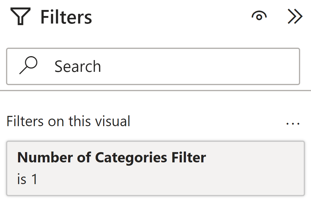
- A number of categories filter: users can specify how many categories they would like to see per bar chart page
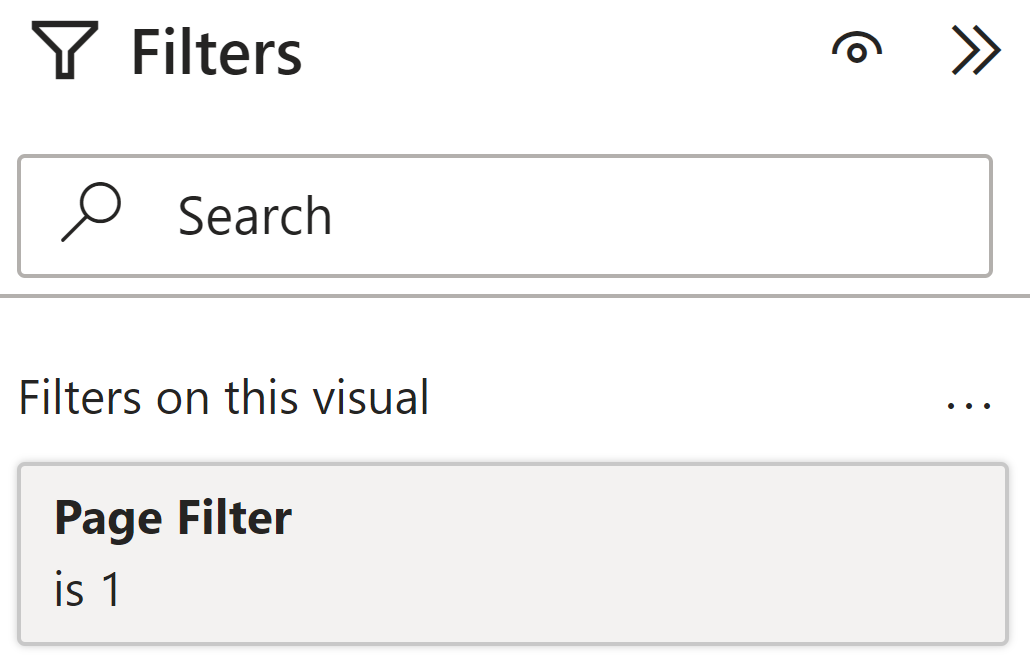
- A page filter: users can navigate to different pages to see more categories
This article was inspired by a video from the YouTube channel, How to Power BI.
The Example
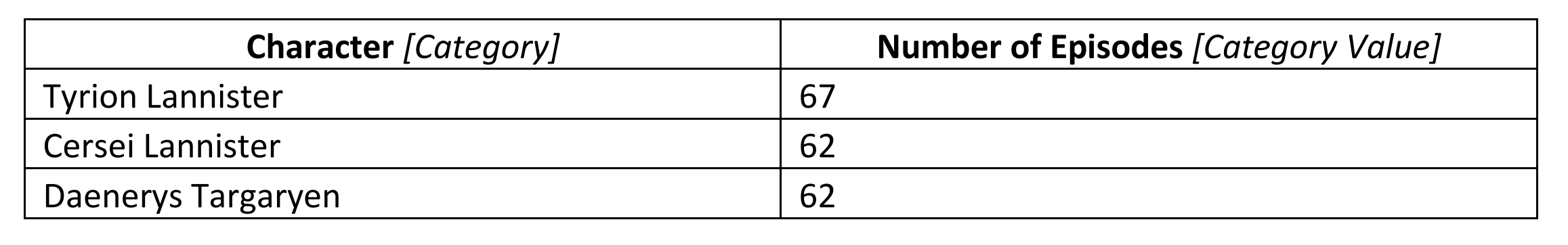
The dataset we will analyse pertains to Game of Thrones characters, and the number of episodes they appeared in. An excerpt of the data is shown below:
A basic Power BI bar chart for the data above is shown below:

The Pagination Process
The process to add pagination to a bar chart visual is as follows:
- Add two numeric parameters: one for number of categories and another for number of pages
- Rank categories in order of category values
- Display the ranking on the bar chart visual
- Create the number of categories filter
- Fine-tune the page filter
- Improve the design
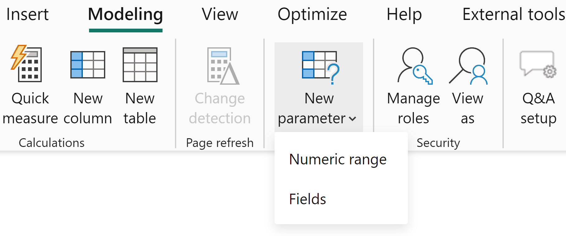
1. Add Numeric Parameters
Numeric parameters can be added under the Modelling tab.
Two measures are automatically created for us upon creation of the numeric parameters: Number of Categories Value and Number of Pages Value. These use the SELECTEDVALUE function to return the value the user has specified.
2. Rank categories in order of category values
To rank the categories in order of category values, we can use the following DAX code:
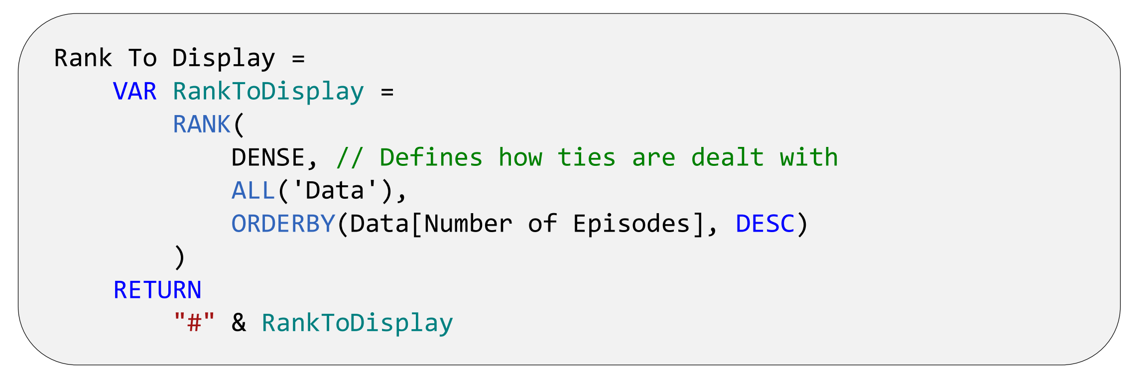
Note, the DAX code above returns the rank that we will display on the visual. We will also create another measure that ranks the categories in the same way as above but adding an additional metric – in the event of ties, rank ties based on alphabetical order.
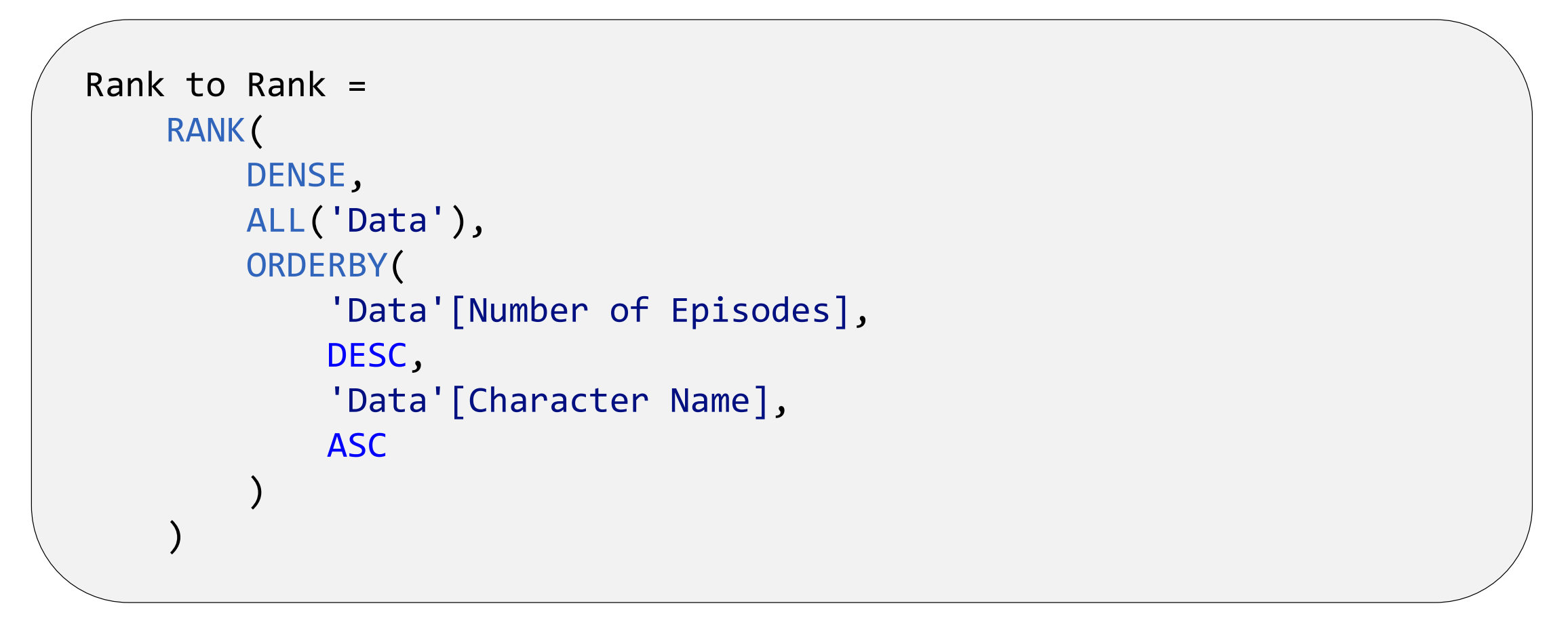
This was created for the following reason: The number of categories filter requires a rank to be used in the DAX formulation. If we were to use Rank To Display for this filter, because of ties, the user-specified number of categories may not always be returned. For example, if a user specified they wanted to see 2 categories per page, the first page would show 4 categories (Tyrion Lannister, Cersei Lannister, Daenerys Targaryen and Jon Snow) as the latter 3 are all tied on the same rank (#2, 62 episodes). Instead, by using Rank to Rank, each category will have a unique rank and so the user-specified number of categories per page will be correctly returned.
3. Display the ranking in the bar chart visual
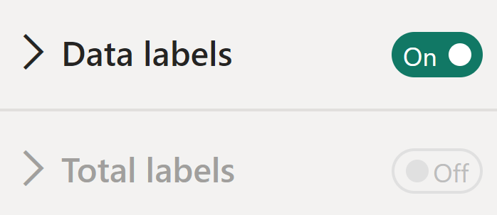
We would like to display two data labels on the visual – the category value and the rank. To do this, we can activate the Total labels option – however, by default this is un-selectable.
To enable the selection of this option, we must add a second series to the bar chart using a Dummy measure:

This measure has no function other than to allow us to select the Total labels option – after adding the Dummy measure to the visual, we can hide its existence through the various formatting options Power BI provides.
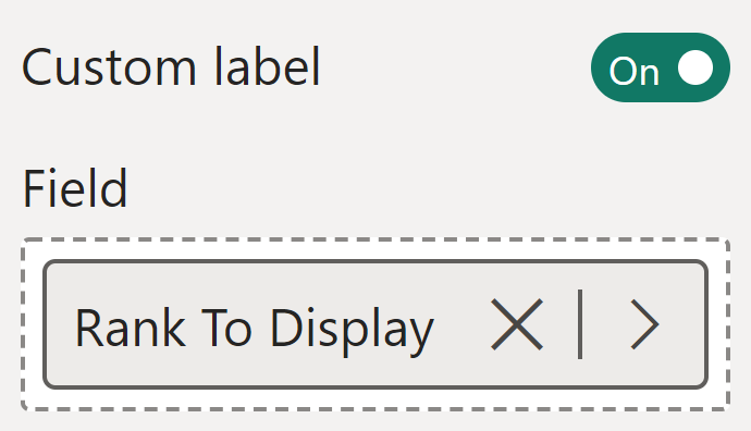
We can now format our two data labels:
- Within data labels, we can activate the Custom label option, allowing us to display the Rank.
- Upon activation of Total labels, Power BI will automatically display the category values.
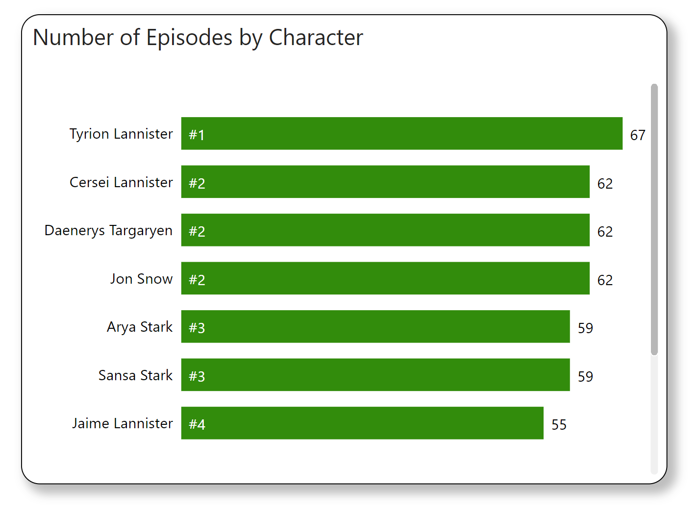
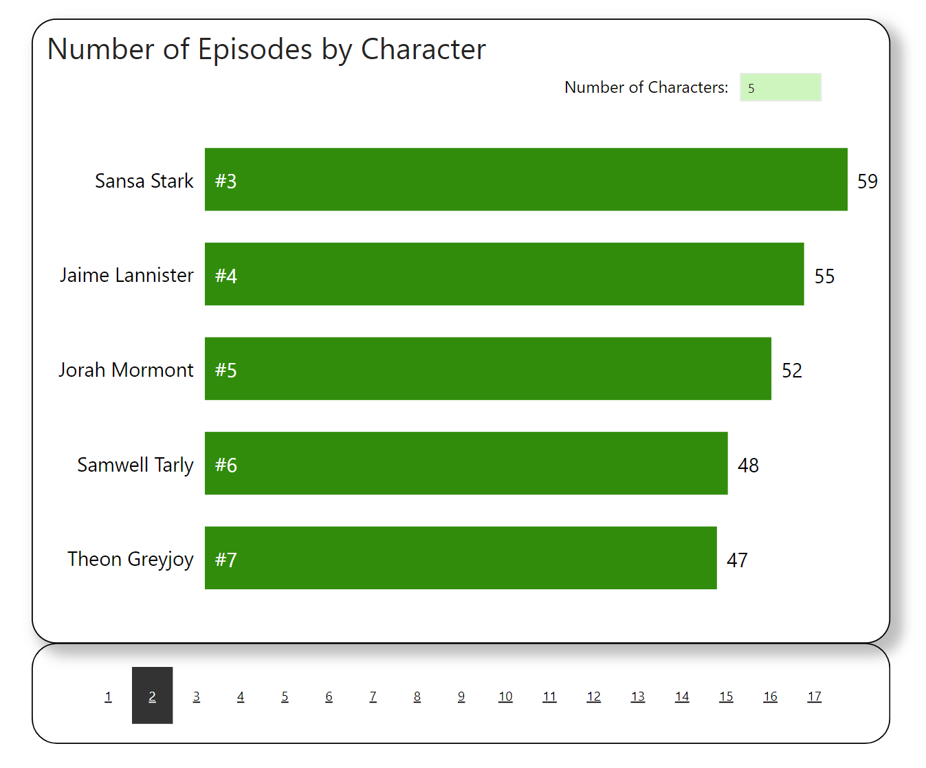
After formatting, the visual is shown below:
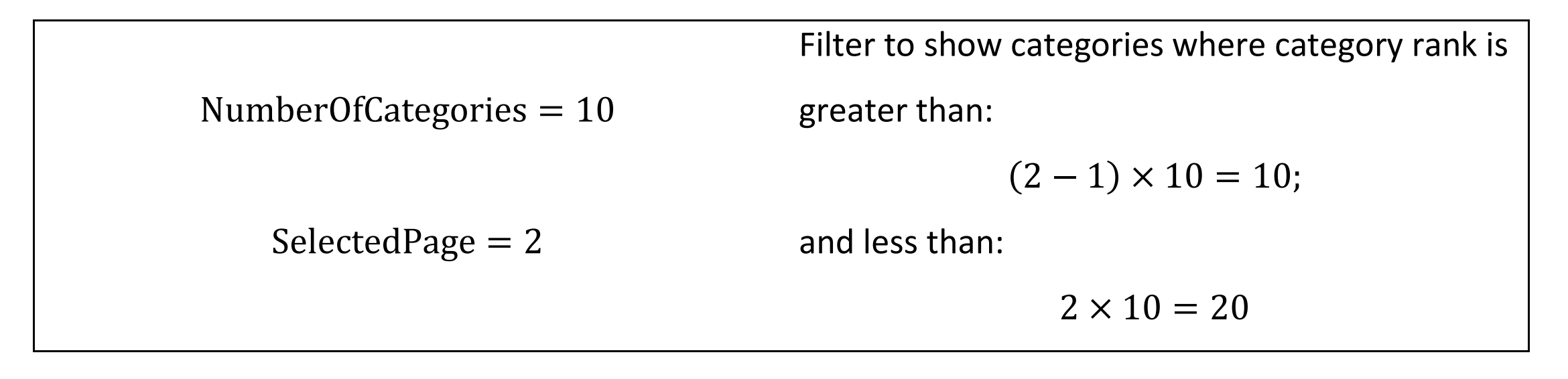
4. Create the number of categories filter
Now, let’s create the number of categories filter: the functionality allowing users to specify how many categories they would like to see per bar chart page. The DAX code enabling this is shown below:
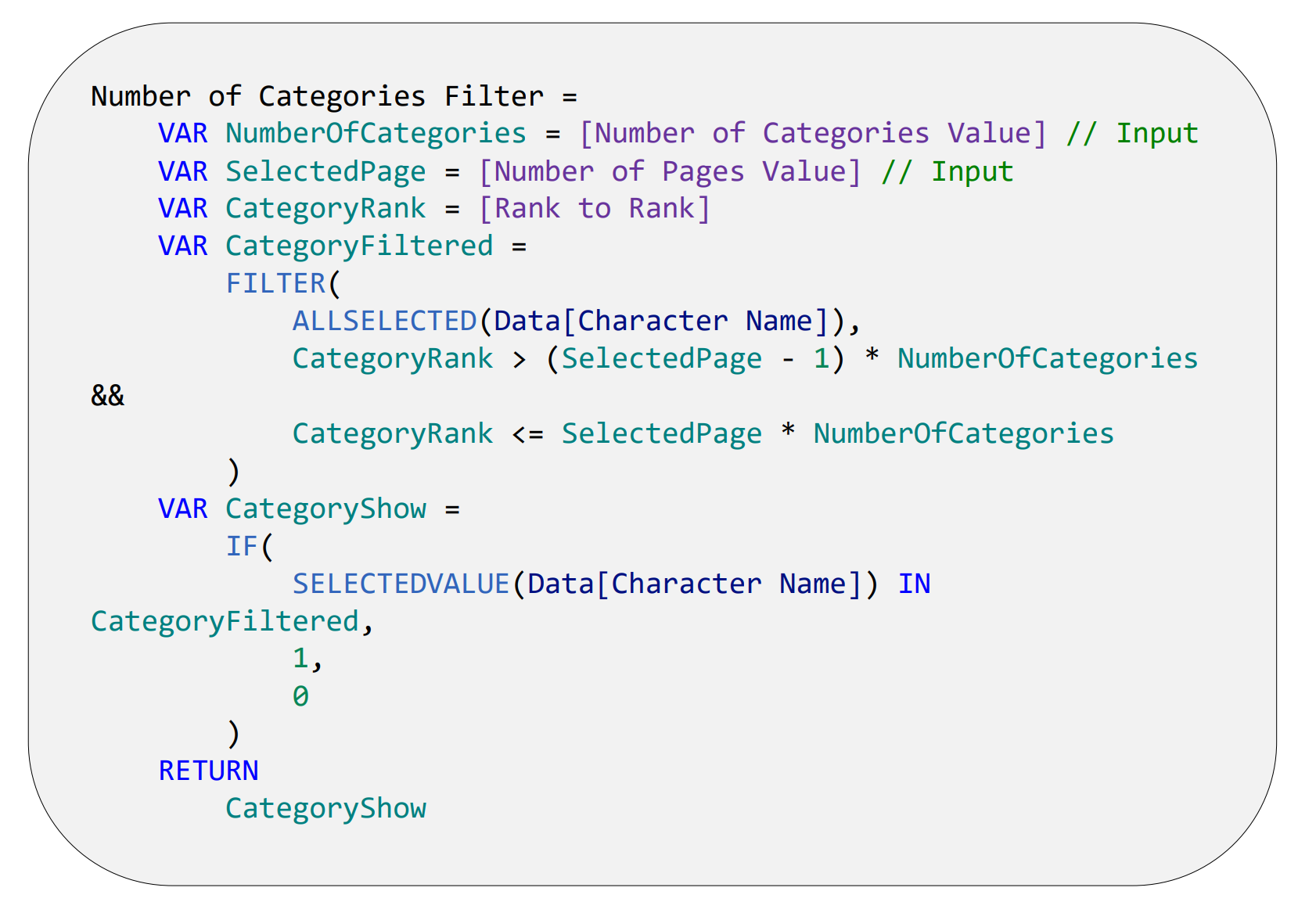
The DAX code above takes two inputs: the number of categories and the page number. The code then filters the categories based on the value ranking. An example is shown below:
We can then filter the bar chart using the following configuration:
5. Fine-tune the page filter
The page filter was created automatically upon creation of the numeric parameter. However, it requires some fine-tuning to prevent users being able to click pages that have no data in them. The DAX code enabling this is shown below:
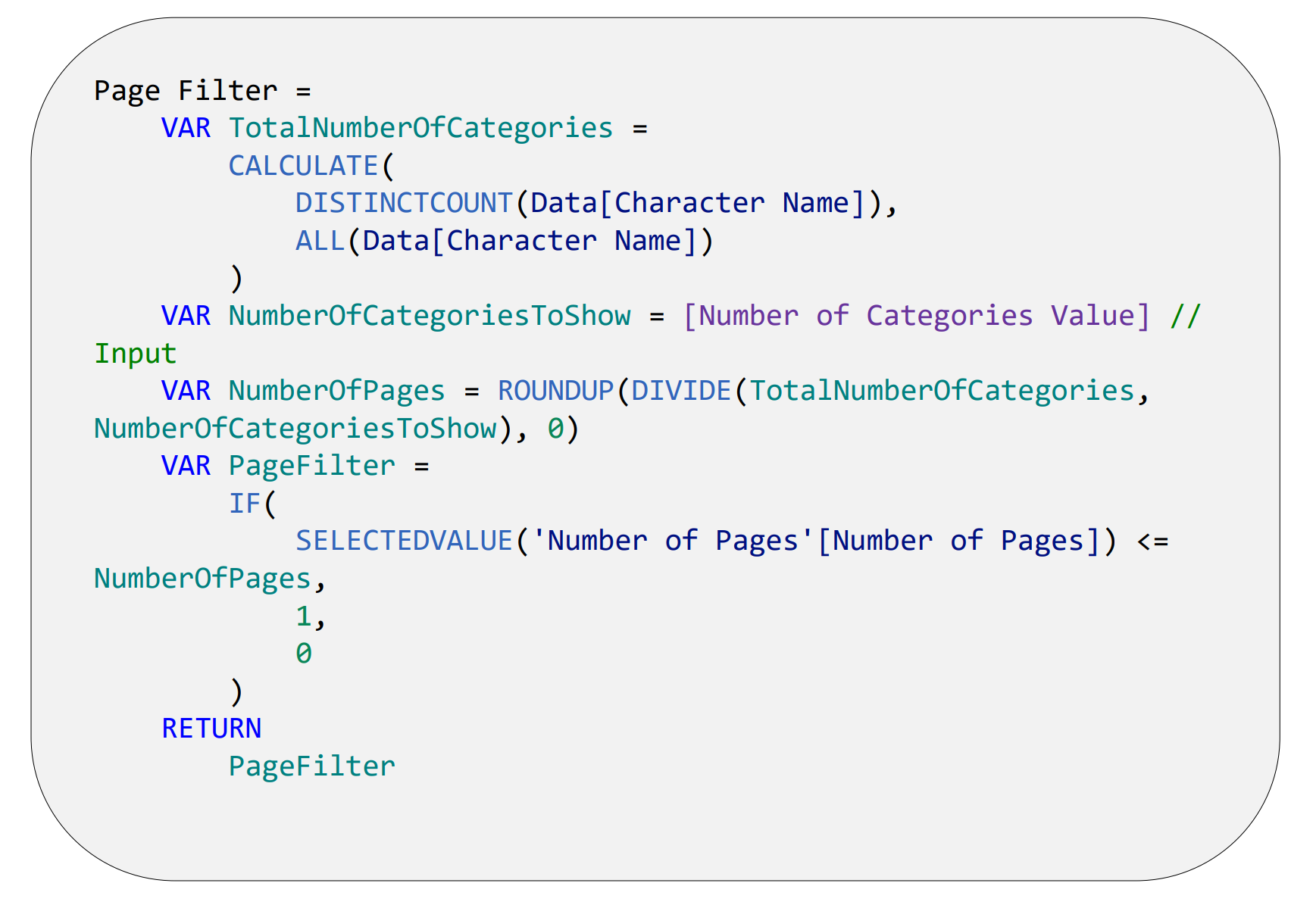
The DAX code above calculates the total number of pages using the following equation:
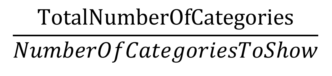
The output of the equation is also rounded up to ensure the last page is shown. For example, if the number of categories is 16 and the user-specified they wanted to see 5 categories per page:

Like previously, we can then filter the filter using the following configuration:
Having now completed the set-up, now all that remains is formatting the chart. The final visual is shown below:
Wrap-up
In this blog, we have discussed the creation of bar chart pagination in Power BI and the DAX that enables it. Hopefully, you can now incorporate this newfound knowledge in your own Power BI reports!
Note
The data and Power BI model discussed in this blog can be found here.
Introduction to Data Wrangler in Microsoft Fabric
What is Data Wrangler? A key selling point of Microsoft Fabric is the Data Science
Jul
Autogen Power BI Model in Tabular Editor
In the realm of business intelligence, Power BI has emerged as a powerful tool for
Jul
Microsoft Healthcare Accelerator for Fabric
Microsoft released the Healthcare Data Solutions in Microsoft Fabric in Q1 2024. It was introduced
Jul
Unlock the Power of Colour: Make Your Power BI Reports Pop
Colour is a powerful visual tool that can enhance the appeal and readability of your
Jul
Python vs. PySpark: Navigating Data Analytics in Databricks – Part 2
Part 2: Exploring Advanced Functionalities in Databricks Welcome back to our Databricks journey! In this
May
GPT-4 with Vision vs Custom Vision in Anomaly Detection
Businesses today are generating data at an unprecedented rate. Automated processing of data is essential
May
Exploring DALL·E Capabilities
What is DALL·E? DALL·E is text-to-image generation system developed by OpenAI using deep learning methodologies.
May
Using Copilot Studio to Develop a HR Policy Bot
The next addition to Microsoft’s generative AI and large language model tools is Microsoft Copilot
Apr