Users love pretty things! Especially upper management who have minions to actually make sense of the numbers behind the reports for them 😉 Out of the box Reporting Services reports look anything but pretty! Here’s few tips to make your bosses happy 🙂
-
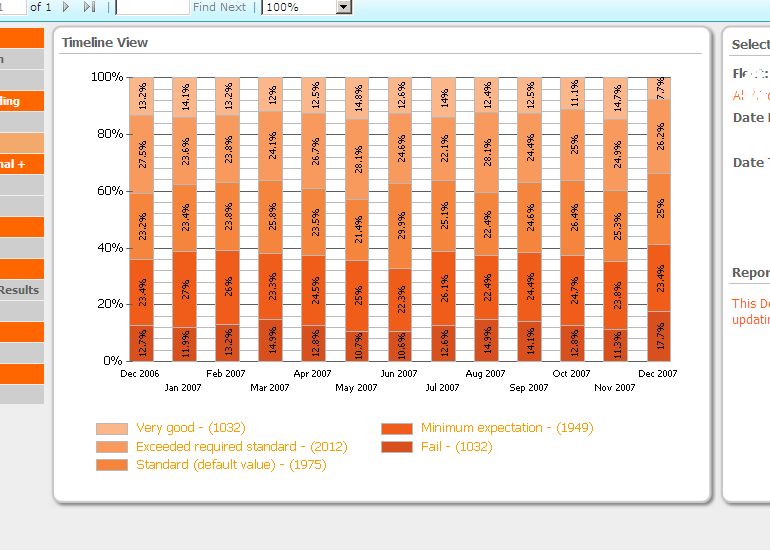
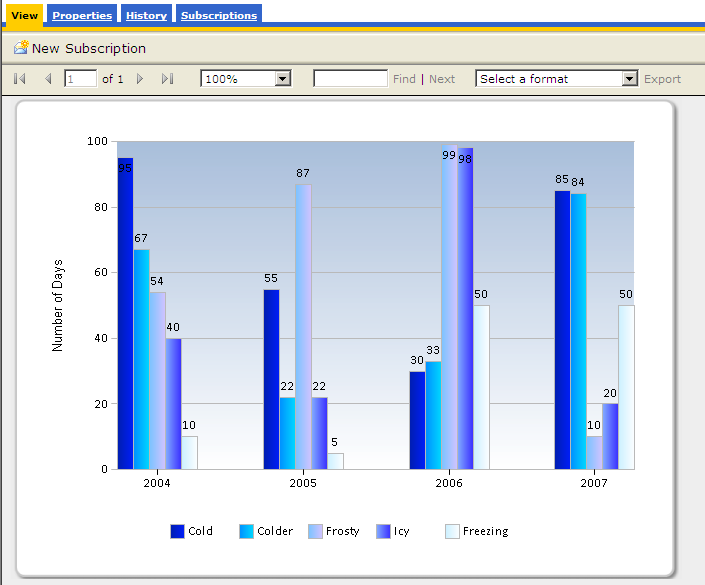
Use a background image as a border for charts. The image behind the chart below is a simple png file of only 8kb in size. To make this work you need to use a rectangle object with the background image set to your image and the chart dropped in the rectangle
-
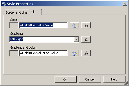
Use custom palettes for your chart series. To do this set up a new table with two columns, one that relates to the key’s in your data source and one with the hex codes of the colours you want to use. Then in your recordset join the id to your data. Once you are returning the hex value for each row to your RS dataset you can use this to define the series colour:
1) Right click on chart -> Properties
2) Select the data tab then edit the value
3) Select the appearance tab then the series style button
4) Select the fill tab then use an expression to
5) Set the color property to your dataset field
6) Click OK, OK, OK, OK (phew!)
I’ve uploaded a sample project to show how this is done.
-
Use black borders and lines sparingly (silver is always a good one).
-
Put RS in Sharepoint Integration mode – the toolbars and filters are much nicer and auto-hide (sort of!). Make sure you consider the limitations of this mode first though.
-
Avoid using 3d perspectives in your charts – this is the easiest way to make your charts fugly (IMO)!


Pingback: Great Dashboard Design – Adatis