Introduction
As a newbie to Adatis I begin my journey of learning the vast, ever-growing languages and platforms. In my first few steps I am taking a problem I already have experience with in R and understanding if the solution in Python presents similar hurdles as a comparison between the two languages.
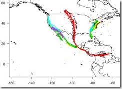
Before joining Adatis I have just graduated with a degree in Biology. During my course I discovered a website containing animal GPS tracked movement data sets, free to use from movebank. So, I am using a data set I am familiar with that contains GPS tracking data of 27 Vulture Turkeys (Cathartes aura) and using both tools to plot the 350,000 points on a map.
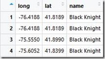
How the data set looks as a csv file loaded into R’s viewing window.
Note: While both platforms are open source there may be packages out there that would optimise the process I was trying to achieve, as a beginner with limited knowledge this was my experience of trying to map geospatial data in R compared to Python and ArcGIS in PowerBI.
Python
Packages concerned: basic (numpy, pandas, matplotlib) geometry (geopandas and shapely)
Python failed to install the geopandas and shapely package and I had to use the pip install command in the command window, alternatively the packages can be downloaded in the anaconda environment. The data loaded in fine as expected. First the longitude and latitude values were zipped together and shapely’s apply point function was used to turn them into a single co-ordinate value.
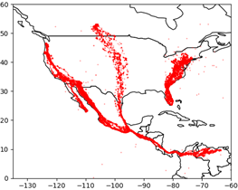
If I were to plot now, I could retrieve a world map (template from the geopandas library, changing the fill, colour of sea and country outline colour) with custom size, shape and a single colour for all the data points which is something, but we can make it more informative.
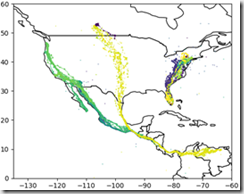
Now when plotting I could not find a function that would allow python to sort colour by groups based on a string value (name of vulture). Instead I created a function just to convert every name to a number, so each co-ordinate had a group number assigned to it depending which vulture it came from. This means a list of 350,000 numbers ranging from 1:27 can be classed as colour for the points.
After plotting python offers a zoom function which allows you to zoom in down to a single point but is limited by the resolution of the map/plot. I did however limit the axis to over the Americas just for initial plot clarity.
The point conversion and plotting process takes around 15 seconds according to python sys.time() function placed at beginning and end of code. Ignoring the library imports the whole process took 14 lines of unique code.
R
Packages concerned: rworldmap
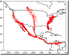
Now R has some useful packages like ggmap, mapdata and ggplot2 which allow you to source you map satellite images directly from google maps, but this does require a free google API key to source from the cloud. These packages can also plot the map around the data as I am currently trimming the map to fit the data. But for a fair test I also used a simplistic pre-built map in R. This was from the package rworldmap, which allows plotting at a country level with defined borders. Axes can be scaled to act like a zoom function but without a higher resolutions map or raster satellite image map it is pointless to go past a country level.
R works a little different to Python, initially we plot a blank map and in a sequential but new line add the points. This differs from the points being plotted and the map being contained in the plot function.
The first step is to get the map from the rworldmap library and plot limiting axes to act a zoom. However, the axes do not automatically show this way. So next, manually define the intervals of axes aka longitude and latitude.
Finally plot the points with customisation on size, shape and colour.
The colour of each point can be assigned using ‘col=factor(dataframe$column)’. So, no need to make a group number index as we did in python.
Using the function system.time(), R reported the plotting take 7 seconds but the actual graphic doesn’t show up for a further 8 seconds making the total time 15 seconds, same as python. R however, again ignoring the library imports executed this in only 6 lines of unique code!
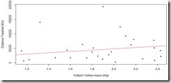
Just for fun I did check for a correlation between distance travelled and weight and a regression analysis would suggest a statistically significant relationship, but without a time scale we cannot conclude anything e.g. some birds could have been tagged longer than others resulting in greater distance travelled.
Is geospatial suitable to present in R and Python?
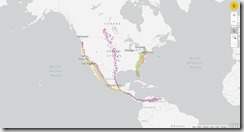
During the write up of this blog I read Jason’s blog(s) on ArcGIS Maps for PowerBI (Jason’s blog), So I trialled my own data. Now quite simply the program is drag and drop. An image presenting the same final information from both R and Python can be created in roughly 2 minutes.
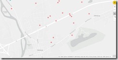
One of the feature I really got on well with is the variable zoom down to the precision of a street. If you have read Jasons blog you will know about all the customisable features, if not read it! But quite simply ArcGIS Maps gave you the option to fully explore the data visually but is limited by analysis and ‘map features’.
PowerBI handles statistical analysis similarly to excel, possible but tedious having to generate each column. The map feature limit poses another problem; ArcGIS (free version) only allows for 1,500 ‘map features’ (5,000 in paid version) which equated to around 30,000 points. With this data set it meant not all the data could be plotted. I thinned out the data in R just by removing every 9 of 10 points and considering the data was continuous this meant the readings were once every half/full day instead of every 1-3 hours, this shouldn’t really affect the overall distance travelled. I suspect a limit like this is in place to save the performance as a similar platform called Tableau plotted all of the data but at the cost of performance to the point that the zoom navigation was unusable.
Conclusion
In summary, I feel like difference between R/Python and PowerBI just depends on the user. PowerBI makes the data very accessible and gives great control for visually exploring the data to a business analyst for example. But if the user is more technical e.g. data scientist, then R/Python might be more fitting. Between R and Python there was no difference in performance with this data set but that could be because in the grand scheme of things 350,000 isn’t ‘big’. There was a notable difference in the amount of code needed but this could be down to my greater experience with R and lacking knowledge in a Python package capable of achieving the same task.

Introduction to Data Wrangler in Microsoft Fabric
What is Data Wrangler? A key selling point of Microsoft Fabric is the Data Science
Jul
Autogen Power BI Model in Tabular Editor
In the realm of business intelligence, Power BI has emerged as a powerful tool for
Jul
Microsoft Healthcare Accelerator for Fabric
Microsoft released the Healthcare Data Solutions in Microsoft Fabric in Q1 2024. It was introduced
Jul
Unlock the Power of Colour: Make Your Power BI Reports Pop
Colour is a powerful visual tool that can enhance the appeal and readability of your
Jul
Python vs. PySpark: Navigating Data Analytics in Databricks – Part 2
Part 2: Exploring Advanced Functionalities in Databricks Welcome back to our Databricks journey! In this
May
GPT-4 with Vision vs Custom Vision in Anomaly Detection
Businesses today are generating data at an unprecedented rate. Automated processing of data is essential
May
Exploring DALL·E Capabilities
What is DALL·E? DALL·E is text-to-image generation system developed by OpenAI using deep learning methodologies.
May
Using Copilot Studio to Develop a HR Policy Bot
The next addition to Microsoft’s generative AI and large language model tools is Microsoft Copilot
Apr