Datazen is a great new addition to the MS BI stack which has been greeted with much enthusiasm since the announcement from Microsoft they had acquired it and it would be freely available to use for customers with SQL Enterprise licenses.
However there have been a few complications around how the interface with Analysis services worked – the main one being that only measures on the first axis were included in the query.
For example executing the following basic MDX query:
1 SELECT
2 NON EMPTY {[Measures].[Internet Sales Amount]} ON 0,
3 NON EMPTY {[Product].[Product].[Product]} ON 1
4 FROM [Adventure Works]
Would result in a dataset which did not include the members from the product dimension (not great!).
Until recently the workaround to get around this involves creating a calculated member which returns the Member_Caption and then placing this on the same axis as the measures. Such as in the example below.
1 WITH MEMBER [Measures].[ProductName] as [Product].[Product].CurrentMember.properties("Member_Caption")
2
3 SELECT
4 {[Measures].[ProductName], [Measures].[Internet Sales Amount]} on 0,
5 nonempty({[Product].[Product].[Product]}, [Measures].[Internet Sales Amount]) on 1
6 FROM [Adventure Works]
However with the latest version of Datazen, this is no longer required! This means that you can write the query above in the original format and it will work as expected. For people that use management studio or report builder to create their MDX queries rather than hand coding it this now means it is possible to use these statements in your Datazen MDX queries.
Firstly you need to connect Datazen server to your SSAS instance – there is a great article on the Microsoft site here which explains the process.
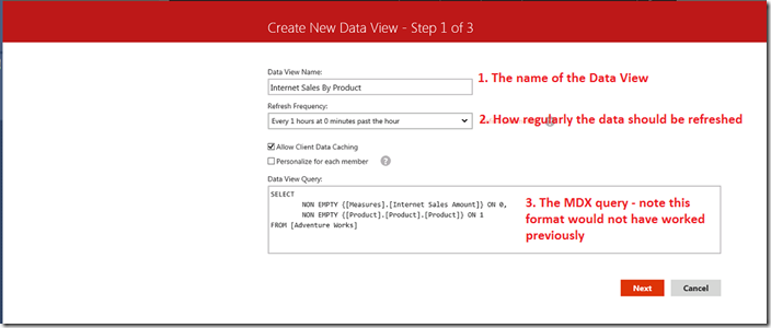
1. When you connect to Analysis Services to create a new dataset you are now presented with the following options. Note the MDX is from the first example which would not have worked previously.

2. In the second screen you need to select the data types and display names for each of the measures. I suggest that it is a good idea to change the names to something which should be as clear as possible during report creation (by default the display name is the same as the Column Name).

3. There’s not much to do on this screen provided that the preview looks correct – you just click Next 🙂

Now the data set is ready to be used in reports.
Introduction to Data Wrangler in Microsoft Fabric
What is Data Wrangler? A key selling point of Microsoft Fabric is the Data Science
Jul
Autogen Power BI Model in Tabular Editor
In the realm of business intelligence, Power BI has emerged as a powerful tool for
Jul
Microsoft Healthcare Accelerator for Fabric
Microsoft released the Healthcare Data Solutions in Microsoft Fabric in Q1 2024. It was introduced
Jul
Unlock the Power of Colour: Make Your Power BI Reports Pop
Colour is a powerful visual tool that can enhance the appeal and readability of your
Jul
Python vs. PySpark: Navigating Data Analytics in Databricks – Part 2
Part 2: Exploring Advanced Functionalities in Databricks Welcome back to our Databricks journey! In this
May
GPT-4 with Vision vs Custom Vision in Anomaly Detection
Businesses today are generating data at an unprecedented rate. Automated processing of data is essential
May
Exploring DALL·E Capabilities
What is DALL·E? DALL·E is text-to-image generation system developed by OpenAI using deep learning methodologies.
May
Using Copilot Studio to Develop a HR Policy Bot
The next addition to Microsoft’s generative AI and large language model tools is Microsoft Copilot
Apr