On February 8th, Power BI released a new custom visual called Dual KPI. The purpose of this chart is to visualise two measures over time and show their trend based on a joint timeline. The absolute values may use different scales e.g. Sales and Profit.
This blog will not only show you how to set up the new visual, but also demonstrate how changing some of the settings can enhance a report. Adam Saxton posted a YouTube video that also walks through the Dual KPI.
Pre Requisites
In order to follow my example, you will need a copy of AdventureWorksDW2014 database – found here. You will also need to download the following custom visuals:
o Hierarchy Slicer – http://bit.ly/2kAv4Id
o Dual KPI – http://bit.ly/2l1qCTp
NOTE: This article assumes previous knowledge of downloading and importing Custom Visuals into Power BI Desktop. If this concept is new to you, Scott Murray’s blog gives great step by step instructions.
Prepare Data
Open Power BI Desktop and Get Data. Point to the new AdventureWorksDW2014 database and drop down Advanced Options. Paste in the following T-SQL:
SELECT
DPC.EnglishProductCategoryName
,DPS.EnglishProductSubCategoryName
,DP.EnglishProductName
,SUM([TotalProductCost]) AS [TotalProductCost]
,SUM([SalesAmount]) AS [SalesAmount]
,SUM([SalesAmount]) – SUM([TotalProductCost]) As ProfitAmount
,[ShipDate]
FROM [AdventureWorksDW2014].[dbo].[FactInternetSales] FI
INNER JOIN
[dbo].[DimProduct] DP
ON DP.ProductKey = FI.ProductKey
INNER JOIN
[dbo].[DimProductSubcategory] DPS
ON DPS.ProductSubcategoryKey = DP.ProductSubcategoryKey
INNER JOIN
[dbo].[DimProductcategory] DPC
ON DPS.ProductcategoryKey = DPC.ProductcategoryKey
WHERE ShipDate BETWEEN ‘2013-01-01’ AND ‘2013-06-30’
GROUP BY
DPC.EnglishProductCategoryName
,DPS.EnglishProductSubCategoryName
,DP.EnglishProductName
,[ShipDate]
When happy, click ‘OK’ to continue. The preview of the data will open. Click Load, as we do not need to edit any data in the Query Editor. Apply and changes and rename the query to ‘Internet Sales’ – final output below:

Some measures and attributes need to be formatted within the ‘Modeling’ Tab.
o ‘ShipDate’ = dd MMMM yyyy
o ‘ProfitAmout’ = Currency
o ‘SalesAmount’ = Currency
The final formatting step is to create a Product hierarchy, based on the three product attributes. Navigate to the Data tab, right click on the ‘EnglishProductCategoryName’ attribute and select ‘New Hierarchy’. Drag the attributes into the hierarchy and name it ‘Products’. It should look like the following:

Create Report Visual
We need to use both the Slicer and Dual KPI custom visual. To achieve this, follow the steps below:
Select the Hierarchy Slicer in the Visualizations menu and drag the ‘Products’ hierarchy on to the Fields box. The slicer will now appear in the report.

Select the Dual KPI Slicer in the Visualizations menu and drag the following measures to the appropriate chart properties box:
a. ‘ShipDate’ > Axis
b. ‘SalesAmount’ > Top values
c. ‘ProfitAmount’ > Bottom values

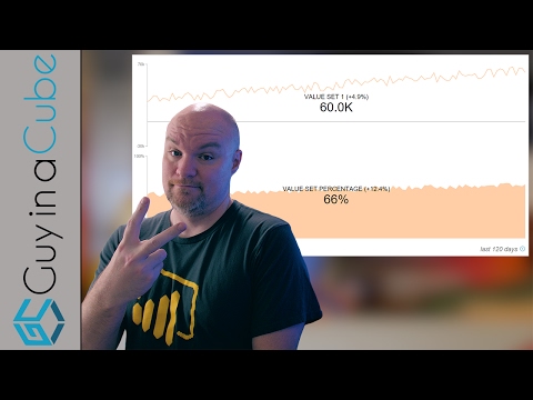
The chart is now configured and each metric/visual is explained in more detail below. Only the top KPI (Sales Amount) is shown because both use the same calculations.
![clip_image002[4]](https://adatis.co.uk/wp-content/uploads/historic/callumgreen_clip_image0024_3.jpg "clip_image002[4]")
1. This is a fixed growth percentage, comparing the last (06/30/2013) vs. first (01/01/2013) data point on the graph. The metric acts as a static KPI.
2. The Sales Amount value for the last data point on the graph. Also a static KPI.
3. The data point currently being hovered over. This dynamically changes when you move along the axes.
4. The Sales Amount value for the current data point being hovered over. Also dynamic.
5. % since metric that looks at the Sales Amount for the last data point on the graph and works out the growth based on the current data point being hovered over. To use the example in the screenshot:
– Sales Amount for 06/30/2013 = 51,596
– Sales Amount for 05/17/2013 = 18,442
– % since: ((51,596 – 18,442) / 18,442) * 100 = 179.7%
Enhancing the Report
As with all custom visual in Power BI, there are lots of settings that you may never use. I have picked out some that enrich the capabilities of the Dual KPI Chart:
o Fields
o Warning State
§ Set alerts around data freshness and view warning messages.
o Top/Bottom % change start date
§ For the fixed +/- % change on the chart, you can add an override start date. The dates could vary by product category and dynamically impact the % in the visual.
o Format
o Dual KPI Properties
§ Show abbreviated values, define multiple tooltips and show stale data warnings.
o Dual KPI Chart Type
§ Choice of either Area or Line charts.
I have applied the Top/Bottom % change start date functionality and also formatted the chart properties. The report now looks a little more professional:
![clip_image002[6]](https://adatis.co.uk/wp-content/uploads/historic/callumgreen_clip_image0026_4.jpg "clip_image002[6]")
Further Reading
o Adam Saxton YouTube Video – https://www.youtube.com/watch?v=821o0-eVBXo
o Power BI Blog – http://bit.ly/2kudZ0a
Contact Me
If you would like a copy of the workbook or have any questions about this blog, please leave a comment below.
Twitter: @DataVizWhizz
Introduction to Data Wrangler in Microsoft Fabric
What is Data Wrangler? A key selling point of Microsoft Fabric is the Data Science
Jul
Autogen Power BI Model in Tabular Editor
In the realm of business intelligence, Power BI has emerged as a powerful tool for
Jul
Microsoft Healthcare Accelerator for Fabric
Microsoft released the Healthcare Data Solutions in Microsoft Fabric in Q1 2024. It was introduced
Jul
Unlock the Power of Colour: Make Your Power BI Reports Pop
Colour is a powerful visual tool that can enhance the appeal and readability of your
Jul
Python vs. PySpark: Navigating Data Analytics in Databricks – Part 2
Part 2: Exploring Advanced Functionalities in Databricks Welcome back to our Databricks journey! In this
May
GPT-4 with Vision vs Custom Vision in Anomaly Detection
Businesses today are generating data at an unprecedented rate. Automated processing of data is essential
May
Exploring DALL·E Capabilities
What is DALL·E? DALL·E is text-to-image generation system developed by OpenAI using deep learning methodologies.
May
Using Copilot Studio to Develop a HR Policy Bot
The next addition to Microsoft’s generative AI and large language model tools is Microsoft Copilot
Apr