XLCubed Version 4 was recently released, adding support for increased data visualisation via MicroCharts, as well as enhanced web publishing.
I’ve been using XLCubed since version 1 and have always found it both powerful and easy to use. All the standard functionality that you’d expect from an OLAP/Analysis Services Excel add-in exists and is incredibly intuitive, yet there’s plenty more if you want to dive deeper. In particular, I’ve always liked the following features:
- Wealth of right click functionality, such as remove only, keep only, propagate across sheets;
- Drag and drop pivoting – alter your report quickly without having to open toolbars or menus;
- Converting grids to formula – Allows you to easily create disjoint reports using Excel formulas;
- Linking grids – Means that an action in one grid (such as a drill down on a dimension) can automatically perform the same operation on multiple linked grids.
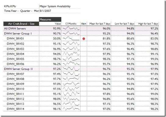
As mentioned, version 4 sees the inclusion of the interesting MicroCharts feature to the XLCubed grids. This essentially means that you can choose to display just numbers, a graphical MicroChart visualisation of the numbers, or both (see below). The MicroCharts do not hinder the core functionality, such as drill down or pivoting, and can be turned on for any of the measures.

There’s a lot more functionality worth looking at, you can find out more at www.xlcubed.com.
Introduction to Data Wrangler in Microsoft Fabric
What is Data Wrangler? A key selling point of Microsoft Fabric is the Data Science
Jul
Autogen Power BI Model in Tabular Editor
In the realm of business intelligence, Power BI has emerged as a powerful tool for
Jul
Microsoft Healthcare Accelerator for Fabric
Microsoft released the Healthcare Data Solutions in Microsoft Fabric in Q1 2024. It was introduced
Jul
Unlock the Power of Colour: Make Your Power BI Reports Pop
Colour is a powerful visual tool that can enhance the appeal and readability of your
Jul
Python vs. PySpark: Navigating Data Analytics in Databricks – Part 2
Part 2: Exploring Advanced Functionalities in Databricks Welcome back to our Databricks journey! In this
May
GPT-4 with Vision vs Custom Vision in Anomaly Detection
Businesses today are generating data at an unprecedented rate. Automated processing of data is essential
May
Exploring DALL·E Capabilities
What is DALL·E? DALL·E is text-to-image generation system developed by OpenAI using deep learning methodologies.
May
Using Copilot Studio to Develop a HR Policy Bot
The next addition to Microsoft’s generative AI and large language model tools is Microsoft Copilot
Apr