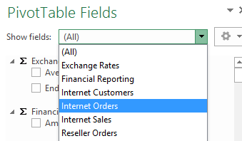
I’ve always liked how Excel and other client tools deal with measure groups in a multi dimensional SSAS cube. Once you connect to the cube, you get a drop down in the Pivot Table fields pane that lets you choose which measure group you want. From there, you get a filtered list of measures and dimensions. For example, if I connect to the Adventure Works 2012 sample cube, I get the following:
By picking Internet Orders, I will see only the measures dimensions that relate to Internet Orders, which provides me with a good way of navigating a large cube.
Tabular
Unfortunately though, if I connect to a Tabular model (e.g. the sample Adventure Works 2012 model that I got from codeplex), then if I click the same drop down, then I will see every table in the entire model, whether the table is a dimension, a fact or something else. E.g. here for a tabular model than contains 3 fact tables, but 15 tables in total, then I see all 15 tables:
This isn’t ideal in my opinion, as I’d much rather that users had the ability to quickly jump to an area of interest, which measure groups achieve fairly well. As I have 3 fact tables, I would expect to see those 3 fact tables/measure groups in the drop down.
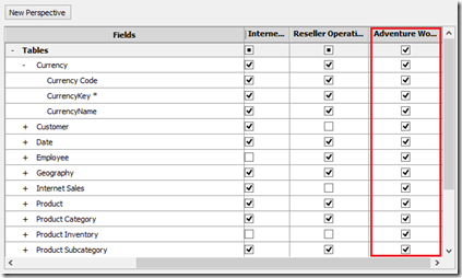
I did accept this as a quirk of tabular until I stumbled across something recently. If you connect to a tabular perspective, then Excel behaves exactly as Multi Dimensional does, i.e. it shows you only measure groups in the drop down. To illustrate I’ve added a new perspective to the model that contains all tables and I’ve called this perspective ‘Adventure Works’:
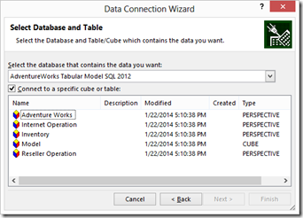
Now I can connect to this new perspective via Excel. Remember the perspective contains all my tables, so it shouldn’t be any different than connecting the model itself:
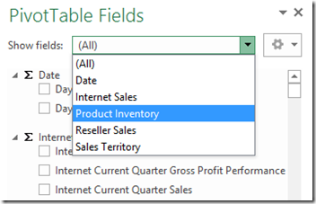
The perspective does give a different result though – now only the actual measure groups are displayed to me in the drop down, which is much more user friendly:
Summary
This is completely different to the way that perspectives work in multi dimensional. When making MD cubes, I wouldn’t always need perspectives, just because the measure groups provided a ‘natural’ way of the users picking the subset of the cube that was of interest to them. Now with tabular, it seems that using a perspective will actually improve the user experience.


Introduction to Data Wrangler in Microsoft Fabric
What is Data Wrangler? A key selling point of Microsoft Fabric is the Data Science
Jul
Autogen Power BI Model in Tabular Editor
In the realm of business intelligence, Power BI has emerged as a powerful tool for
Jul
Microsoft Healthcare Accelerator for Fabric
Microsoft released the Healthcare Data Solutions in Microsoft Fabric in Q1 2024. It was introduced
Jul
Unlock the Power of Colour: Make Your Power BI Reports Pop
Colour is a powerful visual tool that can enhance the appeal and readability of your
Jul
Python vs. PySpark: Navigating Data Analytics in Databricks – Part 2
Part 2: Exploring Advanced Functionalities in Databricks Welcome back to our Databricks journey! In this
May
GPT-4 with Vision vs Custom Vision in Anomaly Detection
Businesses today are generating data at an unprecedented rate. Automated processing of data is essential
May
Exploring DALL·E Capabilities
What is DALL·E? DALL·E is text-to-image generation system developed by OpenAI using deep learning methodologies.
May
Using Copilot Studio to Develop a HR Policy Bot
The next addition to Microsoft’s generative AI and large language model tools is Microsoft Copilot
Apr