In my last post I had a bit of a moan about the lack of new data visualisation features in PerformancePoint Services but to be fair MSFT have really turned up the dial on the data visualisation functionality with the release of Excel 2007 and SSRS 2008. SQL 2008 R2 sees further advances with features such as Sparklines, Data Bars and indicators being far easier to create in SSRS. There’s still a few things missing from the stack though when compared against some of the pureplay visualisation vendors such as Tableau and Spotfire.
Icon Charts (I’m not actually sure that’s their real name!) are another form of Tufte’s “small multiple” that combines the concepts of lattice/trellis charts and heatmaps. This type of visualisation utilises the user’s perception of colour (hue) and form (size) to allow analysis of multiple categories with multiple quantitative measures.
I was hoping that it might be possible to do something with the new indicators in R2 and though you can use custom images there’s no simple way to hook them up to the data in terms of size and colour.
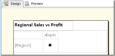
In this solution (workaround/hack?) I’m using the matrix object again but rather than using an inline chart I’m simply using a square symbol (letter n) from the wingdings font and then setting the colour (with a sequential palette) and size according to the data. My example uses hard-coded values in a switch statement in the expression but you could be cleverer than this and make the values percentages of the maximum in your dataset for example.

Add a couple of legends so that the viewer can clearly see what they are looking at. It’s easy to pick out that SouthWest in Q3 had good revenue but low profit. Is there a Problem? Add a drillthrough to detail report to allow the user to find out.

As always the sample report can be downloaded from here: IconCharts.rdl (81.36 kb)
Alternatively, e-mail devteam(at)adatis(dot)co(dot)uk for a copy.
Introduction to Data Wrangler in Microsoft Fabric
What is Data Wrangler? A key selling point of Microsoft Fabric is the Data Science
Jul
Autogen Power BI Model in Tabular Editor
In the realm of business intelligence, Power BI has emerged as a powerful tool for
Jul
Microsoft Healthcare Accelerator for Fabric
Microsoft released the Healthcare Data Solutions in Microsoft Fabric in Q1 2024. It was introduced
Jul
Unlock the Power of Colour: Make Your Power BI Reports Pop
Colour is a powerful visual tool that can enhance the appeal and readability of your
Jul
Python vs. PySpark: Navigating Data Analytics in Databricks – Part 2
Part 2: Exploring Advanced Functionalities in Databricks Welcome back to our Databricks journey! In this
May
GPT-4 with Vision vs Custom Vision in Anomaly Detection
Businesses today are generating data at an unprecedented rate. Automated processing of data is essential
May
Exploring DALL·E Capabilities
What is DALL·E? DALL·E is text-to-image generation system developed by OpenAI using deep learning methodologies.
May
Using Copilot Studio to Develop a HR Policy Bot
The next addition to Microsoft’s generative AI and large language model tools is Microsoft Copilot
Apr