In this blog I will go about discussing the importance of design, in particular looking at how icons can help add the finishing touches to a piece of front end development.
Whether you’re building a Power BI report, SSRS report, PowerApp, or doing any kind of front end visualisation and design, you’ll know that 50% of the battle is making whatever you’re building jump out of the page. You could have built the most useful report that a user could wish for, but unless it looks good, you’re not going to get any plaudits. Essentially, good design goes a long way to making a success on a piece of development. This is even more important if you’re building the underlying architecture / ETL, and for all our good practice and thoughtfulness in this area as developers, will rarely impress or impact on an end user.
Its important to get inspiration for design from somewhere, so before going about designing or even building something, take a look on Google, do some research and try to look for similar things to what you’re doing and see what you think looks good, or not so good. You should build an idea up of how you want to design you’re landing page, report or report headers, etc. within the tool. If you’re in Power BI, take a look at the partner showcase for example. There’s some really good examples to give you ideas – like this one!
Microsoft apps such as Power BI or PowerApps go a long way in helping us build the best when it comes to data analytics and visualisation, but unfortunately they sometimes rely on developers to go outside the box to finish things off.
Icon Finder
Recently I’ve started to use a site called iconfinder.com which has a large pool of useful icons you can use for building out certain corners of apps that the standard MS tooling will not support. The icons are mostly $2 each, but you can get a subscription for £20/month or $10 with a discount code (which you should cancel as soon as you register). Please, don’t jump in if you think you need to use this as a resource. Alternatively, save the icon using Chrome and use it as a placeholder until you are happy to push to production. For non-subscribed users, the icon will always come on a background of faint grey lines. This isn’t too bad as they don’t completely ruin the look and feel of the icon in the development and are good for a placeholder for demos, etc. To get started, just type in your keyword for the type of icon you’re looking for, and then its just a case of wading through the results to find the icon that fits the look and feel your inspired to build against. Sometimes, you’ll get another bit of inspiration off the back of this which you can use as another key word to find even more icons.
The site also comes with a very handy icon editor tool, essential Paint Shop Pro on the web. There’s lots of these sites out there but its useful its all integrated into one place at no extra cost. It will load the SVG icon into it automatically if subscribed which then allows you to edit colours or shapes etc. In my instance, I found a nice % complete icon set which would look good on a white background. Unfortunately, I wanted it on a blue header bar, so needed to change it up slightly to fit the look and feel. No problem, took less than a minute to modify and download.
Its also worth mentioning that the site does a good job at helping you find a pool of icons which will fit together nicely using the same look and feel, showing you icons from the same icon set. In one instance, I replaced an icon I was looking for to be from the same pool even though the icon wasn’t exactly what I was looking for – because overall it just felt like it fitted together nicer with the other icons on the screen.
Design in Practice
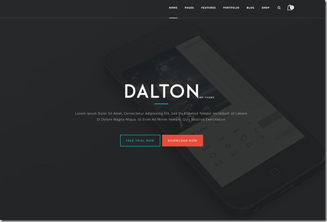
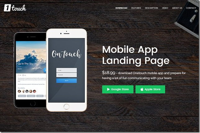
As mentioned above, doing some research before you build can really help you create a much better finish. For inspiration for a recent PowerApps design I did a quick search for landing pages on Google, and found a few I liked the look of (below). As long as the general elements you are working to are similar, it really doesn’t matter where the inspiration comes from. In these cases, they were in the form of mobile apps.
From these images, I was able to identify the key components which made me bookmark them:
- I wanted some kind of non-offensive background, possibly semi-transparent, or with overlay.
- I wanted a title that stands out the page, so white on grey or similar.
- I wanted a small section for a blurb for the PowerApp.
- I wanted 2 buttons, and the buttons to stand out.
- I wanted logos in the top corners.
- I wanted a nice look and feel for the colour palette.
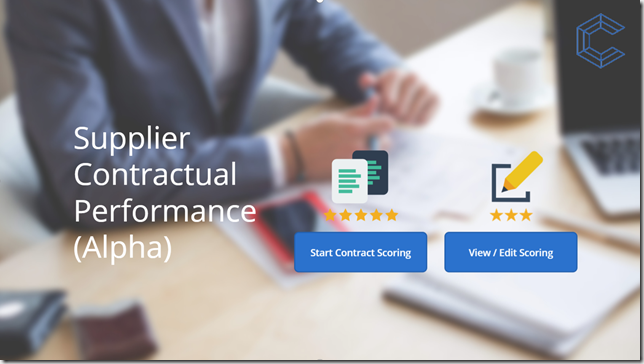
From this, I then produced the following landing page.
I found the background on picjumbo.com which turned out to be quite a nice resource for some generic business style artwork, and then added a blurring filter across the top. This still interferes slightly with the buttons / title so I’m not completely happy but satisfied enough that it achieves the look and feel I was looking for. For the title, the range of fonts supplied with PowerApps is rather limited so I could go externally for this too but was happy enough for the time being. The layout also leaves room to shrink the title and add a small blurb if need be. The buttons are made up of a number of icons and fit with the theme for the app.
As mentioned above, I also added % complete icons to each page so users were able to understand how far they were along the scoring pages within the app. PowerApps provides sufficient icons for the back/refresh buttons that fit in with the white on blue theme, so I didn’t have to go externally for these. These were placed on the page header next to the logo.
Power BI
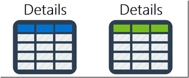
While this most recent bit of design was focused on PowerApps, I also add small bits into PowerBI during report design. For instance, rather than just have a generic button that can push you to a “details” page which has a table for the row by row breakdown of some aggregated data – I looked for an icon, edited the colour palette slightly and added this to the report. With recent Power BI functionality, I can make the image act as a button and redirect the user to another page.
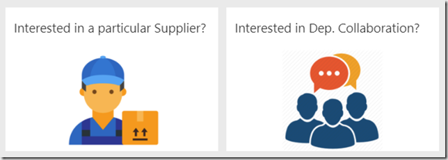
I’ve also used icons in dashboard design where a single visual didn’t really represent the content of the report to drill into. This can also be a good way to go about adding a bit of flavour to a dashboard to mix things up. In my case, it also meant the drill down into the report level was less ambiguous, by asking a question as the title if that’s what the user wants to do.
Design is always subjective of course, but its great to use other resources at your disposal to go about building out apps. Depending upon the current estate in which you develop, it also helps them stand out a bit more and add a unique context to the reports/apps within the project. Hopefully this blog has given you a few ideas for your next project!


Introduction to Data Wrangler in Microsoft Fabric
What is Data Wrangler? A key selling point of Microsoft Fabric is the Data Science
Jul
Autogen Power BI Model in Tabular Editor
In the realm of business intelligence, Power BI has emerged as a powerful tool for
Jul
Microsoft Healthcare Accelerator for Fabric
Microsoft released the Healthcare Data Solutions in Microsoft Fabric in Q1 2024. It was introduced
Jul
Unlock the Power of Colour: Make Your Power BI Reports Pop
Colour is a powerful visual tool that can enhance the appeal and readability of your
Jul
Python vs. PySpark: Navigating Data Analytics in Databricks – Part 2
Part 2: Exploring Advanced Functionalities in Databricks Welcome back to our Databricks journey! In this
May
GPT-4 with Vision vs Custom Vision in Anomaly Detection
Businesses today are generating data at an unprecedented rate. Automated processing of data is essential
May
Exploring DALL·E Capabilities
What is DALL·E? DALL·E is text-to-image generation system developed by OpenAI using deep learning methodologies.
May
Using Copilot Studio to Develop a HR Policy Bot
The next addition to Microsoft’s generative AI and large language model tools is Microsoft Copilot
Apr