The ability to effectively transfer knowledge within organisations is critical to the success of a business – whether it be preserving a competitive advantage, encouraging new ideas or improving employee satisfaction. In this article, I detail some helpful techniques that may be utilised to effectively facilitate knowledge transfer. For purposes of context, I will refer back to a recent data visualisation training course that I developed and ran in which I adopted these techniques.
The aforementioned training course was aimed at people who were relatively new to data visualisation and was scheduled to last a full day. Hence, the potential for attendees to become mentally fatigued and/or uninterested by the end of the day was high. This is the case with many training programs – learning new things can be both difficult and tiring. To mitigate this, I developed the course with two key principles in mind: simplicity and intrigue.
Simplicity
To teach by definition is to impart new knowledge onto someone. Therefore, it is crucial to streamline the delivery of teaching material to ensure that students can absorb as much new information as possible. This can be achieved by removing any hindrances to learning, such as complex language or irrelevant and unengaging concepts.
Conciseness
Conciseness is an important trait to exhibit if you want to be a successful communicator. Workshop material often contains an excessive amount of information when taking the proficiency level of those attending into context. Training programmes should not be in the format of an encyclopedia. Instead, they should focus on providing a solid foundation of the subject, covering the most commonly occurring cases, as the Pareto principle states! This helps in the following ways:
- Attendees are not disenfranchised by being overwhelmed with too much information too quickly.
- As attendees work on the project, they will need to fill any knowledge gaps they may have. This approach facilitates improved knowledge uptake through hands-on learning rather than solely relying on listening and instruction.
For instance, in the aforementioned training course mentioned earlier, I utilised Top Tip lists and Step-by-step Procedures to ensure that the material included was highly relevant and communicated in a concise and simple manner.
Choice of Examples
Selecting engaging and straightforward examples to contextualize teaching material is crucial. For instance, when teaching Business Intelligence (BI) concepts, product sales databases are often used to demonstrate key ideas. While this is common practice, as many individuals who engage with these materials will work with this type of data, I contend that there are more effective and simpler examples to illustrate BI concepts. Sales data can be uninteresting and may contain concepts that people may not naturally grasp, as it is not inherently relatable.
So, what do people find interesting and relatable? Themselves, of course! Hence, I developed a dummy dataset relating to employees working for a restaurant chain, an excerpt of which is presented below:
| ID | Employee | Gender | Location | Position | Salary (£) | Date of Birth | Race |
| 0 | Tobias Peters | M | Netherlands | Manager | 75,474 | 08/04/1972 | White |
| 1 | Jasmine Dupont | F | France | Chef | 40,407 | 19/11/1990 | Black |
| 2 | Ezra Archer | M | Ireland | Bartender | 25,456 | 26/01/1992 | White |
This data is instinctively understood by everyone because everyone has a gender, a location of work and a date of birth, thus ensuring delivery of the teaching material is as streamlined as possible.
Intrigue
As discussed previously, prioritising simplicity through conciseness and choosing appropriate examples helps facilitate learning. Another aspect that helps facilitate learning is intrigue – if people are interested and engaged in what they are learning, they are more likely to:
- Successfully retain the information
- Be motivated to apply what they have learned, reinforcing learnt material and plugging in knowledge gaps as they learn through practical application
Choice of Examples
The use of intriguing examples helps to attract and engage the audience, allowing them to think creatively, and hence improve their understanding, by showcasing key concepts in different contexts.
To demonstrate this, I presented a few examples of intriguing data visualisations. The key here was to utilise examples that were creative. Reddit is a great resource for original content, and there is a subreddit, DataIsBeautiful, that showcases examples of interesting and beautiful data visualisations. Some of the examples I shared can be seen below:
[1] 
[2]
These examples intrigue and engage the audience by allowing them to think creatively about the various contexts data visualisation can be used in.
These examples could also come in the form of stories. As Tyrion Lannister famously once said, “There is nothing more powerful than a good story”. And, although Game of Thrones Season 8 doesn’t get many things right, this line remains true, especially in the context of teaching.
During my course, I shared a famous story about confirmation bias during World War II:
During the war, researchers investigated the body damage of planes that had returned from battles and decided that they should reinforce particular body-parts (e.g. the wings) based on the amount of damage sustained on these planes. However, further analysis suggested this was erroneous as it didn’t account for all the planes that did not return. The fact that the planes had returned despite particular body parts being heavily damaged showed that these body parts were robust enough to sustain that damage. In turned out, the body parts that should have been reinforced were those that were not heavily damaged on the planes that came back, because if they had been heavily damaged, they would not have come back!
This story helps create intrigue by showcasing:
- How important data can be when utilised correctly, in this case, potentially life-saving.
- The different and unique contexts data analytics techniques can be used in to gain a competitive advantage.
Interaction
Discussions are far more interesting than lectures. Although workshop leads, are expected to do a lot of talking, allowing time for attendees to make contributions improves their overall experience of the workshop as they can:
- Help shape and direct the course around what they are interested in.
- Validate what they have learnt through clarification questions.
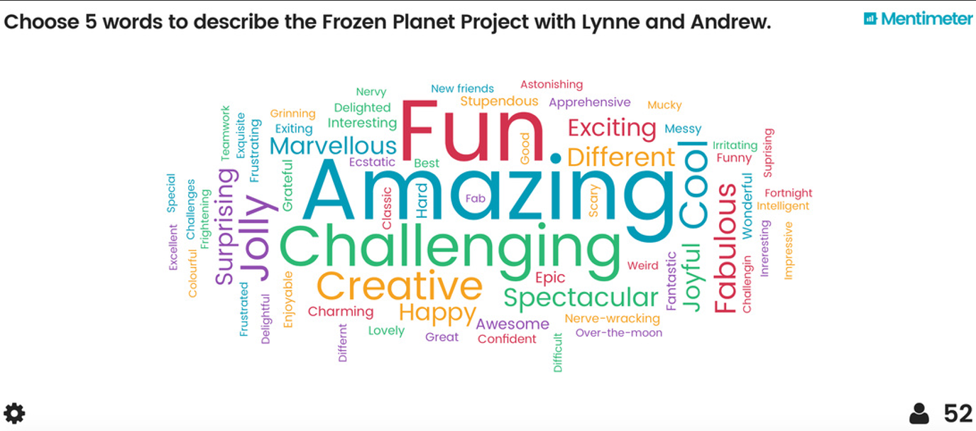
There are even new applications which aid this process. In my workshop, I adopted the use of a particular application called Mentimeter. This application helps facilitate improved interaction during presentations by allowing multiple users to answer prompts on a shared whiteboard-type interface, as shown in the image below:

Utilising programmes like Mentimeter has a number of benefits, including
- Ease of use
- Anonymity
- Ability to gather large volumes of input in small amounts of time
Asking During the data visualisation training programme, I allocated time for participants to play around with the data by themselves, seeing what insights they were able to extract. Due to participants’ active participation and sense of ownership over the outcome, this involvement not only enhanced learning through learning by practical application but also increased passion. This approach can be seen as a form of gamification, where participants are motivated to achieve goals such as discovering the most interesting insights in the workshop
Capitalising on the Intrigue
Having done all this work to engage the audience, it would be a shame if some members were to never touch the material ever again! Therefore, it is important to capitalise on the interest of the audience by making it as easy as possible for them to continue learning if they wish to do so – remember, people lead busy lives! The simplest means of doing this is by recommending various further study materials.
There are a plethora of study materials available online, and different people prefer different forms of learning. For example, YouTube channels are a great way for attendees to continue to be exposed to teaching material that is delivered in an interesting and engaging manner. In my experience, YouTube works better than some more conventional methods such as textbooks because of its:
- Ease of access. Videos are free, easily searchable, accessible anywhere (e.g. on the go) and accessible in customizable formats (e.g. playback speed may be altered or subtitles added).
- Diverse library of options. If you don’t associate with one teaching style, it is often easy to find the same material from another contributor.
- Primary function – a means of entertainment – in contrast to textbooks, which remind people of stressful times like exam preparation. This helps lower the motivation barrier for learning.
- Bitesize content – people aren’t overwhelmed by an enormous volume of material
- Ability to use visuals and audio to enhance the learning experience
Final Thoughts
Although not the only two key principles, simplicity and intrigue are both very important for organisations to keep in mind when developing training programmes.
Although the examples used in this article pertain to an introductory course on data visualisation, these principles apply to more comprehensive courses too. In essence, for any type of training course, one should focus on:
- Ensuring that delivery of teaching material is focused on key topics as well as streamlined so that the student is able to absorb as much new material as possible (removing hindrances to learning).
- Providing a springboard (by generating interest throughout the workshop and capitalising on that interest through providing further study recommendations) to enable attendees to continue their development after the workshop.
If you have any questions related to this post please Get in touch and speak to a member of the Adatis team to discuss the topic in greater detail.
Introduction to Data Wrangler in Microsoft Fabric
What is Data Wrangler? A key selling point of Microsoft Fabric is the Data Science
Jul
Autogen Power BI Model in Tabular Editor
In the realm of business intelligence, Power BI has emerged as a powerful tool for
Jul
Microsoft Healthcare Accelerator for Fabric
Microsoft released the Healthcare Data Solutions in Microsoft Fabric in Q1 2024. It was introduced
Jul
Unlock the Power of Colour: Make Your Power BI Reports Pop
Colour is a powerful visual tool that can enhance the appeal and readability of your
Jul
Python vs. PySpark: Navigating Data Analytics in Databricks – Part 2
Part 2: Exploring Advanced Functionalities in Databricks Welcome back to our Databricks journey! In this
May
GPT-4 with Vision vs Custom Vision in Anomaly Detection
Businesses today are generating data at an unprecedented rate. Automated processing of data is essential
May
Exploring DALL·E Capabilities
What is DALL·E? DALL·E is text-to-image generation system developed by OpenAI using deep learning methodologies.
May
Using Copilot Studio to Develop a HR Policy Bot
The next addition to Microsoft’s generative AI and large language model tools is Microsoft Copilot
Apr