Intro
‘It’s not what you say; it’s how you say it.’ The same applies to data. Sometimes data lies, and this blog is an explanation of how. With this information, you can spot data quality issues and subsequently improve the value of your data.
Framing
By positively or negatively framing data, you can mislead, persuade, and lie. For example, if I said that 1% of young adults in London are violent, you may not have a massive cause for concern. However, if I said that there are 10,000 violent young adults in London, you may be more worried. We can deceive either with intention or not, and sometimes it’s because we want the perceiver to think a certain way.
The framing effect can include decoys, which is famous in supermarkets. For example, if you have a £30 drink next to a £10 drink, you will probably not feel as bad with buying a £10 drink. Regarding presenting data, we can do the same thing. One can compare one data set to another and change the context. Framing is famous for investment graphs. For example, when trying to show a good performance of an investment, one may hide a crash in previous years.
Relative data over absolute
Another example of displaying deceitful data is to show a relative change instead of an absolute. For example, the relative increased risk of colon cancer when eating Bacon every day is 27%. As an absolute, 7 Out of 100 people who eat bacon every day will eventually get colon cancer, but 6 out of 100 people who do not eat bacon every day will get colon cancer anyway. This is an increase of 1 person out of 100 if they eat bacon every day. From this study, the press then purported that eating bacon gave a person a 27% increase in being diagnosed with cancer, which is technically true but misrepresented.

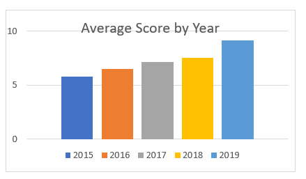
Quantifying the unquantifiable
We often try to quantify the unquantifiable. It is not always possible to measure and weigh human experiences, anecdotes, and feelings. To some, happiness is an unquantifiable concept. If I asked you to rate your happiness from 1 to 10, you would put a result. This rating does not examine what 10 means to you; it does not examine the context, nor does it allow for examples. This gets worse when you ask a large pool of people to also rate their happiness. So, an average score is not valuable if current happiness means different things to a group of large people. This is not to say that quantifiable data is useless. However, sometimes to give validity to quantitative data you must add context with qualitative information.

This short blog has been an introduction to three issues when representing data. For more, I would recommend looking at David Spiegelhalter’s twitter and books!
Introduction to Data Wrangler in Microsoft Fabric
What is Data Wrangler? A key selling point of Microsoft Fabric is the Data Science
Jul
Autogen Power BI Model in Tabular Editor
In the realm of business intelligence, Power BI has emerged as a powerful tool for
Jul
Microsoft Healthcare Accelerator for Fabric
Microsoft released the Healthcare Data Solutions in Microsoft Fabric in Q1 2024. It was introduced
Jul
Unlock the Power of Colour: Make Your Power BI Reports Pop
Colour is a powerful visual tool that can enhance the appeal and readability of your
Jul
Python vs. PySpark: Navigating Data Analytics in Databricks – Part 2
Part 2: Exploring Advanced Functionalities in Databricks Welcome back to our Databricks journey! In this
May
GPT-4 with Vision vs Custom Vision in Anomaly Detection
Businesses today are generating data at an unprecedented rate. Automated processing of data is essential
May
Exploring DALL·E Capabilities
What is DALL·E? DALL·E is text-to-image generation system developed by OpenAI using deep learning methodologies.
May
Using Copilot Studio to Develop a HR Policy Bot
The next addition to Microsoft’s generative AI and large language model tools is Microsoft Copilot
Apr