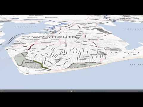
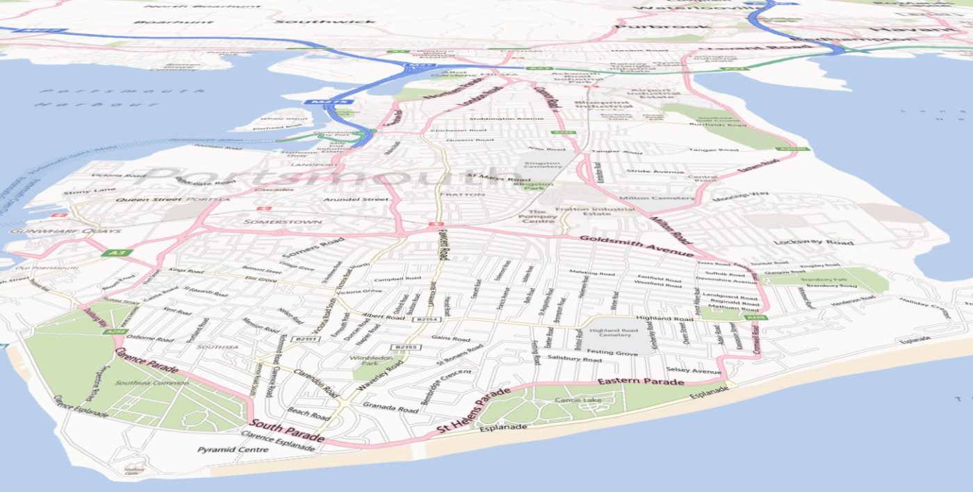
GeoFlow was released to public preview yesterday; a new 3D visualization tool for Excel which allow users to create, navigate and interact with time-sensitive data applied to a digital map.
Back in October last year, along with 25,000 other people, my good friend and colleague Tim Kent (@TimK_Adatis) and I ran the Great South Run; a 10 mile run around the City of Portsmouth on the south coast of England. As it happened, we both wore GPS watches and using the data collected I’ve created a simple GeoFlow tour of the race.
Tim is Green – I am Red – who wins… there’s only one way to find out ……
Introduction to Data Wrangler in Microsoft Fabric
What is Data Wrangler? A key selling point of Microsoft Fabric is the Data Science
Jul
Autogen Power BI Model in Tabular Editor
In the realm of business intelligence, Power BI has emerged as a powerful tool for
Jul
Microsoft Healthcare Accelerator for Fabric
Microsoft released the Healthcare Data Solutions in Microsoft Fabric in Q1 2024. It was introduced
Jul
Unlock the Power of Colour: Make Your Power BI Reports Pop
Colour is a powerful visual tool that can enhance the appeal and readability of your
Jul
Python vs. PySpark: Navigating Data Analytics in Databricks – Part 2
Part 2: Exploring Advanced Functionalities in Databricks Welcome back to our Databricks journey! In this
May
GPT-4 with Vision vs Custom Vision in Anomaly Detection
Businesses today are generating data at an unprecedented rate. Automated processing of data is essential
May
Exploring DALL·E Capabilities
What is DALL·E? DALL·E is text-to-image generation system developed by OpenAI using deep learning methodologies.
May
Using Copilot Studio to Develop a HR Policy Bot
The next addition to Microsoft’s generative AI and large language model tools is Microsoft Copilot
Apr