I spend a fair amount of time championing the use of data and analytics around my client’s companies, convincing people from all walks of life that making their data more visible and available around the company will be hugely beneficial.
I was recently challenged on this – If I’m such a firm believer in sharing data and improvement through analysis, why am I not sharing my own data? It’s a very good point, and not one that I had an answer for readily available.
I’m currently engaged on a project which uses Visual Studio Online for both ALM and source control. Fortunately, Microsoft have recently released the PowerBI Visual Studio Online Content Pack, making the data held within your account available for dashboarding.
The above link describes the steps to connect, but I found the dashboards required a little setting up before they were completely useful.
You are first presented with a mixed bag of charts and metrics, many of which will contain no data. This is because the data model has different entities depending on the project template (Agile, Scrum or CMMI) chosen within TFS, as well as the source control binding (TFS or Git).
I removed many of the charts from the default dashboard then went exploring in the exposed report model – I was very happy with what I found, the Visual Studio Online object model exposed pretty much every metric I could think of to report on the activity of a BI development team, including report templates for each template/source version you could be using.
I gave myself 15 minutes to see if I could pull out a reasonable dashboard and was pleasantly surprised by what could be done in so little time.

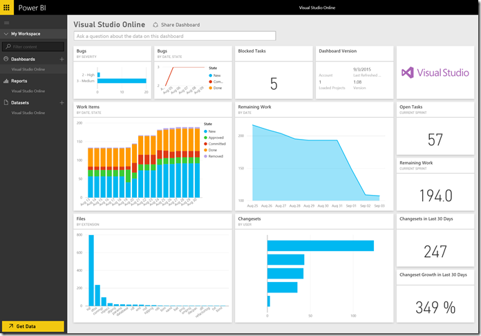
So – how do you analyse an analysis team?
How is the Project Going?
Firstly, we’re an agile team. We run iterations loosely based around Scrum principles, we manage our client projects through story backlogs and report daily on blockers, impediments etc. This information is key to us operationally, but it also tells a useful story.
How many new features were added in the sprint? How many individual user stories, each representing a distinct piece of business value, were delivered? How much effort is remaining in the backlog (and therefore how many additional sprints would be required to deliver all known functionality?). How many bugs have been raised – and how effective are we at dealing with them?

What’s the current Sprint Status?
The day to day metrics also tell a valuable story – was the sprint smooth and predictable, or was it a rush to deliver towards the end? How much work is still remaining in the current sprint? Are there any blocked tasks or impediments that may be seen as a risk to delivery?

What actual work has been done?
Stories and tasks only tell one side of the story – a task may represent a change to a single piece of code, or a large update that touches much of the system. Simply counting tasks therefore limits our understanding of how productive we were during a sprint.
Fortunately, we can also analyse the source control history, looking at the changesets committed and their contents. This provides some insight into the complexity of those completed tasks – it’s not a perfect measure but gets us a little closer. We can now ask questions such as:
How many individual changesets were committed? Who commits most regularly? What kind of work was done – what is the most common file amended? Is there someone who hordes changes and causes potential problems by not regularly committing their work? Is our development behaviour changing overtime as we review our practices and learn from them?

Finally, it’s also worth noting that the content pack has been fully set up with synonyms to allow for the Q&A Natural Language query bar to be activated. So if there’s a metric not included in the dashboards, users can simply type their question into the query bar.
For example, I want to better understand the type of changes we’re doing – are we creating new entities or modifying existing code? For this, I tried the following, with the relevant chart appearing before I’d even finished typing:

There’s a whole lot more content in the packs under the individual report tabs, but this gave me a good point to start that conversation. I can now provide weekly dashboard updates to my project sponsors, showing just how much progress we’re making.
This is a huge boost to my ability to champion data and I’m expecting it to actually improve some of our working habits. Now, if anyone interrupts me mid-flow I can simply grab my phone, load up the Power BI app and pull out some insights from the team’s current performance, wherever I am.
Introduction to Data Wrangler in Microsoft Fabric
What is Data Wrangler? A key selling point of Microsoft Fabric is the Data Science
Jul
Autogen Power BI Model in Tabular Editor
In the realm of business intelligence, Power BI has emerged as a powerful tool for
Jul
Microsoft Healthcare Accelerator for Fabric
Microsoft released the Healthcare Data Solutions in Microsoft Fabric in Q1 2024. It was introduced
Jul
Unlock the Power of Colour: Make Your Power BI Reports Pop
Colour is a powerful visual tool that can enhance the appeal and readability of your
Jul
Python vs. PySpark: Navigating Data Analytics in Databricks – Part 2
Part 2: Exploring Advanced Functionalities in Databricks Welcome back to our Databricks journey! In this
May
GPT-4 with Vision vs Custom Vision in Anomaly Detection
Businesses today are generating data at an unprecedented rate. Automated processing of data is essential
May
Exploring DALL·E Capabilities
What is DALL·E? DALL·E is text-to-image generation system developed by OpenAI using deep learning methodologies.
May
Using Copilot Studio to Develop a HR Policy Bot
The next addition to Microsoft’s generative AI and large language model tools is Microsoft Copilot
Apr