
What is clustering?
In simple words – clustering is grouping objects based on similarities. In the data world some common tasks include classifying data points into categories(clusters) or based on existing classification to predict the category of a new data point.
There are many algorithms for clustering analysis that can provide insights of the data by learning the features that separate it into groups. The main idea is that if things can be grouped together then they possess similar features and therefore can be treated similarly from business decision perspective.
We are going to show python implementation for three popular algorithms and go through some pros and cons.
K-Means Clustering
One of the most popular and easy to understand algorithms for clustering. Basically it tries to “circle” the data in different groups based on the minimal distance of the points to the centres of these clusters. Check out this cool animation of the process.
How it works:
- Choose the number of clusters (let’s say you want k clusters).
- Choose k random points for the cluster centres;
- Assign the data points to the closest cluster centre;
- Recompute the cluster centres by calculating the mean of the distance of all points belonging to the current cluster;
- Repeat until no new centers are assigned or all points remain in the same cluster;
Now that we are familiar with the process we can proceed with implementing it on data.
We are going to try and cluster data without using any prior knowledge. We are going to assign the number of clusters based on a plot of the data:
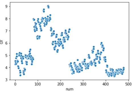
From the plot we can assume we have 3/5 clusters.
We import the algorithm and set the number of clusters to 4
from sklearn.cluster import KMeans
kmeans = KMeans(n_clusters=5)
kmeans.fit(X)
y_kmeans = kmeans.predict(X)
Plot the data and check the newly created clusters:
ax = sns.scatterplot(X[:, 0], X[:, 1], hue=y_kmeans)
centers = kmeans.cluster_centers_
sns.scatterplot(centers[:, 0], centers[:, 1], color="1")
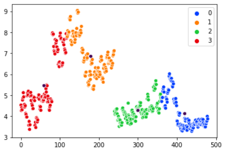
The human eye can easily detect that this clusterization is not optimal for the data we have. We can experiment with 3 or 5 clusters but the results are similar.
Why is that?
While K-means works pretty fast with it’s linear complexity and performs awesome on many datasets there are a few drawbacks on the algorithm. Different cluster size can be a problem when working with K-means as well as different density of the data points.
Some data distributions are too complex for K-means’ naive approach. Consider the following examples and the two clusters (green and blue) created by K-means:
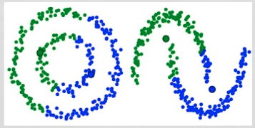
It is pretty obvious that K-means fails to separate the data correctly in these cases.
For our data distribution one possible solution might be to increase the cluster numbers. Check out the output when using six clusters:
The clusters makes more sense this way.
A few other specifics of the algorithm must be taken into consideration such as the randomness of the initial cluster centroids. We risk getting different clusters each time we run the algorithm. K-means++ might offer solution to this issue as it allows to choose the initial cluster centroids.
Lastly, K-means needs to be told how many clusters to form which is not always a straightforward task. Even in a case with easily dividable to the human eye data (such as the example) we still have doubts on the number of clusters we should use.
The next algorithm we will talk about offers solution to some of the problems with K-means and can be considered as a generalisation of K-means.
Gaussian Mixture Model with Expectation Maximization
The algorithm assumes that the data points can be represented with a number of gaussian distributions. Each distribution is a different cluster.
In 1D data case we would get something like that:
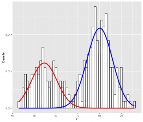
Where we use two gaussians (the red and blue curve) to map the distribution of the data represented with the histogram.
Of course, with higher dimensions the shape that can describe the distribution of our data is no longer the bell curve but something more like this:
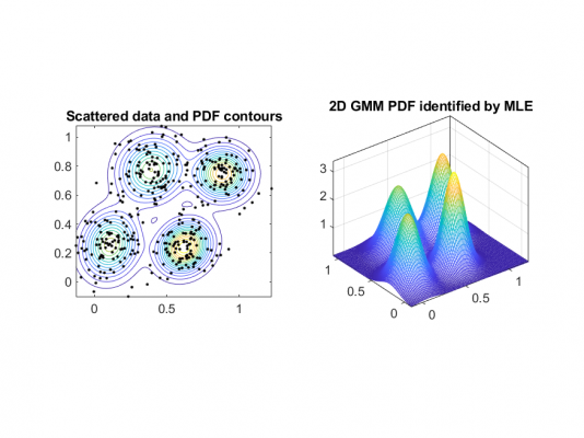
The 2D model we see sort of encapsulates the data with multiple Gaussians for each cluster and you can see how if we consider the contour of the probability density function for the Gaussians (imagine that we slice the 2D shapes and look on top) we get elliptical forms (the left figure).
This offers much more flexibility that the circular form that K-means offers for the clusters.
Since this algorithm uses distributions it actually tells us the probability that each data point belongs to a certain cluster. Which is a nice feature if you are looking for multi-categorical data.
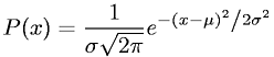
Parameters of the algorithm are the mean(μ) and standard deviation(σ) in 1D or covariance in multidimensional case. Remember the probability density function(PDF) for gaussian distribution? Here it is (one dimension) in case you don’t:
To find the right parameters the algorithm uses expectation maximisation – an optimisation algorithm. This is achieved in two steps:
- E-step (estimation step) : We provide the number of clusters (let’s say k) and randomly assign values for the mean and covariance. Then calculate the probability for each data point to belong to each cluster;
- M-step (maximisation step): Update the parameters based on the probabilities from the previous step such that the probability for each data point is maximised (the closer a data point is to the cluster centre, the higher the probability). This process is repeated until convergence.
This algorithm is much more flexible than K-means in the sense that it can cover better more types of data distributions and as previously mentioned, offers the ability to classify one data point into multiple clusters. On the down side we still need to provide the number of clusters. Although there are algorithms that offer workaround such as BIC for model selection.
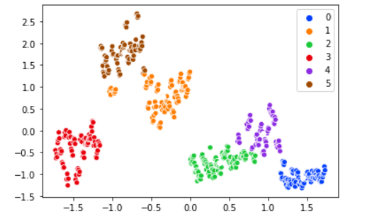
It is time for the implementation of the algorithm:
gmm = GaussianMixture(n_components=5)
gmm.fit(X)

labels = gmm.predict(X)
frame = pd.DataFrame(X)
frame['cluster'] = labels

sns.scatterplot(X[:, 0], X[:, 1], hue="cluster", data=frame)
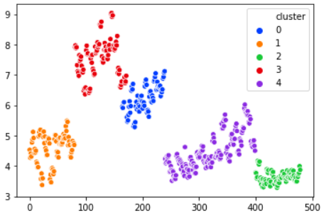
We picked 5 clusters for the model. The output splits very naturally the data into clusters. Clearly outperforms K-means on this example.
Let’s jump right into the last algorithm.
Density-Based Spatial Clustering of Applications with Noise (DBSCAN)
DBSCAN uses two parameters:
- ε : the distance that defines data points as “neighbours”. All data points within ε distance between one another are considered in the same neighbourhood.
- min points: The minimum number of points in a neighbourhood. Bigger dataset usually requires bigger min points parameter.
With that in mind let’s dive into the algorithm process:
- DBSCAN starts by selecting an unvisited data point (let’s call it a) and extracting all points in the same neighbourhood.
- If the number of points is sufficient (according to min points) then this data point belongs to a (new) cluster. If the neighbours are less than min points then a is categorised as an outlier.
- If a is a point in new cluster then all neighbours to a become part of the same cluster. Then all neighbours to a‘s neighbours are added to the cluster as well. We repeat the last two steps until all points within ε from the cluster have been visited and marked as parts of it or as outliers. The cluster is ready.
- We proceed to a new unvisited point and repeat the process until all points are either part of a cluster or outliers.
Let’s check out the code for this algorithm:
X = StandardScaler().fit_transform(X)

# Compute DBSCAN
db = DBSCAN(eps=0.2, min_samples=5).fit(X)
core_samples_mask = np.zeros_like(db.labels_, dtype=bool)
core_samples_mask[db.core_sample_indices_] = True
labels = db.labels_

# Number of clusters in labels, ignoring noise if present.
n_clusters_ = len(set(labels)) - (1 if -1 in labels else 0)
n_noise_ = list(labels).count(-1)

print('Estimated number of clusters: %d' % n_clusters_)
print('Estimated number of noise points: %d' % n_noise_)

# Plot result
import matplotlib.pyplot as plt

# Black removed and is used for noise instead.
unique_labels = set(labels)
colors = [plt.cm.Spectral(each)
          for each in np.linspace(0, 1, len(unique_labels))]

for k, col in zip(unique_labels, colors):
    if k == -1:
        # Black used for noise.
        col = [0, 0, 0, 1]

    class_member_mask = (labels == k)

    xy = X[class_member_mask & core_samples_mask]
    frame = pd.DataFrame(xy)
    ax = sns.scatterplot(xy[:, 0], xy[:, 1], data=frame, palette=cmap)

    xy = X[class_member_mask & ~core_samples_mask]
    frame = pd.DataFrame(xy)
    ax = sns.scatterplot(xy[:, 0], xy[:, 1], data=frame, palette=cmap)

plt.title('Estimated number of clusters: %d' % n_clusters_)
plt.show()
DBSCAN kindly estimated seven clusters for our data. The red and green clusters contain enough points to be formed separately. With bigger value for parameter min_samples these data points might be classified as outliers.
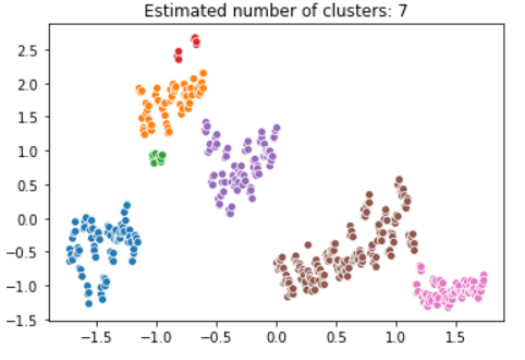
Time to rate DBSCAN – it performs well on weird-shaped data, it can classify noise data instead of hiding it in some cluster and does not require for us to set the number of clusters(Finally!). On the other hand performance suffers when the data points vary in density.
We went through three popular clustering algorithms and some basic implementation.
The entire code used in this post can be found here.
For more algorithms, I recommend checking out this comparison example on different clustering methods provided by the nice people from scikit learn.
References:
https://jakevdp.github.io/PythonDataScienceHandbook/05.11-k-means.html
https://www.analyticsvidhya.com/blog/2019/10/gaussian-mixture-models-clustering/
Introduction to Data Wrangler in Microsoft Fabric
What is Data Wrangler? A key selling point of Microsoft Fabric is the Data Science
Jul
Autogen Power BI Model in Tabular Editor
In the realm of business intelligence, Power BI has emerged as a powerful tool for
Jul
Microsoft Healthcare Accelerator for Fabric
Microsoft released the Healthcare Data Solutions in Microsoft Fabric in Q1 2024. It was introduced
Jul
Unlock the Power of Colour: Make Your Power BI Reports Pop
Colour is a powerful visual tool that can enhance the appeal and readability of your
Jul
Python vs. PySpark: Navigating Data Analytics in Databricks – Part 2
Part 2: Exploring Advanced Functionalities in Databricks Welcome back to our Databricks journey! In this
May
GPT-4 with Vision vs Custom Vision in Anomaly Detection
Businesses today are generating data at an unprecedented rate. Automated processing of data is essential
May
Exploring DALL·E Capabilities
What is DALL·E? DALL·E is text-to-image generation system developed by OpenAI using deep learning methodologies.
May
Using Copilot Studio to Develop a HR Policy Bot
The next addition to Microsoft’s generative AI and large language model tools is Microsoft Copilot
Apr