The ArcGIS Maps for Power BI is also useful when used in conjunction with other visualizations, through Interactions. When selecting any location feature on the map, the filters will be communicated to the other visualizations which will in turn consider the same filtering.
The perfect map blends art and science into an effective tool of visual communication.
In the previous blog posts (that can be accessed from the following links: https://bit.ly/2PnIgR3 and https://bit.ly/2PnegWk),we have gone through the ArcGIS Maps for Power BI tool and had an overview of its use.
To wrap up this series, we will build on the description of most of the features in the previous posts, available when editing the ArcGIS Maps for Power BI.
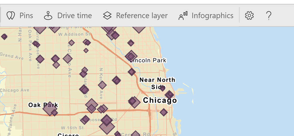
The remaining features currently available in this tool will be shortly described to wrap up the features section:
- Pins – These provide the option of adding locations that are important to you on the map. For instance, if you are analyzing supply chain and distribution, the warehouse/s might be useful as pin/s, since these do not change no matter the changing dataset and need to be considered in most analysis.
- Drive time – Once pins are set-up, drive time tool could be used to highlight distances within specified radius or drive time. For instance, if you are analyzing orders that are being delivered late in a particular area, the pin and drive time tools could help in analyzing the possibility of opening a new store in a nearby area (in comparison to the coverage it will offer to the client sites that are having the orders delivered late).
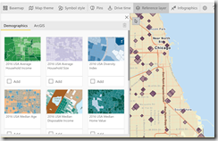
- Reference layers – These can be either demographic layers or ArcGIS reference layers. Out-of-the-box demographic layers are US based and 10 of them are provided freely, which give data such as average households incomes. ArcGIS layers is data being published by other authoritative partners, customers and users that use ArcGIS online like weather services related data. Such data can be loaded and used in Power BI, without the need to spend time collecting regional data, cleaning and modelling it. For instance, an insurance company using Power BI and which might need to analyze the impact of a storm and the insurance policies within an area, might utilize ArcGIS storm surge information alongside with their own dataset for prediction and effect on policies.
- Infographics – This tool provides information such as population and age that could also be used alongside the data. So, taking the same insurance use case above, this information could help identify how many people (irrelevant whether customers or not) are likely to be affected. This might hence be a good indication for selling and marketing departments.
Different selection options
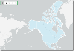
There are different select methods available when using ArcGIS Maps for Power BI. These can be accessed through the map visual beneath the zoom in and out buttons (+ and -), as highlighted below:
- Select individual location – This enables the selection of only a single individual location at a time. Once another location is clicked the previous selected one will be automatically unselected, and the last selection retained with the reporting data refreshed and re-filtered accordingly.
- Select multiple location – This enables the selection of multiple locations by drawing a box over multiple locations that need to be selected simultaneously. This provide a good way of comparing the data of various locations.
- Select locations using reference layer – This enables the selection by area on a reference layer or within a defined radius / driving time from a specific location. This selection method will only be available if the map contains a reference layer or a drive-time area layer. If the map contains both a reference layer and a drive-time area layer, then both options will be available to choose from. The Reference layer selection tool will select all map features within the reference polygon – for instance if a state in US is selected, all location-based features located in that state on the data layer will be selected on the map. If the Drive time areas is chosen, data features will be selected within the defined area.
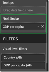
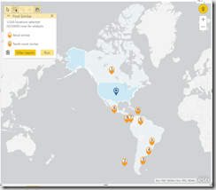
- Find similar – This latest added feature helps the user to swiftly pinpoint any locations that have similar attributes to the selected locations on the map (through the data layer only). For instance, in a map showing the GDP per country, the Find similar would allow the easy identification of those countries/ locations that have the same/ closest GDP. The numerical field (like GDP in this case) that is to be used as a basis for comparable values, needs to be dragged in the Find Similar data well.
Then, after choosing the location to have the GDP compared to – in this case US – the GDP for the other locations will be compared and a rank for the most similar GDPs will be shown. In this case, Canada has been ranked as the closest for that year when filtering on the North and South American regions, with Dominican Republic being marked as the 10th most similar.
Basic vs Plus subscriber/ ArcGIS account
By default, the ArcGIS Maps for Power BI tool is available in basic version. This brings with it some limitations when compared to the same tool accessed through the Plus Subscription.
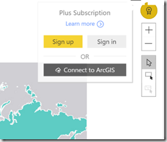
In order to login or signup for Plus Subscription, or even connect to ArcGIS directly, the yellow circle with the plus sign on the ArcGIS Map for Power BI could be used – as per below:
But what is exactly different between the Basic and Plus subscription? Following is a summarized comparison of the main features that differ between both:
|
ArcGIS Maps for Power BI features |
||
|---|---|---|
| Free (incorporated within Power BI with no cost) | Plus subscription (monthly fee per user – currently $5 pp) | |
| US demographics only | Global and richer demographics including Age, Behaviours, Healthcare etc. | |
| Public maps | Validated, at the ready data, organized and collected from reliable and trustworthy sources | |
| Map and visualize locations: 1.5K features (geocoded locations) per map; 100K features per month | Map and visualize further locations: 5K features per map; 1 million features per month | |
| Carry out spatial analysis including heatmaps, drive-time etc. | Execute the same spatial analysis as the basic incorporated | |
| 4 basic basemaps | 4 basic basemaps + 8 others including satellite imagery, oceans and terrain | |
One point that remains evident from the above is the limit that still exist in the features that could be included in a map. Hence if one is trying to geocode locations or street addresses, in Basic, only the first 1500 will be considered in one map, whilst 5000 will be taken into account for the Plus subscription. This cap mainly exists to retain a good user experience for both visualization and performance, yet might be something to keep in mind especially if targeting large datasets.
However, this is not a restriction for Power BI overall – since it offers other mapping tools that might be used in large datasets like for instance MapBox. The different mapping tools present different capabilities and features that might appeal and apply to different users depending on their use-case, scope, complexity and functionality sought.
Performance enhancement and other improvements
In one of the latest updates (September 2018), performance of ArcGIS Maps for Power BI has been improved drastically, and is cited to be about 50% better. This is mostly visible when navigating through the map or through interactions done and its benefits make live presentations of such maps less nerve-wracking. The improvement does not only apply for new maps or new reports, but will also be experienced by existing reports that are already using an ArcGIS Map for Power BI.
In December 2018, other improvements were released for ArcGIS Maps for Power BI. In addition to the Find Similar feature that has been referred to already above, there were other features enhanced covering both the basic and plus subscription. One other improvement worth highlighting is the boundary data in the Location Type (which had been described in the previous blog on this series). In this latest release, more boundary data has been made available to help increase accuracy in data analysis. Likewise, the Plus subscribers have access to lot more curated infographic data for various demographics.
Concluding remarks
All of this shows that GIS and mapping tools are being given the required attention by Power BI and Microsoft in general. With their increased popularity in recent years, they have now become essential in decision making and business, and through proper data visualizations – the data could become much more meaningful. This ties up with what Dr. Keith Harries suggests, that “The perfect map blends art and science into an effective tool of visual communication.” And thanks to Power BI mapping tools this is being enabled!

Introduction to Data Wrangler in Microsoft Fabric
What is Data Wrangler? A key selling point of Microsoft Fabric is the Data Science
Jul
Autogen Power BI Model in Tabular Editor
In the realm of business intelligence, Power BI has emerged as a powerful tool for
Jul
Microsoft Healthcare Accelerator for Fabric
Microsoft released the Healthcare Data Solutions in Microsoft Fabric in Q1 2024. It was introduced
Jul
Unlock the Power of Colour: Make Your Power BI Reports Pop
Colour is a powerful visual tool that can enhance the appeal and readability of your
Jul
Python vs. PySpark: Navigating Data Analytics in Databricks – Part 2
Part 2: Exploring Advanced Functionalities in Databricks Welcome back to our Databricks journey! In this
May
GPT-4 with Vision vs Custom Vision in Anomaly Detection
Businesses today are generating data at an unprecedented rate. Automated processing of data is essential
May
Exploring DALL·E Capabilities
What is DALL·E? DALL·E is text-to-image generation system developed by OpenAI using deep learning methodologies.
May
Using Copilot Studio to Develop a HR Policy Bot
The next addition to Microsoft’s generative AI and large language model tools is Microsoft Copilot
Apr