Once in awhile you happen upon a really useful feature in SSRS that you were unaware of. For me strip lines are definitely one of these features that you don’t see that much mention of but which can add valuable insight to a report.
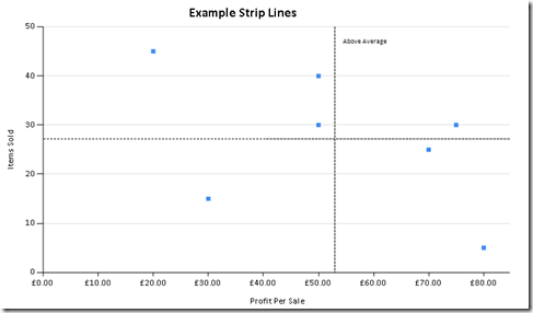
Below is a simple example of a scatter chart with a horizontal and vertical strip line each marking the average values of their axis.

In order to add strip lines to the report you need to do the following:
1. Select the chart axis to which you wish to add the strip line and go to the properties window. In this there is an option marked ‘StripLines’. When you click in the cell you can open up the Strip Line Collection editor.


2. Click the ‘Add’ button in the strip line editor (note: you can add multiple strip lines to each axis if required).
3. In the option marked ‘IntervalOffset’ specify the required value for the Strip Line, you can either specify a fixed value or use an expression from your Dataset. If you require the line to repeat over fixed values you can fill in the properties for ‘Interval’.

4. You then need to set the display properties for the strip lines under appearance in order for them to be visible. To produce the example strip lines in this post I have set the ‘BorderColour’ to black and the ‘BorderStyle’ to dashed.

5. If you wish to add text after the strip line on the graph – for example to illustrate that values after the strip line are above average as shown below then the settings are under the title section.


That’s it for now, hope that you’ve found this helpful:)
Introduction to Data Wrangler in Microsoft Fabric
What is Data Wrangler? A key selling point of Microsoft Fabric is the Data Science
Jul
Autogen Power BI Model in Tabular Editor
In the realm of business intelligence, Power BI has emerged as a powerful tool for
Jul
Microsoft Healthcare Accelerator for Fabric
Microsoft released the Healthcare Data Solutions in Microsoft Fabric in Q1 2024. It was introduced
Jul
Unlock the Power of Colour: Make Your Power BI Reports Pop
Colour is a powerful visual tool that can enhance the appeal and readability of your
Jul
Python vs. PySpark: Navigating Data Analytics in Databricks – Part 2
Part 2: Exploring Advanced Functionalities in Databricks Welcome back to our Databricks journey! In this
May
GPT-4 with Vision vs Custom Vision in Anomaly Detection
Businesses today are generating data at an unprecedented rate. Automated processing of data is essential
May
Exploring DALL·E Capabilities
What is DALL·E? DALL·E is text-to-image generation system developed by OpenAI using deep learning methodologies.
May
Using Copilot Studio to Develop a HR Policy Bot
The next addition to Microsoft’s generative AI and large language model tools is Microsoft Copilot
Apr