Following on from Part 1 which introduces the R basics (which can be found here), in Part 2 I’ll start to use lists, data frames, and more excitingly graphics.
Lists
Lists differ from vectors and matrices because they are able to store different data types together in the same data structure. A list can contain all kinds of R objects – vectors, matrices, data frames, factors and more. They can even store other lists. Unfortunately calculations are less straightforward because there’s no predefined structure.
To store data within a list, we can use the list() function, trip <- c(“London”,”Paris”,220,3). As mentioned in my previous blog we can use str(list) to understand the structure, this will come in handy. Notice, the different data types.
Subsetting lists is not similar to subsetting vectors. If you try to subset a list using the same square brackets as when subsetting a vector, it will return a list element containing the first element, not just the first element “London” as a character vector. To extract just the vector element, we can use double square brackets [[ ]]. We can use similar syntax to before, to extract the first and third elements [c(1,3)] as a new list, but the same does not work with double brackets. The double brackets are reserved to select single elements from a list. If you have a list inside a list, then [[c(1,3)]] would work and would select the 3rd element of the 1st list! Subsetting by names, and logicals is exactly the same as vectors.
Another piece of syntax we can use is $ to select an element, but it only works on named lists. To select the destination of the trip, we can use trip$destination. We can also use this syntax to add elements to the list, trip$equipment <- c(“bike”,”food”,”drink”).
Interested in testing your knowledge, check out the DataCamp exercises here and here.
Data Frames
While using R, you’ll often be working with data sets. These are typically comprised of observations and each observation has a number of variables against it, similar to a customer/product table you’d usually find in a database. This is where data frames come in, as the other data structures are not practical to store this type of data. In a data frame, the rows correspond to the observations, while the columns the variables. Similar to a matrix but we can store different data types (like a list!). Under the hood, a data frame is actually a list but with some special requirements such as vector length, and char vectors as factors. Creating a data frame is usually achieved by importing data from source rather than manually created but you can do this via the data.frame function as shown below:
# Definition of vectors
planets <- c("Mercury", "Venus", "Earth", "Mars", "Jupiter", "Saturn", "Uranus", "Neptune")
type <- c("Terrestrial planet", "Terrestrial planet", "Terrestrial planet",
          "Terrestrial planet", "Gas giant", "Gas giant", "Gas giant", "Gas giant")
diameter <- c(0.382, 0.949, 1, 0.532, 11.209, 9.449, 4.007, 3.883)
rotation <- c(58.64, -243.02, 1, 1.03, 0.41, 0.43, -0.72, 0.67)
rings <- c(FALSE, FALSE, FALSE, FALSE, TRUE, TRUE, TRUE, TRUE)

# Encoded type as a factor
type_factor <- factor(type)

# Constructed planets_df
planets_df <- data.frame(planets, type_factor, diameter, rotation, rings, stringsAsFactors = FALSE)

# Displays the structure of planets_df
str(planets_df)
Similar to SQL, sometimes you will want just a small portion of the dataset to inspect. This can be done by using the head() and tail() functions. We can also use dim() to show the dimensions which returns the number of rows and number of columns, but str() is preferable as you get a lot more detail.
Due to the fact a data frame is an intersection between a matrix and a list, the subsetting syntax can be used from both, so the familiar [ ], [[ ]], and $ will work to extract either elements, vectors, or data frames depending upon the type of subsetting performed. We can also use the subset() function, for instance subset(planets_df, subset = has_rings == TRUE). The subset argument should be a logical expression that indicates which rows to keep.
We can also extend the data frame in a similar format to lists/matrices. To add a new variable/column we can use either people$height <- new_vector or people[[“height”]] <- new_vector. We can also use cbind() for example people <- cbind(people, “height” = new_vector), it works just the same. Similarly rbind() can add new rows, but you’ll need to add a data frame made of new vectors to the existing data frame, the names between the data frames will also need to match.
Lastly, you may also want to sort your data frame – you can do this via the order() function. The function returns a vector with the rank position of each element. For example in a vector of 21,23,22,25,24 the order function will return 1,3,2,5,4 to correspond the position in the rank. We can then use ages[ranks, ] to re-arrange the order of the data frame. To sort in descending order, we can use the argument decreasing = TRUE.
# Created a desired ordering for planets_df
positions <- order(planets_df$diameter, decreasing = TRUE)

# Created a new, ordered data frame
largest_first_df <- planets_df[positions, ]

# Printed new data frame
largest_first_df
Interested in testing your knowledge, check out the DataCamp exercises here and here.
Graphics
One of the main reasons to use R is its graphics capabilities. The difference between R and a program such as Excel is that you can create plots with lines of R code which you can replicate each time. The default graphics functionality of R can do many things, but packages have also been developed to extend this – popular packages include ggplot2, ggvis, and lattice.
The first function to look at is plot() which is a very generic function to plot. For instance, take a data frame of MPs (members of parliament), which contains the name of the MP, their constituency area, their party, their constituency county, number of years as MP, etc. We can plot the parties in a bar chart by using plot(parliamentMembers$party). R realises that their party is a factor and you want to do a count across it in a bar chart format (by default). If you pick a different variable such as the continuous variable number of years as MP, the figures are shown on an indexed plot. Pick 2 continuous variables, such as number of years as MP vs. yearly expenses – plot(parliamentMembers$numOfYearsMP, parliamentMembers$yearlyExpenses) and the result is a scatter plot (each variable holds an axis).
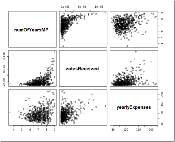
Are these variables related? To make relationships clearer, we can use the log() function- plot(log(parliamentMembers$numOfYearsMP), log(parliamentMembers$yearlyExpenses)). For 2 categorical variables, R handles it differently again, and creates a stacked bar chart giving the user an idea of the proportion of the 2 variables. Notice how the type of variable you use impacts the type of chart displayed. You will find that the first element of plot forms the x axis and the second element the y axis. For 3 variables, it gets better still – here I used plot(parliamentMembers[c(“numOfYearsMP”,”votesReceived”,”yearlyExpenses”)]). As you can see below, R plots the variables against one another in 9 different plots!

The second function to look at is hist(), which gives us a way to view the distribution of data. We can use this in a similar format to plot by specifying the syntax hist(parliamentMembers$numOfYearsMP). By default, R uses an algorithm to work out the number of bins to split the data into based on the data set. To create a more detailed representation, we can increase the bins by using the breaks argument – hist(parliamentMembers$numOfYearsMP, breaks = 10).
There are of course, many other functions we can use to create graphics, the most popular being barplot(), boxplot(), pie(), and pairs().
Customising the Layout
To make our plots more informative,we need to add a number of arguments to the plot function. For instance the following R script creates the plot below:
plot(
parliamentMembers$startingYearMP,
parliamentMembers$votesReceived,
xlab = "Number of votes",
ylab = "Year",
main = "Starting Year of MP vs Votes Received",
col = "orange",
col.main = "black",
cex.axis = 0.8
pch = 19
)

# xlab = horizontal axis label
# ylab = vertical axis label
# main = plot title
# col = colour of line
# col.main = colour of the title
# cex.axis = ratio of font size on axis tick marks
# pch = plot symbol (35 different types!!)
![clip_image001[7]](https://adatis.co.uk/wp-content/uploads/historic/TristanRobinson_clip_image0017.png "clip_image001[7]")
To inspect and control these graphical parameters, we can use the par() function. To get a complete list of options we can use ?par to bring up the R documentation. By default, the parameters are set per plot, but to specify session-wide parameters, just use par(col = “blue”).
Multiple Plots
The next natural step for plots is to incorporate multiple plots – either side by side or on top of one another.
To build a grid of plots and compare correlations we can use the mfrow parameter, like this par(mfrow = c(2,2)) by using par() and passing in a 2×2 vector which will build us 4 subplots on a 2 by 2 grid. Now, when you start creating plots, they are not replaced each time but are added to the grid one by one. Plots are added in a row-wise fashion – to use column-wise, we can use mfcol. To reset the graphical parameters, so that R plots once again to a single figure per layout, we pass in a 1×1 grid.
Apart from these 2 parameters, we can also use the layout() function that allows us to specify more complex arrangements. This takes in a matrix, where you specify the location of the figures. For instance:
grid <- matrix(c(1,1,2,3), nrow = 2, ncol = 2, byrow = TRUE)

grid
    [1][2]
[1]  1  1
[2]  2  3

layout(grid)
plot(dataFrame$country, dataFrame$sales)
plot(dataFrame$time, dataFrame$sales)
plot(dataFrame$businessFunction, dataFrame$sales)

# Plot 1 stretches across the entire width of the figure
# Plot 2 and 3 sit underneath this and are half the size
To reset the layout we can use layout(1) or use the mfcol / mfrow parameters again. One clever trick to save time is to store the default parameters in a variable such as old_par <- par() and then reset once done using par(old_par).
Apart from showing the graphics next to one another, we can also stack them on top of one another in layers. There are functions such as abline(), text(), lines(), and segments() to add depth to a graphic. Using lm() we can create an object which contains the coefficients of the line representing the linear fit using 2 variables, for instance movies_lm <- lm(movies$rating ~ movies$sales). We can then add it to an existing plot such as plot(movies$rating, movies$sales) by using the abline() (adds the line) and coef() (extracts the coefficients) functions, for instance abline(coef(movies_lm)). To add some informative text we can use xco <- 7e5 yco <- 7 and text(xco, yco, label = “More votes? Higher rating!”) to generate the following:
![clip_image001[1]](https://adatis.co.uk/wp-content/uploads/historic/TristanRobinson_clip_image0011.png "clip_image001[1]")
Interested in testing your knowledge, check out the DataCamp exercises here, here and here.
Summary
This pretty much concludes the crash course in R. We’ve looked at the basics, vectors, matrices, factors, lists, data frames and graphics – and in each case looked at arithmetic and subsetting functions.
Next I’ll be looking at some programming techniques using R, reading/writing to data sources and some use cases – to demonstrate the power of R using some slightly more interesting data sets such as the crime statistics in San Francisco.
Introduction to Data Wrangler in Microsoft Fabric
What is Data Wrangler? A key selling point of Microsoft Fabric is the Data Science
Jul
Autogen Power BI Model in Tabular Editor
In the realm of business intelligence, Power BI has emerged as a powerful tool for
Jul
Microsoft Healthcare Accelerator for Fabric
Microsoft released the Healthcare Data Solutions in Microsoft Fabric in Q1 2024. It was introduced
Jul
Unlock the Power of Colour: Make Your Power BI Reports Pop
Colour is a powerful visual tool that can enhance the appeal and readability of your
Jul
Python vs. PySpark: Navigating Data Analytics in Databricks – Part 2
Part 2: Exploring Advanced Functionalities in Databricks Welcome back to our Databricks journey! In this
May
GPT-4 with Vision vs Custom Vision in Anomaly Detection
Businesses today are generating data at an unprecedented rate. Automated processing of data is essential
May
Exploring DALL·E Capabilities
What is DALL·E? DALL·E is text-to-image generation system developed by OpenAI using deep learning methodologies.
May
Using Copilot Studio to Develop a HR Policy Bot
The next addition to Microsoft’s generative AI and large language model tools is Microsoft Copilot
Apr